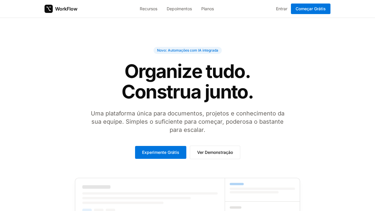
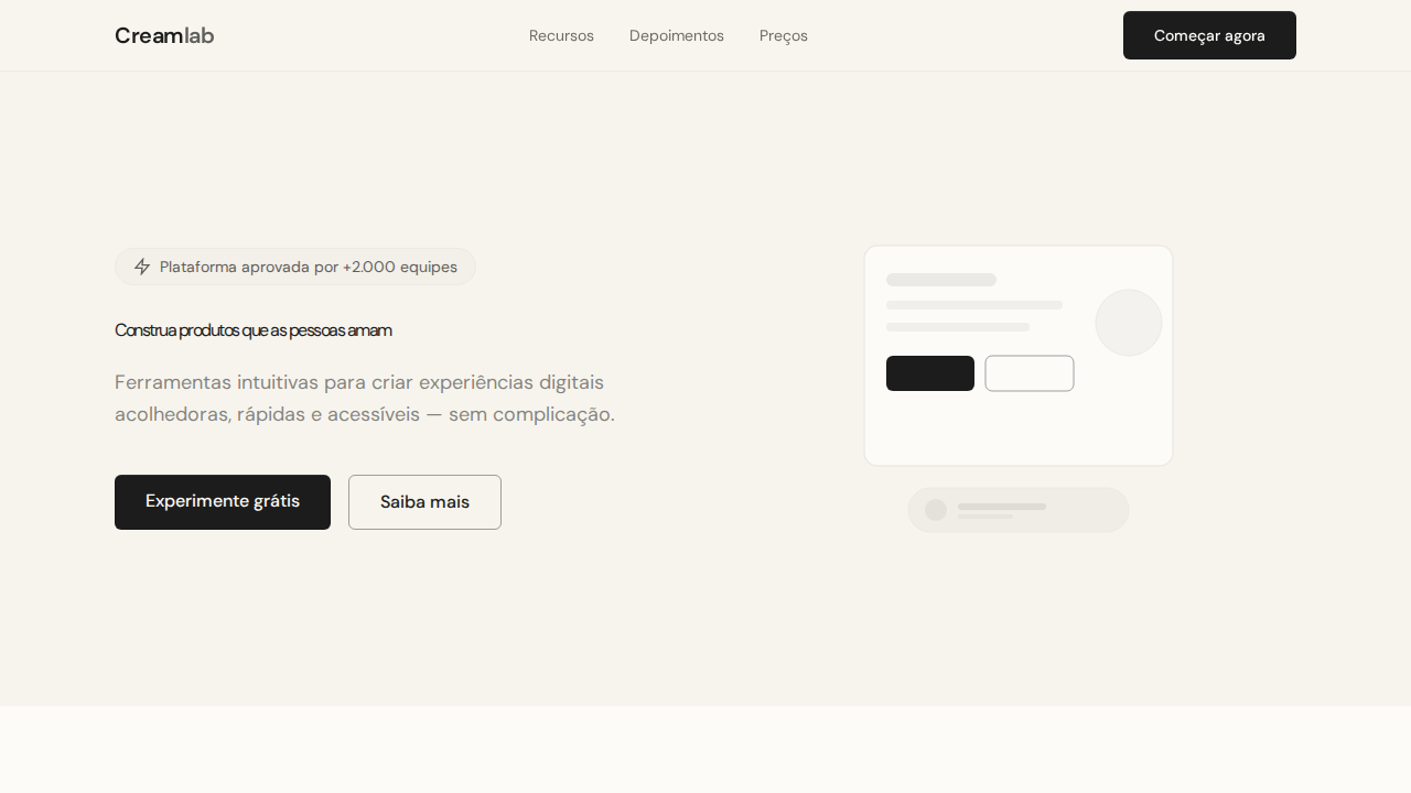
Notion Warm Workspace
Estilo Notion Warm Workspace com minimalismo quente, bordas whisper e sombras multi-camada sutis. Ideal para produtividade, workspaces e ferramentas de equipe.
Uso: Ferramentas de produtividade, Workspaces colaborativos, Gestão de conhecimento, Wikis
Contexto Histórico
Inspirado no design do Notion, que trata minimalismo como papel de qualidade — quente, tátil e analógico em vez de frio e digital.
Especificações Técnicas
Cores
Primárias
Secundárias
Efeitos
Canvas branco com texto near-black via rgba(0,0,0,0.95) — não preto puro. Paleta de cinzas quentes com subtom amarelo-marrom (#f6f5f4, #615d59, #a39e98). Bordas whisper: 1px solid rgba(0,0,0,0.1) ultra-finas. Sombras multi-camada com opacidade sub-0.05 para profundidade sutil. Azul Notion (#0075de) como único acento para CTAs. Seções alternando branco e branco quente (#f6f5f4). Pill badges (9999px) com fundo azul tintado.
Light/Dark
✓ Full / ✗ Not Recommended
CSS
background: #ffffff; color: rgba(0,0,0,0.95); accent: #0075de; border: 1px solid rgba(0,0,0,0.1); box-shadow: multi-layer sub-0.05 opacity; font-family: 'Inter', sans-serif; letter-spacing: -2.125px at 64px; border-radius: 4px buttons, 12px cards, 9999px badges
Variáveis
--bg: #ffffff; --bg-warm: #f6f5f4; --text: rgba(0,0,0,0.95); --accent: #0075de; --text-secondary: #615d59; --text-tertiary: #a39e98; --border: rgba(0,0,0,0.1); --radius-btn: 4px; --radius-card: 12px; --radius-pill: 9999px
Checklist
☐ Canvas branco com texto rgba(0,0,0,0.95), ☐ Cinzas quentes com subtom amarelo, ☐ Bordas whisper rgba(0,0,0,0.1), ☐ Sombras multi-camada sub-0.05, ☐ Azul #0075de único acento, ☐ Alternância branco/branco quente, ☐ Responsivo
DESIGN.md
Design System: Notion Warm Workspace
1. Visual Theme & Atmosphere
Estilo Notion Warm Workspace com minimalismo quente, bordas whisper e sombras multi-camada sutis. Ideal para produtividade, workspaces e ferramentas de equipe. Inspirado no design do Notion, que trata minimalismo como papel de qualidade — quente, tátil e analógico em vez de frio e digital.
- Density: 3/10 — Airy
- Variance: 2/10 — Structured
- Motion: 4/10 — Subtle
2. Color Palette & Roles
- Branco (#ffffff) — Light surface, card backgrounds
- Azul Notion (#0075de) — Accent highlight, links and focus states
- Branco Quente (#f6f5f4) — Light surface, card backgrounds
- Quase Preto (rgba(0,0,0,0.95)) — Dark surface, primary background
- Navy (#213183) — Extended palette, decorative use
- Cinza Quente (#615d59) — Secondary text, borders, muted elements
- Cinza Claro (#a39e98) — Secondary text, borders, muted elements
- Borda (rgba(0,0,0,0.1)) — Extended palette, decorative use
3. Typography Rules
- Display / Hero: Inter — Weight 700, tight tracking, used for headline impact
- Body: Inter — Weight 400, 16px/1.6 line-height, max 72ch per line
- UI Labels / Captions: Inter — 0.875rem, weight 500, slight letter-spacing
- Monospace: JetBrains Mono — Used for code, metadata, and technical values
Scale:
- Hero: clamp(2.5rem, 5vw, 4rem)
- H1: 2.25rem
- H2: 1.5rem
- Body: 1rem / 1.6
- Small: 0.875rem
4. Component Stylings
- Primary Button: Pill-shaped (9999px) shape. Accent color fill. Hover: 8% darken + subtle lift shadow. Active: -1px translate tactile press. Font weight 600. No outer glows.
- Secondary / Ghost Button: Outline variant. 1.5px border in muted color. Text in primary color. Hover: subtle background fill.
- Cards: Pill-shaped (9999px) corners. Surface background. Subtle shadow (0 2px 12px rgba(0,0,0,0.06)). 1px border stroke.
- Inputs: Label above input. 1px border stroke. Focus ring: 2px accent color offset 2px. Error text below in semantic red. No floating labels.
- Navigation: Primary surface background. Active item: accent color indicator. Font weight 500 when active.
- Skeletons: Shimmer animation matching component dimensions. No circular spinners.
- Empty States: Icon-based composition with descriptive text and action button.
5. Layout Principles
- Grid: CSS Grid primary. Max-width containment: 1280px centered with 1.5rem side padding.
- Spacing rhythm: Balanced. Base unit: 0.5rem (8px).
- Section vertical gaps: clamp(4rem, 8vw, 8rem).
- Hero layout: Split-screen (text left, visual right).
- Feature sections: Zig-zag alternating text+image rows. No 3-equal-columns.
- Mobile collapse: All multi-column layouts collapse below 768px. No horizontal overflow.
- z-index contract: base (0) / sticky-nav (100) / overlay (200) / modal (300) / toast (500).
6. Motion & Interaction
- Physics: Ease-out curves, 200-300ms duration. Smooth and predictable.
- Entry animations: Fade + translate-Y (16px → 0) over 420ms ease-out. Staggered cascades for lists: 80ms between items.
- Hover states: Subtle color shift + shadow adjustment over 200ms.
- Page transitions: Fade only (200ms).
- Performance: Only transform and opacity animated. No layout-triggering properties.
7. Anti-Patterns (Banned)
- No emojis in UI — use icon system only (Lucide, Heroicons)
- No decorative gradients — flat color only
- No shadows heavier than 0 2px 8px rgba(0,0,0,0.08)
- No pure black (#000000) — use off-black or charcoal variants
- No oversaturated accent colors (saturation cap: 80%)
- No 3-column equal-width feature layouts — use zig-zag or asymmetric grid
- No
h-screen— usemin-h-[100dvh] - No AI copywriting clichés: "Elevate", "Seamless", "Unleash", "Next-Gen"
- No broken external image links — use picsum.photos or inline SVG
- No generic lorem ipsum in demos
Prompt para AI
Design a Notion-inspired warm workspace landing page. White canvas with near-black text via rgba(0,0,0,0.95). Warm gray scale with yellow-brown undertones (#f6f5f4, #615d59, #a39e98). Ultra-thin whisper borders: 1px solid rgba(0,0,0,0.1). Multi-layer shadows with sub-0.05 opacity. Notion Blue (#0075de) as singular accent for CTAs. Sections alternating white and warm white (#f6f5f4). Headlines at 64px weight 700 with -2.125px letter-spacing. Pill badges (9999px) with tinted blue backgrounds.
Relacionados
Última sincronização: 01/04/2026