Claude Warm Parchment
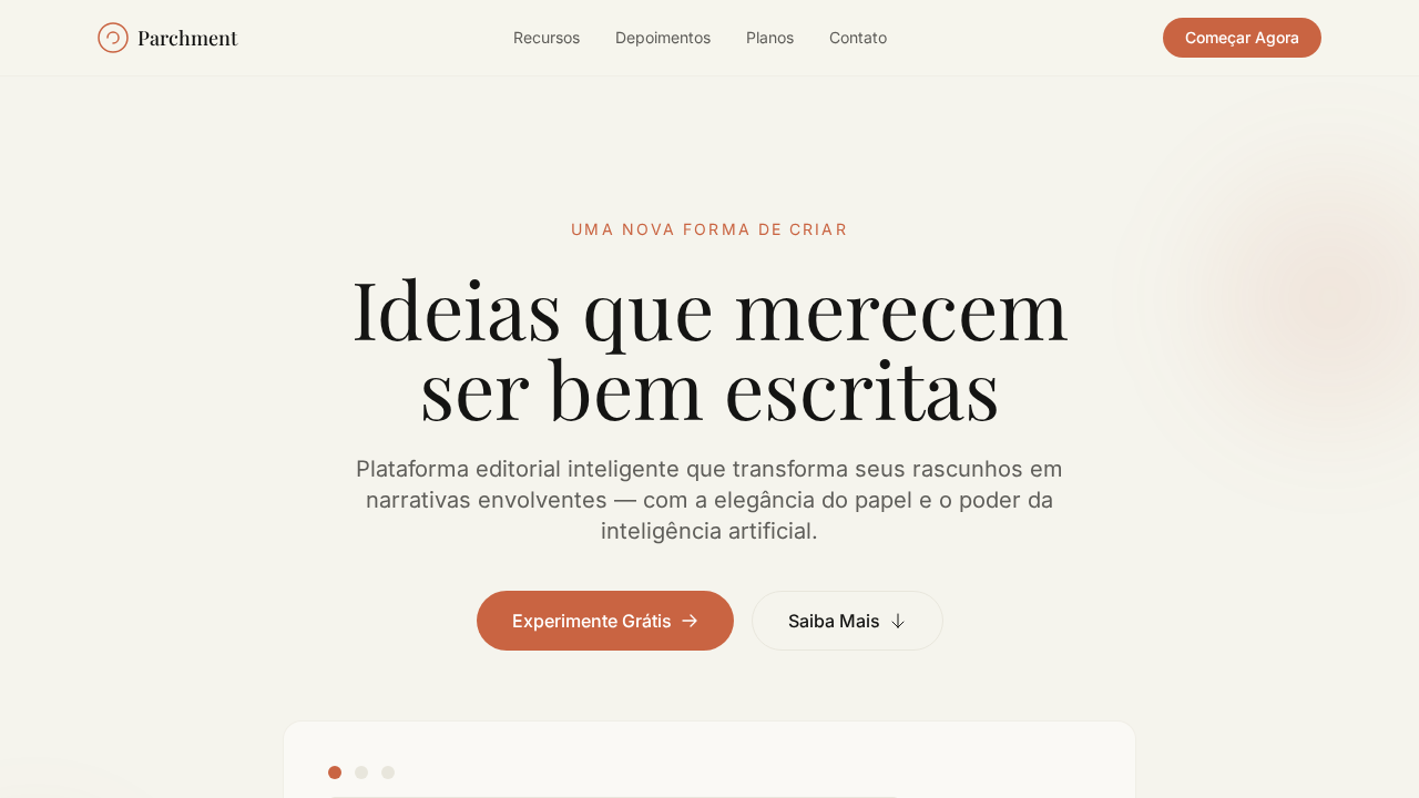
Estilo Claude Warm Parchment com canvas pergaminho, tipografia serif editorial e acento terracotta. Ideal para IA, educação e plataformas literárias.
Uso: Plataformas de IA, Educação, Editoras, Produtos literários
Contexto Histórico
Inspirado no design do Claude da Anthropic, que rejeita a estética fria de IA em favor de calor humano com pergaminho, serif e terracotta.
Especificações Técnicas
Cores
Primárias
Secundárias
Efeitos
Canvas cor de pergaminho (#f5f4ed) evocando papel premium. Headlines em serif customizada weight 500 com gravitas de título de livro. Acento terracotta (#c96442) para CTAs — deliberadamente terroso e anti-tech. Todos os cinzas com subtom amarelo-marrom. Ring shadows (0px 0px 0px 1px) criando bordas-sombra suaves. Alternância light/dark entre seções como capítulos de um livro.
Light/Dark
✓ Full / ✓ Full
CSS
background: #f5f4ed; color: #141413; accent: #c96442; font-family: Georgia, serif for headlines; font-family: Arial, sans-serif for body; border: 1px solid #f0eee6; box-shadow: 0px 0px 0px 1px warm-grays; line-height: 1.60 body, 1.10 headlines
Variáveis
--bg-parchment: #f5f4ed; --bg-ivory: #faf9f5; --text-primary: #141413; --accent-terracotta: #c96442; --accent-coral: #d97757; --text-secondary: #5e5d59; --text-tertiary: #87867f; --border-cream: #f0eee6; --border-warm: #e8e6dc; --dark-surface: #30302e
Checklist
☐ Fundo pergaminho #f5f4ed, ☐ Headlines serif weight 500, ☐ Acento terracotta #c96442, ☐ Cinzas com subtom quente, ☐ Ring shadows, ☐ Alternância light/dark, ☐ Body line-height 1.60, ☐ Responsivo
DESIGN.md
Design System: Claude Warm Parchment
1. Visual Theme & Atmosphere
Estilo Claude Warm Parchment com canvas pergaminho, tipografia serif editorial e acento terracotta. Ideal para IA, educação e plataformas literárias. Inspirado no design do Claude da Anthropic, que rejeita a estética fria de IA em favor de calor humano com pergaminho, serif e terracotta.
- Density: 5/10 — Balanced
- Variance: 8/10 — Expressive
- Motion: 8/10 — Cinematic
2. Color Palette & Roles
- Pergaminho (#f5f4ed) — Primary surface or dominant color
- Quase Preto (#141413) — Dark surface, primary background
- Terracotta (#c96442) — Supporting palette color
- Marfim (#faf9f5) — Supporting palette color
- Coral (#d97757) — Extended palette, decorative use
- Cinza Oliva (#5e5d59) — Secondary text, borders, muted elements
- Cinza Pedra (#87867f) — Secondary text, borders, muted elements
- Borda Creme (#f0eee6) — Extended palette, decorative use
3. Typography Rules
- Display / Hero: Georgia — Weight 700, tight tracking, used for headline impact
- Accent: Arial — Used for decorative or emphasis text
- Body: Georgia — Weight 400, 16px/1.6 line-height, max 72ch per line
- UI Labels / Captions: Georgia — 0.875rem, weight 500, slight letter-spacing
- Monospace: JetBrains Mono — Used for code, metadata, and technical values
Scale:
- Hero: clamp(2.5rem, 5vw, 4rem)
- H1: 2.25rem
- H2: 1.5rem
- Body: 1rem / 1.6
- Small: 0.875rem
4. Component Stylings
- Primary Button: Subtly rounded (0.5rem) shape. Accent color fill. Hover: 8% darken + subtle lift shadow. Active: -1px translate tactile press. Font weight 600. No outer glows.
- Secondary / Ghost Button: Outline variant. 1.5px border in muted color. Text in primary color. Hover: subtle background fill.
- Cards: Subtly rounded (0.5rem) corners. Surface background. Subtle shadow (0 2px 12px rgba(0,0,0,0.06)). 1px border stroke.
- Inputs: Label above input. 1px border stroke. Focus ring: 2px accent color offset 2px. Error text below in semantic red. No floating labels.
- Navigation: Primary surface background. Active item: accent color indicator. Font weight 500 when active.
- Skeletons: Shimmer animation matching component dimensions. No circular spinners.
- Empty States: Icon-based composition with descriptive text and action button.
5. Layout Principles
- Grid: CSS Grid primary. Max-width containment: 1280px centered with 1.5rem side padding.
- Spacing rhythm: Balanced. Base unit: 0.5rem (8px).
- Section vertical gaps: clamp(4rem, 8vw, 8rem).
- Hero layout: Asymmetric composition.
- Feature sections: Asymmetric grid with varied card sizes. No 3-equal-columns.
- Mobile collapse: All multi-column layouts collapse below 768px. No horizontal overflow.
- z-index contract: base (0) / sticky-nav (100) / overlay (200) / modal (300) / toast (500).
6. Motion & Interaction
- Physics: Spring — stiffness 120, damping 20. Confident, weighted transitions.
- Entry animations: Fade + translate-Y (16px → 0) over 540ms ease-out. Staggered cascades for lists: 120ms between items.
- Hover states: Scale(1.03) + shadow lift over 200ms.
- Page transitions: Fade + slide (300ms).
- Performance: Only transform and opacity animated. No layout-triggering properties.
7. Anti-Patterns (Banned)
- No emojis in UI — use icon system only (Lucide, Heroicons)
- No pure black (#000000) — use off-black or charcoal variants
- No oversaturated accent colors (saturation cap: 80%)
- No 3-column equal-width feature layouts — use zig-zag or asymmetric grid
- No
h-screen— usemin-h-[100dvh] - No AI copywriting clichés: "Elevate", "Seamless", "Unleash", "Next-Gen"
- No broken external image links — use picsum.photos or inline SVG
- No generic lorem ipsum in demos
Prompt para AI
Design a warm editorial landing page inspired by Claude/Anthropic. Parchment background (#f5f4ed) evoking premium paper. Serif headlines (Georgia fallback) at weight 500 for all headings with book-title gravitas. Terracotta (#c96442) as the sole accent for CTAs. All grays warm-toned with yellow-brown undertones (#5e5d59, #87867f). Ring-based shadows (0px 0px 0px 1px) instead of drop shadows. Light/dark section alternation like book chapters. Body text at 1.60 line-height for comfortable reading.
Relacionados
Última sincronização: 01/04/2026