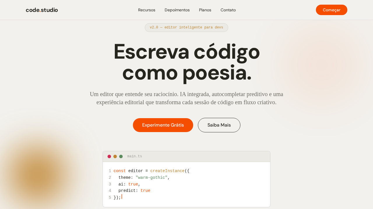
Cursor Warm Gothic
Estilo Cursor Warm Gothic com três fontes, bordas oklab e estética de editor de código quente. Ideal para ferramentas de código AI e editores inteligentes.
Uso: Editores de código AI, Ferramentas developer, IDEs inteligentes, Plataformas de coding
Contexto Histórico
Inspirado no design do Cursor, que combina calor editorial com estética de terminal usando três vozes tipográficas distintas.
Especificações Técnicas
Cores
Primárias
Secundárias
Efeitos
Canvas off-white quente (#f2f1ed) com texto warm near-black (#26251e) com subtom amarelado. Gothic display font com letter-spacing agressivo negativo (-2.16px em 72px). Serif body font com swash alternates para passagens editoriais. Bordas em espaço de cor oklab para uniformidade perceptual. Acento laranja (#f54e00) para links e marca. Pill elements com radius extremo. Hover muda texto para crimson (#cf2d56).
Light/Dark
✓ Full / ✗ Not Recommended
CSS
background: #f2f1ed; color: #26251e; accent: #f54e00; border: 1px solid oklab(0.263 -0.002 0.012 / 0.1); font-family: system-ui for display, Georgia for body, monospace for code; letter-spacing: -2.16px at 72px; border-radius: 8px standard, 9999px pills
Variáveis
--bg: #f2f1ed; --text: #26251e; --accent: #f54e00; --surface-300: #ebeae5; --surface-400: #e6e5e0; --border: oklab(0.263 / 0.1); --hover-color: #cf2d56; --gold: #c08532; --radius: 8px; --radius-pill: 9999px
Checklist
☐ Fundo creme quente #f2f1ed, ☐ Gothic display com tracking negativo, ☐ Serif body editorial, ☐ Bordas oklab, ☐ Acento laranja #f54e00, ☐ Hover crimson, ☐ Pill elements, ☐ Responsivo
DESIGN.md
Design System: Cursor Warm Gothic
1. Visual Theme & Atmosphere
Estilo Cursor Warm Gothic com três fontes, bordas oklab e estética de editor de código quente. Ideal para ferramentas de código AI e editores inteligentes. Inspirado no design do Cursor, que combina calor editorial com estética de terminal usando três vozes tipográficas distintas.
- Density: 3/10 — Airy
- Variance: 3/10 — Restrained
- Motion: 4/10 — Subtle
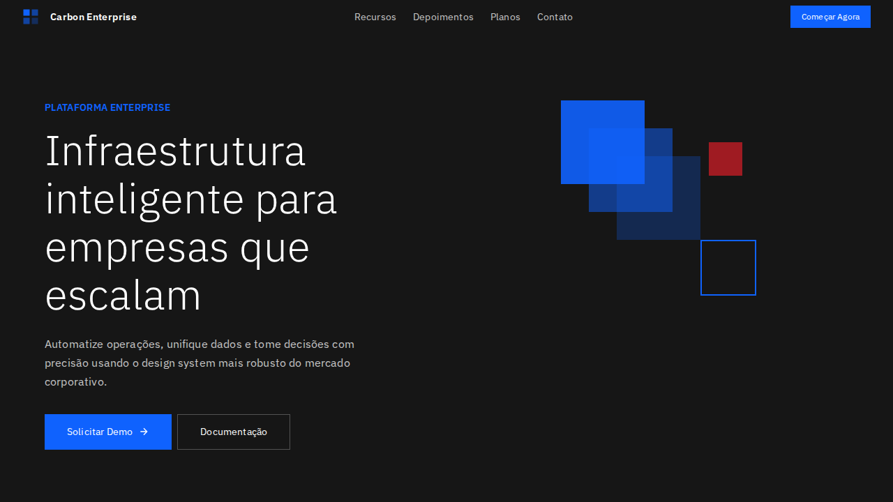
2. Color Palette & Roles
- Creme (#f2f1ed) — Primary surface or dominant color
- Escuro Quente (#26251e) — Dark surface, primary background
- Laranja (#f54e00) — Warm accent, call-to-action secondary
- Superfície (#ebeae5) — Supporting palette color
- Ouro (#c08532) — Premium accent, decorative highlights
- Erro (#cf2d56) — Extended palette, decorative use
- Superfície Clara (#e6e5e0) — Extended palette, decorative use
3. Typography Rules
- Display / Hero: system-ui for display — Weight 700, tight tracking, used for headline impact
- Body: system-ui for display — Weight 400, 16px/1.6 line-height, max 72ch per line
- UI Labels / Captions: system-ui for display — 0.875rem, weight 500, slight letter-spacing
- Monospace: JetBrains Mono — Used for code, metadata, and technical values
Scale:
- Hero: clamp(2.5rem, 5vw, 4rem)
- H1: 2.25rem
- H2: 1.5rem
- Body: 1rem / 1.6
- Small: 0.875rem
4. Component Stylings
- Primary Button: Pill-shaped (9999px) shape. Accent color fill. Hover: 8% darken + subtle lift shadow. Active: -1px translate tactile press. Font weight 600. No outer glows.
- Secondary / Ghost Button: Outline variant. 1.5px border in muted color. Text in primary color. Hover: subtle background fill.
- Cards: Pill-shaped (9999px) corners. Surface background. Subtle shadow (0 2px 12px rgba(0,0,0,0.06)). 1px border stroke.
- Inputs: Label above input. 1px border stroke. Focus ring: 2px accent color offset 2px. Error text below in semantic red. No floating labels.
- Navigation: Primary surface background. Active item: accent color indicator. Font weight 500 when active.
- Skeletons: Shimmer animation matching component dimensions. No circular spinners.
- Empty States: Icon-based composition with descriptive text and action button.
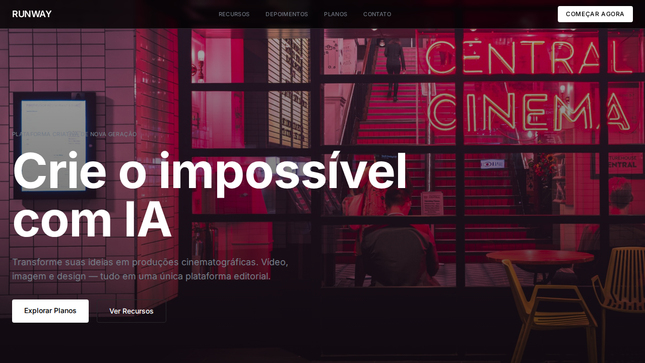
5. Layout Principles
- Grid: CSS Grid primary. Max-width containment: 1280px centered with 1.5rem side padding.
- Spacing rhythm: Balanced. Base unit: 0.5rem (8px).
- Section vertical gaps: clamp(4rem, 8vw, 8rem).
- Hero layout: Split-screen (text left, visual right).
- Feature sections: Zig-zag alternating text+image rows. No 3-equal-columns.
- Mobile collapse: All multi-column layouts collapse below 768px. No horizontal overflow.
- z-index contract: base (0) / sticky-nav (100) / overlay (200) / modal (300) / toast (500).
6. Motion & Interaction
- Physics: Ease-out curves, 200-300ms duration. Smooth and predictable.
- Entry animations: Fade + translate-Y (16px → 0) over 420ms ease-out. Staggered cascades for lists: 80ms between items.
- Hover states: Subtle color shift + shadow adjustment over 200ms.
- Page transitions: Fade only (200ms).
- Performance: Only transform and opacity animated. No layout-triggering properties.
7. Anti-Patterns (Banned)
- No emojis in UI — use icon system only (Lucide, Heroicons)
- No pure black (#000000) — use off-black or charcoal variants
- No oversaturated accent colors (saturation cap: 80%)
- No 3-column equal-width feature layouts — use zig-zag or asymmetric grid
- No
h-screen— usemin-h-[100dvh] - No AI copywriting clichés: "Elevate", "Seamless", "Unleash", "Next-Gen"
- No broken external image links — use picsum.photos or inline SVG
- No generic lorem ipsum in demos
Prompt para AI
Design a Cursor-inspired warm landing page. Off-white cream background (#f2f1ed) with warm near-black text (#26251e). Gothic sans-serif for display headlines with -2.16px letter-spacing at 72px. Serif font for body text with editorial warmth. Orange accent (#f54e00) for links and brand moments. Warm brown borders using oklab color space at various alpha levels. Pill-shaped elements with extreme radius. Hover states shift text to warm crimson (#cf2d56). Three-font system: gothic display, serif body, mono code.
Relacionados
Última sincronização: 01/04/2026