Apple Premium Cinematic
Estilo Apple Premium Cinematic com ritmo binário light/dark, tipografia SF Pro comprimida e CTAs pill. Ideal para produtos premium e tecnologia.
Uso: Produtos premium, Tecnologia, Eletrônicos, Marcas de luxo
Contexto Histórico
Inspirado no design system da Apple, referência mundial em minimalismo premium com produto como herói e tipografia SF Pro com line-heights ultra-comprimidas.
Especificações Técnicas
Cores
Primárias
Secundárias
Efeitos
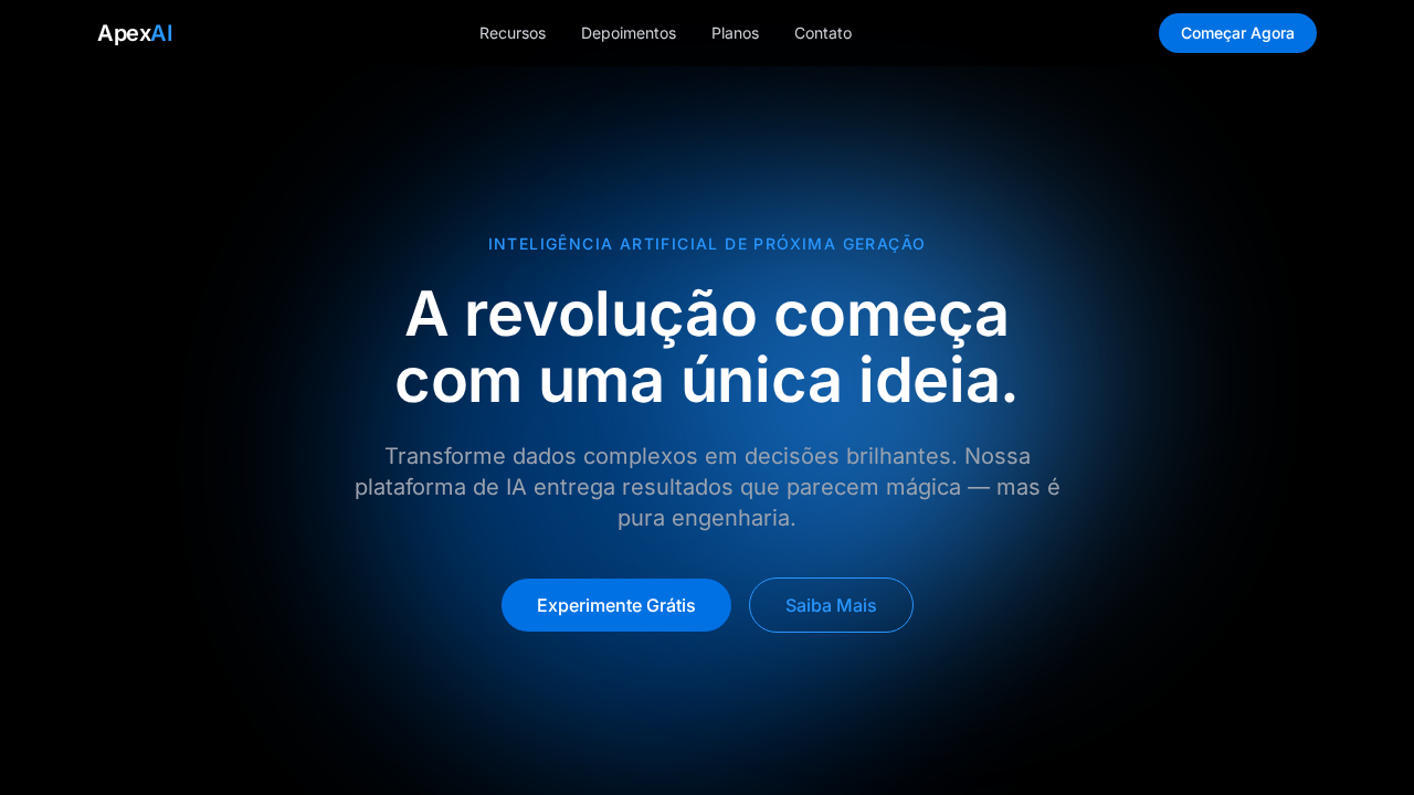
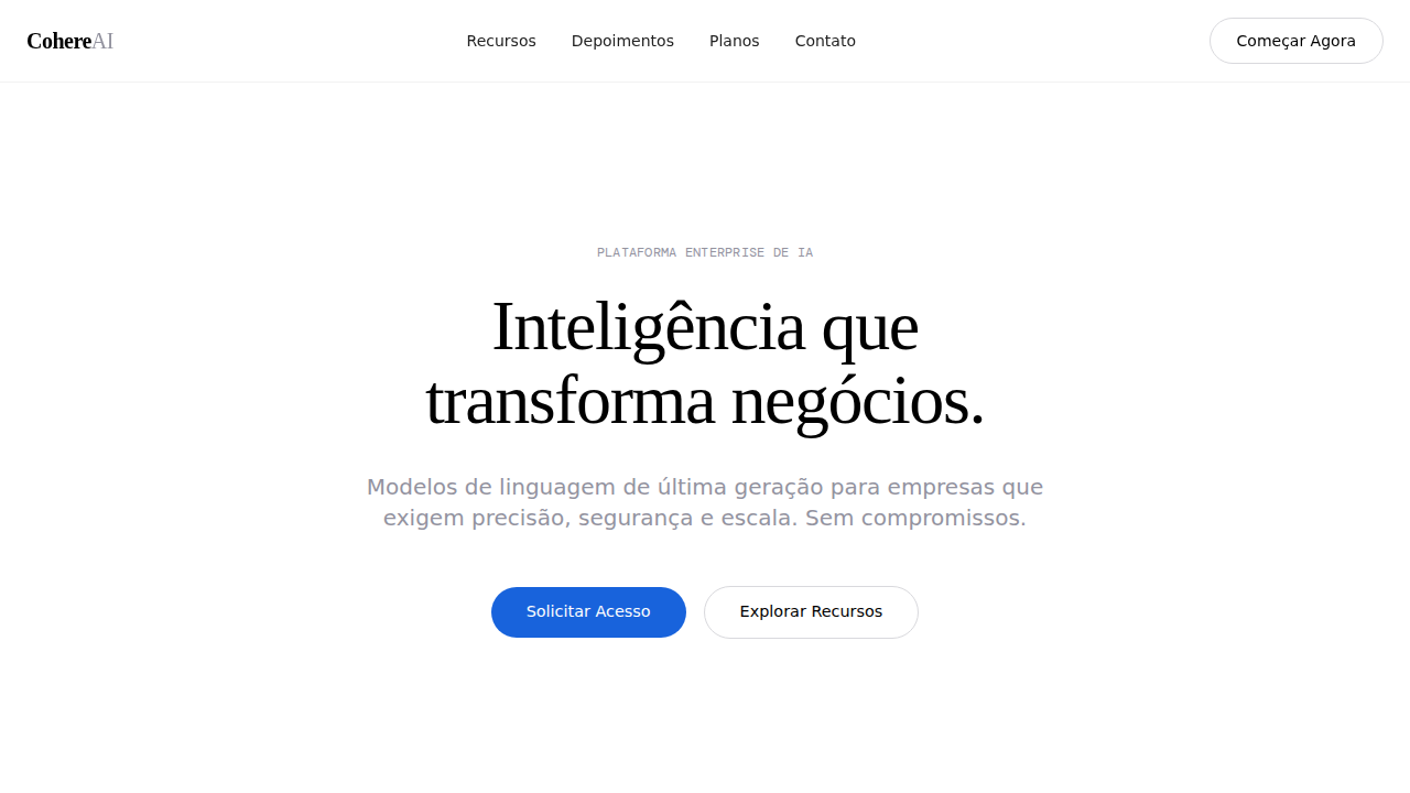
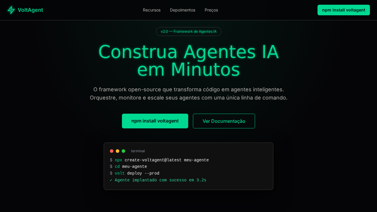
Seções alternando entre fundo preto puro e cinza claro (#f5f5f7) criando ritmo cinematográfico. Navbar translúcida com backdrop-filter: saturate(180%) blur(20px) sobre rgba(0,0,0,0.8). CTAs pill-shaped com border-radius 980px. Headlines com line-height 1.07 ultra-comprimidas. Produto como herói em campos de cor sólida sem distrações.
Light/Dark
✓ Full / ✓ Full
CSS
font-family: 'SF Pro Display', 'SF Pro Text', 'Helvetica Neue', sans-serif; background alternating #000000 and #f5f5f7; color: #1d1d1f on light, #ffffff on dark; accent: #0071e3; border-radius: 980px for pills, 8px for buttons; backdrop-filter: saturate(180%) blur(20px); line-height: 1.07 for headlines; letter-spacing: -0.28px
Variáveis
--bg-dark: #000000; --bg-light: #f5f5f7; --text-dark: #1d1d1f; --text-light: #ffffff; --accent: #0071e3; --link: #0066cc; --link-dark: #2997ff; --nav-bg: rgba(0,0,0,0.8); --radius-pill: 980px; --radius-btn: 8px
Checklist
☐ Seções alternando preto/cinza claro, ☐ Navbar translúcida com blur, ☐ Headlines SF Pro 56px weight 600 line-height 1.07, ☐ Único acento azul #0071e3, ☐ CTAs pill 980px radius, ☐ Produto como herói em fundo sólido, ☐ Whitespace cinematográfico entre seções, ☐ Responsivo
DESIGN.md
Design System: Apple Premium Cinematic
1. Visual Theme & Atmosphere
Estilo Apple Premium Cinematic com ritmo binário light/dark, tipografia SF Pro comprimida e CTAs pill. Ideal para produtos premium e tecnologia. Inspirado no design system da Apple, referência mundial em minimalismo premium com produto como herói e tipografia SF Pro com line-heights ultra-comprimidas.
- Density: 3/10 — Airy
- Variance: 2/10 — Structured
- Motion: 8/10 — Cinematic
2. Color Palette & Roles
- Preto Puro (#000000) — Dark surface, primary background
- Cinza Claro (#f5f5f7) — Secondary text, borders, muted elements
- Quase Preto (#1d1d1f) — Dark surface, primary background
- Azul Apple (#0071e3) — Accent highlight, links and focus states
- Azul Link (#0066cc) — Primary text color
- Azul Brilhante (#2997ff) — Secondary accent
- Branco (#FFFFFF) — Secondary surface
- **** (rgba(0,0,0,0.8)) — Extended palette, decorative use
3. Typography Rules
- Display / Hero: SF Pro Display — Weight 700, tight tracking, used for headline impact
- Accent: SF Pro Text — Used for decorative or emphasis text
- Body: SF Pro Display — Weight 400, 16px/1.6 line-height, max 72ch per line
- UI Labels / Captions: SF Pro Display — 0.875rem, weight 500, slight letter-spacing
- Monospace: JetBrains Mono — Used for code, metadata, and technical values
Scale:
- Hero: clamp(2.5rem, 5vw, 4rem)
- H1: 2.25rem
- H2: 1.5rem
- Body: 1rem / 1.6
- Small: 0.875rem
4. Component Stylings
- Primary Button: Pill-shaped (9999px) shape. Accent color fill. Hover: 8% darken + subtle lift shadow. Active: -1px translate tactile press. Font weight 600. No outer glows.
- Secondary / Ghost Button: Outline variant. 1.5px border in muted color. Text in primary color. Hover: subtle background fill.
- Cards: Pill-shaped (9999px) corners. Surface background. Subtle shadow (0 2px 12px rgba(0,0,0,0.06)). 1px border stroke.
- Inputs: Label above input. 1px border stroke. Focus ring: 2px accent color offset 2px. Error text below in semantic red. No floating labels.
- Navigation: Primary surface background. Active item: accent color indicator. Font weight 500 when active.
- Skeletons: Shimmer animation matching component dimensions. No circular spinners.
- Empty States: Icon-based composition with descriptive text and action button.
5. Layout Principles
- Grid: CSS Grid primary. Max-width containment: 1280px centered with 1.5rem side padding.
- Spacing rhythm: Balanced. Base unit: 0.5rem (8px).
- Section vertical gaps: clamp(4rem, 8vw, 8rem).
- Hero layout: Split-screen (text left, visual right).
- Feature sections: Zig-zag alternating text+image rows. No 3-equal-columns.
- Mobile collapse: All multi-column layouts collapse below 768px. No horizontal overflow.
- z-index contract: base (0) / sticky-nav (100) / overlay (200) / modal (300) / toast (500).
6. Motion & Interaction
- Physics: Spring — stiffness 120, damping 20. Confident, weighted transitions.
- Entry animations: Fade + translate-Y (16px → 0) over 540ms ease-out. Staggered cascades for lists: 120ms between items.
- Hover states: Scale(1.03) + shadow lift over 200ms.
- Page transitions: Fade + slide (300ms).
- Performance: Only transform and opacity animated. No layout-triggering properties.
7. Anti-Patterns (Banned)
- No emojis in UI — use icon system only (Lucide, Heroicons)
- No decorative gradients — flat color only
- No shadows heavier than 0 2px 8px rgba(0,0,0,0.08)
- No pure white (#FFFFFF) backgrounds — use off-white or dark surfaces
- No oversaturated accent colors (saturation cap: 80%)
- No 3-column equal-width feature layouts — use zig-zag or asymmetric grid
- No
h-screen— usemin-h-[100dvh] - No AI copywriting clichés: "Elevate", "Seamless", "Unleash", "Next-Gen"
- No broken external image links — use picsum.photos or inline SVG
- No generic lorem ipsum in demos
Prompt para AI
Design a premium Apple-style landing page with binary light/dark section rhythm. Pure black (#000000) hero alternating with light gray (#f5f5f7) sections. SF Pro Display headlines at 56px weight 600, line-height 1.07, letter-spacing -0.28px. Single accent color Apple Blue (#0071e3) for CTAs only. Pill-shaped CTAs with 980px radius. Translucent dark glass navbar with backdrop-filter saturate(180%) blur(20px). Product-as-hero photography on solid color fields. Extreme whitespace between sections.
Relacionados
Última sincronização: 01/04/2026