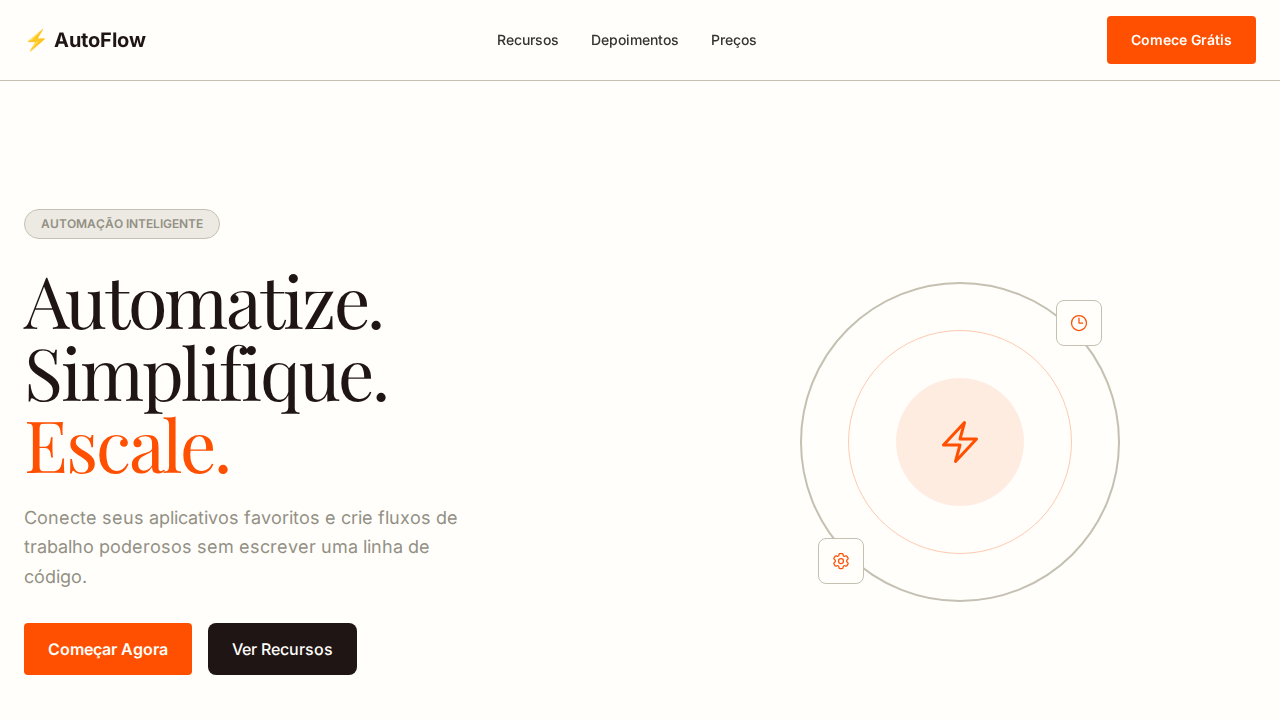
Zapier Warm Automation
Estilo Zapier Warm Automation com canvas creme, acento laranja e design border-forward. Ideal para automação, integrações e plataformas de workflow.
Uso: Automação, Integrações, Plataformas de workflow, Ferramentas no-code
Contexto Histórico
Inspirado no design do Zapier, que usa calor e bordas sand para fazer automação parecer acessível e humana.
Especificações Técnicas
Cores
Primárias
Secundárias
Efeitos
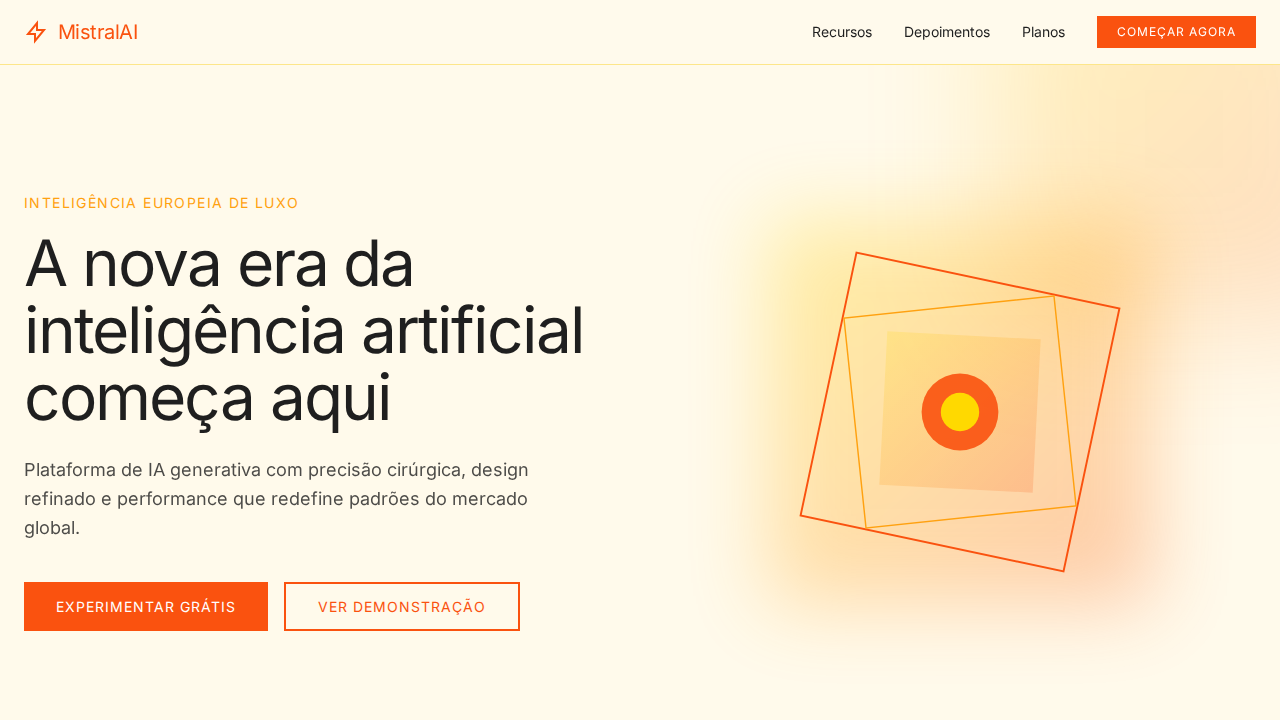
Canvas creme quente (#fffefb) como papel não-branqueado. Texto near-black com subtom avermelhado (#201515). Degular Display para hero headlines com line-height 0.90 ultra-comprimido. Laranja Zapier (#ff4f00) para CTAs primários e indicadores de tab ativo. Design border-forward: bordas sand (#c5c0b1) como elemento estrutural principal em vez de sombras. Tab underlines via inset box-shadow. GT Alpina serif thin-weight para momentos editoriais. Botões com padding generoso (20px 24px).
Light/Dark
✓ Full / ✗ Not Recommended
CSS
background: #fffefb; color: #201515; accent: #ff4f00; border: 1px solid #c5c0b1; box-shadow: rgb(255,79,0) 0px -4px 0px 0px inset for active tabs; font-family: 'Inter', sans-serif; border-radius: 4px orange CTA, 8px dark buttons, 20px pills
Variáveis
--bg: #fffefb; --text: #201515; --accent: #ff4f00; --sand: #c5c0b1; --light-sand: #eceae3; --charcoal: #36342e; --warm-gray: #939084; --radius-cta: 4px; --radius-btn: 8px; --radius-pill: 20px
Checklist
☐ Canvas creme #fffefb, ☐ Texto quente #201515, ☐ Degular Display line-height 0.90, ☐ Laranja #ff4f00 para CTAs, ☐ Bordas sand como estrutura, ☐ Tab underlines inset, ☐ Padding generoso, ☐ Responsivo
DESIGN.md
Design System: Zapier Warm Automation
1. Visual Theme & Atmosphere
Estilo Zapier Warm Automation com canvas creme, acento laranja e design border-forward. Ideal para automação, integrações e plataformas de workflow. Inspirado no design do Zapier, que usa calor e bordas sand para fazer automação parecer acessível e humana.
- Density: 5/10 — Balanced
- Variance: 4/10 — Moderate
- Motion: 4/10 — Subtle
2. Color Palette & Roles
- Creme (#fffefb) — Primary surface or dominant color
- Preto Quente (#201515) — Dark surface, primary background
- Laranja Zapier (#ff4f00) — Warm accent, call-to-action secondary
- Sand (#c5c0b1) — Supporting palette color
- Light Sand (#eceae3) — Extended palette, decorative use
- Charcoal (#36342e) — Deep contrast surface
- Warm Gray (#939084) — Secondary text, borders, muted elements
- Mid Warm (#b5b2aa) — Extended palette, decorative use
3. Typography Rules
- Display / Hero: Inter — Weight 700, tight tracking, used for headline impact
- Body: Inter — Weight 400, 16px/1.6 line-height, max 72ch per line
- UI Labels / Captions: Inter — 0.875rem, weight 500, slight letter-spacing
- Monospace: JetBrains Mono — Used for code, metadata, and technical values
Scale:
- Hero: clamp(2.5rem, 5vw, 4rem)
- H1: 2.25rem
- H2: 1.5rem
- Body: 1rem / 1.6
- Small: 0.875rem
4. Component Stylings
- Primary Button: Pill-shaped (9999px) shape. Accent color fill. Hover: 8% darken + subtle lift shadow. Active: -1px translate tactile press. Font weight 600. No outer glows.
- Secondary / Ghost Button: Outline variant. 1.5px border in muted color. Text in primary color. Hover: subtle background fill.
- Cards: Pill-shaped (9999px) corners. Surface background. Subtle shadow (0 2px 12px rgba(0,0,0,0.06)). 1px border stroke.
- Inputs: Label above input. 1px border stroke. Focus ring: 2px accent color offset 2px. Error text below in semantic red. No floating labels.
- Navigation: Primary surface background. Active item: accent color indicator. Font weight 500 when active.
- Skeletons: Shimmer animation matching component dimensions. No circular spinners.
- Empty States: Icon-based composition with descriptive text and action button.
5. Layout Principles
- Grid: CSS Grid primary. Max-width containment: 1280px centered with 1.5rem side padding.
- Spacing rhythm: Balanced. Base unit: 0.5rem (8px).
- Section vertical gaps: clamp(4rem, 8vw, 8rem).
- Hero layout: Split-screen (text left, visual right).
- Feature sections: Zig-zag alternating text+image rows. No 3-equal-columns.
- Mobile collapse: All multi-column layouts collapse below 768px. No horizontal overflow.
- z-index contract: base (0) / sticky-nav (100) / overlay (200) / modal (300) / toast (500).
6. Motion & Interaction
- Physics: Ease-out curves, 200-300ms duration. Smooth and predictable.
- Entry animations: Fade + translate-Y (16px → 0) over 420ms ease-out. Staggered cascades for lists: 80ms between items.
- Hover states: Subtle color shift + shadow adjustment over 200ms.
- Page transitions: Fade only (200ms).
- Performance: Only transform and opacity animated. No layout-triggering properties.
7. Anti-Patterns (Banned)
- No emojis in UI — use icon system only (Lucide, Heroicons)
- No pure black (#000000) — use off-black or charcoal variants
- No oversaturated accent colors (saturation cap: 80%)
- No 3-column equal-width feature layouts — use zig-zag or asymmetric grid
- No
h-screen— usemin-h-[100dvh] - No AI copywriting clichés: "Elevate", "Seamless", "Unleash", "Next-Gen"
- No broken external image links — use picsum.photos or inline SVG
- No generic lorem ipsum in demos
Prompt para AI
Design a Zapier-inspired warm automation landing page. Cream canvas (#fffefb) like unbleached paper. Near-black text with reddish warmth (#201515). Degular Display for hero headlines at 56-80px weight 500 line-height 0.90. Zapier Orange (#ff4f00) for primary CTAs and active tab underlines. Border-forward design: sand borders (#c5c0b1) as primary structural element. Tab underlines via inset box-shadow (rgb(255,79,0) 0px -4px 0px 0px inset). Generous button padding (20px 24px). Inter for all functional UI.
Relacionados
Última sincronização: 01/04/2026