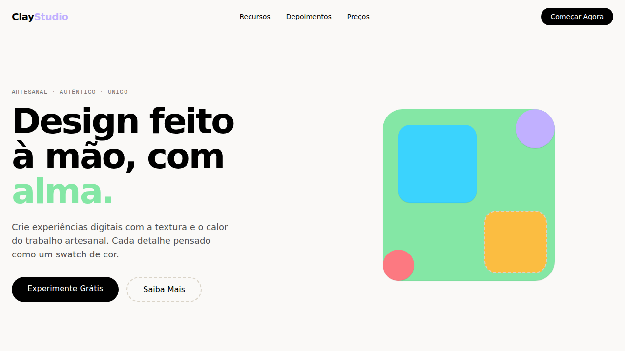
Clay Artisanal Swatch
Estilo Clay Artisanal Swatch com canvas creme, paleta de swatches coloridos e hover animations playful. Ideal para B2B criativo, agências e plataformas de dados.
Uso: B2B criativo, Agências, Plataformas de dados, Ferramentas de enriquecimento
Contexto Histórico
Inspirado no design do Clay, que trata B2B como craft artesanal com swatches nomeados como sabores e hover animations que fazem botões dançar.
Especificações Técnicas
Cores
Primárias
Secundárias
Efeitos
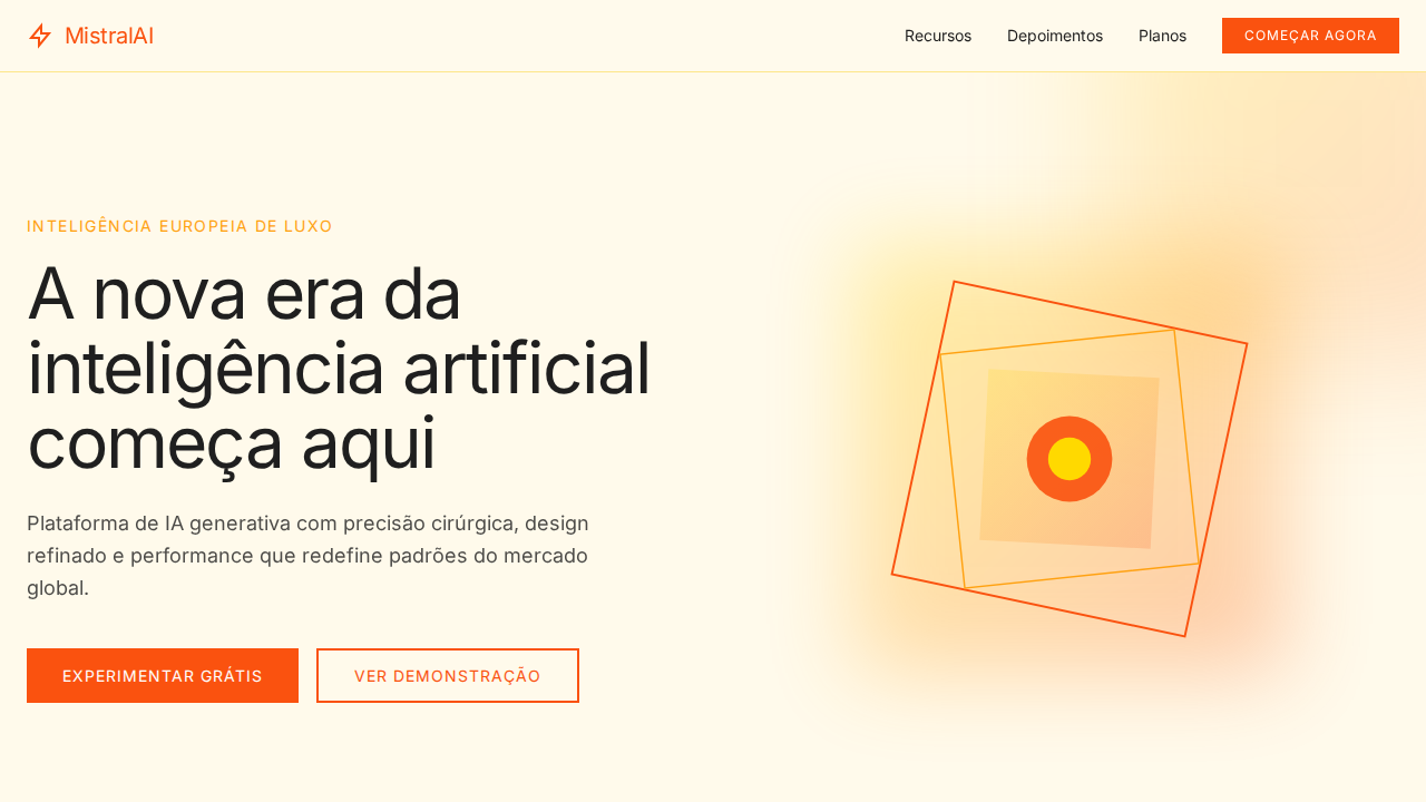
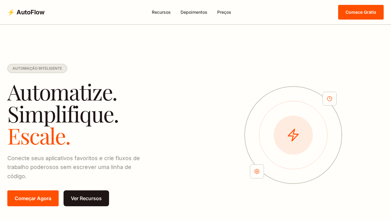
Canvas creme quente (#faf9f7) como papel artesanal. Paleta de swatches nomeados como sabores: Matcha verde, Slushie cyan, Lemon dourado, Ube roxo, Pomegranate rosa. Roobert com 5 OpenType stylistic sets (ss01, ss03, ss10, ss11, ss12). Hover playful: rotateZ(-8deg) + translateY(-80%) + hard offset shadow (-7px 7px). Bordas oat quentes (#dad4c8) + bordas dashed misturadas. Radius generoso: 24px cards, 40px seções, 1584px pills. Sombra multi-camada com inset highlight. Space Mono para labels técnicos.
Light/Dark
✓ Full / ✗ Not Recommended
CSS
background:#faf9f7;color:#000000;border:1px solid #dad4c8;box-shadow:rgba(0,0,0,0.1) 0px 1px 1px,rgba(0,0,0,0.04) 0px -1px 1px inset;font-family:system-ui;font-feature-settings:'ss01','ss03','ss10','ss11','ss12';border-radius:24px cards,40px sections,1584px pills;hover:rotateZ(-8deg) translateY(-80%)
Variáveis
--bg:#faf9f7;--text:#000000;--border-oat:#dad4c8;--matcha:#84e7a5;--slushie:#3bd3fd;--lemon:#fbbd41;--ube:#c1b0ff;--pomegranate:#fc7981;--radius-card:24px;--radius-section:40px;--radius-pill:1584px
Checklist
☐ Canvas creme #faf9f7, ☐ Swatch palette nomeado, ☐ Roobert com 5 OpenType sets, ☐ Hover rotateZ(-8deg) + hard shadow, ☐ Bordas oat + dashed, ☐ Radius generoso 24-40px, ☐ Space Mono labels, ☐ Responsivo
DESIGN.md
Design System: Clay Artisanal Swatch
1. Visual Theme & Atmosphere
Estilo Clay Artisanal Swatch com canvas creme, paleta de swatches coloridos e hover animations playful. Ideal para B2B criativo, agências e plataformas de dados. Inspirado no design do Clay, que trata B2B como craft artesanal com swatches nomeados como sabores e hover animations que fazem botões dançar.
- Density: 5/10 — Balanced
- Variance: 4/10 — Moderate
- Motion: 4/10 — Subtle
2. Color Palette & Roles
- Creme Quente (#faf9f7) — Primary surface or dominant color
- Preto (#000000) — Dark surface, primary background
- Branco (#ffffff) — Light surface, card backgrounds
- Borda Oat (#dad4c8) — Supporting palette color
- Matcha (#84e7a5) — Extended palette, decorative use
- Slushie (#3bd3fd) — Extended palette, decorative use
- Lemon (#fbbd41) — Extended palette, decorative use
- Ube (#c1b0ff) — Extended palette, decorative use
3. Typography Rules
- Display / Hero: system-ui — Weight 700, tight tracking, used for headline impact
- Body: system-ui — Weight 400, 16px/1.6 line-height, max 72ch per line
- UI Labels / Captions: system-ui — 0.875rem, weight 500, slight letter-spacing
- Monospace: JetBrains Mono — Used for code, metadata, and technical values
Scale:
- Hero: clamp(2.5rem, 5vw, 4rem)
- H1: 2.25rem
- H2: 1.5rem
- Body: 1rem / 1.6
- Small: 0.875rem
4. Component Stylings
- Primary Button: Pill-shaped (9999px) shape. Accent color fill. Hover: 8% darken + subtle lift shadow. Active: -1px translate tactile press. Font weight 600. No outer glows.
- Secondary / Ghost Button: Outline variant. 1.5px border in muted color. Text in primary color. Hover: subtle background fill.
- Cards: Pill-shaped (9999px) corners. Surface background. Subtle shadow (0 2px 12px rgba(0,0,0,0.06)). 1px border stroke.
- Inputs: Label above input. 1px border stroke. Focus ring: 2px accent color offset 2px. Error text below in semantic red. No floating labels.
- Navigation: Primary surface background. Active item: accent color indicator. Font weight 500 when active.
- Skeletons: Shimmer animation matching component dimensions. No circular spinners.
- Empty States: Icon-based composition with descriptive text and action button.
5. Layout Principles
- Grid: CSS Grid primary. Max-width containment: 1280px centered with 1.5rem side padding.
- Spacing rhythm: Balanced. Base unit: 0.5rem (8px).
- Section vertical gaps: clamp(4rem, 8vw, 8rem).
- Hero layout: Split-screen (text left, visual right).
- Feature sections: Zig-zag alternating text+image rows. No 3-equal-columns.
- Mobile collapse: All multi-column layouts collapse below 768px. No horizontal overflow.
- z-index contract: base (0) / sticky-nav (100) / overlay (200) / modal (300) / toast (500).
6. Motion & Interaction
- Physics: Ease-out curves, 200-300ms duration. Smooth and predictable.
- Entry animations: Fade + translate-Y (16px → 0) over 420ms ease-out. Staggered cascades for lists: 80ms between items.
- Hover states: Subtle color shift + shadow adjustment over 200ms.
- Page transitions: Fade only (200ms).
- Performance: Only transform and opacity animated. No layout-triggering properties.
7. Anti-Patterns (Banned)
- No emojis in UI — use icon system only (Lucide, Heroicons)
- No pure black (#000000) — use off-black or charcoal variants
- No oversaturated accent colors (saturation cap: 80%)
- No 3-column equal-width feature layouts — use zig-zag or asymmetric grid
- No
h-screen— usemin-h-[100dvh] - No AI copywriting clichés: "Elevate", "Seamless", "Unleash", "Next-Gen"
- No broken external image links — use picsum.photos or inline SVG
- No generic lorem ipsum in demos
Prompt para AI
Design a Clay-inspired artisanal landing page. Warm cream canvas (#faf9f7) like handmade paper. Named swatch palette sections: Matcha green (#84e7a5), Slushie cyan (#3bd3fd), Lemon gold (#fbbd41), Ube purple (#c1b0ff). Roobert font with OpenType ss01, ss03, ss10, ss11, ss12 at 80px weight 600, letter-spacing -3.2px. Playful hover: rotateZ(-8deg), translateY(-80%), hard shadow rgb(0,0,0) -7px 7px. Warm oat borders (#dad4c8) mixed with dashed borders. Generous radius: 24px cards, 40px sections, 1584px pills. Space Mono for technical labels.
Relacionados
Última sincronização: 01/04/2026