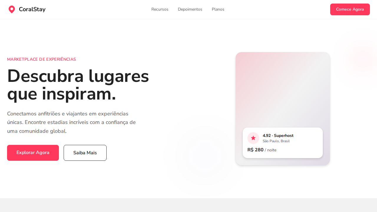
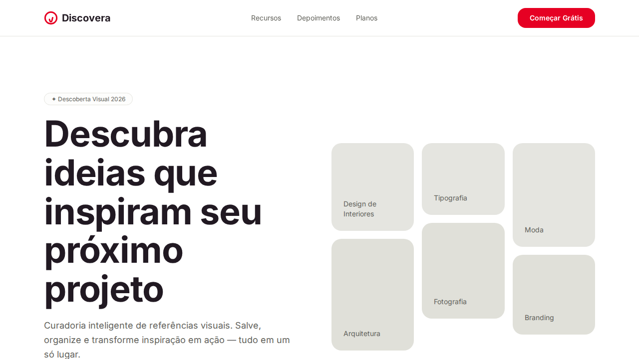
Airbnb Coral Marketplace
Estilo Airbnb Coral Marketplace com acento Rausch Red, sombras three-layer e layout photography-first. Ideal para marketplaces, viagens e plataformas de hospedagem.
Uso: Marketplaces, Viagens, Plataformas de hospedagem, E-commerce experiencial
Contexto Histórico
Inspirado no design do Airbnb, que usa Rausch Red (nomeado pela primeira rua da empresa) e fotografia como linguagem visual primária.
Especificações Técnicas
Cores
Primárias
Secundárias
Efeitos
Canvas branco puro com Rausch Red (#ff385c) como acento singular icônico. Texto near-black quente (#222222) — nunca preto puro. Cereal VF variable font com terminais arredondados quentes, pesos 500-700. Sombras three-layer: ring (0.02) + soft blur (0.04) + primary lift (0.1). Radius generoso: 8px botões, 14px badges, 20px cards, 32px large, 50% circular. Controles circulares (50%) para carrosséis. Fotografia como conteúdo primário. Letter-spacing negativo (-0.18px a -0.44px) em headings para intimidade.
Light/Dark
✓ Full / ✗ Not Recommended
CSS
background:#ffffff;color:#222222;accent:#ff385c;box-shadow:rgba(0,0,0,0.02) 0px 0px 0px 1px,rgba(0,0,0,0.04) 0px 2px 6px,rgba(0,0,0,0.1) 0px 4px 8px;border-radius:8px buttons,20px cards,50% circles;font-family:system-ui;font-weight:500-700;letter-spacing:-0.44px at 22px
Variáveis
--bg:#ffffff;--text:#222222;--red:#ff385c;--surface:#f2f2f2;--secondary:#6a6a6a;--border:#c1c1c1;--luxe:#460479;--radius-btn:8px;--radius-card:20px;--radius-circle:50%
Checklist
☐ Canvas branco com Rausch Red, ☐ Texto near-black #222222, ☐ Variable font 500-700, ☐ Sombras three-layer, ☐ Radius generoso 8-50%, ☐ Controles circulares, ☐ Fotografia-first, ☐ Tracking negativo headings, ☐ Responsivo
DESIGN.md
Design System: Airbnb Coral Marketplace
1. Visual Theme & Atmosphere
Estilo Airbnb Coral Marketplace com acento Rausch Red, sombras three-layer e layout photography-first. Ideal para marketplaces, viagens e plataformas de hospedagem. Inspirado no design do Airbnb, que usa Rausch Red (nomeado pela primeira rua da empresa) e fotografia como linguagem visual primária.
- Density: 5/10 — Balanced
- Variance: 4/10 — Moderate
- Motion: 4/10 — Subtle
2. Color Palette & Roles
- Branco (#ffffff) — Light surface, card backgrounds
- Near Black (#222222) — Dark surface, primary background
- Rausch Red (#ff385c) — Error states, destructive actions
- Light Surface (#f2f2f2) — Supporting palette color
- Focused Gray (#3f3f3f) — Secondary text, borders, muted elements
- Secondary Gray (#6a6a6a) — Secondary text, borders, muted elements
- Border Gray (#c1c1c1) — Secondary text, borders, muted elements
- Luxe Purple (#460479) — Accent color, emphasis elements
3. Typography Rules
- Display / Hero: system-ui — Weight 700, tight tracking, used for headline impact
- Body: system-ui — Weight 400, 16px/1.6 line-height, max 72ch per line
- UI Labels / Captions: system-ui — 0.875rem, weight 500, slight letter-spacing
- Monospace: JetBrains Mono — Used for code, metadata, and technical values
Scale:
- Hero: clamp(2.5rem, 5vw, 4rem)
- H1: 2.25rem
- H2: 1.5rem
- Body: 1rem / 1.6
- Small: 0.875rem
4. Component Stylings
- Primary Button: Rounded (8px buttons) shape. Accent color fill. Hover: 8% darken + subtle lift shadow. Active: -1px translate tactile press. Font weight 600. No outer glows.
- Secondary / Ghost Button: Outline variant. 1.5px border in muted color. Text in primary color. Hover: subtle background fill.
- Cards: Rounded (8px buttons) corners. Surface background. Subtle shadow (0 2px 12px rgba(0,0,0,0.06)). 1px border stroke.
- Inputs: Label above input. 1px border stroke. Focus ring: 2px accent color offset 2px. Error text below in semantic red. No floating labels.
- Navigation: Primary surface background. Active item: accent color indicator. Font weight 500 when active.
- Skeletons: Shimmer animation matching component dimensions. No circular spinners.
- Empty States: Icon-based composition with descriptive text and action button.
5. Layout Principles
- Grid: CSS Grid primary. Max-width containment: 1280px centered with 1.5rem side padding.
- Spacing rhythm: Balanced. Base unit: 0.5rem (8px).
- Section vertical gaps: clamp(4rem, 8vw, 8rem).
- Hero layout: Split-screen (text left, visual right).
- Feature sections: Zig-zag alternating text+image rows. No 3-equal-columns.
- Mobile collapse: All multi-column layouts collapse below 768px. No horizontal overflow.
- z-index contract: base (0) / sticky-nav (100) / overlay (200) / modal (300) / toast (500).
6. Motion & Interaction
- Physics: Ease-out curves, 200-300ms duration. Smooth and predictable.
- Entry animations: Fade + translate-Y (16px → 0) over 420ms ease-out. Staggered cascades for lists: 80ms between items.
- Hover states: Subtle color shift + shadow adjustment over 200ms.
- Page transitions: Fade only (200ms).
- Performance: Only transform and opacity animated. No layout-triggering properties.
7. Anti-Patterns (Banned)
- No emojis in UI — use icon system only (Lucide, Heroicons)
- No pure black (#000000) — use off-black or charcoal variants
- No oversaturated accent colors (saturation cap: 80%)
- No 3-column equal-width feature layouts — use zig-zag or asymmetric grid
- No
h-screen— usemin-h-[100dvh] - No AI copywriting clichés: "Elevate", "Seamless", "Unleash", "Next-Gen"
- No broken external image links — use picsum.photos or inline SVG
- No generic lorem ipsum in demos
Prompt para AI
Design an Airbnb-inspired warm marketplace landing page. White canvas with Rausch Red (#ff385c) as singular iconic accent. Warm near-black (#222222) text — never pure black. Variable font with rounded terminals at weight 500-700. Three-layer card shadows: rgba(0,0,0,0.02) 0px 0px 0px 1px + rgba(0,0,0,0.04) 0px 2px 6px + rgba(0,0,0,0.1) 0px 4px 8px. Generous radius: 8px buttons, 20px cards, 50% circular controls. Photography-first listing cards. Negative letter-spacing (-0.18px to -0.44px) on headings.
Relacionados
Última sincronização: 01/04/2026