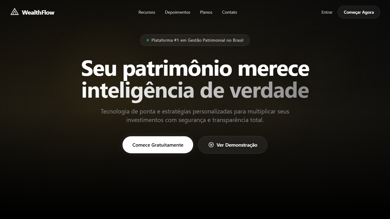
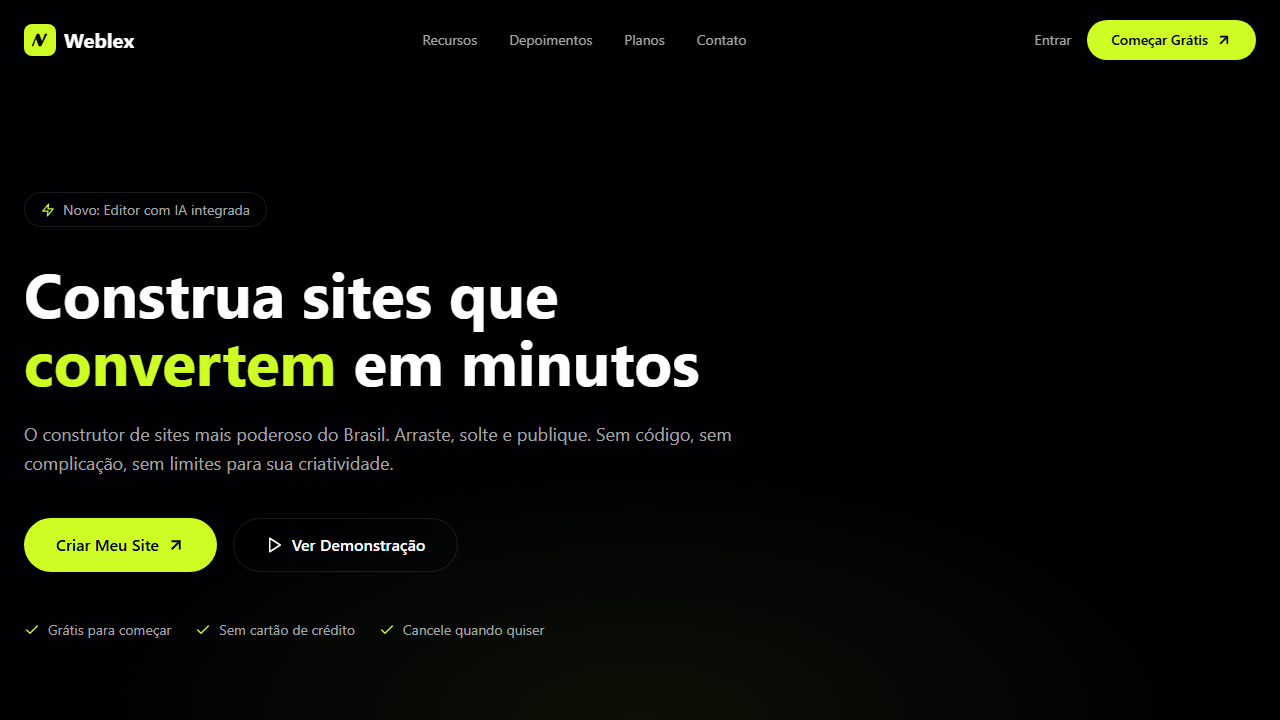
Wealth Video Hero
Estilo Wealth Video Hero com vídeo de fundo premium, glassmorphism escuro e grid flutuante. Ideal para fintechs, plataformas de investimento e landing pages financeiras.
Uso: Fintechs, Plataformas de investimento, Gestão patrimonial, Landing pages financeiras premium
Contexto Histórico
Inspirado nas interfaces premium de fintechs modernas, combina vídeo de fundo imersivo com glassmorphism escuro para transmitir confiança e sofisticação financeira.
Especificações Técnicas
Cores
Primárias
Secundárias
Efeitos
VÍDEO: Vídeo cinematográfico de ambiente financeiro/corporativo com tons escuros e dourados. Cenas abstratas de gráficos financeiros, moedas digitais ou skyline urbano noturno com luzes bokeh. Movimento lento e elegante transmitindo sofisticação e confiança. Escalado a 150% com foco no canto superior esquerdo para efeito de zoom imersivo. | EFEITOS CSS: Vídeo de fundo em tela cheia (autoplay, loop, muted) escalado a 150% com origin top-left, glassmorphism cards (bg-black/70, backdrop-blur-xl, borda branca sutil), pill badge translúcido no hero, hover com scale nos botões, grid de 4 colunas flutuante na parte inferior com efeito vidro
Light/Dark
✗ Not Recommended / ✓ Full
CSS
background: #000000, video: object-cover scale-150 origin-top-left autoplay loop muted, backdrop-filter: blur(24px), background: rgba(0,0,0,0.7), border: 1px solid rgba(255,255,255,0.1), border-radius: 9999px for pills / 16px for cards, transition: transform 200ms, transform: scale(1.05) on hover
Variáveis
--bg-primary: #000000, --text-primary: #FFFFFF, --glass-bg: rgba(0,0,0,0.7), --glass-border: rgba(255,255,255,0.1), --blur: 24px, --radius-pill: 9999px, --radius-card: 16px, --video-scale: 1.5, --transition: 200ms ease
Checklist
☐ Vídeo de fundo tela cheia (autoplay, loop, muted, scale 150%), ☐ Navbar transparente, ☐ Pill badge glassmórfico, ☐ Headline grande branca centralizada, ☐ CTA pill branco com hover scale, ☐ Card inferior glassmorphism com grid 4 colunas, ☐ Responsivo stack vertical mobile
DESIGN.md
Design System: Wealth Video Hero
1. Visual Theme & Atmosphere
Estilo Wealth Video Hero com vídeo de fundo premium, glassmorphism escuro e grid flutuante. Ideal para fintechs, plataformas de investimento e landing pages financeiras. Inspirado nas interfaces premium de fintechs modernas, combina vídeo de fundo imersivo com glassmorphism escuro para transmitir confiança e sofisticação financeira.
- Density: 5/10 — Balanced
- Variance: 2/10 — Structured
- Motion: 4/10 — Subtle
2. Color Palette & Roles
- Preto Profundo (#000000) — Primary background surface
- Branco Puro (#FFFFFF) — Light surface, card backgrounds
- Cinza Escuro (#1A1A1A) — Dark surface, primary background
- Cinza Médio (#888888) — Secondary text, borders, muted elements
- Cinza Claro (#CCCCCC) — Secondary text, borders, muted elements
- Preto Suave (#111111) — Deep contrast surface
- Vidro Translúcido (rgba(0,0,0,0.7)) — Extended palette, decorative use
- Borda Sutil (rgba(255,255,255,0.1)) — Extended palette, decorative use
3. Typography Rules
- Display / Hero: System UI stack (-apple-system, sans-serif) — Weight 700, tight tracking, used for headline impact
- Body: System UI stack (-apple-system, sans-serif) — Weight 400, 16px/1.6 line-height, max 72ch per line
- UI Labels / Captions: System UI stack (-apple-system, sans-serif) — 0.875rem, weight 500, slight letter-spacing
- Monospace: JetBrains Mono — Used for code, metadata, and technical values
Scale:
- Hero: clamp(2.5rem, 5vw, 4rem)
- H1: 2.25rem
- H2: 1.5rem
- Body: 1rem / 1.6
- Small: 0.875rem
4. Component Stylings
- Primary Button: Pill-shaped (9999px) shape. Accent color fill. Hover: 8% darken + subtle lift shadow. Active: -1px translate tactile press. Font weight 600. No outer glows.
- Secondary / Ghost Button: Outline variant. 1.5px border in muted color. Text in primary color. Hover: subtle background fill.
- Cards: Pill-shaped (9999px) corners. Surface background. Subtle shadow (0 2px 12px rgba(0,0,0,0.06)). 1px border stroke.
- Inputs: Label above input. 1px border stroke. Focus ring: 2px accent color offset 2px. Error text below in semantic red. No floating labels.
- Navigation: Primary surface background. Active item: accent color indicator. Font weight 500 when active.
- Skeletons: Shimmer animation matching component dimensions. No circular spinners.
- Empty States: Icon-based composition with descriptive text and action button.
5. Layout Principles
- Grid: CSS Grid primary. Max-width containment: 1280px centered with 1.5rem side padding.
- Spacing rhythm: Balanced. Base unit: 0.5rem (8px).
- Section vertical gaps: clamp(4rem, 8vw, 8rem).
- Hero layout: Split-screen (text left, visual right).
- Feature sections: Zig-zag alternating text+image rows. No 3-equal-columns.
- Mobile collapse: All multi-column layouts collapse below 768px. No horizontal overflow.
- z-index contract: base (0) / sticky-nav (100) / overlay (200) / modal (300) / toast (500).
6. Motion & Interaction
- Physics: Ease-out curves, 200-300ms duration. Smooth and predictable.
- Entry animations: Fade + translate-Y (16px → 0) over 420ms ease-out. Staggered cascades for lists: 80ms between items.
- Hover states: Subtle color shift + shadow adjustment over 200ms.
- Page transitions: Fade only (200ms).
- Performance: Only transform and opacity animated. No layout-triggering properties.
7. Anti-Patterns (Banned)
- No emojis in UI — use icon system only (Lucide, Heroicons)
- No pure white (#FFFFFF) backgrounds — use off-white or dark surfaces
- No oversaturated accent colors (saturation cap: 80%)
- No 3-column equal-width feature layouts — use zig-zag or asymmetric grid
- No
h-screen— usemin-h-[100dvh] - No AI copywriting clichés: "Elevate", "Seamless", "Unleash", "Next-Gen"
- No broken external image links — use picsum.photos or inline SVG
- No generic lorem ipsum in demos
Prompt para AI
Design a premium fintech hero with full-screen looping background video scaled 150% with top-left focal point. Black background, transparent navbar. Centered hero with glassmorphic pill badge, massive white headline, subtle subtitle, white pill CTA with hover scale. Bottom floating card with dark glassmorphism (bg-black/70, backdrop-blur-xl, white border) containing 4-column feature grid.
Relacionados
Última sincronização: 01/04/2026