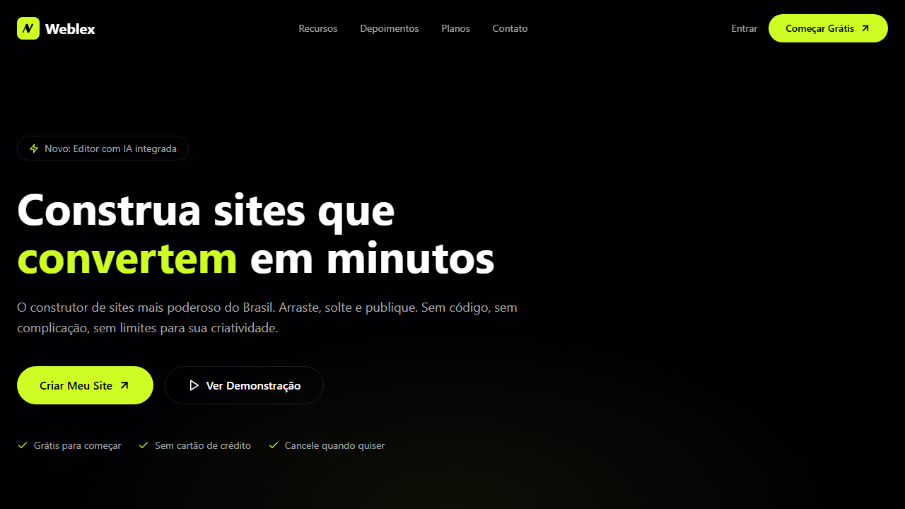
HR SaaS Hero
Estilo HR SaaS com vídeo invertido, gradient branco, tipografia editorial e botão multi-camada. Ideal para SaaS de RH, gestão de equipes remotas e ferramentas de colaboração.
Uso: SaaS de RH, Gestão de equipes remotas, Ferramentas de colaboração, Plataformas de onboarding
Contexto Histórico
Representa a tendência de SaaS minimalistas com fundo branco e vídeo sutil, priorizando tipografia editorial e micro-interações sofisticadas como botões multi-camada.
Especificações Técnicas
Cores
Primárias
Efeitos
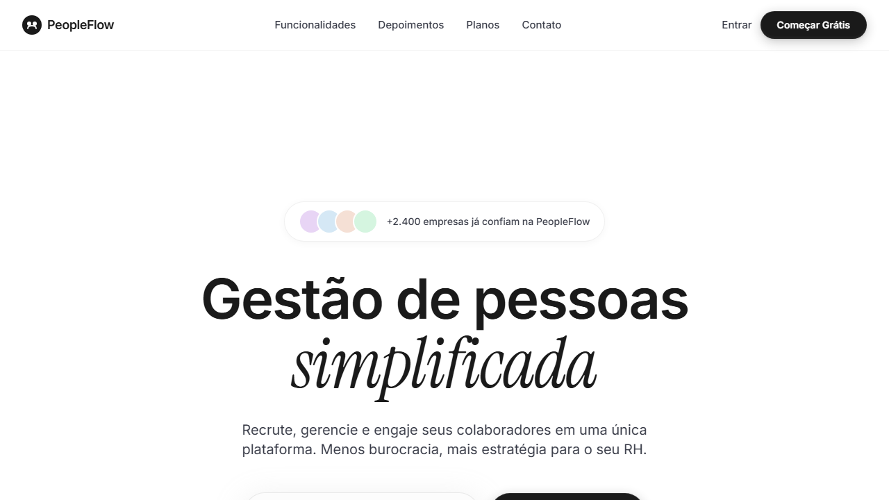
VÍDEO: Vídeo abstrato com tons claros e suaves, possivelmente cenas de natureza, nuvens ou formas orgânicas em movimento lento. Invertido verticalmente via CSS scaleY(-1) para criar efeito visual único. Gradient overlay branco (from transparent at 26.4% to white at 66.9%) funde suavemente o vídeo no fundo branco da página, criando uma transição etérea entre o vídeo e o conteúdo minimalista. | EFEITOS CSS: Vídeo de fundo invertido verticalmente (scaleY(-1)) com object-cover, gradient overlay branco (from transparent at 26.4% to white at 66.9%), espaçamento editorial pesado (290px top padding), headline 80px Geist medium tracking -0.04em com palavra em Instrument Serif italic 100px, input email arredondado 40px com sombra suave, botão CTA escuro multi-camada com inner shadow complexo, social proof com badge de reviews, animações staggered fade+slide-up via Motion
Light/Dark
✓ Full / ✗ Not Recommended
CSS
font-family: 'Geist' / 'Instrument Serif' italic, background: #FFFFFF, video: object-cover scaleY(-1) with white gradient overlay, padding-top: 290px, font-size: 80px / 100px italic, border-radius: 40px input, box-shadow: 0px 10px 40px 5px rgba(194,194,194,0.25), button shadow: inset complex, animation: staggered fade+slide-up
Variáveis
--bg-primary: #FFFFFF, --text-primary: #1A1A1A, --text-muted: #373a46, --input-bg: #fcfcfc, --input-radius: 40px, --input-shadow: 0px 10px 40px 5px rgba(194,194,194,0.25), --font-body: 'Geist', --font-accent: 'Instrument Serif', --headline-size: 80px, --padding-top: 290px
Checklist
☐ Vídeo invertido scaleY(-1) gradient overlay branco, ☐ Padding top 290px, ☐ Headline 80px Geist + 100px Instrument Serif italic, ☐ Input email arredondado 40px sombra, ☐ Botão CTA inner shadows complexos, ☐ Social proof badge reviews, ☐ Animações staggered, ☐ Descrição 18px opacity 80%, ☐ Responsivo
DESIGN.md
Design System: HR SaaS Hero
1. Visual Theme & Atmosphere
Estilo HR SaaS com vídeo invertido, gradient branco, tipografia editorial e botão multi-camada. Ideal para SaaS de RH, gestão de equipes remotas e ferramentas de colaboração. Representa a tendência de SaaS minimalistas com fundo branco e vídeo sutil, priorizando tipografia editorial e micro-interações sofisticadas como botões multi-camada.
- Density: 3/10 — Airy
- Variance: 2/10 — Structured
- Motion: 8/10 — Cinematic
2. Color Palette & Roles
- Branco (#FFFFFF) — Light surface, card backgrounds
- Preto Texto (#1A1A1A) — Dark surface, primary background
- Cinza Slate (#373a46) — Secondary text, borders, muted elements
- Cinza Input (#fcfcfc) — Secondary text, borders, muted elements
- Sombra Input (rgba(194,194,194,0.25)) — Extended palette, decorative use
- Sombra Botão Interna (rgba(201,201,201,0.08)) — Extended palette, decorative use
- Sombra Botão Escura (rgba(29,29,29,0.24)) — Extended palette, decorative use
- Borda Sutil (rgba(0,0,0,0.08)) — Extended palette, decorative use
3. Typography Rules
- Display / Hero: Geist — Weight 700, tight tracking, used for headline impact
- Accent: Instrument Serif — Used for decorative or emphasis text
- Body: Geist — Weight 400, 16px/1.6 line-height, max 72ch per line
- UI Labels / Captions: Geist — 0.875rem, weight 500, slight letter-spacing
- Monospace: JetBrains Mono — Used for code, metadata, and technical values
Scale:
- Hero: clamp(2.5rem, 5vw, 4rem)
- H1: 2.25rem
- H2: 1.5rem
- Body: 1rem / 1.6
- Small: 0.875rem
4. Component Stylings
- Primary Button: Rounded (40px input) shape. Accent color fill. Hover: 8% darken + subtle lift shadow. Active: -1px translate tactile press. Font weight 600. No outer glows.
- Secondary / Ghost Button: Outline variant. 1.5px border in muted color. Text in primary color. Hover: subtle background fill.
- Cards: Rounded (40px input) corners. Surface background. Subtle shadow (0 2px 12px rgba(0,0,0,0.06)). 1px border stroke.
- Inputs: Label above input. 1px border stroke. Focus ring: 2px accent color offset 2px. Error text below in semantic red. No floating labels.
- Navigation: Primary surface background. Active item: accent color indicator. Font weight 500 when active.
- Skeletons: Shimmer animation matching component dimensions. No circular spinners.
- Empty States: Icon-based composition with descriptive text and action button.
5. Layout Principles
- Grid: CSS Grid primary. Max-width containment: 1280px centered with 1.5rem side padding.
- Spacing rhythm: Balanced. Base unit: 0.5rem (8px).
- Section vertical gaps: clamp(4rem, 8vw, 8rem).
- Hero layout: Split-screen (text left, visual right).
- Feature sections: Zig-zag alternating text+image rows. No 3-equal-columns.
- Mobile collapse: All multi-column layouts collapse below 768px. No horizontal overflow.
- z-index contract: base (0) / sticky-nav (100) / overlay (200) / modal (300) / toast (500).
6. Motion & Interaction
- Physics: Spring — stiffness 120, damping 20. Confident, weighted transitions.
- Entry animations: Fade + translate-Y (16px → 0) over 540ms ease-out. Staggered cascades for lists: 120ms between items.
- Hover states: Scale(1.03) + shadow lift over 200ms.
- Page transitions: Fade + slide (300ms).
- Performance: Only transform and opacity animated. No layout-triggering properties.
7. Anti-Patterns (Banned)
- No emojis in UI — use icon system only (Lucide, Heroicons)
- No decorative gradients — flat color only
- No shadows heavier than 0 2px 8px rgba(0,0,0,0.08)
- No pure black (#000000) — use off-black or charcoal variants
- No oversaturated accent colors (saturation cap: 80%)
- No 3-column equal-width feature layouts — use zig-zag or asymmetric grid
- No
h-screen— usemin-h-[100dvh] - No AI copywriting clichés: "Elevate", "Seamless", "Unleash", "Next-Gen"
- No broken external image links — use picsum.photos or inline SVG
- No generic lorem ipsum in demos
Prompt para AI
Design a minimalist white SaaS hero with background video vertically flipped scaleY(-1) and white gradient overlay (transparent at 26.4% to white at 66.9%). Heavy editorial top padding 290px. Headline 80px Geist medium tracking -0.04em with word in Instrument Serif italic 100px. Rounded email input 40px radius subtle shadow. Dark multi-layer CTA with complex inner shadows. Social proof badge. Staggered fade+slide-up animations.
Relacionados
Última sincronização: 01/04/2026