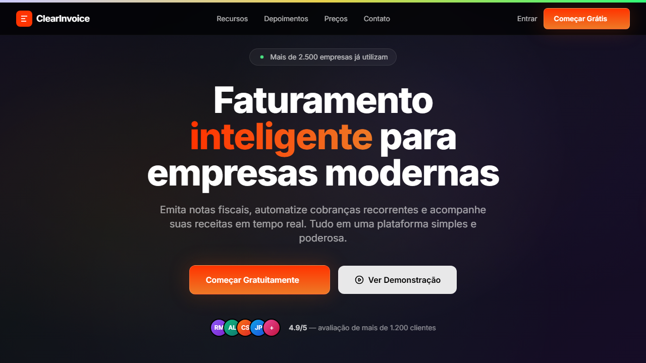
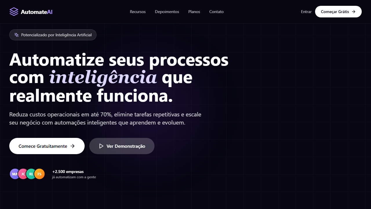
ClearInvoice SaaS Hero
Estilo ClearInvoice SaaS com vídeo HLS, botão gradiente com glow e social proof com avatars. Ideal para SaaS de faturamento, billing e plataformas de pagamento.
Uso: SaaS de faturamento, Plataformas de billing, Ferramentas de pagamento, Gestão financeira
Contexto Histórico
Reflete a tendência de SaaS conversion-focused com CTAs de alto impacto visual e social proof imediato para aumentar confiança e conversão.
Especificações Técnicas
Cores
Primárias
Secundárias
Efeitos
VÍDEO: Stream HLS de vídeo abstrato com formas fluidas e orgânicas em movimento. Tons escuros com destaques luminosos sutis, criando textura visual dinâmica. Exibido em opacity 100% sem overlay escuro, o vídeo serve como fundo imersivo total. Aspect ratio widescreen (~16:9 baseado no storyboard 284x160px), duração ~14s em loop contínuo. | EFEITOS CSS: Vídeo de fundo HLS (autoplay, loop, muted) com opacity 100% sem overlay, barra gradiente 5px no topo (from #ccf via #e7d04c to #31fb78), botão primário com gradiente laranja e glow (blur-lg opacity-20 atrás), inner stroke 1.5px (border-white/20), hover scale 1.05 com glow opacity-60 e seta deslizante, botão secundário bg-white/90 backdrop-blur, social proof com avatars sobrepostos, animações staggered de entrada
Light/Dark
✗ Not Recommended / ✓ Full
CSS
font-family: 'Switzer' headings / 'Geist' body, background: #000000, video: HLS autoplay loop muted opacity-100, gradient-bar: 5px, button: linear-gradient(#FF3300, #EE7926) with glow blur-lg, border: 1.5px solid rgba(255,255,255,0.2), transition: transform scale 200ms
Variáveis
--bg-primary: #000000, --text-primary: #FFFFFF, --gradient-cta: linear-gradient(#FF3300, #EE7926), --glow-color: #EA580C, --inner-stroke: rgba(255,255,255,0.2), --gradient-bar: linear-gradient(to right, #ccf, #e7d04c, #31fb78), --font-heading: 'Switzer', --font-body: 'Geist'
Checklist
☐ Vídeo HLS tela cheia sem overlay, ☐ Barra gradiente 5px no topo, ☐ Botão gradiente laranja com glow e inner stroke, ☐ Hover com scale e seta deslizante, ☐ Botão secundário branco backdrop-blur, ☐ Social proof com avatars sobrepostos, ☐ Animações staggered, ☐ Responsivo com mobile hamburger
DESIGN.md
Design System: ClearInvoice SaaS Hero
1. Visual Theme & Atmosphere
Estilo ClearInvoice SaaS com vídeo HLS, botão gradiente com glow e social proof com avatars. Ideal para SaaS de faturamento, billing e plataformas de pagamento. Reflete a tendência de SaaS conversion-focused com CTAs de alto impacto visual e social proof imediato para aumentar confiança e conversão.
- Density: 5/10 — Balanced
- Variance: 4/10 — Moderate
- Motion: 8/10 — Cinematic
2. Color Palette & Roles
- Preto (#000000) — Dark surface, primary background
- Branco (#FFFFFF) — Light surface, card backgrounds
- Laranja Gradiente from (#FF3300) — Warm accent, call-to-action secondary
- to (#EE7926) — Supporting palette color
- **** (rgba(255,255,255,0.9)) — Supporting palette color
- Laranja Glow (#EA580C) — Warm accent, call-to-action secondary
- Gradiente Topo from (#ccf) — Extended palette, decorative use
- via (#e7d04c) — Extended palette, decorative use
- to (#31fb78) — Extended palette, decorative use
- Borda Interna (rgba(255,255,255,0.2)) — Extended palette, decorative use
- Borda Preta (rgba(0,0,0,0.05)) — Extended palette, decorative use
3. Typography Rules
- Display / Hero: Switzer — Weight 700, tight tracking, used for headline impact
- Accent: Geist — Used for decorative or emphasis text
- Body: Switzer — Weight 400, 16px/1.6 line-height, max 72ch per line
- UI Labels / Captions: Switzer — 0.875rem, weight 500, slight letter-spacing
- Monospace: JetBrains Mono — Used for code, metadata, and technical values
Scale:
- Hero: clamp(2.5rem, 5vw, 4rem)
- H1: 2.25rem
- H2: 1.5rem
- Body: 1rem / 1.6
- Small: 0.875rem
4. Component Stylings
- Primary Button: Subtly rounded (0.5rem) shape. Accent color fill. Hover: 8% darken + subtle lift shadow. Active: -1px translate tactile press. Font weight 600. No outer glows.
- Secondary / Ghost Button: Outline variant. 1.5px border in muted color. Text in primary color. Hover: subtle background fill.
- Cards: Subtly rounded (0.5rem) corners. Surface background. Subtle shadow (0 2px 12px rgba(0,0,0,0.06)). 1px border stroke.
- Inputs: Label above input. 1px border stroke. Focus ring: 2px accent color offset 2px. Error text below in semantic red. No floating labels.
- Navigation: Primary surface background. Active item: accent color indicator. Font weight 500 when active.
- Skeletons: Shimmer animation matching component dimensions. No circular spinners.
- Empty States: Icon-based composition with descriptive text and action button.
5. Layout Principles
- Grid: CSS Grid primary. Max-width containment: 1280px centered with 1.5rem side padding.
- Spacing rhythm: Balanced. Base unit: 0.5rem (8px).
- Section vertical gaps: clamp(4rem, 8vw, 8rem).
- Hero layout: Split-screen (text left, visual right).
- Feature sections: Zig-zag alternating text+image rows. No 3-equal-columns.
- Mobile collapse: All multi-column layouts collapse below 768px. No horizontal overflow.
- z-index contract: base (0) / sticky-nav (100) / overlay (200) / modal (300) / toast (500).
6. Motion & Interaction
- Physics: Spring — stiffness 120, damping 20. Confident, weighted transitions.
- Entry animations: Fade + translate-Y (16px → 0) over 540ms ease-out. Staggered cascades for lists: 120ms between items.
- Hover states: Scale(1.03) + shadow lift over 200ms.
- Page transitions: Fade + slide (300ms).
- Performance: Only transform and opacity animated. No layout-triggering properties.
7. Anti-Patterns (Banned)
- No emojis in UI — use icon system only (Lucide, Heroicons)
- No pure black (#000000) — use off-black or charcoal variants
- No oversaturated accent colors (saturation cap: 80%)
- No 3-column equal-width feature layouts — use zig-zag or asymmetric grid
- No
h-screen— usemin-h-[100dvh] - No AI copywriting clichés: "Elevate", "Seamless", "Unleash", "Next-Gen"
- No broken external image links — use picsum.photos or inline SVG
- No generic lorem ipsum in demos
Prompt para AI
Design a SaaS hero with HLS background video at full opacity no overlay. 5px gradient top bar (from #ccf via #e7d04c to #31fb78). Switzer font headings, Geist body. Primary CTA with orange gradient and glow div behind, inner stroke 1.5px, hover scale 1.05 with arrow sliding in. Secondary CTA bg-white/90 backdrop-blur. Social proof with overlapping avatars. Staggered entrance animations.
Relacionados
Última sincronização: 01/04/2026