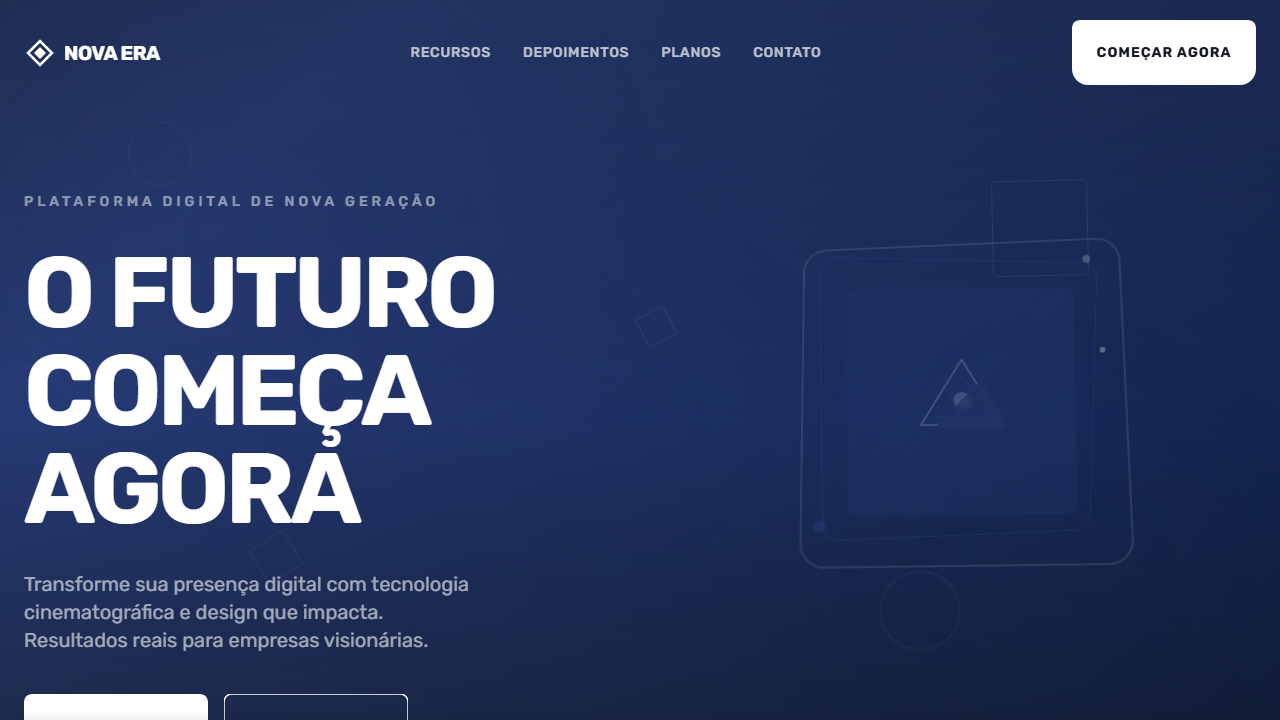
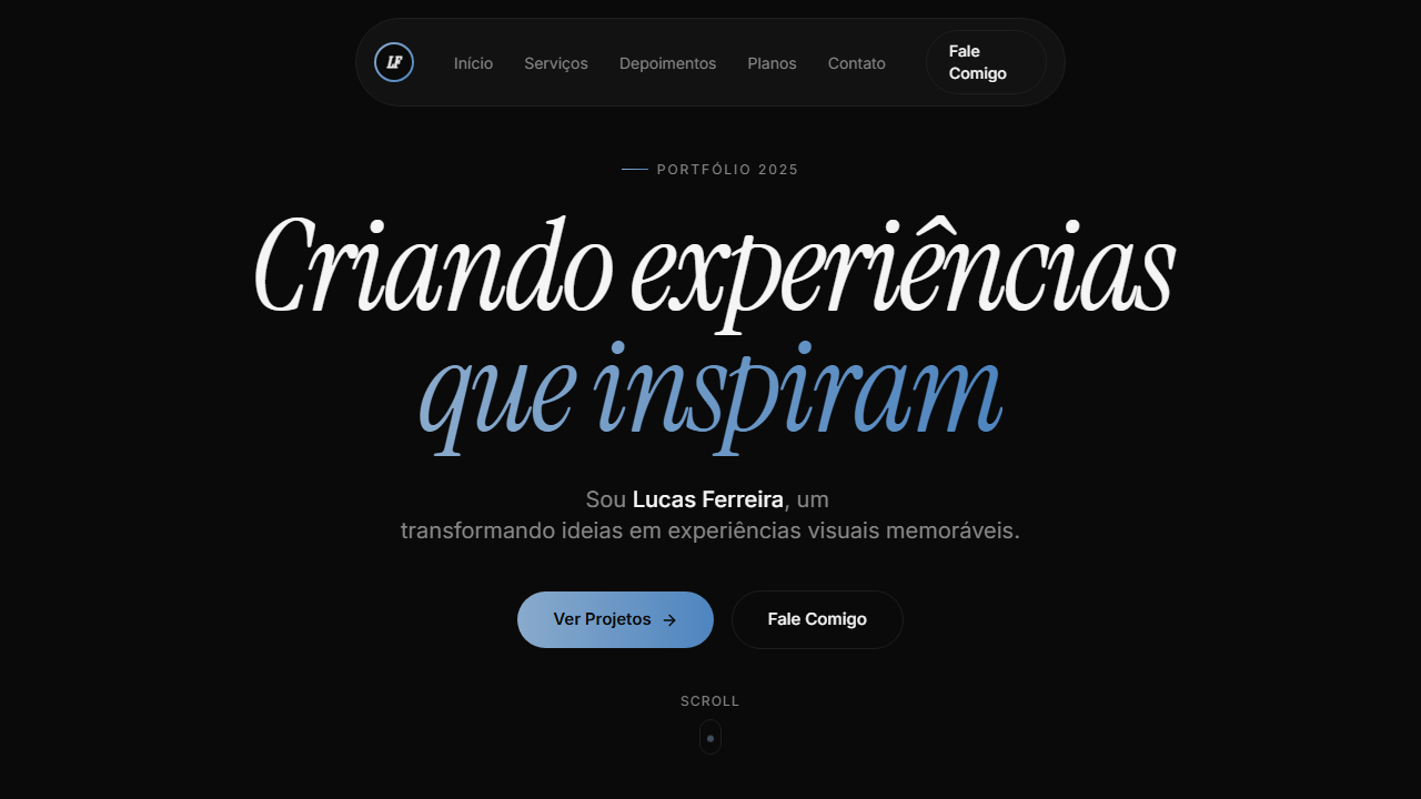
New Era Bold Hero
Estilo New Era Bold Hero com tipografia massiva uppercase, vídeo cinematográfico e botão SVG customizado. Ideal para agências criativas e portfólios impactantes.
Uso: Agências criativas, Portfólios impactantes, Landing pages editoriais, Marcas de moda
Contexto Histórico
Inspirado no design editorial cinematográfico moderno, combina tipografia bold oversized com vídeo de fundo para criar impacto visual imediato, tendência forte em 2024-2026.
Especificações Técnicas
Cores
Primárias
Secundárias
Efeitos
VÍDEO: Vídeo abstrato com movimento fluido e dinâmico em tons escuros azulados. Formas geométricas ou partículas em movimento criando sensação de energia e modernidade. Estilo cinematográfico com transições suaves, servindo como backdrop para tipografia bold oversized. Fallback azul escuro (#21346e) quando o vídeo não carrega. | EFEITOS CSS: Vídeo de fundo tela cheia (autoplay, loop, muted) com fallback azul escuro, tipografia massiva uppercase (text-6xl a text-[100px]) com line-height 0.98 e letter-spacing negativo (-2px a -4px), botão CTA com shape SVG customizado (184x65px, path branco, texto escuro), hover scale-105, active scale-95
Light/Dark
✗ Not Recommended / ✓ Full
CSS
font-family: 'Rubik', sans-serif, font-weight: 700, text-transform: uppercase, font-size: clamp(3.5rem, 10vw, 100px), line-height: 0.98, letter-spacing: -4px, background: #21346e, video: autoplay loop muted object-cover, button: 184px x 65px SVG path, transition: transform 200ms
Variáveis
--bg-fallback: #21346e, --text-primary: #FFFFFF, --text-button: #161a20, --font-primary: 'Rubik', --font-weight: 700, --line-height: 0.98, --letter-spacing: -4px, --btn-w: 184px, --btn-h: 65px, --hover-scale: 1.05
Checklist
☐ Vídeo de fundo tela cheia com fallback azul escuro, ☐ Tipografia massiva uppercase 3 linhas, ☐ Font Rubik bold line-height 0.98, ☐ Letter-spacing negativo, ☐ Botão CTA com SVG path customizado, ☐ Hover scale-105 active scale-95, ☐ Conteúdo alinhado ao topo, ☐ Responsivo com font-size adaptativo
DESIGN.md
Design System: New Era Bold Hero
1. Visual Theme & Atmosphere
Estilo New Era Bold Hero com tipografia massiva uppercase, vídeo cinematográfico e botão SVG customizado. Ideal para agências criativas e portfólios impactantes. Inspirado no design editorial cinematográfico moderno, combina tipografia bold oversized com vídeo de fundo para criar impacto visual imediato, tendência forte em 2024-2026.
- Density: 5/10 — Balanced
- Variance: 4/10 — Moderate
- Motion: 8/10 — Cinematic
2. Color Palette & Roles
- Azul Escuro (#21346e) — Dark surface, primary background
- Branco (#FFFFFF) — Light surface, card backgrounds
- Preto Escuro (#161a20) — Dark surface, primary background
- Cinza Escuro (#1A1A1A) — Dark surface, primary background
- Azul Médio (#2A4080) — Secondary accent
- Cinza Claro (#CCCCCC) — Secondary text, borders, muted elements
- Branco Suave (#F5F5F5) — Secondary surface
- Preto (#000000) — Deep contrast surface
3. Typography Rules
- Display / Hero: Rubik — Weight 700, tight tracking, used for headline impact
- Body: Rubik — Weight 400, 16px/1.6 line-height, max 72ch per line
- UI Labels / Captions: Rubik — 0.875rem, weight 500, slight letter-spacing
- Monospace: JetBrains Mono — Used for code, metadata, and technical values
Scale:
- Hero: clamp(2.5rem, 5vw, 4rem)
- H1: 2.25rem
- H2: 1.5rem
- Body: 1rem / 1.6
- Small: 0.875rem
4. Component Stylings
- Primary Button: Subtly rounded (0.5rem) shape. Accent color fill. Hover: 8% darken + subtle lift shadow. Active: -1px translate tactile press. Font weight 600. No outer glows.
- Secondary / Ghost Button: Outline variant. 1.5px border in muted color. Text in primary color. Hover: subtle background fill.
- Cards: Subtly rounded (0.5rem) corners. Surface background. Subtle shadow (0 2px 12px rgba(0,0,0,0.06)). 1px border stroke.
- Inputs: Label above input. 1px border stroke. Focus ring: 2px accent color offset 2px. Error text below in semantic red. No floating labels.
- Navigation: Primary surface background. Active item: accent color indicator. Font weight 500 when active.
- Skeletons: Shimmer animation matching component dimensions. No circular spinners.
- Empty States: Icon-based composition with descriptive text and action button.
5. Layout Principles
- Grid: CSS Grid primary. Max-width containment: 1280px centered with 1.5rem side padding.
- Spacing rhythm: Balanced. Base unit: 0.5rem (8px).
- Section vertical gaps: clamp(4rem, 8vw, 8rem).
- Hero layout: Split-screen (text left, visual right).
- Feature sections: Zig-zag alternating text+image rows. No 3-equal-columns.
- Mobile collapse: All multi-column layouts collapse below 768px. No horizontal overflow.
- z-index contract: base (0) / sticky-nav (100) / overlay (200) / modal (300) / toast (500).
6. Motion & Interaction
- Physics: Spring — stiffness 120, damping 20. Confident, weighted transitions.
- Entry animations: Fade + translate-Y (16px → 0) over 540ms ease-out. Staggered cascades for lists: 120ms between items.
- Hover states: Scale(1.03) + shadow lift over 200ms.
- Page transitions: Fade + slide (300ms).
- Performance: Only transform and opacity animated. No layout-triggering properties.
7. Anti-Patterns (Banned)
- No emojis in UI — use icon system only (Lucide, Heroicons)
- No pure white (#FFFFFF) backgrounds — use off-white or dark surfaces
- No oversaturated accent colors (saturation cap: 80%)
- No 3-column equal-width feature layouts — use zig-zag or asymmetric grid
- No
h-screen— usemin-h-[100dvh] - No AI copywriting clichés: "Elevate", "Seamless", "Unleash", "Next-Gen"
- No broken external image links — use picsum.photos or inline SVG
- No generic lorem ipsum in demos
Prompt para AI
Design a bold cinematic hero with full-screen background video and dark blue fallback. Massive uppercase headline on three lines using Rubik font bold, tight line-height 0.98, negative letter-spacing. Custom CTA button with SVG path shape 184x65px, white fill, dark text, hover scale-105, active scale-95. Content aligned to top with significant top padding (pt-32 mobile, pt-48 desktop).
Relacionados
Última sincronização: 01/04/2026