Vercel Geist Minimal
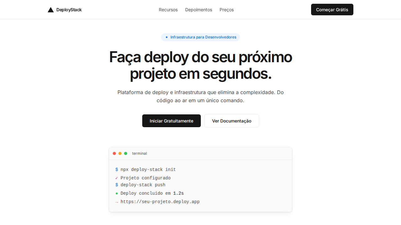
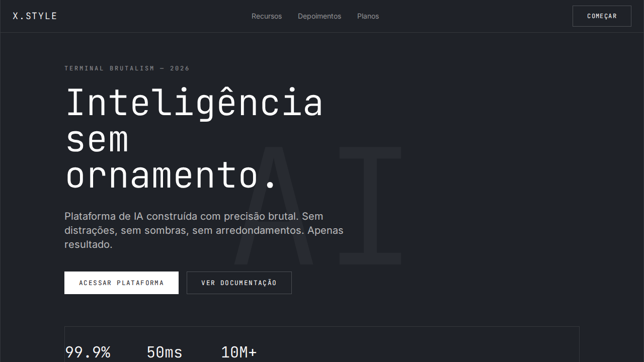
Estilo Vercel Geist Minimal com shadow-as-border, tipografia Geist comprimida e shadow stacks multi-camada. Ideal para infraestrutura developer e deploy.
Uso: Infraestrutura developer, Plataformas de deploy, Ferramentas frontend, CI/CD
Contexto Histórico
Inspirado no design system da Vercel com Geist, possivelmente o sistema de sombras mais sofisticado do web design moderno.
Especificações Técnicas
Cores
Primárias
Secundárias
Efeitos
Shadow-as-border: box-shadow 0px 0px 0px 1px rgba(0,0,0,0.08) substituindo bordas tradicionais. Multi-layer shadow stacks para cards (border + elevation + ambient + inner highlight). Geist Sans com letter-spacing extremo negativo (-2.4px a -2.88px em display). Ligatures (liga) habilitadas globalmente. Cores de workflow: Ship Red, Preview Pink, Develop Blue. Canvas quase branco puro com texto #171717.
Light/Dark
✓ Full / ✗ Not Recommended
CSS
font-family: 'Geist', sans-serif; font-feature-settings: 'liga'; letter-spacing: -2.88px at 48px; box-shadow: rgba(0,0,0,0.08) 0px 0px 0px 1px; color: #171717; background: #ffffff; border-radius: 6px buttons, 8px cards, 9999px badges
Variáveis
--text: #171717; --bg: #ffffff; --gray-100: #ebebeb; --gray-50: #fafafa; --ship: #ff5b4f; --preview: #de1d8d; --develop: #0a72ef; --shadow-border: rgba(0,0,0,0.08); --radius-btn: 6px; --radius-card: 8px; --radius-pill: 9999px
Checklist
☐ Shadow-as-border technique, ☐ Geist com tracking negativo extremo, ☐ Ligatures habilitadas, ☐ Multi-layer shadow stacks, ☐ Cores de workflow, ☐ Canvas branco com texto #171717, ☐ Pill badges, ☐ Responsivo
DESIGN.md
Design System: Vercel Geist Minimal
1. Visual Theme & Atmosphere
Estilo Vercel Geist Minimal com shadow-as-border, tipografia Geist comprimida e shadow stacks multi-camada. Ideal para infraestrutura developer e deploy. Inspirado no design system da Vercel com Geist, possivelmente o sistema de sombras mais sofisticado do web design moderno.
- Density: 3/10 — Airy
- Variance: 2/10 — Structured
- Motion: 4/10 — Subtle
2. Color Palette & Roles
- Quase Preto (#171717) — Dark surface, primary background
- Branco (#ffffff) — Light surface, card backgrounds
- Cinza 100 (#ebebeb) — Secondary text, borders, muted elements
- Cinza 50 (#fafafa) — Secondary text, borders, muted elements
- Ship Red (#ff5b4f) — Error states, destructive actions
- Preview Pink (#de1d8d) — Primary text color
- Develop Blue (#0a72ef) — Secondary accent
- Cinza 600 (#4d4d4d) — Secondary text, borders, muted elements
3. Typography Rules
- Display / Hero: Geist — Weight 700, tight tracking, used for headline impact
- Body: Geist — Weight 400, 16px/1.6 line-height, max 72ch per line
- UI Labels / Captions: Geist — 0.875rem, weight 500, slight letter-spacing
- Monospace: JetBrains Mono — Used for code, metadata, and technical values
Scale:
- Hero: clamp(2.5rem, 5vw, 4rem)
- H1: 2.25rem
- H2: 1.5rem
- Body: 1rem / 1.6
- Small: 0.875rem
4. Component Stylings
- Primary Button: Pill-shaped (9999px) shape. Accent color fill. Hover: 8% darken + subtle lift shadow. Active: -1px translate tactile press. Font weight 600. No outer glows.
- Secondary / Ghost Button: Outline variant. 1.5px border in muted color. Text in primary color. Hover: subtle background fill.
- Cards: Pill-shaped (9999px) corners. Surface background. Subtle shadow (0 2px 12px rgba(0,0,0,0.06)). 1px border stroke.
- Inputs: Label above input. 1px border stroke. Focus ring: 2px accent color offset 2px. Error text below in semantic red. No floating labels.
- Navigation: Primary surface background. Active item: accent color indicator. Font weight 500 when active.
- Skeletons: Shimmer animation matching component dimensions. No circular spinners.
- Empty States: Icon-based composition with descriptive text and action button.
5. Layout Principles
- Grid: CSS Grid primary. Max-width containment: 1280px centered with 1.5rem side padding.
- Spacing rhythm: Balanced. Base unit: 0.5rem (8px).
- Section vertical gaps: clamp(4rem, 8vw, 8rem).
- Hero layout: Split-screen (text left, visual right).
- Feature sections: Zig-zag alternating text+image rows. No 3-equal-columns.
- Mobile collapse: All multi-column layouts collapse below 768px. No horizontal overflow.
- z-index contract: base (0) / sticky-nav (100) / overlay (200) / modal (300) / toast (500).
6. Motion & Interaction
- Physics: Ease-out curves, 200-300ms duration. Smooth and predictable.
- Entry animations: Fade + translate-Y (16px → 0) over 420ms ease-out. Staggered cascades for lists: 80ms between items.
- Hover states: Subtle color shift + shadow adjustment over 200ms.
- Page transitions: Fade only (200ms).
- Performance: Only transform and opacity animated. No layout-triggering properties.
7. Anti-Patterns (Banned)
- No emojis in UI — use icon system only (Lucide, Heroicons)
- No decorative gradients — flat color only
- No shadows heavier than 0 2px 8px rgba(0,0,0,0.08)
- No pure black (#000000) — use off-black or charcoal variants
- No oversaturated accent colors (saturation cap: 80%)
- No 3-column equal-width feature layouts — use zig-zag or asymmetric grid
- No
h-screen— usemin-h-[100dvh] - No AI copywriting clichés: "Elevate", "Seamless", "Unleash", "Next-Gen"
- No broken external image links — use picsum.photos or inline SVG
- No generic lorem ipsum in demos
Prompt para AI
Design a Vercel-inspired minimal landing page. Shadow-as-border technique: box-shadow 0px 0px 0px 1px rgba(0,0,0,0.08) replacing traditional borders. Geist Sans with extreme negative letter-spacing (-2.4px to -2.88px at 48px display). Three weights: 400 body, 500 UI, 600 headings. Multi-layer shadow stacks for cards. Workflow accent colors: Ship Red (#ff5b4f), Preview Pink (#de1d8d), Develop Blue (#0a72ef). Near-white canvas with #171717 text. Pill badges (9999px) with tinted backgrounds.
Relacionados
Última sincronização: 01/04/2026