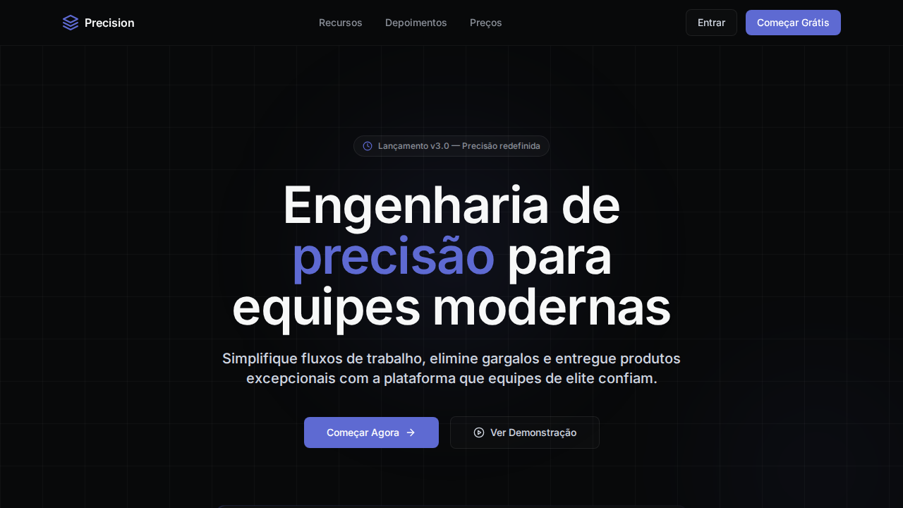
Linear Precision Dark
Estilo Linear Precision Dark com engenharia de precisão, Inter Variable cv01/ss03 e acento indigo-violeta. Ideal para ferramentas de gestão e SaaS developer.
Uso: Ferramentas de gestão de projetos, SaaS developer, Plataformas de engenharia, Issue trackers
Contexto Histórico
Inspirado no Linear.app, referência em design dark-mode-first com precisão tipográfica e uso sofisticado de Inter Variable com features OpenType.
Especificações Técnicas
Cores
Primárias
Secundárias
Efeitos
Dark-mode-first com canvas near-black (#08090a). Inter Variable com features cv01 e ss03 para estética geométrica. Weight 510 como peso padrão (entre regular e medium). Letter-spacing agressivo negativo (-1.584px em 72px). Bordas semi-transparentes brancas (rgba 0.05-0.08). Botões com background near-zero opacity (rgba 0.02-0.05). Acento indigo-violeta (#5e6ad2) como única cor cromática.
Light/Dark
✗ Not Recommended / ✓ Full
CSS
background: #08090a; color: #f7f8f8; accent: #5e6ad2; font-family: 'Inter', sans-serif; font-feature-settings: 'cv01', 'ss03'; font-weight: 510; letter-spacing: -1.584px at 72px; border: 1px solid rgba(255,255,255,0.05); button-bg: rgba(255,255,255,0.02)
Variáveis
--bg-marketing: #08090a; --bg-panel: #0f1011; --bg-surface: #191a1b; --text-primary: #f7f8f8; --text-secondary: #d0d6e0; --text-tertiary: #8a8f98; --brand-indigo: #5e6ad2; --accent-violet: #7170ff; --border-subtle: rgba(255,255,255,0.05); --border-standard: rgba(255,255,255,0.08)
Checklist
☐ Canvas near-black #08090a, ☐ Inter com cv01 ss03, ☐ Weight 510 padrão, ☐ Headlines com tracking negativo agressivo, ☐ Bordas semi-transparentes brancas, ☐ Acento indigo-violeta único, ☐ Botões near-zero opacity, ☐ Responsivo
DESIGN.md
Design System: Linear Precision Dark
1. Visual Theme & Atmosphere
Estilo Linear Precision Dark com engenharia de precisão, Inter Variable cv01/ss03 e acento indigo-violeta. Ideal para ferramentas de gestão e SaaS developer. Inspirado no Linear.app, referência em design dark-mode-first com precisão tipográfica e uso sofisticado de Inter Variable com features OpenType.
- Density: 5/10 — Balanced
- Variance: 4/10 — Moderate
- Motion: 4/10 — Subtle
2. Color Palette & Roles
- Marketing Black (#08090a) — Dark surface, primary background
- Painel (#0f1011) — Secondary surface or text color
- Superfície (#191a1b) — Supporting palette color
- Texto (#f7f8f8) — Primary text color
- Indigo (#5e6ad2) — Accent color, emphasis elements
- Violeta (#7170ff) — Accent color, emphasis elements
- Hover (#828fff) — Extended palette, decorative use
- Borda (rgba(255,255,255,0.05)) — Extended palette, decorative use
3. Typography Rules
- Display / Hero: Inter — Weight 700, tight tracking, used for headline impact
- Body: Inter — Weight 400, 16px/1.6 line-height, max 72ch per line
- UI Labels / Captions: Inter — 0.875rem, weight 500, slight letter-spacing
- Monospace: JetBrains Mono — Used for code, metadata, and technical values
Scale:
- Hero: clamp(2.5rem, 5vw, 4rem)
- H1: 2.25rem
- H2: 1.5rem
- Body: 1rem / 1.6
- Small: 0.875rem
4. Component Stylings
- Primary Button: Subtly rounded (0.5rem) shape. Accent color fill. Hover: 8% darken + subtle lift shadow. Active: -1px translate tactile press. Font weight 600. No outer glows.
- Secondary / Ghost Button: Outline variant. 1.5px border in muted color. Text in primary color. Hover: subtle background fill.
- Cards: Subtly rounded (0.5rem) corners. Surface background. Subtle shadow (0 2px 12px rgba(0,0,0,0.06)). 1px border stroke.
- Inputs: Label above input. 1px border stroke. Focus ring: 2px accent color offset 2px. Error text below in semantic red. No floating labels.
- Navigation: Primary surface background. Active item: accent color indicator. Font weight 500 when active.
- Skeletons: Shimmer animation matching component dimensions. No circular spinners.
- Empty States: Icon-based composition with descriptive text and action button.
5. Layout Principles
- Grid: CSS Grid primary. Max-width containment: 1280px centered with 1.5rem side padding.
- Spacing rhythm: Balanced. Base unit: 0.5rem (8px).
- Section vertical gaps: clamp(4rem, 8vw, 8rem).
- Hero layout: Split-screen (text left, visual right).
- Feature sections: Zig-zag alternating text+image rows. No 3-equal-columns.
- Mobile collapse: All multi-column layouts collapse below 768px. No horizontal overflow.
- z-index contract: base (0) / sticky-nav (100) / overlay (200) / modal (300) / toast (500).
6. Motion & Interaction
- Physics: Ease-out curves, 200-300ms duration. Smooth and predictable.
- Entry animations: Fade + translate-Y (16px → 0) over 420ms ease-out. Staggered cascades for lists: 80ms between items.
- Hover states: Subtle color shift + shadow adjustment over 200ms.
- Page transitions: Fade only (200ms).
- Performance: Only transform and opacity animated. No layout-triggering properties.
7. Anti-Patterns (Banned)
- No emojis in UI — use icon system only (Lucide, Heroicons)
- No pure white (#FFFFFF) backgrounds — use off-white or dark surfaces
- No oversaturated accent colors (saturation cap: 80%)
- No 3-column equal-width feature layouts — use zig-zag or asymmetric grid
- No
h-screen— usemin-h-[100dvh] - No AI copywriting clichés: "Elevate", "Seamless", "Unleash", "Next-Gen"
- No broken external image links — use picsum.photos or inline SVG
- No generic lorem ipsum in demos
Prompt para AI
Design a precision-engineered dark landing page inspired by Linear. Near-black canvas (#08090a). Inter font with OpenType cv01 ss03 features. Signature weight 510 for UI text. Display headlines at 72px with -1.584px letter-spacing. Semi-transparent white borders (rgba 255,255,255,0.05 to 0.08). Button backgrounds at near-zero opacity (rgba 0.02-0.05). Brand indigo-violet (#5e6ad2) as the only chromatic color. Multi-layered shadows with inset variants.
Relacionados
Última sincronização: 01/04/2026