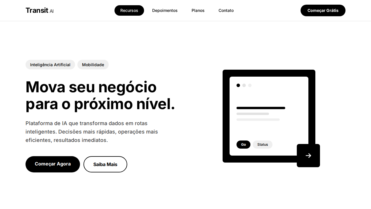
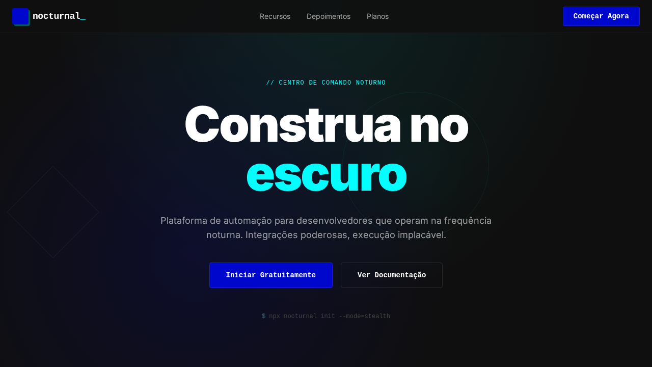
Uber Bold Transit
Estilo Uber Bold Transit com dualidade preto-branco, tipografia billboard e navegação pill. Ideal para mobilidade, logística e plataformas urbanas.
Uso: Mobilidade urbana, Logística, Delivery, Plataformas de transporte
Contexto Histórico
Inspirado no design do Uber, que usa dualidade preto-branco com confiança de marca estabelecida e geometria pill como linguagem tátil.
Especificações Técnicas
Cores
Primárias
Secundárias
Efeitos
Dualidade preto-branco stark sem cinzas intermediários no chrome. Headlines bold (700) em geometric sans-serif com presença de billboard. Pill-shaped (999px) em TUDO interativo — botões, chips, nav, seletores. Ilustrações quentes e humanas contrastando com interface monocromática. Sombras whisper-soft (0.12-0.16 opacity). Layout denso e eficiente como mapa de trânsito. Footer preto full-width.
Light/Dark
✓ Full / ✗ Not Recommended
CSS
background: #ffffff; color: #000000; border-radius: 999px interactive, 8px cards, 12px featured; box-shadow: rgba(0,0,0,0.12) 0px 4px 16px; font-family: system-ui, sans-serif; font-weight: 700 headlines, 500 body
Variáveis
--bg: #ffffff; --text: #000000; --hover: #e2e2e2; --chip: #efefef; --body-text: #4b4b4b; --shadow-light: rgba(0,0,0,0.12); --shadow-medium: rgba(0,0,0,0.16); --radius-pill: 999px; --radius-card: 8px
Checklist
☐ Dualidade preto/branco stark, ☐ Headlines bold 700 billboard, ☐ Pill 999px em tudo interativo, ☐ Ilustrações quentes humanas, ☐ Sombras whisper 0.12-0.16, ☐ Layout denso eficiente, ☐ Footer preto, ☐ Responsivo
DESIGN.md
Design System: Uber Bold Transit
1. Visual Theme & Atmosphere
Estilo Uber Bold Transit com dualidade preto-branco, tipografia billboard e navegação pill. Ideal para mobilidade, logística e plataformas urbanas. Inspirado no design do Uber, que usa dualidade preto-branco com confiança de marca estabelecida e geometria pill como linguagem tátil.
- Density: 3/10 — Airy
- Variance: 3/10 — Restrained
- Motion: 4/10 — Subtle
2. Color Palette & Roles
- Preto Uber (#000000) — Dark surface, primary background
- Branco (#ffffff) — Light surface, card backgrounds
- Cinza Hover (#e2e2e2) — Secondary text, borders, muted elements
- Cinza Chip (#efefef) — Secondary text, borders, muted elements
- Cinza Body (#4b4b4b) — Primary text color
- Cinza Muted (#afafaf) — Secondary text, borders, muted elements
- Sombra (rgba(0,0,0,0.12)) — Extended palette, decorative use
- Sombra Média (rgba(0,0,0,0.16)) — Extended palette, decorative use
3. Typography Rules
- Display / Hero: system-ui — Weight 700, tight tracking, used for headline impact
- Body: system-ui — Weight 400, 16px/1.6 line-height, max 72ch per line
- UI Labels / Captions: system-ui — 0.875rem, weight 500, slight letter-spacing
- Monospace: JetBrains Mono — Used for code, metadata, and technical values
Scale:
- Hero: clamp(2.5rem, 5vw, 4rem)
- H1: 2.25rem
- H2: 1.5rem
- Body: 1rem / 1.6
- Small: 0.875rem
4. Component Stylings
- Primary Button: Pill-shaped (9999px) shape. Accent color fill. Hover: 8% darken + subtle lift shadow. Active: -1px translate tactile press. Font weight 600. No outer glows.
- Secondary / Ghost Button: Outline variant. 1.5px border in muted color. Text in primary color. Hover: subtle background fill.
- Cards: Pill-shaped (9999px) corners. Surface background. Subtle shadow (0 2px 12px rgba(0,0,0,0.06)). 1px border stroke.
- Inputs: Label above input. 1px border stroke. Focus ring: 2px accent color offset 2px. Error text below in semantic red. No floating labels.
- Navigation: Primary surface background. Active item: accent color indicator. Font weight 500 when active.
- Skeletons: Shimmer animation matching component dimensions. No circular spinners.
- Empty States: Icon-based composition with descriptive text and action button.
5. Layout Principles
- Grid: CSS Grid primary. Max-width containment: 1280px centered with 1.5rem side padding.
- Spacing rhythm: Balanced. Base unit: 0.5rem (8px).
- Section vertical gaps: clamp(4rem, 8vw, 8rem).
- Hero layout: Split-screen (text left, visual right).
- Feature sections: Zig-zag alternating text+image rows. No 3-equal-columns.
- Mobile collapse: All multi-column layouts collapse below 768px. No horizontal overflow.
- z-index contract: base (0) / sticky-nav (100) / overlay (200) / modal (300) / toast (500).
6. Motion & Interaction
- Physics: Ease-out curves, 200-300ms duration. Smooth and predictable.
- Entry animations: Fade + translate-Y (16px → 0) over 420ms ease-out. Staggered cascades for lists: 80ms between items.
- Hover states: Subtle color shift + shadow adjustment over 200ms.
- Page transitions: Fade only (200ms).
- Performance: Only transform and opacity animated. No layout-triggering properties.
7. Anti-Patterns (Banned)
- No emojis in UI — use icon system only (Lucide, Heroicons)
- No pure black (#000000) — use off-black or charcoal variants
- No oversaturated accent colors (saturation cap: 80%)
- No 3-column equal-width feature layouts — use zig-zag or asymmetric grid
- No
h-screen— usemin-h-[100dvh] - No AI copywriting clichés: "Elevate", "Seamless", "Unleash", "Next-Gen"
- No broken external image links — use picsum.photos or inline SVG
- No generic lorem ipsum in demos
Prompt para AI
Design an Uber-inspired bold landing page. Stark black (#000000) and white (#ffffff) duality with virtually no mid-tone grays. Geometric sans-serif headlines at 52px weight 700 with billboard presence. Pill-shaped (999px) everything interactive — buttons, chips, nav items. Warm human illustrations contrasting monochrome interface. Whisper-soft shadows (0.12-0.16 opacity). Dense, information-efficient layout. Black footer anchoring the page. Category pill navigation with active state inversion.
Relacionados
Última sincronização: 01/04/2026