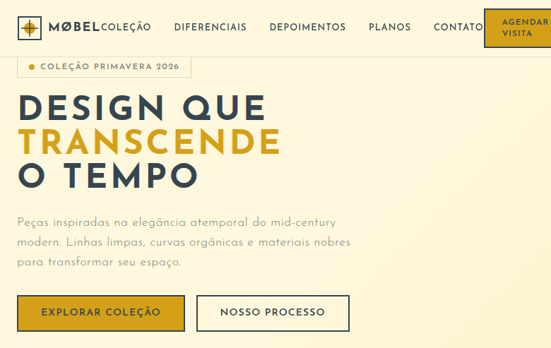
Mid-Century Modern
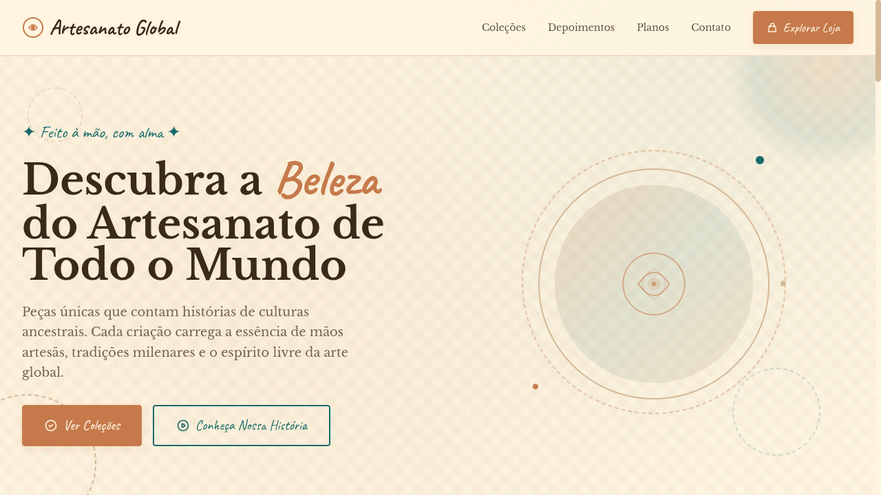
Estilo Mid-Century Modern com linhas limpas, curvas orgânicas e cores vibrantes levemente apagadas dos anos 50. Ideal para branding de móveis, pôsteres retro e decoração.
Uso: Branding de móveis, Layouts de pôsteres retro, Decoração de interiores, Produtos lifestyle
Contexto Histórico
O Mid-Century Modern (1940s-60s) combina linhas limpas com curvas orgânicas e alusões à Era Espacial. Designers como Eames e Saarinen criaram uma estética atemporal que ainda define interiores modernos.
Especificações Técnicas
Cores
Primárias
Secundárias
Efeitos
Atomic-era starburst SVG decorations, organic boomerang/kidney shapes via clip-path, clean thin lines as dividers, muted color blocks, subtle retro texture overlays, smooth slide-in animations (400ms), tapered leg-inspired border details
Light/Dark
✓ Full / ✓ Full
CSS
font-family: 'Josefin Sans', sans-serif, background: #FFF8DC, color: #36454F, border: 2px solid #36454F, border-radius: 0px for sharp + 50% for organic shapes, clip-path: ellipse() for organic curves, box-shadow: 0 2px 8px rgba(0,0,0,0.08), letter-spacing: 0.08em, text-transform: uppercase for headings
Variáveis
--color-mustard: #D4A017, --color-teal: #008080, --color-orange: #CC5500, --color-cream: #FFF8DC, --color-charcoal: #36454F, --font-primary: 'Josefin Sans', --border: 2px solid #36454F, --spacing: 2rem, --letter-spacing: 0.08em
Checklist
☐ Muted vibrant color palette, ☐ Atomic starburst decorations, ☐ Organic boomerang/kidney shapes, ☐ Clean thin line dividers, ☐ Geometric sans-serif typography, ☐ Space Age retro atmosphere, ☐ Muted color blocks, ☐ Responsive with maintained retro elegance
DESIGN.md
Design System: Mid-Century Modern
1. Visual Theme & Atmosphere
Estilo Mid-Century Modern com linhas limpas, curvas orgânicas e cores vibrantes levemente apagadas dos anos 50. Ideal para branding de móveis, pôsteres retro e decoração. O Mid-Century Modern (1940s-60s) combina linhas limpas com curvas orgânicas e alusões à Era Espacial. Designers como Eames e Saarinen criaram uma estética atemporal que ainda define interiores modernos.
- Density: 3/10 — Airy
- Variance: 8/10 — Expressive
- Motion: 6/10 — Expressive
2. Color Palette & Roles
- Mustard Yellow (#D4A017) — Warning states, attention indicators
- Teal (#008080) — Accent highlight, links and focus states
- Burnt Orange (#CC5500) — Warm accent, call-to-action secondary
- Cream (#FFF8DC) — Light surface, card backgrounds
- Olive Green (#6B8E23) — Success states, positive indicators
- Dusty Pink (#D4A0A0) — Primary text color
- Charcoal (#36454F) — Deep contrast surface
- Warm Wood (#8B6914) — Extended palette, decorative use
3. Typography Rules
- Display / Hero: Josefin Sans — Weight 700, tight tracking, used for headline impact
- Body: Josefin Sans — Weight 400, 16px/1.6 line-height, max 72ch per line
- UI Labels / Captions: Josefin Sans — 0.875rem, weight 500, slight letter-spacing
- Monospace: JetBrains Mono — Used for code, metadata, and technical values
Scale:
- Hero: clamp(2.5rem, 5vw, 4rem)
- H1: 2.25rem
- H2: 1.5rem
- Body: 1rem / 1.6
- Small: 0.875rem
4. Component Stylings
- Primary Button: Sharp edges (0px) shape. Accent color fill. Hover: 8% darken + subtle lift shadow. Active: -1px translate tactile press. Font weight 600. No outer glows.
- Secondary / Ghost Button: Outline variant. 1.5px border in muted color. Text in primary color. Hover: subtle background fill.
- Cards: Sharp edges (0px) corners. Surface background. Subtle shadow (0 2px 12px rgba(0,0,0,0.06)). 1px border stroke.
- Inputs: Label above input. 1px border stroke. Focus ring: 2px accent color offset 2px. Error text below in semantic red. No floating labels.
- Navigation: Primary surface background. Active item: accent color indicator. Font weight 500 when active.
- Skeletons: Shimmer animation matching component dimensions. No circular spinners.
- Empty States: Icon-based composition with descriptive text and action button.
5. Layout Principles
- Grid: CSS Grid primary. Max-width containment: 1280px centered with 1.5rem side padding.
- Spacing rhythm: Balanced. Base unit: 0.5rem (8px).
- Section vertical gaps: clamp(4rem, 8vw, 8rem).
- Hero layout: Asymmetric composition.
- Feature sections: Asymmetric grid with varied card sizes. No 3-equal-columns.
- Mobile collapse: All multi-column layouts collapse below 768px. No horizontal overflow.
- z-index contract: base (0) / sticky-nav (100) / overlay (200) / modal (300) / toast (500).
6. Motion & Interaction
- Physics: Spring — stiffness 120, damping 20. Confident, weighted transitions.
- Entry animations: Fade + translate-Y (16px → 0) over 480ms ease-out. Staggered cascades for lists: 100ms between items.
- Hover states: Scale(1.03) + shadow lift over 200ms.
- Page transitions: Fade + slide (300ms).
- Performance: Only transform and opacity animated. No layout-triggering properties.
7. Anti-Patterns (Banned)
- No emojis in UI — use icon system only (Lucide, Heroicons)
- No pure black (#000000) — use off-black or charcoal variants
- No oversaturated accent colors (saturation cap: 80%)
- No 3-column equal-width feature layouts — use zig-zag or asymmetric grid
- No
h-screen— usemin-h-[100dvh] - No AI copywriting clichés: "Elevate", "Seamless", "Unleash", "Next-Gen"
- No broken external image links — use picsum.photos or inline SVG
- No generic lorem ipsum in demos
Prompt para AI
Design a mid-century modern landing page with clean lines, organic curves and muted vibrant colors from the 1950s. Use mustard yellow, teal, burnt orange, cream. Apply atomic starburst SVG decorations, organic boomerang shapes via clip-path, clean thin dividers, muted color blocks, retro texture overlays. Typography should be clean geometric sans-serif. Space Age retro elegance with Eames-inspired organic curves.
Relacionados
Última sincronização: 01/04/2026