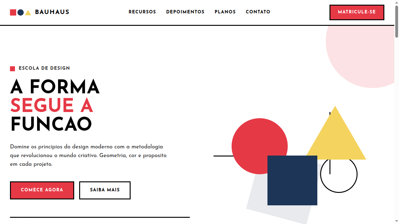
Bauhaus
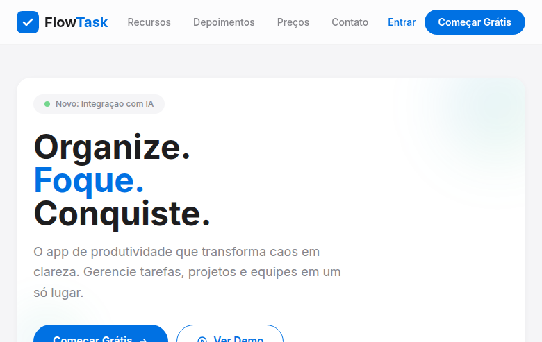
Estilo Bauhaus com cores primárias, formas geométricas ousadas e ornamentação mínima onde a forma segue a função. Ideal para identidade de marca e web design geométrico.
Uso: Identidade de marca, Layouts em grade para editorial, Web design geométrico, Pôsteres
Contexto Histórico
A Bauhaus (1919-1933, Alemanha) revolucionou o design com o princípio 'forma segue função'. Usando cores primárias e geometria pura, influenciou arquitetura, design gráfico e industrial.
Especificações Técnicas
Cores
Primárias
Secundárias
Efeitos
Bold geometric shapes (circles, triangles, squares) as decorative elements via CSS, strict grid layouts, minimal ornamentation, primary color blocks, clean sharp transitions (200ms), geometric hover effects (rotate, scale)
Light/Dark
✓ Full / ✓ Full
CSS
font-family: 'Josefin Sans', sans-serif, background: #FFFFFF, color: #000000, border: 3px solid #000000, border-radius: 0px or 50%, clip-path: polygon() for triangles, no box-shadow, no gradients, display: grid with strict columns, font-weight: 700
Variáveis
--color-red: #E63946, --color-blue: #1D3557, --color-yellow: #F4D35E, --color-white: #FFFFFF, --color-black: #000000, --font-primary: 'Josefin Sans', --border: 3px solid #000000, --border-radius: 0px, --spacing: 2rem
Checklist
☐ Primary colors only (red, blue, yellow, B&W), ☐ Bold geometric shapes (circle, triangle, square), ☐ Strict grid layout, ☐ Minimal ornamentation, ☐ Geometric sans-serif typography, ☐ No gradients or shadows, ☐ Form follows function, ☐ Responsive grid
DESIGN.md
Design System: Bauhaus
1. Visual Theme & Atmosphere
Estilo Bauhaus com cores primárias, formas geométricas ousadas e ornamentação mínima onde a forma segue a função. Ideal para identidade de marca e web design geométrico. A Bauhaus (1919-1933, Alemanha) revolucionou o design com o princípio 'forma segue função'. Usando cores primárias e geometria pura, influenciou arquitetura, design gráfico e industrial.
- Density: 3/10 — Airy
- Variance: 2/10 — Structured
- Motion: 4/10 — Subtle
2. Color Palette & Roles
- Primary Red (#E63946) — Primary accent, CTAs and interactive elements
- Primary Blue (#1D3557) — Primary accent, CTAs and interactive elements
- Primary Yellow (#F4D35E) — Primary accent, CTAs and interactive elements
- Pure White (#FFFFFF) — Light surface, card backgrounds
- Black (#000000) — Deep contrast surface
- Light Grey (#E8E8E8) — Secondary text, borders, muted elements
- Warm Beige (#F5F0E1) — Extended palette, decorative use
- Deep Grey (#2B2B2B) — Secondary text, borders, muted elements
3. Typography Rules
- Display / Hero: Josefin Sans — Weight 700, tight tracking, used for headline impact
- Body: Josefin Sans — Weight 400, 16px/1.6 line-height, max 72ch per line
- UI Labels / Captions: Josefin Sans — 0.875rem, weight 500, slight letter-spacing
- Monospace: JetBrains Mono — Used for code, metadata, and technical values
Scale:
- Hero: clamp(2.5rem, 5vw, 4rem)
- H1: 2.25rem
- H2: 1.5rem
- Body: 1rem / 1.6
- Small: 0.875rem
4. Component Stylings
- Primary Button: Sharp edges (0px) shape. Accent color fill. Hover: 8% darken + subtle lift shadow. Active: -1px translate tactile press. Font weight 600. No outer glows.
- Secondary / Ghost Button: Outline variant. 1.5px border in muted color. Text in primary color. Hover: subtle background fill.
- Cards: Sharp edges (0px) corners. Surface background. Subtle shadow (0 2px 12px rgba(0,0,0,0.06)). 1px border stroke.
- Inputs: Label above input. 1px border stroke. Focus ring: 2px accent color offset 2px. Error text below in semantic red. No floating labels.
- Navigation: Primary surface background. Active item: accent color indicator. Font weight 500 when active.
- Skeletons: Shimmer animation matching component dimensions. No circular spinners.
- Empty States: Icon-based composition with descriptive text and action button.
5. Layout Principles
- Grid: CSS Grid primary. Max-width containment: 1280px centered with 1.5rem side padding.
- Spacing rhythm: Balanced. Base unit: 0.5rem (8px).
- Section vertical gaps: clamp(4rem, 8vw, 8rem).
- Hero layout: Split-screen (text left, visual right).
- Feature sections: Zig-zag alternating text+image rows. No 3-equal-columns.
- Mobile collapse: All multi-column layouts collapse below 768px. No horizontal overflow.
- z-index contract: base (0) / sticky-nav (100) / overlay (200) / modal (300) / toast (500).
6. Motion & Interaction
- Physics: Ease-out curves, 200-300ms duration. Smooth and predictable.
- Entry animations: Fade + translate-Y (16px → 0) over 420ms ease-out. Staggered cascades for lists: 80ms between items.
- Hover states: Subtle color shift + shadow adjustment over 200ms.
- Page transitions: Fade only (200ms).
- Performance: Only transform and opacity animated. No layout-triggering properties.
7. Anti-Patterns (Banned)
- No emojis in UI — use icon system only (Lucide, Heroicons)
- No decorative gradients — flat color only
- No shadows heavier than 0 2px 8px rgba(0,0,0,0.08)
- No pure black (#000000) — use off-black or charcoal variants
- No oversaturated accent colors (saturation cap: 80%)
- No 3-column equal-width feature layouts — use zig-zag or asymmetric grid
- No
h-screen— usemin-h-[100dvh] - No AI copywriting clichés: "Elevate", "Seamless", "Unleash", "Next-Gen"
- No broken external image links — use picsum.photos or inline SVG
- No generic lorem ipsum in demos
Prompt para AI
Design a Bauhaus-inspired landing page with strict primary colors and bold geometric shapes. Use red, blue, yellow, black and white only. Apply circles, triangles and squares as decorative CSS elements, strict grid layouts, minimal ornamentation. Typography should be geometric sans-serif (like Futura). Form follows function — every element has purpose. Clean, bold, modernist aesthetic.
Relacionados
Última sincronização: 01/04/2026