Anthropomorphic
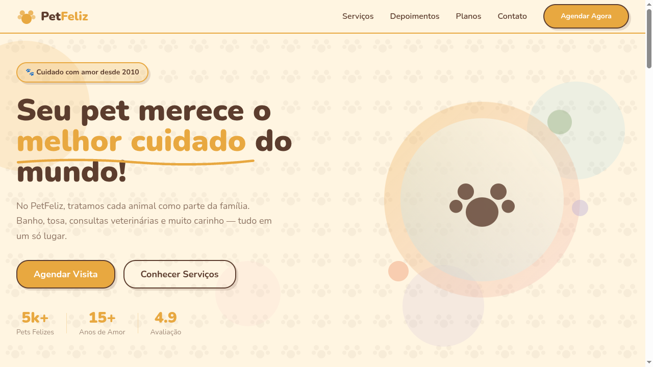
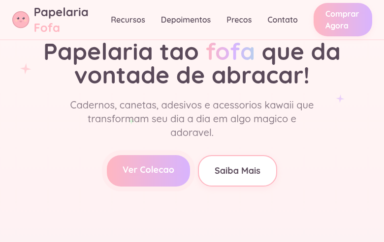
Estilo Antropomórfico com personagens caprichosos, estética de livro de histórias e design lúdico. Ideal para livros infantis, mascotes de marcas e embalagens vintage.
Uso: Livros infantis, Mascotes de marcas, Campanhas lúdicas, Embalagens de produtos vintage
Contexto Histórico
O antropomorfismo na arte remonta a fábulas antigas, ganhando destaque com ilustradores vitorianos como Beatrix Potter. Hoje é essencial em branding de personagens e entretenimento infantil.
Especificações Técnicas
Cores
Primárias
Secundárias
Efeitos
Hand-drawn illustration style borders, rounded playful shapes (20-30px radius), bouncy hover animations (cubic-bezier), soft drop shadows, storybook-style section transitions, warm gradient backgrounds
Light/Dark
✓ Full / ◐ Partial
CSS
font-family: 'Nunito', sans-serif, border-radius: 24px, background: #FFF5E1, color: #5C3D2E, border: 2px solid #E8A840, box-shadow: 4px 4px 0 rgba(92,61,46,0.15), transition: transform 300ms cubic-bezier(0.34,1.56,0.64,1), animation: bounce
Variáveis
--color-honey: #E8A840, --color-cream: #FFF5E1, --color-brown: #5C3D2E, --font-primary: 'Nunito', --border-radius: 24px, --shadow-playful: 4px 4px 0 rgba(92,61,46,0.15), --bounce: cubic-bezier(0.34,1.56,0.64,1), --spacing: 1.5rem
Checklist
☐ Warm playful color palette, ☐ Rounded shapes throughout (20-30px), ☐ Hand-drawn style decorative elements, ☐ Bouncy hover animations, ☐ Friendly rounded typography, ☐ Storybook-like section layouts, ☐ Responsive with maintained charm
DESIGN.md
Design System: Anthropomorphic
1. Visual Theme & Atmosphere
Estilo Antropomórfico com personagens caprichosos, estética de livro de histórias e design lúdico. Ideal para livros infantis, mascotes de marcas e embalagens vintage. O antropomorfismo na arte remonta a fábulas antigas, ganhando destaque com ilustradores vitorianos como Beatrix Potter. Hoje é essencial em branding de personagens e entretenimento infantil.
- Density: 5/10 — Balanced
- Variance: 4/10 — Moderate
- Motion: 6/10 — Expressive
2. Color Palette & Roles
- Warm Honey (#E8A840) — Primary surface or dominant color
- Soft Cream (#FFF5E1) — Light surface, card backgrounds
- Forest Brown (#5C3D2E) — Supporting palette color
- Sky Blue (#87CEEB) — Accent highlight, links and focus states
- Blush Pink (#F5C6C6) — Primary text color
- Leaf Green (#6B8E4E) — Success states, positive indicators
- Sunset Orange (#E87040) — Warm accent, call-to-action secondary
- Lavender (#B8A9D4) — Extended palette, decorative use
3. Typography Rules
- Display / Hero: Nunito — Weight 700, tight tracking, used for headline impact
- Body: Nunito — Weight 400, 16px/1.6 line-height, max 72ch per line
- UI Labels / Captions: Nunito — 0.875rem, weight 500, slight letter-spacing
- Monospace: JetBrains Mono — Used for code, metadata, and technical values
Scale:
- Hero: clamp(2.5rem, 5vw, 4rem)
- H1: 2.25rem
- H2: 1.5rem
- Body: 1rem / 1.6
- Small: 0.875rem
4. Component Stylings
- Primary Button: Generously rounded (1.5rem) shape. Accent color fill. Hover: 8% darken + subtle lift shadow. Active: -1px translate tactile press. Font weight 600. No outer glows.
- Secondary / Ghost Button: Outline variant. 1.5px border in muted color. Text in primary color. Hover: subtle background fill.
- Cards: Generously rounded (1.5rem) corners. Surface background. Subtle shadow (0 2px 12px rgba(0,0,0,0.06)). 1px border stroke.
- Inputs: Label above input. 1px border stroke. Focus ring: 2px accent color offset 2px. Error text below in semantic red. No floating labels.
- Navigation: Primary surface background. Active item: accent color indicator. Font weight 500 when active.
- Skeletons: Shimmer animation matching component dimensions. No circular spinners.
- Empty States: Icon-based composition with descriptive text and action button.
5. Layout Principles
- Grid: CSS Grid primary. Max-width containment: 1280px centered with 1.5rem side padding.
- Spacing rhythm: Balanced. Base unit: 0.5rem (8px).
- Section vertical gaps: clamp(4rem, 8vw, 8rem).
- Hero layout: Split-screen (text left, visual right).
- Feature sections: Zig-zag alternating text+image rows. No 3-equal-columns.
- Mobile collapse: All multi-column layouts collapse below 768px. No horizontal overflow.
- z-index contract: base (0) / sticky-nav (100) / overlay (200) / modal (300) / toast (500).
6. Motion & Interaction
- Physics: Spring — stiffness 120, damping 20. Confident, weighted transitions.
- Entry animations: Fade + translate-Y (16px → 0) over 480ms ease-out. Staggered cascades for lists: 100ms between items.
- Hover states: Scale(1.03) + shadow lift over 200ms.
- Page transitions: Fade + slide (300ms).
- Performance: Only transform and opacity animated. No layout-triggering properties.
7. Anti-Patterns (Banned)
- No emojis in UI — use icon system only (Lucide, Heroicons)
- No pure black (#000000) — use off-black or charcoal variants
- No oversaturated accent colors (saturation cap: 80%)
- No 3-column equal-width feature layouts — use zig-zag or asymmetric grid
- No
h-screen— usemin-h-[100dvh] - No AI copywriting clichés: "Elevate", "Seamless", "Unleash", "Next-Gen"
- No broken external image links — use picsum.photos or inline SVG
- No generic lorem ipsum in demos
Prompt para AI
Design a whimsical anthropomorphic-themed landing page with playful character-driven aesthetics. Use warm honey, cream and forest brown palette. Apply hand-drawn style borders, rounded shapes (20-30px), bouncy animations, storybook-like section layouts. Typography should be friendly and rounded. Create a charming, vintage-meets-modern atmosphere suitable for character brands.
Relacionados
Última sincronização: 01/04/2026