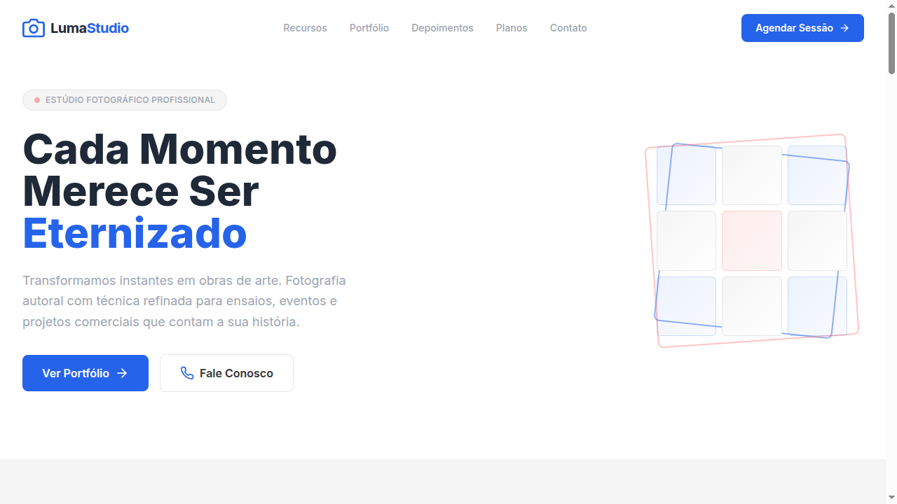
3x3 Grid Design
Estilo Grid 3x3 com layout modular organizado em nove caixas uniformes. Ideal para feeds de Instagram, moodboards, portfólios e design de boutiques.
Uso: Feeds de Instagram, Moodboards, Portfólios, Design de vestuário/boutiques
Contexto Histórico
O design em grade 3x3 é fundamentado em sistemas de grid rígidos, popularizado por feeds de Instagram e moodboards digitais. Organiza conteúdo visual de forma modular e equilibrada.
Especificações Técnicas
Cores
Primárias
Secundárias
Efeitos
Strict 3x3 CSS grid layout, uniform gap spacing (16px), subtle hover scale (1.02) on grid items, clean thin borders between cells, smooth fade-in on scroll for each cell, minimal shadow on hover
Light/Dark
✓ Full / ✓ Full
CSS
display: grid, grid-template-columns: repeat(3, 1fr), gap: 16px, background: #FFFFFF, color: #333333, border: 1px solid #E5E5E5, border-radius: 8px, box-shadow: 0 1px 3px rgba(0,0,0,0.05) on hover, transition: transform 200ms, transform: scale(1.02) on hover
Variáveis
--grid-columns: 3, --gap: 16px, --color-white: #FFFFFF, --color-grey: #F5F5F5, --color-charcoal: #333333, --color-accent: #2563EB, --border: 1px solid #E5E5E5, --border-radius: 8px, --hover-scale: 1.02
Checklist
☐ Strict 3x3 grid layout, ☐ Uniform gap spacing, ☐ Clean thin borders between cells, ☐ Subtle hover scale effect, ☐ Each cell with dedicated content, ☐ Single accent color, ☐ Responsive: 3→2→1 columns on breakpoints
DESIGN.md
Design System: 3x3 Grid Design
1. Visual Theme & Atmosphere
Estilo Grid 3x3 com layout modular organizado em nove caixas uniformes. Ideal para feeds de Instagram, moodboards, portfólios e design de boutiques. O design em grade 3x3 é fundamentado em sistemas de grid rígidos, popularizado por feeds de Instagram e moodboards digitais. Organiza conteúdo visual de forma modular e equilibrada.
- Density: 5/10 — Balanced
- Variance: 2/10 — Structured
- Motion: 4/10 — Subtle
2. Color Palette & Roles
- Pure White (#FFFFFF) — Light surface, card backgrounds
- Soft Grey (#F5F5F5) — Secondary text, borders, muted elements
- Charcoal (#333333) — Dark surface, primary background
- Accent Blue (#2563EB) — Primary accent, CTAs and interactive elements
- Light Grey (#E5E5E5) — Secondary text, borders, muted elements
- Medium Grey (#9CA3AF) — Secondary text, borders, muted elements
- Dark Grey (#1F2937) — Deep contrast surface
- Accent Coral (#FF6B6B) — Primary accent, CTAs and interactive elements
3. Typography Rules
- Display / Hero: System UI stack (-apple-system, sans-serif) — Weight 700, tight tracking, used for headline impact
- Body: System UI stack (-apple-system, sans-serif) — Weight 400, 16px/1.6 line-height, max 72ch per line
- UI Labels / Captions: System UI stack (-apple-system, sans-serif) — 0.875rem, weight 500, slight letter-spacing
- Monospace: JetBrains Mono — Used for code, metadata, and technical values
Scale:
- Hero: clamp(2.5rem, 5vw, 4rem)
- H1: 2.25rem
- H2: 1.5rem
- Body: 1rem / 1.6
- Small: 0.875rem
4. Component Stylings
- Primary Button: Rounded (8px) shape. Accent color fill. Hover: 8% darken + subtle lift shadow. Active: -1px translate tactile press. Font weight 600. No outer glows.
- Secondary / Ghost Button: Outline variant. 1.5px border in muted color. Text in primary color. Hover: subtle background fill.
- Cards: Rounded (8px) corners. Surface background. Subtle shadow (0 2px 12px rgba(0,0,0,0.06)). 1px border stroke.
- Inputs: Label above input. 1px border stroke. Focus ring: 2px accent color offset 2px. Error text below in semantic red. No floating labels.
- Navigation: Primary surface background. Active item: accent color indicator. Font weight 500 when active.
- Skeletons: Shimmer animation matching component dimensions. No circular spinners.
- Empty States: Icon-based composition with descriptive text and action button.
5. Layout Principles
- Grid: CSS Grid primary. Max-width containment: 1280px centered with 1.5rem side padding.
- Spacing rhythm: Balanced. Base unit: 0.5rem (8px).
- Section vertical gaps: clamp(4rem, 8vw, 8rem).
- Hero layout: Split-screen (text left, visual right).
- Feature sections: Zig-zag alternating text+image rows. No 3-equal-columns.
- Mobile collapse: All multi-column layouts collapse below 768px. No horizontal overflow.
- z-index contract: base (0) / sticky-nav (100) / overlay (200) / modal (300) / toast (500).
6. Motion & Interaction
- Physics: Ease-out curves, 200-300ms duration. Smooth and predictable.
- Entry animations: Fade + translate-Y (16px → 0) over 420ms ease-out. Staggered cascades for lists: 80ms between items.
- Hover states: Subtle color shift + shadow adjustment over 200ms.
- Page transitions: Fade only (200ms).
- Performance: Only transform and opacity animated. No layout-triggering properties.
7. Anti-Patterns (Banned)
- No emojis in UI — use icon system only (Lucide, Heroicons)
- No pure black (#000000) — use off-black or charcoal variants
- No oversaturated accent colors (saturation cap: 80%)
- No 3-column equal-width feature layouts — use zig-zag or asymmetric grid
- No
h-screen— usemin-h-[100dvh] - No AI copywriting clichés: "Elevate", "Seamless", "Unleash", "Next-Gen"
- No broken external image links — use picsum.photos or inline SVG
- No generic lorem ipsum in demos
Prompt para AI
Design a 3x3 grid-based landing page where content is organized in nine uniform boxes. Use strict CSS grid (3 columns, 3 rows), uniform gap spacing, clean thin borders between cells. White, grey and single accent color palette. Each cell should have its own dedicated content. Subtle hover effects on grid items. Clean, structured, modular aesthetic perfect for portfolios and moodboards.
Relacionados
Última sincronização: 01/04/2026