Spotify Dark Immersive
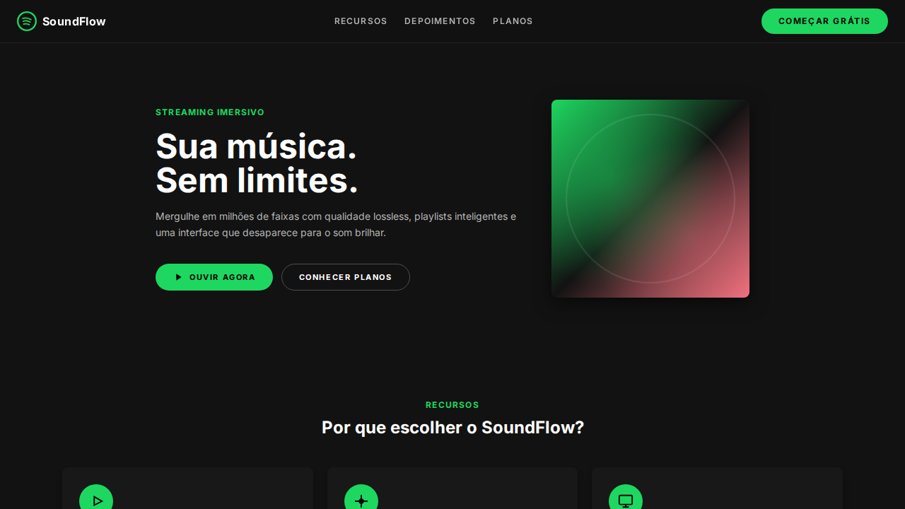
Estilo Spotify Dark Immersive com dark imersivo, verde funcional e geometria pill-and-circle. Ideal para streaming de música, áudio e plataformas de entretenimento.
Uso: Streaming de música, Plataformas de áudio, Podcasts, Entretenimento digital
Contexto Histórico
Inspirado no design do Spotify, que cria um casulo near-black onde album art e conteúdo são as únicas fontes de cor.
Especificações Técnicas
Cores
Primárias
Secundárias
Efeitos
Canvas near-black imersivo (#121212, #181818, #1f1f1f) — UI desaparece para conteúdo brilhar. Spotify Green (#1ed760) como acento funcional singular — play buttons, estados ativos, CTAs. Geometria pill-and-circle: botões pill (500px-9999px), controles play circulares (50%). Botões uppercase com letter-spacing largo (1.4px-2px). Sombras heavy (rgba(0,0,0,0.5) 0px 8px 24px) para elementos elevados. Inset border-shadow combo em inputs. Album art como fonte primária de cor. Tipografia compacta (10px-24px range).
Light/Dark
✗ Not Recommended / ✓ Full
CSS
background:#121212;color:#ffffff;accent:#1ed760;border-radius:9999px pills,50% circles,8px cards;box-shadow:rgba(0,0,0,0.5) 0px 8px 24px elevated,rgba(0,0,0,0.3) 0px 8px 8px cards;font-family:system-ui;text-transform:uppercase buttons;letter-spacing:1.4px-2px buttons;font-weight:700 bold,400 regular
Variáveis
--bg:#121212;--surface:#181818;--interactive:#1f1f1f;--text:#ffffff;--text-secondary:#b3b3b3;--green:#1ed760;--border:#4d4d4d;--red:#f3727f;--radius-pill:9999px;--radius-circle:50%;--radius-card:8px
Checklist
☐ Near-black imersivo #121212, ☐ Spotify Green #1ed760 funcional, ☐ Pill buttons 9999px, ☐ Circle controls 50%, ☐ Uppercase buttons 1.4-2px tracking, ☐ Heavy shadows 0.5 opacity, ☐ Tipografia compacta, ☐ Album art como cor, ☐ Responsivo
DESIGN.md
Design System: Spotify Dark Immersive
1. Visual Theme & Atmosphere
Estilo Spotify Dark Immersive com dark imersivo, verde funcional e geometria pill-and-circle. Ideal para streaming de música, áudio e plataformas de entretenimento. Inspirado no design do Spotify, que cria um casulo near-black onde album art e conteúdo são as únicas fontes de cor.
- Density: 5/10 — Balanced
- Variance: 4/10 — Moderate
- Motion: 4/10 — Subtle
2. Color Palette & Roles
- Near Black (#121212) — Dark surface, primary background
- Dark Surface (#181818) — Dark surface, primary background
- Mid Dark (#1f1f1f) — Dark surface, primary background
- Spotify Green (#1ed760) — Supporting palette color
- Branco (#ffffff) — Secondary surface
- Silver (#b3b3b3) — Extended palette, decorative use
- Borda (#4d4d4d) — Extended palette, decorative use
- Red (#f3727f) — Error states, destructive actions
3. Typography Rules
- Display / Hero: system-ui — Weight 700, tight tracking, used for headline impact
- Body: system-ui — Weight 400, 16px/1.6 line-height, max 72ch per line
- UI Labels / Captions: system-ui — 0.875rem, weight 500, slight letter-spacing
- Monospace: JetBrains Mono — Used for code, metadata, and technical values
Scale:
- Hero: clamp(2.5rem, 5vw, 4rem)
- H1: 2.25rem
- H2: 1.5rem
- Body: 1rem / 1.6
- Small: 0.875rem
4. Component Stylings
- Primary Button: Pill-shaped (9999px) shape. Accent color fill. Hover: 8% darken + subtle lift shadow. Active: -1px translate tactile press. Font weight 600. No outer glows.
- Secondary / Ghost Button: Outline variant. 1.5px border in muted color. Text in primary color. Hover: subtle background fill.
- Cards: Pill-shaped (9999px) corners. Surface background. Subtle shadow (0 2px 12px rgba(0,0,0,0.06)). 1px border stroke.
- Inputs: Label above input. 1px border stroke. Focus ring: 2px accent color offset 2px. Error text below in semantic red. No floating labels.
- Navigation: Primary surface background. Active item: accent color indicator. Font weight 500 when active.
- Skeletons: Shimmer animation matching component dimensions. No circular spinners.
- Empty States: Icon-based composition with descriptive text and action button.
5. Layout Principles
- Grid: CSS Grid primary. Max-width containment: 1280px centered with 1.5rem side padding.
- Spacing rhythm: Balanced. Base unit: 0.5rem (8px).
- Section vertical gaps: clamp(4rem, 8vw, 8rem).
- Hero layout: Split-screen (text left, visual right).
- Feature sections: Zig-zag alternating text+image rows. No 3-equal-columns.
- Mobile collapse: All multi-column layouts collapse below 768px. No horizontal overflow.
- z-index contract: base (0) / sticky-nav (100) / overlay (200) / modal (300) / toast (500).
6. Motion & Interaction
- Physics: Ease-out curves, 200-300ms duration. Smooth and predictable.
- Entry animations: Fade + translate-Y (16px → 0) over 420ms ease-out. Staggered cascades for lists: 80ms between items.
- Hover states: Subtle color shift + shadow adjustment over 200ms.
- Page transitions: Fade only (200ms).
- Performance: Only transform and opacity animated. No layout-triggering properties.
7. Anti-Patterns (Banned)
- No emojis in UI — use icon system only (Lucide, Heroicons)
- No pure white (#FFFFFF) backgrounds — use off-white or dark surfaces
- No oversaturated accent colors (saturation cap: 80%)
- No 3-column equal-width feature layouts — use zig-zag or asymmetric grid
- No
h-screen— usemin-h-[100dvh] - No AI copywriting clichés: "Elevate", "Seamless", "Unleash", "Next-Gen"
- No broken external image links — use picsum.photos or inline SVG
- No generic lorem ipsum in demos
Prompt para AI
Design a Spotify-inspired dark immersive landing page. Near-black backgrounds (#121212, #181818, #1f1f1f) — UI disappears behind content. Spotify Green (#1ed760) for play controls, active states, and primary CTAs only. Pill buttons (9999px radius) with 8px 16px padding. Circular play buttons (50% radius). Uppercase button labels with 1.4px-2px letter-spacing. Heavy shadows (rgba(0,0,0,0.5) 0px 8px 24px) for elevated elements. Compact typography (10px-24px range). Silver (#b3b3b3) for secondary text. Album art provides the only color.
Relacionados
Última sincronização: 01/04/2026