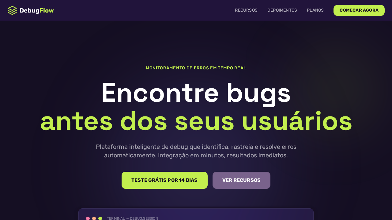
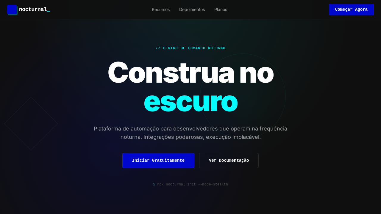
Sentry Purple Debugger
Estilo Sentry Purple Debugger com dark purple IDE, acento verde lima e botões com inset shadows. Ideal para monitoramento de erros, DevOps e ferramentas developer.
Uso: Monitoramento de erros, DevOps, Ferramentas developer, Observabilidade
Contexto Histórico
Inspirado no design do Sentry, que abraça a estética dark IDE com roxo quente e verde lima como sinal de alerta.
Especificações Técnicas
Cores
Primárias
Secundárias
Efeitos
Fundos purple-black (#1f1633, #150f23) evocando sessões de debug noturnas. Verde lima (#c2ef4e) como acento de alta visibilidade — usado com parcimônia para máximo impacto. Botões com inset shadows (rgba(0,0,0,0.1) 0px 1px 3px inset) criando qualidade tátil. Efeitos frosted glass (blur(18px) saturate(180%)). Font display com personalidade para hero (88px weight 700). Rubik como font UI com sistema uppercase + letter-spacing 0.2px. Ambient glow roxo (rgba(22,15,36,0.9)).
Light/Dark
✗ Not Recommended / ✓ Full
CSS
background:#1f1633;color:#ffffff;accent:#c2ef4e;button-bg:#79628c;box-shadow:rgba(0,0,0,0.1) 0px 1px 3px 0px inset;backdrop-filter:blur(18px) saturate(180%);font-family:Rubik,system-ui;border-radius:13px buttons,12px cards;letter-spacing:0.2px uppercase
Variáveis
--bg-primary:#1f1633;--bg-deep:#150f23;--text:#ffffff;--lime:#c2ef4e;--purple:#6a5fc1;--muted-purple:#79628c;--coral:#ffb287;--pink:#fa7faa;--border:#362d59;--radius-btn:13px;--radius-card:12px
Checklist
☐ Fundos purple-black, ☐ Verde lima #c2ef4e sparingly, ☐ Inset shadows em botões, ☐ Frosted glass blur(18px), ☐ Display 88px weight 700, ☐ Rubik UI com uppercase, ☐ Ambient glow roxo, ☐ Responsivo
DESIGN.md
Design System: Sentry Purple Debugger
1. Visual Theme & Atmosphere
Estilo Sentry Purple Debugger com dark purple IDE, acento verde lima e botões com inset shadows. Ideal para monitoramento de erros, DevOps e ferramentas developer. Inspirado no design do Sentry, que abraça a estética dark IDE com roxo quente e verde lima como sinal de alerta.
- Density: 5/10 — Balanced
- Variance: 4/10 — Moderate
- Motion: 4/10 — Subtle
2. Color Palette & Roles
- Roxo Profundo (#1f1633) — Primary background surface
- Roxo Escuro (#150f23) — Dark surface, primary background
- Branco (#ffffff) — Light surface, card backgrounds
- Verde Lima (#c2ef4e) — Supporting palette color
- Roxo Sentry (#6a5fc1) — Accent color, emphasis elements
- Roxo Muted (#79628c) — Secondary text, borders, muted elements
- Coral (#ffb287) — Extended palette, decorative use
- Rosa (#fa7faa) — Decorative accent, highlight elements
3. Typography Rules
- Display / Hero: Rubik — Weight 700, tight tracking, used for headline impact
- Body: Rubik — Weight 400, 16px/1.6 line-height, max 72ch per line
- UI Labels / Captions: Rubik — 0.875rem, weight 500, slight letter-spacing
- Monospace: JetBrains Mono — Used for code, metadata, and technical values
Scale:
- Hero: clamp(2.5rem, 5vw, 4rem)
- H1: 2.25rem
- H2: 1.5rem
- Body: 1rem / 1.6
- Small: 0.875rem
4. Component Stylings
- Primary Button: Rounded (13px buttons) shape. Accent color fill. Hover: 8% darken + subtle lift shadow. Active: -1px translate tactile press. Font weight 600. No outer glows.
- Secondary / Ghost Button: Outline variant. 1.5px border in muted color. Text in primary color. Hover: subtle background fill.
- Cards: Rounded (13px buttons) corners. Surface background. Subtle shadow (0 2px 12px rgba(0,0,0,0.06)). 1px border stroke.
- Inputs: Label above input. 1px border stroke. Focus ring: 2px accent color offset 2px. Error text below in semantic red. No floating labels.
- Navigation: Primary surface background. Active item: accent color indicator. Font weight 500 when active.
- Skeletons: Shimmer animation matching component dimensions. No circular spinners.
- Empty States: Icon-based composition with descriptive text and action button.
5. Layout Principles
- Grid: CSS Grid primary. Max-width containment: 1280px centered with 1.5rem side padding.
- Spacing rhythm: Balanced. Base unit: 0.5rem (8px).
- Section vertical gaps: clamp(4rem, 8vw, 8rem).
- Hero layout: Split-screen (text left, visual right).
- Feature sections: Zig-zag alternating text+image rows. No 3-equal-columns.
- Mobile collapse: All multi-column layouts collapse below 768px. No horizontal overflow.
- z-index contract: base (0) / sticky-nav (100) / overlay (200) / modal (300) / toast (500).
6. Motion & Interaction
- Physics: Ease-out curves, 200-300ms duration. Smooth and predictable.
- Entry animations: Fade + translate-Y (16px → 0) over 420ms ease-out. Staggered cascades for lists: 80ms between items.
- Hover states: Subtle color shift + shadow adjustment over 200ms.
- Page transitions: Fade only (200ms).
- Performance: Only transform and opacity animated. No layout-triggering properties.
7. Anti-Patterns (Banned)
- No emojis in UI — use icon system only (Lucide, Heroicons)
- No pure white (#FFFFFF) backgrounds — use off-white or dark surfaces
- No oversaturated accent colors (saturation cap: 80%)
- No 3-column equal-width feature layouts — use zig-zag or asymmetric grid
- No
h-screen— usemin-h-[100dvh] - No AI copywriting clichés: "Elevate", "Seamless", "Unleash", "Next-Gen"
- No broken external image links — use picsum.photos or inline SVG
- No generic lorem ipsum in demos
Prompt para AI
Design a Sentry-inspired dark purple developer landing page. Deep purple-black backgrounds (#1f1633, #150f23) — never pure black. Lime-green accent (#c2ef4e) for high-visibility highlights. Muted purple buttons (#79628c) with inset shadow (rgba(0,0,0,0.1) 0px 1px 3px inset) for tactile feel. Frosted glass effects (backdrop-filter: blur(18px) saturate(180%)). Display font at 88px weight 700 for hero. Rubik for all UI text. Uppercase labels with 0.2px letter-spacing. Ambient purple glow (rgba(22,15,36,0.9) 0px 4px 4px 9px).
Relacionados
Última sincronização: 01/04/2026