Scrapbook / Collage
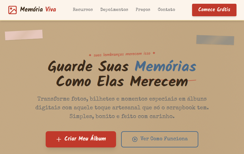
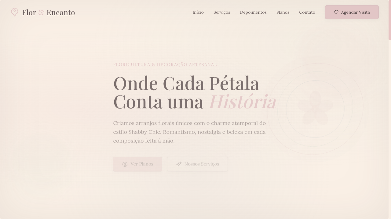
Estilo Scrapbook/Colagem com fotos, recortes e elementos decorativos em camadas para visual analógico e tátil. Ideal para diários pessoais, convites e vision boards.
Uso: Diários pessoais, Convites de casamento, Vision boards, Publicações acolhedoras em redes sociais
Contexto Histórico
O Scrapbook é uma tradição artesanal de preservar memórias com fotos, recortes e decorações em camadas. No design digital, recria a sensação tátil e pessoal do feito à mão.
Especificações Técnicas
Cores
Primárias
Secundárias
Efeitos
Layered photo-style elements with slight rotation (-3deg to 5deg), washi tape SVG border decorations, paper clip/pin SVG accents, torn paper edges via clip-path, polaroid-style photo frames, handwritten annotation overlays, cork board texture backgrounds, sticker-like decorative elements
Light/Dark
✓ Full / ✗ Not Recommended
CSS
font-family: 'Kalam', cursive mixed with 'Special Elite', background: #C4A882 with cork texture, color: #3A2A1A, transform: rotate(-3deg to 5deg) on layered elements, clip-path: polygon() for torn edges, box-shadow: 2px 3px 5px rgba(0,0,0,0.15), border: none (use tape/pin decorations), z-index stacking for layers
Variáveis
--color-kraft: #C4A882, --color-cream: #FFF8F0, --color-washi: #F5D5D5, --color-denim: #4A6A8A, --font-handwritten: 'Kalam', --font-typewriter: 'Special Elite', --rotation-range: -3deg to 5deg, --shadow: 2px 3px 5px rgba(0,0,0,0.15), --spacing: 1.5rem
Checklist
☐ Layered elements with rotation, ☐ Washi tape SVG borders, ☐ Paper clip/pin accents, ☐ Torn paper edge effects, ☐ Polaroid photo frames, ☐ Handwritten + typewriter typography, ☐ Cork board texture background, ☐ Cozy handmade atmosphere, ☐ Responsive with maintained craft feel
DESIGN.md
Design System: Scrapbook / Collage
1. Visual Theme & Atmosphere
Estilo Scrapbook/Colagem com fotos, recortes e elementos decorativos em camadas para visual analógico e tátil. Ideal para diários pessoais, convites e vision boards. O Scrapbook é uma tradição artesanal de preservar memórias com fotos, recortes e decorações em camadas. No design digital, recria a sensação tátil e pessoal do feito à mão.
- Density: 5/10 — Balanced
- Variance: 7/10 — Dynamic
- Motion: 8/10 — Cinematic
2. Color Palette & Roles
- Kraft Paper (#C4A882) — Primary surface or dominant color
- Cream White (#FFF8F0) — Light surface, card backgrounds
- Washi Pink (#F5D5D5) — Primary text color
- Denim Blue (#4A6A8A) — Accent highlight, links and focus states
- Tape Yellow (#E8D5A0) — Warning states, attention indicators
- Stamp Red (#C0392B) — Error states, destructive actions
- Marker Green (#4CAF50) — Success states, positive indicators
- Pencil Grey (#6B6B6B) — Secondary text, borders, muted elements
3. Typography Rules
- Display / Hero: Kalam — Weight 700, tight tracking, used for headline impact
- Accent: Special Elite — Used for decorative or emphasis text
- Body: Kalam — Weight 400, 16px/1.6 line-height, max 72ch per line
- UI Labels / Captions: Kalam — 0.875rem, weight 500, slight letter-spacing
- Monospace: JetBrains Mono — Used for code, metadata, and technical values
Scale:
- Hero: clamp(2.5rem, 5vw, 4rem)
- H1: 2.25rem
- H2: 1.5rem
- Body: 1rem / 1.6
- Small: 0.875rem
4. Component Stylings
- Primary Button: Generously rounded (1.5rem) shape. Accent color fill. Hover: 8% darken + subtle lift shadow. Active: -1px translate tactile press. Font weight 600. No outer glows.
- Secondary / Ghost Button: Outline variant. 1.5px border in muted color. Text in primary color. Hover: subtle background fill.
- Cards: Generously rounded (1.5rem) corners. Surface background. Subtle shadow (0 2px 12px rgba(0,0,0,0.06)). 1px border stroke.
- Inputs: Label above input. 1px border stroke. Focus ring: 2px accent color offset 2px. Error text below in semantic red. No floating labels.
- Navigation: Primary surface background. Active item: accent color indicator. Font weight 500 when active.
- Skeletons: Shimmer animation matching component dimensions. No circular spinners.
- Empty States: Icon-based composition with descriptive text and action button.
5. Layout Principles
- Grid: CSS Grid primary. Max-width containment: 1280px centered with 1.5rem side padding.
- Spacing rhythm: Balanced. Base unit: 0.5rem (8px).
- Section vertical gaps: clamp(4rem, 8vw, 8rem).
- Hero layout: Asymmetric composition.
- Feature sections: Asymmetric grid with varied card sizes. No 3-equal-columns.
- Mobile collapse: All multi-column layouts collapse below 768px. No horizontal overflow.
- z-index contract: base (0) / sticky-nav (100) / overlay (200) / modal (300) / toast (500).
6. Motion & Interaction
- Physics: Spring — stiffness 120, damping 20. Confident, weighted transitions.
- Entry animations: Fade + translate-Y (16px → 0) over 540ms ease-out. Staggered cascades for lists: 120ms between items.
- Hover states: Scale(1.03) + shadow lift over 200ms.
- Page transitions: Fade + slide (300ms).
- Performance: Only transform and opacity animated. No layout-triggering properties.
7. Anti-Patterns (Banned)
- No emojis in UI — use icon system only (Lucide, Heroicons)
- No pure black (#000000) — use off-black or charcoal variants
- No oversaturated accent colors (saturation cap: 80%)
- No 3-column equal-width feature layouts — use zig-zag or asymmetric grid
- No
h-screen— usemin-h-[100dvh] - No AI copywriting clichés: "Elevate", "Seamless", "Unleash", "Next-Gen"
- No broken external image links — use picsum.photos or inline SVG
- No generic lorem ipsum in demos
Prompt para AI
Design a scrapbook/collage landing page with analog handmade tactile aesthetics. Use kraft paper, cream white, washi pink, denim blue. Apply layered elements with slight rotation, washi tape SVG borders, paper clip/pin accents, torn paper clip-path edges, polaroid photo frames, handwritten annotations, cork board textures, sticker decorations. Typography should mix handwritten and typewriter styles. Cozy, personal, journal-like atmosphere.
Relacionados
Última sincronização: 01/04/2026