Pointillism / Stipple Art
Estilo Pontilhismo com milhares de pequenos pontos organizados que criam imagens coesas e hipnotizantes. Ideal para ilustrações editoriais e embalagens artísticas.
Uso: Ilustrações editoriais, Embalagens artísticas, Marcas com margem artística, Pôsteres
Contexto Histórico
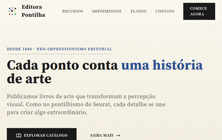
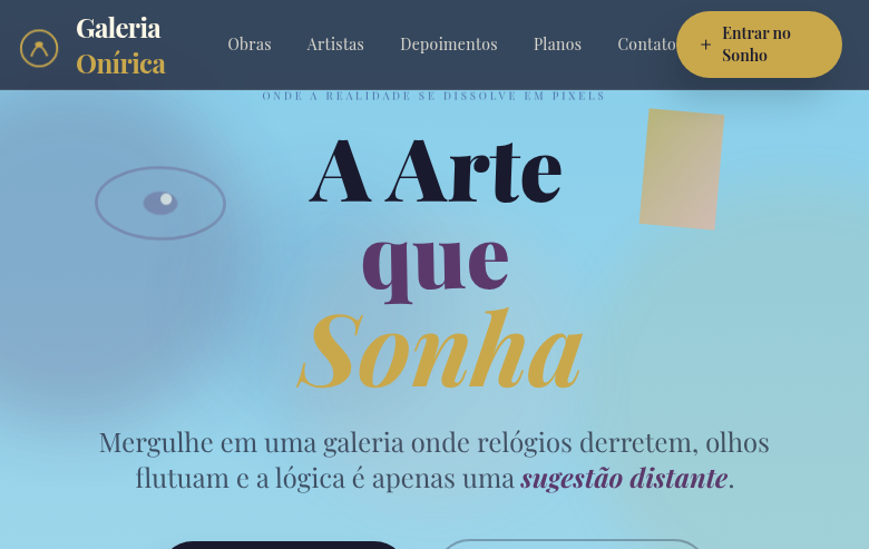
O Pontilhismo (1880s) de Georges Seurat usa milhares de pontos de cor pura que se misturam opticamente à distância. Técnica neo-impressionista que influenciou arte digital e design gráfico.
Especificações Técnicas
Cores
Primárias
Secundárias
Efeitos
CSS radial-gradient dot patterns at various densities, stipple texture overlays, dot-based section dividers, pointillist gradient backgrounds (dots instead of smooth gradients), subtle dot animation on hover, grain/noise texture via SVG filter
Light/Dark
✓ Full / ◐ Partial
CSS
font-family: 'Source Serif Pro', serif, background: #FAF8F0 with radial-gradient(circle, #1A1A1A 1px, transparent 1px) for dot pattern, background-size: 8px 8px, color: #1A1A1A, border: none (use dot-pattern borders), box-shadow: none, line-height: 1.8, letter-spacing: 0.03em
Variáveis
--color-white: #FAF8F0, --color-ink: #1A1A1A, --color-blue: #2E5090, --color-red: #C0392B, --font-primary: 'Source Serif Pro', --dot-size: 1px, --dot-spacing: 8px, --spacing: 2rem, --border-radius: 0px
Checklist
☐ Dot pattern textures throughout, ☐ Varying dot densities for depth, ☐ Stipple-based section dividers, ☐ Clean typography contrasting with dots, ☐ Pointillist gradient backgrounds, ☐ Artistic impressionist atmosphere, ☐ Responsive with maintained dot textures
DESIGN.md
Design System: Pointillism / Stipple Art
1. Visual Theme & Atmosphere
Estilo Pontilhismo com milhares de pequenos pontos organizados que criam imagens coesas e hipnotizantes. Ideal para ilustrações editoriais e embalagens artísticas. O Pontilhismo (1880s) de Georges Seurat usa milhares de pontos de cor pura que se misturam opticamente à distância. Técnica neo-impressionista que influenciou arte digital e design gráfico.
- Density: 5/10 — Balanced
- Variance: 8/10 — Expressive
- Motion: 6/10 — Expressive
2. Color Palette & Roles
- Warm White (#FAF8F0) — Light surface, card backgrounds
- Ink Black (#1A1A1A) — Dark surface, primary background
- Stipple Blue (#2E5090) — Accent highlight, links and focus states
- Stipple Red (#C0392B) — Error states, destructive actions
- Stipple Green (#27AE60) — Success states, positive indicators
- Stipple Yellow (#F1C40F) — Warning states, attention indicators
- Warm Grey (#7F8C8D) — Secondary text, borders, muted elements
- Soft Cream (#F5F0E0) — Secondary surface
3. Typography Rules
- Display / Hero: Source Serif Pro — Weight 700, tight tracking, used for headline impact
- Body: Source Serif Pro — Weight 400, 16px/1.6 line-height, max 72ch per line
- UI Labels / Captions: Source Serif Pro — 0.875rem, weight 500, slight letter-spacing
- Monospace: JetBrains Mono — Used for code, metadata, and technical values
Scale:
- Hero: clamp(2.5rem, 5vw, 4rem)
- H1: 2.25rem
- H2: 1.5rem
- Body: 1rem / 1.6
- Small: 0.875rem
4. Component Stylings
- Primary Button: Sharp edges (0px) shape. Accent color fill. Hover: 8% darken + subtle lift shadow. Active: -1px translate tactile press. Font weight 600. No outer glows.
- Secondary / Ghost Button: Outline variant. 1.5px border in muted color. Text in primary color. Hover: subtle background fill.
- Cards: Sharp edges (0px) corners. Surface background. Subtle shadow (0 2px 12px rgba(0,0,0,0.06)). 1px border stroke.
- Inputs: Label above input. 1px border stroke. Focus ring: 2px accent color offset 2px. Error text below in semantic red. No floating labels.
- Navigation: Primary surface background. Active item: accent color indicator. Font weight 500 when active.
- Skeletons: Shimmer animation matching component dimensions. No circular spinners.
- Empty States: Icon-based composition with descriptive text and action button.
5. Layout Principles
- Grid: CSS Grid primary. Max-width containment: 1280px centered with 1.5rem side padding.
- Spacing rhythm: Balanced. Base unit: 0.5rem (8px).
- Section vertical gaps: clamp(4rem, 8vw, 8rem).
- Hero layout: Asymmetric composition.
- Feature sections: Asymmetric grid with varied card sizes. No 3-equal-columns.
- Mobile collapse: All multi-column layouts collapse below 768px. No horizontal overflow.
- z-index contract: base (0) / sticky-nav (100) / overlay (200) / modal (300) / toast (500).
6. Motion & Interaction
- Physics: Spring — stiffness 120, damping 20. Confident, weighted transitions.
- Entry animations: Fade + translate-Y (16px → 0) over 480ms ease-out. Staggered cascades for lists: 100ms between items.
- Hover states: Scale(1.03) + shadow lift over 200ms.
- Page transitions: Fade + slide (300ms).
- Performance: Only transform and opacity animated. No layout-triggering properties.
7. Anti-Patterns (Banned)
- No emojis in UI — use icon system only (Lucide, Heroicons)
- No pure black (#000000) — use off-black or charcoal variants
- No oversaturated accent colors (saturation cap: 80%)
- No 3-column equal-width feature layouts — use zig-zag or asymmetric grid
- No
h-screen— usemin-h-[100dvh] - No AI copywriting clichés: "Elevate", "Seamless", "Unleash", "Next-Gen"
- No broken external image links — use picsum.photos or inline SVG
- No generic lorem ipsum in demos
Prompt para AI
Design a pointillism/stipple art landing page where visual texture is created through thousands of tiny dots. Use CSS radial-gradient dot patterns at various densities, stipple texture overlays, dot-based dividers. Warm white, ink black with colored stipple accents. Typography should be clean to contrast with dotted textures. Hypnotic, artistic, impressionist atmosphere where dots blend into cohesive visuals.
Relacionados
Última sincronização: 01/04/2026