Graffiti
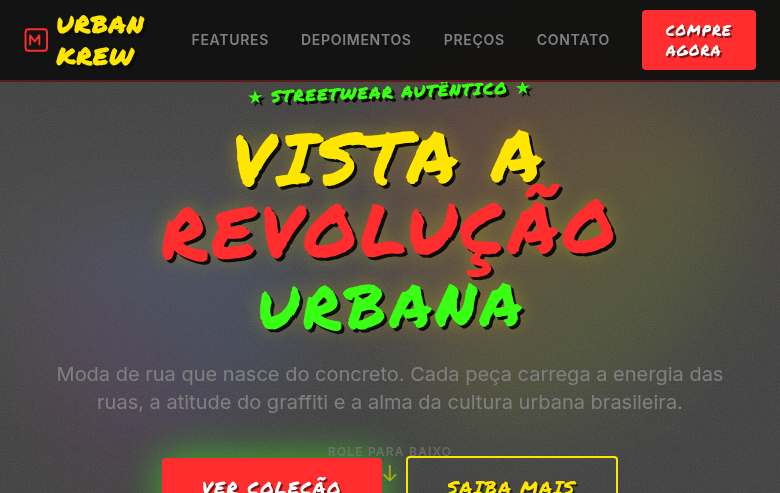
Estilo Grafite com cores brilhantes, texturas de spray e estética de arte urbana rebelde. Ideal para campanhas provocadoras, pôsteres de música e streetwear.
Uso: Campanhas de marcas provocadoras, Pôsteres de música, Linhas de streetwear, Eventos urbanos
Contexto Histórico
O Grafite nasceu nas ruas de Nova York nos anos 70, evoluindo de tags simples para murais complexos. Hoje é reconhecido como forma de arte legítima, influenciando moda, design e cultura pop.
Especificações Técnicas
Cores
Primárias
Secundárias
Efeitos
Spray paint texture overlays (CSS noise/grain), drip effects on borders via SVG, concrete/brick texture backgrounds, bold graffiti-style lettering, tag-style decorative elements, gritty shadow effects, splatter animations on hover
Light/Dark
✓ Full / ✓ Full
CSS
font-family: 'Permanent Marker', cursive, background: #808080 with CSS noise texture, color: #FFE600 or #FF2D2D, border: none (use SVG drip borders), text-shadow: 3px 3px 0 #0D0D0D, font-weight: 700, text-transform: uppercase, transform: rotate(-2deg to 3deg) for irregular feel, letter-spacing: 0.05em
Variáveis
--color-red: #FF2D2D, --color-yellow: #FFE600, --color-green: #39FF14, --color-black: #0D0D0D, --color-concrete: #808080, --font-graffiti: 'Permanent Marker', --text-shadow: 3px 3px 0 #0D0D0D, --rotation-range: -2deg to 3deg, --spacing: 1.5rem
Checklist
☐ Bright spray-paint colors, ☐ Concrete/brick texture backgrounds, ☐ Drip effect borders, ☐ Bold graffiti-style lettering, ☐ Tag-style decorative elements, ☐ Gritty urban atmosphere, ☐ Irregular rotation on elements, ☐ Responsive with maintained street energy
DESIGN.md
Design System: Graffiti
1. Visual Theme & Atmosphere
Estilo Grafite com cores brilhantes, texturas de spray e estética de arte urbana rebelde. Ideal para campanhas provocadoras, pôsteres de música e streetwear. O Grafite nasceu nas ruas de Nova York nos anos 70, evoluindo de tags simples para murais complexos. Hoje é reconhecido como forma de arte legítima, influenciando moda, design e cultura pop.
- Density: 5/10 — Balanced
- Variance: 4/10 — Moderate
- Motion: 6/10 — Expressive
2. Color Palette & Roles
- Spray Red (#FF2D2D) — Error states, destructive actions
- Electric Yellow (#FFE600) — Warning states, attention indicators
- Neon Green (#39FF14) — Supporting palette color
- Deep Black (#0D0D0D) — Dark surface, primary background
- Spray Blue (#0080FF) — Secondary accent
- Hot Pink (#FF1493) — Primary text color
- Concrete Grey (#808080) — Secondary text, borders, muted elements
- Brick Brown (#8B4513) — Extended palette, decorative use
3. Typography Rules
- Display / Hero: Permanent Marker — Weight 700, tight tracking, used for headline impact
- Body: Permanent Marker — Weight 400, 16px/1.6 line-height, max 72ch per line
- UI Labels / Captions: Permanent Marker — 0.875rem, weight 500, slight letter-spacing
- Monospace: JetBrains Mono — Used for code, metadata, and technical values
Scale:
- Hero: clamp(2.5rem, 5vw, 4rem)
- H1: 2.25rem
- H2: 1.5rem
- Body: 1rem / 1.6
- Small: 0.875rem
4. Component Stylings
- Primary Button: Generously rounded (1.5rem) shape. Accent color fill. Hover: 8% darken + subtle lift shadow. Active: -1px translate tactile press. Font weight 600. No outer glows.
- Secondary / Ghost Button: Outline variant. 1.5px border in muted color. Text in primary color. Hover: subtle background fill.
- Cards: Generously rounded (1.5rem) corners. Surface background. Subtle shadow (0 2px 12px rgba(0,0,0,0.06)). 1px border stroke.
- Inputs: Label above input. 1px border stroke. Focus ring: 2px accent color offset 2px. Error text below in semantic red. No floating labels.
- Navigation: Primary surface background. Active item: accent color indicator. Font weight 500 when active.
- Skeletons: Shimmer animation matching component dimensions. No circular spinners.
- Empty States: Icon-based composition with descriptive text and action button.
5. Layout Principles
- Grid: CSS Grid primary. Max-width containment: 1280px centered with 1.5rem side padding.
- Spacing rhythm: Balanced. Base unit: 0.5rem (8px).
- Section vertical gaps: clamp(4rem, 8vw, 8rem).
- Hero layout: Split-screen (text left, visual right).
- Feature sections: Zig-zag alternating text+image rows. No 3-equal-columns.
- Mobile collapse: All multi-column layouts collapse below 768px. No horizontal overflow.
- z-index contract: base (0) / sticky-nav (100) / overlay (200) / modal (300) / toast (500).
6. Motion & Interaction
- Physics: Spring — stiffness 120, damping 20. Confident, weighted transitions.
- Entry animations: Fade + translate-Y (16px → 0) over 480ms ease-out. Staggered cascades for lists: 100ms between items.
- Hover states: Scale(1.03) + shadow lift over 200ms.
- Page transitions: Fade + slide (300ms).
- Performance: Only transform and opacity animated. No layout-triggering properties.
7. Anti-Patterns (Banned)
- No emojis in UI — use icon system only (Lucide, Heroicons)
- No pure black (#000000) — use off-black or charcoal variants
- No oversaturated accent colors (saturation cap: 80%)
- No 3-column equal-width feature layouts — use zig-zag or asymmetric grid
- No
h-screen— usemin-h-[100dvh] - No AI copywriting clichés: "Elevate", "Seamless", "Unleash", "Next-Gen"
- No broken external image links — use picsum.photos or inline SVG
- No generic lorem ipsum in demos
Prompt para AI
Design a graffiti-inspired landing page with bright spray-paint colors on gritty urban backgrounds. Use spray red, electric yellow, neon green on deep black and concrete grey. Apply spray paint textures, drip effect SVG borders, concrete/brick backgrounds, bold graffiti lettering, tag-style decorations, splatter effects. Typography should be bold, irregular, street-art-style. Rebel, urban, full of personality.
Relacionados
Última sincronização: 01/04/2026