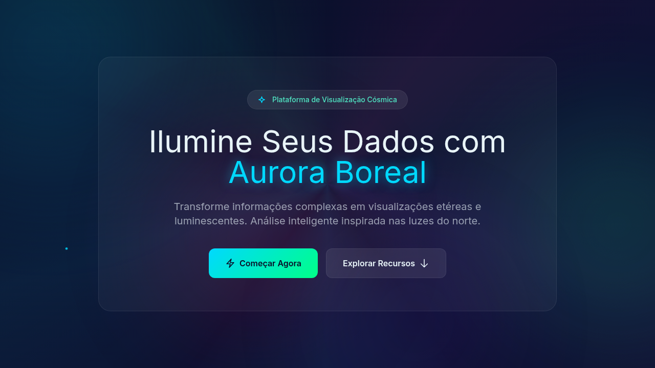
Gradient Aurora Borealis
Gradient Aurora Borealis — Design infographic com aurora borealis gradients, cosmic waves, luminescent light waves. Template e prompt pronto para IA.
Uso: Landing pages, Websites modernas
Contexto Histórico
Estilo Gradient Aurora Borealis representa uma tendência moderna em design UI/UX web com foco em infographic.
Especificações Técnicas
Cores
Primárias
Secundárias
Efeitos
Multicolor luminescent lighting, magical glow, aurora wave animations (flowing gradients), cosmic particle effects, ethereal fade transitions, light wave pulses
Light/Dark
✗ No / ✓ Full
CSS
background: #0A0E27, conic-gradient or radial-gradient for aurora, animation: aurora-flow (background-position shift), filter: blur for glow, mix-blend-mode: screen, cosmic particle canvas, text-shadow: glow
Variáveis
--deep-space: #0A0E27, --aurora-cyan: #00D9FF, --aurora-green: #00FF88, --aurora-pink: #FF006E, --aurora-purple: #7928CA, --flow-duration: 12s
Checklist
☐ Aurora gradients flowing, ☐ Deep space background, ☐ Luminescent effects, ☐ Cosmic particles, ☐ Text readable, ☐ Magical ethereal feel
DESIGN.md
Design System: Gradient Aurora Borealis
1. Visual Theme & Atmosphere
Gradient Aurora Borealis — Design infographic com aurora borealis gradients, cosmic waves, luminescent light waves. Template e prompt pronto para IA. Estilo Gradient Aurora Borealis representa uma tendência moderna em design UI/UX web com foco em infographic.
- Density: 5/10 — Balanced
- Variance: 4/10 — Moderate
- Motion: 8/10 — Cinematic
2. Color Palette & Roles
- Deep Space (#0A0E27) — Primary surface or dominant color
- Light Cyan Text (#E8F4F8) — Primary text color
- Bright Cyan (#00D9FF) — Accent highlight, links and focus states
- Mint Green (#00FF88) — Supporting palette color
- Hot Pink (#FF006E) — Primary text color
- Sky Cyan (#00C9FF) — Secondary accent
- Purple (#7928CA) — Accent color, emphasis elements
- Teal (#50E3C2) — Secondary accent
3. Typography Rules
- Display / Hero: System UI stack (-apple-system, sans-serif) — Weight 700, tight tracking, used for headline impact
- Body: System UI stack (-apple-system, sans-serif) — Weight 400, 16px/1.6 line-height, max 72ch per line
- UI Labels / Captions: System UI stack (-apple-system, sans-serif) — 0.875rem, weight 500, slight letter-spacing
- Monospace: JetBrains Mono — Used for code, metadata, and technical values
Scale:
- Hero: clamp(2.5rem, 5vw, 4rem)
- H1: 2.25rem
- H2: 1.5rem
- Body: 1rem / 1.6
- Small: 0.875rem
4. Component Stylings
- Primary Button: Subtly rounded (0.5rem) shape. Accent color fill. Hover: 8% darken + subtle lift shadow. Active: -1px translate tactile press. Font weight 600. No outer glows.
- Secondary / Ghost Button: Outline variant. 1.5px border in muted color. Text in primary color. Hover: subtle background fill.
- Cards: Subtly rounded (0.5rem) corners. Surface background. Subtle shadow (0 2px 12px rgba(0,0,0,0.06)). 1px border stroke.
- Inputs: Label above input. 1px border stroke. Focus ring: 2px accent color offset 2px. Error text below in semantic red. No floating labels.
- Navigation: Primary surface background. Active item: accent color indicator. Font weight 500 when active.
- Skeletons: Shimmer animation matching component dimensions. No circular spinners.
- Empty States: Icon-based composition with descriptive text and action button.
5. Layout Principles
- Grid: CSS Grid primary. Max-width containment: 1280px centered with 1.5rem side padding.
- Spacing rhythm: Balanced. Base unit: 0.5rem (8px).
- Section vertical gaps: clamp(4rem, 8vw, 8rem).
- Hero layout: Split-screen (text left, visual right).
- Feature sections: Zig-zag alternating text+image rows. No 3-equal-columns.
- Mobile collapse: All multi-column layouts collapse below 768px. No horizontal overflow.
- z-index contract: base (0) / sticky-nav (100) / overlay (200) / modal (300) / toast (500).
6. Motion & Interaction
- Physics: Spring — stiffness 120, damping 20. Confident, weighted transitions.
- Entry animations: Fade + translate-Y (16px → 0) over 540ms ease-out. Staggered cascades for lists: 120ms between items.
- Hover states: Scale(1.03) + shadow lift over 200ms.
- Page transitions: Fade + slide (300ms).
- Performance: Only transform and opacity animated. No layout-triggering properties.
7. Anti-Patterns (Banned)
- No emojis in UI — use icon system only (Lucide, Heroicons)
- No pure black (#000000) — use off-black or charcoal variants
- No oversaturated accent colors (saturation cap: 80%)
- No 3-column equal-width feature layouts — use zig-zag or asymmetric grid
- No
h-screen— usemin-h-[100dvh] - No AI copywriting clichés: "Elevate", "Seamless", "Unleash", "Next-Gen"
- No broken external image links — use picsum.photos or inline SVG
- No generic lorem ipsum in demos
Prompt para AI
Design a gradient aurora borealis infographic. Use: aurora-inspired flowing gradients, cosmic wave patterns, luminescent light effects, deep space background (#0A0E27), multicolor gradient transitions (cyan, green, pink, purple), ethereal transparency, magical shimmer.
Relacionados
Última sincronização: 01/04/2026