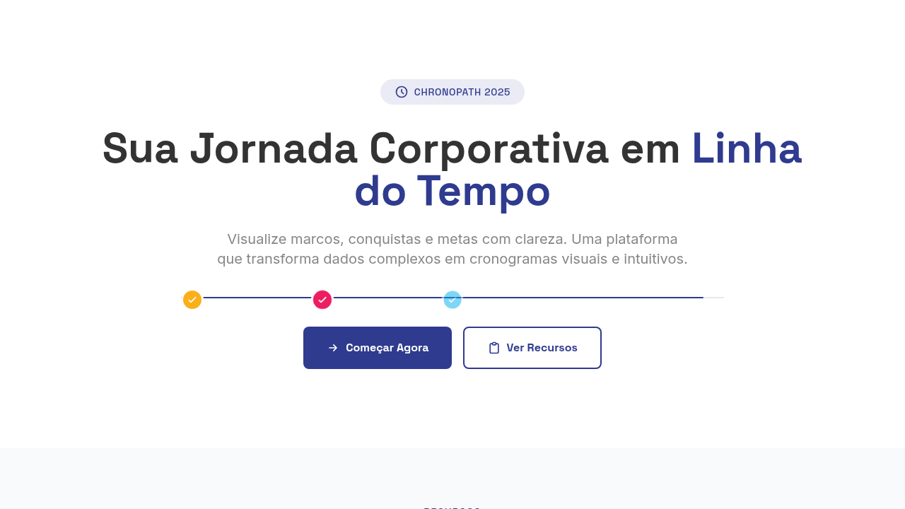
Timeline Horizontal Corporativo
Timeline Horizontal Corporativo — Design infographic com horizontal timeline, flat vector iconography, geometric data modules. Template e prompt pronto para IA.
Uso: Landing pages, Websites modernas
Contexto Histórico
Estilo Timeline Horizontal Corporativo representa uma tendência moderna em design UI/UX web com foco em infographic.
Especificações Técnicas
Cores
Primárias
Secundárias
Efeitos
Flat 2D illumination, no shadows/gradients, milestone pop-in animations, timeline draw animation, module slide-in, color-coded category reveals
Light/Dark
✓ Full / ✓ Full
CSS
display: flex for horizontal, SVG line for timeline, circle markers, rounded-rect labels, color-coded sections, font: geometric sans-serif bold, uppercase labels, sentence case descriptions
Variáveis
--bg-white: #FFFFFF, --navy: #2E3B8F, --amber: #FBAF18, --pink: #EC1C5F, --timeline-height: 2px, --milestone-size: 32px
Checklist
☐ Timeline horizontal, ☐ Milestones marked, ☐ Color-coded sections, ☐ Flat vector icons, ☐ Responsive scroll, ☐ Corporate aesthetic
DESIGN.md
Design System: Timeline Horizontal Corporativo
1. Visual Theme & Atmosphere
Timeline Horizontal Corporativo — Design infographic com horizontal timeline, flat vector iconography, geometric data modules. Template e prompt pronto para IA. Estilo Timeline Horizontal Corporativo representa uma tendência moderna em design UI/UX web com foco em infographic.
- Density: 5/10 — Balanced
- Variance: 2/10 — Structured
- Motion: 6/10 — Expressive
2. Color Palette & Roles
- White (#FFFFFF) — Light surface, card backgrounds
- Dark Text (#333333) — Dark surface, primary background
- Navy (#2E3B8F) — Supporting palette color
- Amber (#FBAF18) — Warning states, attention indicators
- Pink (#EC1C5F) — Primary text color
- Cyan (#00AEEF) — Secondary accent
- Purple (#6556DF) — Accent color, emphasis elements
3. Typography Rules
- Display / Hero: System UI stack (-apple-system, sans-serif) — Weight 700, tight tracking, used for headline impact
- Body: System UI stack (-apple-system, sans-serif) — Weight 400, 16px/1.6 line-height, max 72ch per line
- UI Labels / Captions: System UI stack (-apple-system, sans-serif) — 0.875rem, weight 500, slight letter-spacing
- Monospace: JetBrains Mono — Used for code, metadata, and technical values
Scale:
- Hero: clamp(2.5rem, 5vw, 4rem)
- H1: 2.25rem
- H2: 1.5rem
- Body: 1rem / 1.6
- Small: 0.875rem
4. Component Stylings
- Primary Button: Moderately rounded (0.75rem) shape. Accent color fill. Hover: 8% darken + subtle lift shadow. Active: -1px translate tactile press. Font weight 600. No outer glows.
- Secondary / Ghost Button: Outline variant. 1.5px border in muted color. Text in primary color. Hover: subtle background fill.
- Cards: Moderately rounded (0.75rem) corners. Surface background. Subtle shadow (0 2px 12px rgba(0,0,0,0.06)). 1px border stroke.
- Inputs: Label above input. 1px border stroke. Focus ring: 2px accent color offset 2px. Error text below in semantic red. No floating labels.
- Navigation: Primary surface background. Active item: accent color indicator. Font weight 500 when active.
- Skeletons: Shimmer animation matching component dimensions. No circular spinners.
- Empty States: Icon-based composition with descriptive text and action button.
5. Layout Principles
- Grid: CSS Grid primary. Max-width containment: 1280px centered with 1.5rem side padding.
- Spacing rhythm: Balanced. Base unit: 0.5rem (8px).
- Section vertical gaps: clamp(4rem, 8vw, 8rem).
- Hero layout: Split-screen (text left, visual right).
- Feature sections: Zig-zag alternating text+image rows. No 3-equal-columns.
- Mobile collapse: All multi-column layouts collapse below 768px. No horizontal overflow.
- z-index contract: base (0) / sticky-nav (100) / overlay (200) / modal (300) / toast (500).
6. Motion & Interaction
- Physics: Spring — stiffness 120, damping 20. Confident, weighted transitions.
- Entry animations: Fade + translate-Y (16px → 0) over 480ms ease-out. Staggered cascades for lists: 100ms between items.
- Hover states: Scale(1.03) + shadow lift over 200ms.
- Page transitions: Fade + slide (300ms).
- Performance: Only transform and opacity animated. No layout-triggering properties.
7. Anti-Patterns (Banned)
- No emojis in UI — use icon system only (Lucide, Heroicons)
- No pure black (#000000) — use off-black or charcoal variants
- No oversaturated accent colors (saturation cap: 80%)
- No 3-column equal-width feature layouts — use zig-zag or asymmetric grid
- No
h-screen— usemin-h-[100dvh] - No AI copywriting clichés: "Elevate", "Seamless", "Unleash", "Next-Gen"
- No broken external image links — use picsum.photos or inline SVG
- No generic lorem ipsum in demos
Prompt para AI
Design a horizontal corporate timeline. Use: flat vector iconography, horizontal timeline structure, geometric data modules, color-coded categorization, circular milestone markers, thin solid connectors, rounded rectangle labels, hierarchical grid system.
Relacionados
Última sincronização: 01/04/2026