Chalkboard
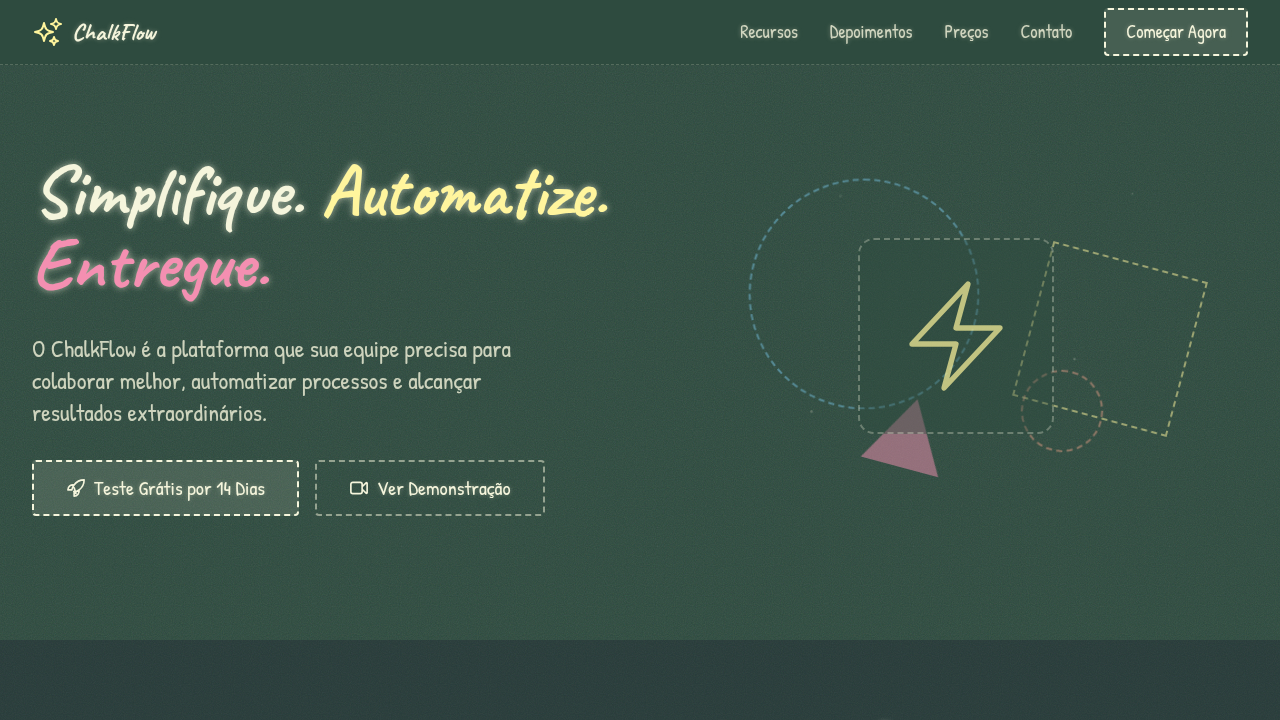
Estilo lousa/quadro-negro com texto em giz, bordas desenhadas à mão e textura granulada. Perfeito para educação, tutoriais e projetos nostálgicos.
Uso: Educação, Tutoriais, Restaurantes, Projetos nostálgicos, Menus criativos
Contexto Histórico
O quadro-negro é símbolo universal de educação desde o século XIX. O estilo digital recria a nostalgia da sala de aula com texturas de giz e tipografia manuscrita.
Especificações Técnicas
Cores
Primárias
Secundárias
Efeitos
Chalk-like text rendering with text-shadow glow, rough/grainy background texture via CSS noise, hand-drawn border style (dashed/irregular), subtle dust particle animation, sketch-style illustrations via SVG filters
Light/Dark
✗ No / ✓ Only
CSS
background: dark green/slate with CSS noise texture overlay, color: #F5F5DC chalk white, text-shadow: 0 0 3px rgba(255,255,255,0.3) for chalk glow, border: 2px dashed for hand-drawn feel, font-family: cursive or handwriting fonts, filter: url(#chalk-texture) SVG filter
Variáveis
--bg-chalkboard: #2D4A3E, --chalk-white: #F5F5DC, --chalk-glow: 0 0 3px rgba(255,255,255,0.3), --border-style: 2px dashed, --font-chalk: 'Caveat' or cursive, --texture-opacity: 0.15
Checklist
☐ Dark chalkboard background, ☐ Chalk-like white text with glow, ☐ Hand-drawn dashed borders, ☐ Grainy texture overlay, ☐ Pastel chalk accent colors, ☐ Handwriting-style typography
DESIGN.md
Design System: Chalkboard
1. Visual Theme & Atmosphere
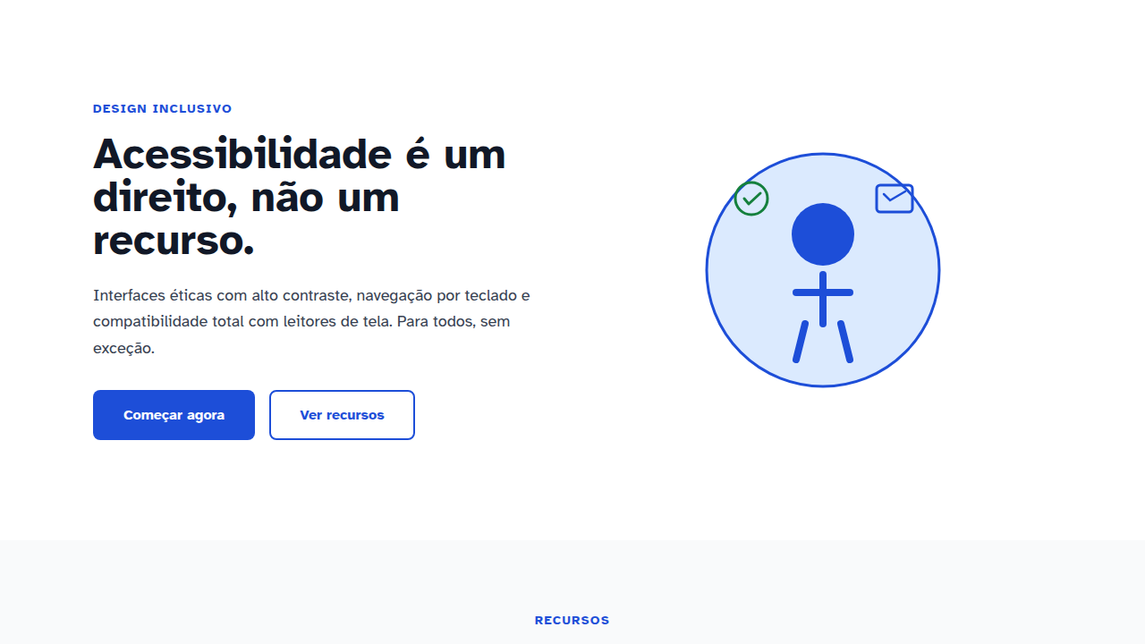
Estilo lousa/quadro-negro com texto em giz, bordas desenhadas à mão e textura granulada. Perfeito para educação, tutoriais e projetos nostálgicos. O quadro-negro é símbolo universal de educação desde o século XIX. O estilo digital recria a nostalgia da sala de aula com texturas de giz e tipografia manuscrita.
- Density: 5/10 — Balanced
- Variance: 8/10 — Expressive
- Motion: 8/10 — Cinematic
2. Color Palette & Roles
- Chalkboard Green (#2D4A3E) — Primary surface or dominant color
- Deep Slate (#1A1A2E) — Secondary surface or text color
- Chalk White (#F5F5DC) — Light surface, card backgrounds
- Pastel Chalk Yellow (#FFF59D) — Warning states, attention indicators
- Chalk Pink (#F48FB1) — Primary text color
- Chalk Blue (#81D4FA) — Secondary accent
- Chalk Orange (#FFAB91) — Warm accent, call-to-action secondary
3. Typography Rules
- Display / Hero: Caveat — Weight 700, tight tracking, used for headline impact
- Accent: cursive or handwriting fonts — Used for decorative or emphasis text
- Body: Caveat — Weight 400, 16px/1.6 line-height, max 72ch per line
- UI Labels / Captions: Caveat — 0.875rem, weight 500, slight letter-spacing
- Monospace: JetBrains Mono — Used for code, metadata, and technical values
Scale:
- Hero: clamp(2.5rem, 5vw, 4rem)
- H1: 2.25rem
- H2: 1.5rem
- Body: 1rem / 1.6
- Small: 0.875rem
4. Component Stylings
- Primary Button: Subtly rounded (0.5rem) shape. Accent color fill. Hover: 8% darken + subtle lift shadow. Active: -1px translate tactile press. Font weight 600. No outer glows.
- Secondary / Ghost Button: Outline variant. 1.5px border in muted color. Text in primary color. Hover: subtle background fill.
- Cards: Subtly rounded (0.5rem) corners. Surface background. Subtle shadow (0 2px 12px rgba(0,0,0,0.06)). 1px border stroke.
- Inputs: Label above input. 1px border stroke. Focus ring: 2px accent color offset 2px. Error text below in semantic red. No floating labels.
- Navigation: Primary surface background. Active item: accent color indicator. Font weight 500 when active.
- Skeletons: Shimmer animation matching component dimensions. No circular spinners.
- Empty States: Icon-based composition with descriptive text and action button.
5. Layout Principles
- Grid: CSS Grid primary. Max-width containment: 1280px centered with 1.5rem side padding.
- Spacing rhythm: Balanced. Base unit: 0.5rem (8px).
- Section vertical gaps: clamp(4rem, 8vw, 8rem).
- Hero layout: Asymmetric composition.
- Feature sections: Asymmetric grid with varied card sizes. No 3-equal-columns.
- Mobile collapse: All multi-column layouts collapse below 768px. No horizontal overflow.
- z-index contract: base (0) / sticky-nav (100) / overlay (200) / modal (300) / toast (500).
6. Motion & Interaction
- Physics: Spring — stiffness 120, damping 20. Confident, weighted transitions.
- Entry animations: Fade + translate-Y (16px → 0) over 540ms ease-out. Staggered cascades for lists: 120ms between items.
- Hover states: Scale(1.03) + shadow lift over 200ms.
- Page transitions: Fade + slide (300ms).
- Performance: Only transform and opacity animated. No layout-triggering properties.
7. Anti-Patterns (Banned)
- No emojis in UI — use icon system only (Lucide, Heroicons)
- No pure white (#FFFFFF) backgrounds — use off-white or dark surfaces
- No oversaturated accent colors (saturation cap: 80%)
- No 3-column equal-width feature layouts — use zig-zag or asymmetric grid
- No
h-screen— usemin-h-[100dvh] - No AI copywriting clichés: "Elevate", "Seamless", "Unleash", "Next-Gen"
- No broken external image links — use picsum.photos or inline SVG
- No generic lorem ipsum in demos
Prompt para AI
Design a chalkboard-style landing page. Dark green or slate background with chalk-like white text. Use hand-drawn aesthetic with rough edges, dashed borders, and sketch-style icons. Add subtle chalk dust texture overlay. Typography should look hand-written. Pastel chalk colors for accents. Include eraser smudge effects and chalk line decorations.
Relacionados
Última sincronização: 01/04/2026