Accessible & Ethical
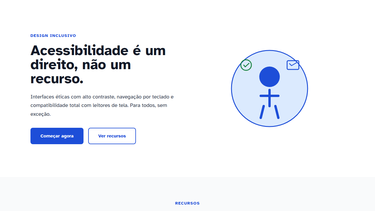
Design WCAG AAA, alto contraste 7:1, navegação teclado, screen reader. Inclusivo e ético. Prompt validado para acessibilidade.
Uso: Governo, Healthcare, Educação, Qualquer site inclusivo
Contexto Histórico
WCAG 1.0 (1999), evoluindo para AAA (2023). Meta: inclusão universal. Screen readers, keyboard nav, alt text, contraste 7:1+.
Especificações Técnicas
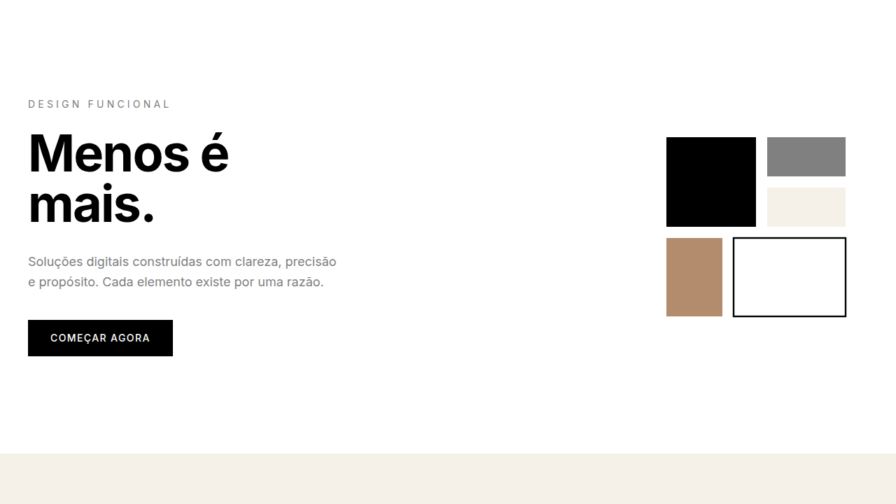
Cores
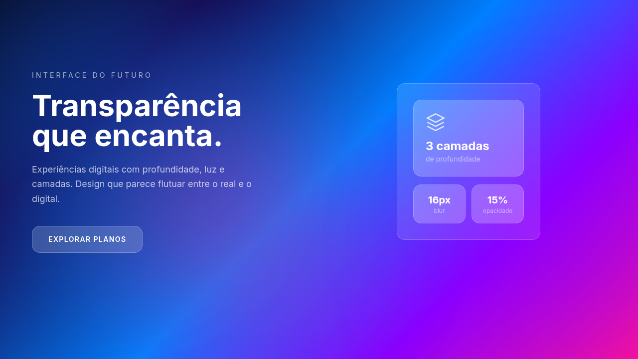
Efeitos
Clear focus rings (3-4px), ARIA labels, skip links, responsive design, reduced motion, 44x44px touch targets
Light/Dark
✓ Full / ✓ Full
CSS
color-contrast: 7:1+, font-size: 16px+, outline: 3-4px on :focus-visible, aria-label, role attributes, @media (prefers-reduced-motion), touch-target: 44x44px, cursor: pointer
Variáveis
--contrast-ratio: 7:1, --font-size-min: 16px, --focus-ring: 3-4px, --touch-target: 44x44px, --wcag-level: AAA, --keyboard-accessible: true, --sr-tested: true
Checklist
☐ WCAG AAA verified, ☐ 7:1+ contrast checked, ☐ Keyboard navigation tested, ☐ Screen reader tested, ☐ Focus visible 3-4px, ☐ Semantic HTML used, ☐ Touch targets 44x44px
DESIGN.md
Design System: Accessible & Ethical
1. Visual Theme & Atmosphere
Design WCAG AAA, alto contraste 7:1, navegação teclado, screen reader. Inclusivo e ético. Prompt validado para acessibilidade. WCAG 1.0 (1999), evoluindo para AAA (2023). Meta: inclusão universal. Screen readers, keyboard nav, alt text, contraste 7:1+.
- Density: 5/10 — Balanced
- Variance: 4/10 — Moderate
- Motion: 6/10 — Expressive
2. Color Palette & Roles
- Palette derived from style keywords and era context
3. Typography Rules
- Display / Hero: System UI stack (-apple-system, sans-serif) — Weight 700, tight tracking, used for headline impact
- Body: System UI stack (-apple-system, sans-serif) — Weight 400, 16px/1.6 line-height, max 72ch per line
- UI Labels / Captions: System UI stack (-apple-system, sans-serif) — 0.875rem, weight 500, slight letter-spacing
- Monospace: JetBrains Mono — Used for code, metadata, and technical values
Scale:
- Hero: clamp(2.5rem, 5vw, 4rem)
- H1: 2.25rem
- H2: 1.5rem
- Body: 1rem / 1.6
- Small: 0.875rem
4. Component Stylings
- Primary Button: Subtly rounded (0.5rem) shape. Accent color fill. Hover: 8% darken + subtle lift shadow. Active: -1px translate tactile press. Font weight 600. No outer glows.
- Secondary / Ghost Button: Outline variant. 1.5px border in muted color. Text in primary color. Hover: subtle background fill.
- Cards: Subtly rounded (0.5rem) corners. Surface background. Subtle shadow (0 2px 12px rgba(0,0,0,0.06)). 1px border stroke.
- Inputs: Label above input. 1px border stroke. Focus ring: 2px accent color offset 2px. Error text below in semantic red. No floating labels.
- Navigation: Primary surface background. Active item: accent color indicator. Font weight 500 when active.
- Skeletons: Shimmer animation matching component dimensions. No circular spinners.
- Empty States: Icon-based composition with descriptive text and action button.
5. Layout Principles
- Grid: CSS Grid primary. Max-width containment: 1280px centered with 1.5rem side padding.
- Spacing rhythm: Balanced. Base unit: 0.5rem (8px).
- Section vertical gaps: clamp(4rem, 8vw, 8rem).
- Hero layout: Split-screen (text left, visual right).
- Feature sections: Zig-zag alternating text+image rows. No 3-equal-columns.
- Mobile collapse: All multi-column layouts collapse below 768px. No horizontal overflow.
- z-index contract: base (0) / sticky-nav (100) / overlay (200) / modal (300) / toast (500).
6. Motion & Interaction
- Physics: Spring — stiffness 120, damping 20. Confident, weighted transitions.
- Entry animations: Fade + translate-Y (16px → 0) over 480ms ease-out. Staggered cascades for lists: 100ms between items.
- Hover states: Scale(1.03) + shadow lift over 200ms.
- Page transitions: Fade + slide (300ms).
- Performance: Only transform and opacity animated. No layout-triggering properties.
7. Anti-Patterns (Banned)
- No emojis in UI — use icon system only (Lucide, Heroicons)
- No pure black (#000000) — use off-black or charcoal variants
- No oversaturated accent colors (saturation cap: 80%)
- No 3-column equal-width feature layouts — use zig-zag or asymmetric grid
- No
h-screen— usemin-h-[100dvh] - No AI copywriting clichés: "Elevate", "Seamless", "Unleash", "Next-Gen"
- No broken external image links — use picsum.photos or inline SVG
- No generic lorem ipsum in demos
Prompt para AI
Design with WCAG AAA compliance. Include: high contrast (7:1+), large text (16px+), keyboard navigation, screen reader compatibility, focus states visible (3-4px ring), semantic HTML, ARIA labels, skip links, reduced motion support (prefers-reduced-motion), 44x44px touch targets.
Relacionados
Última sincronização: 01/04/2026