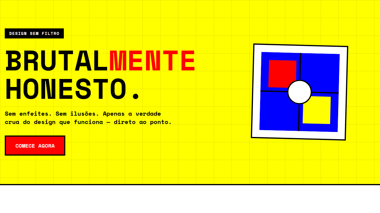
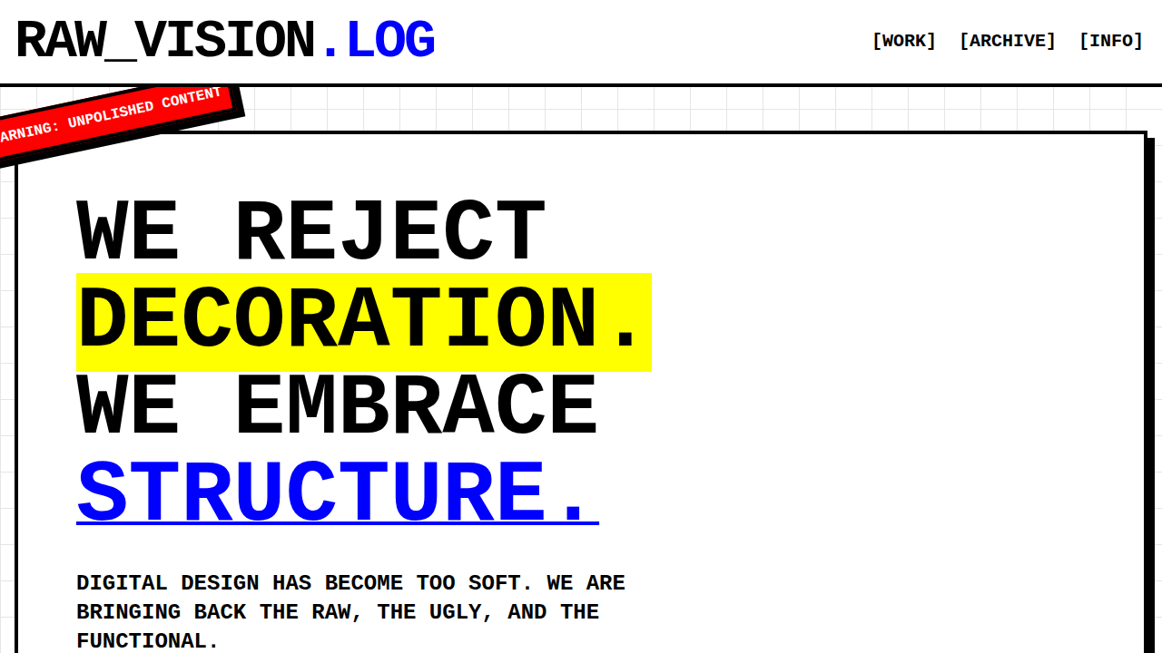
Brutalism
Design raw, alto contraste, cores primárias e zero suavidade. Para projetos antidesign e portfolio criativo. Prompt estruturado pronto.
Uso: Portfolio criativo, Agência de design, Blog experimental, Arte digital
Contexto Histórico
Raízes na arquitetura brutalista dos anos 1950 (brutus = bruto). Web Brutalism rejeita ornamentação, celebrando crua funcionalidade e anti-design.
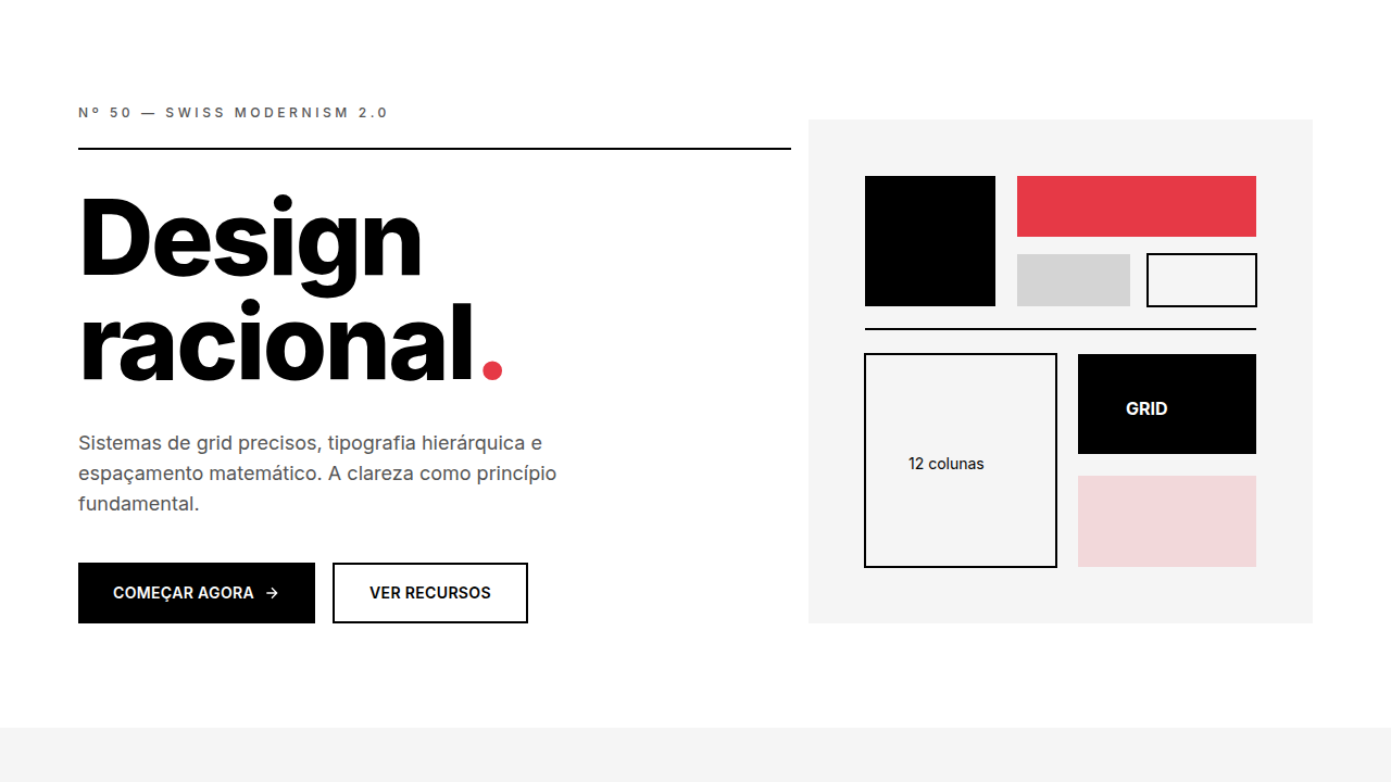
Especificações Técnicas
Cores
Primárias
Secundárias
Efeitos
No smooth transitions (instant), sharp corners (0px), bold typography (700+), visible grid, large blocks
Light/Dark
✓ Full / ✓ Full
CSS
border-radius: 0px, transition: none or 0s, font-family: system-ui or monospace, font-weight: 700+, border: visible 2-4px, colors: #FF0000, #0000FF, #FFFF00, #000000, #FFFFFF
Variáveis
--border-radius: 0px, --transition-duration: 0s, --font-weight: 700-900, --colors: primary only, --border-style: visible, --grid-visible: true
Checklist
☐ No border-radius (0px), ☐ No transitions (instant), ☐ Bold typography (700+), ☐ Pure primary colors used, ☐ Visible grid/borders, ☐ Asymmetric layout intentional
DESIGN.md
Design System: Brutalism
1. Visual Theme & Atmosphere
Design raw, alto contraste, cores primárias e zero suavidade. Para projetos antidesign e portfolio criativo. Prompt estruturado pronto. Raízes na arquitetura brutalista dos anos 1950 (brutus = bruto). Web Brutalism rejeita ornamentação, celebrando crua funcionalidade e anti-design.
- Density: 5/10 — Balanced
- Variance: 7/10 — Dynamic
- Motion: 4/10 — Subtle
2. Color Palette & Roles
- Red (#FF0000) — Error states, destructive actions
- Blue (#0000FF) — Accent highlight, links and focus states
- Yellow (#FFFF00) — Warning states, attention indicators
- Black (#000000) — Dark surface, primary background
- White (#FFFFFF) — Light surface, card backgrounds
- Neon Green (#00FF00) — Success states, positive indicators
- Hot Pink (#FF00FF) — Primary text color
3. Typography Rules
- Display / Hero: system-ui or monospace — Weight 700, tight tracking, used for headline impact
- Body: system-ui or monospace — Weight 400, 16px/1.6 line-height, max 72ch per line
- UI Labels / Captions: system-ui or monospace — 0.875rem, weight 500, slight letter-spacing
- Monospace: system-ui or monospace — Used for code, metadata, and technical values
Scale:
- Hero: clamp(2.5rem, 5vw, 4rem)
- H1: 2.25rem
- H2: 1.5rem
- Body: 1rem / 1.6
- Small: 0.875rem
4. Component Stylings
- Primary Button: Sharp edges (0px) shape. Accent color fill. Hover: 8% darken + subtle lift shadow. Active: -1px translate tactile press. Font weight 600. No outer glows.
- Secondary / Ghost Button: Outline variant. 1.5px border in muted color. Text in primary color. Hover: subtle background fill.
- Cards: Sharp edges (0px) corners. Surface background. Subtle shadow (0 2px 12px rgba(0,0,0,0.06)). 1px border stroke.
- Inputs: Label above input. 1px border stroke. Focus ring: 2px accent color offset 2px. Error text below in semantic red. No floating labels.
- Navigation: Primary surface background. Active item: accent color indicator. Font weight 500 when active.
- Skeletons: Shimmer animation matching component dimensions. No circular spinners.
- Empty States: Icon-based composition with descriptive text and action button.
5. Layout Principles
- Grid: CSS Grid primary. Max-width containment: 1280px centered with 1.5rem side padding.
- Spacing rhythm: Balanced. Base unit: 0.5rem (8px).
- Section vertical gaps: clamp(4rem, 8vw, 8rem).
- Hero layout: Asymmetric composition.
- Feature sections: Asymmetric grid with varied card sizes. No 3-equal-columns.
- Mobile collapse: All multi-column layouts collapse below 768px. No horizontal overflow.
- z-index contract: base (0) / sticky-nav (100) / overlay (200) / modal (300) / toast (500).
6. Motion & Interaction
- Physics: Ease-out curves, 200-300ms duration. Smooth and predictable.
- Entry animations: Fade + translate-Y (16px → 0) over 420ms ease-out. Staggered cascades for lists: 80ms between items.
- Hover states: Subtle color shift + shadow adjustment over 200ms.
- Page transitions: Fade only (200ms).
- Performance: Only transform and opacity animated. No layout-triggering properties.
7. Anti-Patterns (Banned)
- No emojis in UI — use icon system only (Lucide, Heroicons)
- No pure black (#000000) — use off-black or charcoal variants
- No oversaturated accent colors (saturation cap: 80%)
- No 3-column equal-width feature layouts — use zig-zag or asymmetric grid
- No
h-screen— usemin-h-[100dvh] - No AI copywriting clichés: "Elevate", "Seamless", "Unleash", "Next-Gen"
- No broken external image links — use picsum.photos or inline SVG
- No generic lorem ipsum in demos
Prompt para AI
Create a brutalist design with raw, unpolished, stark aesthetic. Use pure primary colors (red, blue, yellow), black & white, no smooth transitions (instant), sharp corners, bold large typography, visible grid lines, default system fonts, intentional 'broken' design elements.
Relacionados
Última sincronização: 01/04/2026