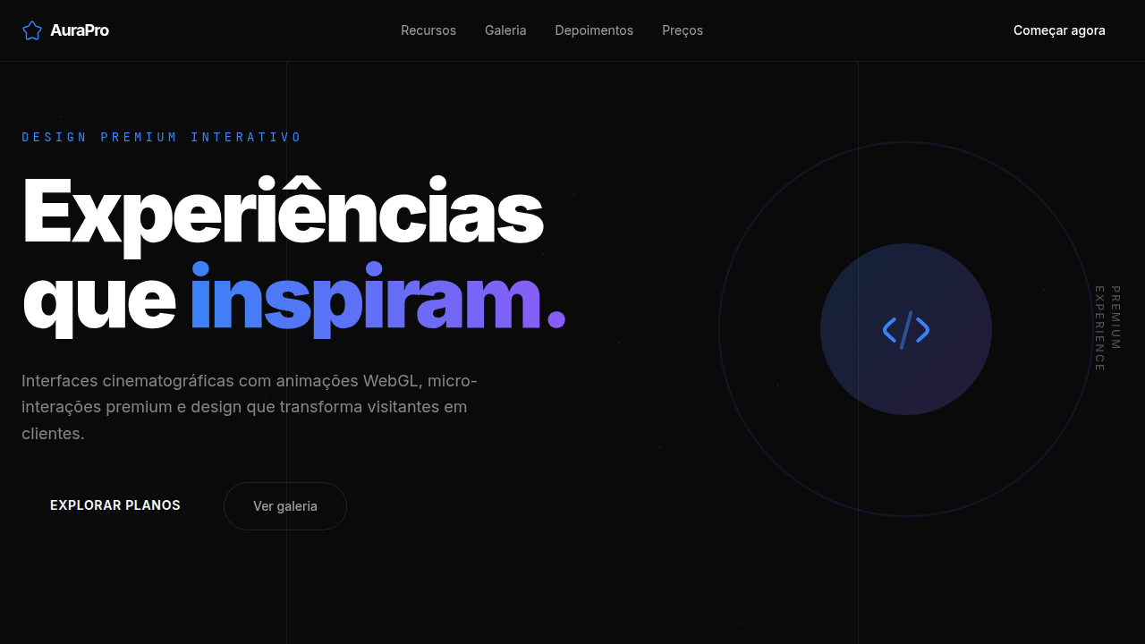
Aura Premium WebGL & Iconify
Design premium dark com WebGL animations, Iconify icons, border beam, sonar effects e flashlight hover. Ideal para portfolios de luxo, arquitetura e marcas premium. Prompt pronto para IA.
Uso: Portfolios de luxo, Estúdios de arquitetura, Marcas premium, Móveis de alto padrão, Wellness premium, Agências criativas
Contexto Histórico
Inspirado nos templates Aura.build (luxury-furniture, architecture-studio, nexus-architecture, plant-based-wellness), este estilo combina WebGL animations avançadas com Iconify icon system, border beam effects e micro-interações premium. Representa o pico do design interativo web em 2025-2026, onde cada elemento tem propósito animado e a experiência é cinematográfica.
Especificações Técnicas
Cores
Primárias
Secundárias
Efeitos
WebGL 4-column clip slide down para imagens, border beam animation 1px em botões pill-shaped no hover, vertical text clip slide down letter by letter, sonar animation em elementos decorativos, flashlight effect sutil no hover/posição do mouse em background e border dos cards, marquee infinito com alpha mask, motion blur em scroll staggered, container-size lines verticais, numeração 01 02 03 em detalhes de seção.
Light/Dark
✗ No / ✓ Full
CSS
background: #0A0A0A, color: #FFFFFF, font-family: 'Inter, system-ui, sans-serif', iconify-icon { font-size: 24px }, .border-beam { animation: beam-rotate 3s linear infinite; border: 1px solid transparent; background-clip: padding-box; position: relative }, .border-beam::after { content: ''; position: absolute; inset: -1px; border-radius: inherit; background: conic-gradient(from var(--angle), transparent 70%, #3B82F6, #8B5CF6, transparent 100%); animation: rotate 3s linear infinite; z-index: -1 }, .sonar { animation: sonar-pulse 2s ease-out infinite }, @keyframes sonar-pulse { 0% { transform: scale(1); opacity: 0.8 } 100% { transform: scale(2.5); opacity: 0 } }, .flashlight-card { background: radial-gradient(circle at var(--mouse-x) var(--mouse-y), rgba(59,130,246,0.15), transparent 50%) }, .marquee { animation: marquee-scroll 30s linear infinite; mask-image: linear-gradient(to right, transparent, black 10%, black 90%, transparent) }, .vertical-text { writing-mode: vertical-rl; animation: clip-slide-down 1.5s ease forwards }, .section-number { font-size: 5rem; font-weight: 800; opacity: 0.08; position: absolute; top: 0; left: 2rem }, canvas { position: fixed; top: 0; left: 0; z-index: -1 }
Variáveis
--bg-primary: #0A0A0A, --bg-secondary: #1A1A2E, --text-primary: #FFFFFF, --text-muted: rgba(255,255,255,0.6), --accent-blue: #3B82F6, --accent-violet: #8B5CF6, --accent-amber: #F59E0B, --accent-emerald: #10B981, --accent-pink: #EC4899, --border-radius-pill: 9999px, --border-radius-card: 16px, --beam-speed: 3s, --sonar-speed: 2s, --marquee-speed: 30s, --flashlight-size: 50%, --icon-size: 24px, --logo-icon-size: 64px, --section-number-size: 5rem, --font-primary: 'Inter, system-ui, sans-serif', --font-mono: 'JetBrains Mono, monospace', --tracking-tighter: -0.05em, --container-line-color: rgba(255,255,255,0.06)
Checklist
☐ Iconify Solar Duotone Bold icons carregados via CDN, ☐ <iconify-icon> tag usada (não SVG inline), ☐ Logo com Solar Linear + lettermark tracking-tighter, ☐ Simple Icons para logos de empresas 64x64, ☐ Fotos reais de headshot nos testimonials, ☐ Linhas verticais container-size decorativas, ☐ Numeração 01 02 03 nas seções, ☐ Border beam 1px animado em botões pill hover, ☐ Vertical text clip slide down letter by letter, ☐ Sonar animation em decorações, ☐ Flashlight hover effect nos cards (background + border), ☐ Marquee infinito com alpha mask, ☐ WebGL canvas para animações de imagem, ☐ 4-column clip staggered scroll com motion blur, ☐ Dark mode consistente, ☐ Responsivo mobile/tablet/desktop
DESIGN.md
Design System: Aura Premium WebGL & Iconify
1. Visual Theme & Atmosphere
Design premium dark com WebGL animations, Iconify icons, border beam, sonar effects e flashlight hover. Ideal para portfolios de luxo, arquitetura e marcas premium. Prompt pronto para IA. Inspirado nos templates Aura.build (luxury-furniture, architecture-studio, nexus-architecture, plant-based-wellness), este estilo combina WebGL animations avançadas com Iconify icon system, border beam effects e micro-interações premium. Representa o pico do design interativo web em 2025-2026, onde cada elemento tem propósito animado e a experiência é cinematográfica.
- Density: 5/10 — Balanced
- Variance: 4/10 — Moderate
- Motion: 6/10 — Expressive
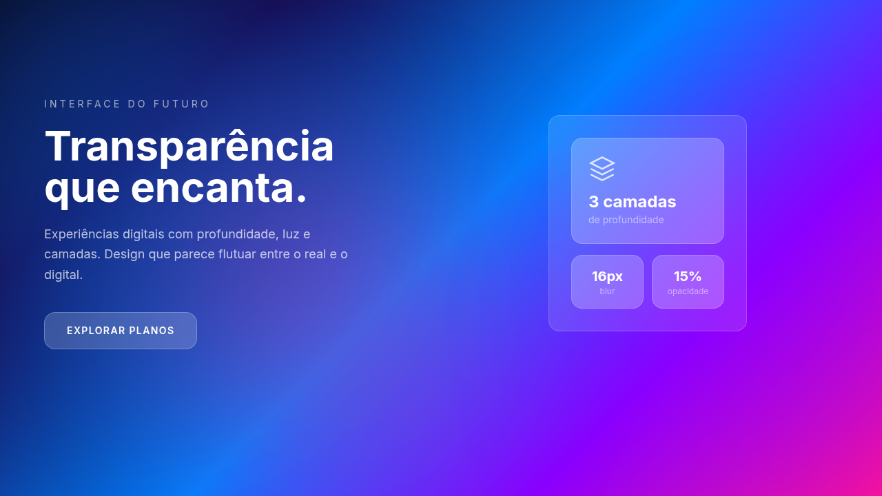
2. Color Palette & Roles
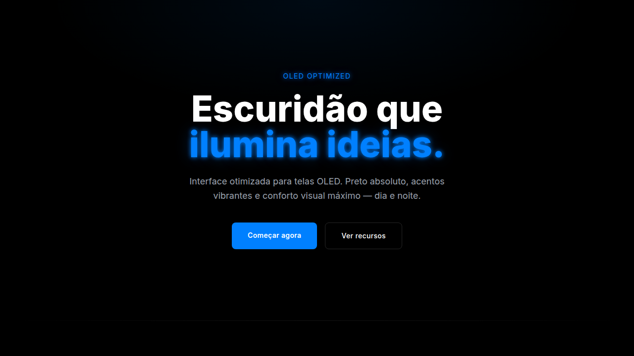
- Preto Profundo (#0A0A0A) — Primary background surface
- Branco Puro (#FFFFFF) — Light surface, card backgrounds
- Cinza Escuro (#1A1A2E) — Dark surface, primary background
- Azul Elétrico (#3B82F6) — Secondary accent
- Violeta Neon (#8B5CF6) — Accent color, emphasis elements
- Âmbar Quente (#F59E0B) — Extended palette, decorative use
- Esmeralda (#10B981) — Extended palette, decorative use
- Rosa Vibrante (#EC4899) — Decorative accent, highlight elements
3. Typography Rules
- Display / Hero: Inter — Weight 700, tight tracking, used for headline impact
- Body: Inter — Weight 400, 16px/1.6 line-height, max 72ch per line
- UI Labels / Captions: Inter — 0.875rem, weight 500, slight letter-spacing
- Monospace: JetBrains Mono — Used for code, metadata, and technical values
Scale:
- Hero: clamp(2.5rem, 5vw, 4rem)
- H1: 2.25rem
- H2: 1.5rem
- Body: 1rem / 1.6
- Small: 0.875rem
4. Component Stylings
- Primary Button: Pill-shaped (9999px) shape. Accent color fill. Hover: 8% darken + subtle lift shadow. Active: -1px translate tactile press. Font weight 600. No outer glows.
- Secondary / Ghost Button: Outline variant. 1.5px border in muted color. Text in primary color. Hover: subtle background fill.
- Cards: Pill-shaped (9999px) corners. Surface background. Subtle shadow (0 2px 12px rgba(0,0,0,0.06)). 1px border stroke.
- Inputs: Label above input. 1px border stroke. Focus ring: 2px accent color offset 2px. Error text below in semantic red. No floating labels.
- Navigation: Primary surface background. Active item: accent color indicator. Font weight 500 when active.
- Skeletons: Shimmer animation matching component dimensions. No circular spinners.
- Empty States: Icon-based composition with descriptive text and action button.
5. Layout Principles
- Grid: CSS Grid primary. Max-width containment: 1280px centered with 1.5rem side padding.
- Spacing rhythm: Balanced. Base unit: 0.5rem (8px).
- Section vertical gaps: clamp(4rem, 8vw, 8rem).
- Hero layout: Split-screen (text left, visual right).
- Feature sections: Zig-zag alternating text+image rows. No 3-equal-columns.
- Mobile collapse: All multi-column layouts collapse below 768px. No horizontal overflow.
- z-index contract: base (0) / sticky-nav (100) / overlay (200) / modal (300) / toast (500).
6. Motion & Interaction
- Physics: Spring — stiffness 120, damping 20. Confident, weighted transitions.
- Entry animations: Fade + translate-Y (16px → 0) over 480ms ease-out. Staggered cascades for lists: 100ms between items.
- Hover states: Scale(1.03) + shadow lift over 200ms.
- Page transitions: Fade + slide (300ms).
- Performance: Only transform and opacity animated. No layout-triggering properties.
7. Anti-Patterns (Banned)
- No emojis in UI — use icon system only (Lucide, Heroicons)
- No pure white (#FFFFFF) backgrounds — use off-white or dark surfaces
- No oversaturated accent colors (saturation cap: 80%)
- No 3-column equal-width feature layouts — use zig-zag or asymmetric grid
- No
h-screen— usemin-h-[100dvh] - No AI copywriting clichés: "Elevate", "Seamless", "Unleash", "Next-Gen"
- No broken external image links — use picsum.photos or inline SVG
- No generic lorem ipsum in demos
Prompt para AI
Design a premium dark-themed landing page with advanced animations and interactions. Use Iconify Solar Duotone Bold icons throughout. For the site logo, use Iconify Solar Linear plus lettermark with tracking-tighter text. Use Iconify Simple Icons for company logos (Nasa, SpaceX, Uber, Visa, Grab, Bose, Discover, DJI, Nikon, Craftsman, Sony) at 64x64 instead of text logos. Use <iconify-icon> instead of full SVG code. For avatars and testimonials, use headshot photos instead of placeholder letters. Add vertical container-size lines as decorative elements. Add 01 02 03 number details on sections. Add a 1px border beam animation around pill-shaped buttons on hover. Add vertical text clip slide down animation letter by letter. Add sonar animation and decorations. Add a subtle flashlight effect on hover/mouse position to both background and border of cards. Animate marquee in infinite loop with alpha mask slowly. Add 4-column clip animate sliding down for all images using WebGL. Full-screen images sliced into 4 vertical columns with staggered scroll speeds and motion blur trails that snap to alignment when scroll stops.
Relacionados
Última sincronização: 01/04/2026