Architectural Portfolio Cinematic
Portfolio arquitetônico cinematográfico com vídeo full-screen, vignette, 3 fontes tipográficas, glass cards e navegação entre páginas com transições. Prompt para IA.
Uso: Portfolios de arquitetura, Estúdios de design, Agências criativas, Portfolios pessoais premium, Showcases de projetos tech
Contexto Histórico
A estética cinematográfica dark com tipografia hierárquica (display + body + mono) tornou-se padrão em portfolios premium de arquitetura e design em 2025-2026. A combinação de vídeo background com vignette, glass cards e navegação paginada com transições suaves cria uma experiência imersiva que eleva o trabalho apresentado.
Especificações Técnicas
Cores
Primárias
Efeitos
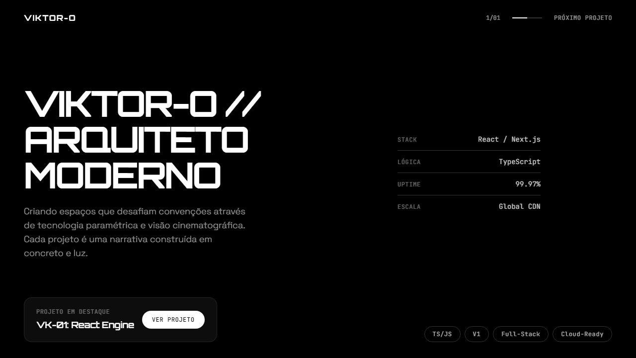
Vídeo background full-screen com vignette radial (70% transparente centro para 70% preto bordas) no desktop e gradient bottom-fade no mobile, glassmorphism cards (bg-white/5 backdrop-blur-xl), navegação entre duas páginas com transições de opacidade e offset Y, tipografia hierárquica com 3 fontes (Orbitron display, Space Grotesk body, JetBrains Mono technical), pill tags com borda white/20, specs técnicas com separadores thin border, counter 1/01 com linha de progresso
Light/Dark
✗ None / ✓ Full
CSS
background: #000000; color: #FFFFFF; font-family: 'Space Grotesk', sans-serif; .font-display { font-family: 'Orbitron', sans-serif; } .font-mono { font-family: 'JetBrains Mono', monospace; } ::selection { background: white; color: black; } .vignette { background: radial-gradient(ellipse at center, transparent 30%, rgba(0,0,0,0.7) 100%); } .glass-card { background: rgba(255,255,255,0.05); backdrop-filter: blur(24px); -webkit-backdrop-filter: blur(24px); } .pill-tag { border: 1px solid rgba(255,255,255,0.2); border-radius: 9999px; } .page-transition { transition: opacity 0.6s ease, transform 0.6s ease; } @media (max-width: 768px) { .hero-video { height: 50vh; } }
Variáveis
--bg: #000000; --text: #FFFFFF; --text-60: rgba(255,255,255,0.6); --text-40: rgba(255,255,255,0.4); --border: rgba(255,255,255,0.2); --glass-bg: rgba(255,255,255,0.05); --glass-blur: 24px; --hover-bg: rgba(255,255,255,0.1); --font-display: 'Orbitron', sans-serif; --font-body: 'Space Grotesk', sans-serif; --font-mono: 'JetBrains Mono', monospace
Checklist
☐ Fundo preto puro #000000 com texto branco, ☐ Vídeo background full-screen com vignette radial, ☐ Três fontes carregadas (Orbitron + Space Grotesk + JetBrains Mono), ☐ Hierarquia tipográfica clara entre display/body/mono, ☐ Glass card com backdrop-blur-xl, ☐ Navegação entre duas páginas com transição suave, ☐ Specs técnicas com separadores thin border, ☐ Pill tags com borda white/20, ☐ Counter 1/01 com linha de progresso, ☐ Mobile: vídeo 50vh com gradient fade, ☐ Custom selection color branco/preto
DESIGN.md
Design System: Architectural Portfolio Cinematic
1. Visual Theme & Atmosphere
Portfolio arquitetônico cinematográfico com vídeo full-screen, vignette, 3 fontes tipográficas, glass cards e navegação entre páginas com transições. Prompt para IA. A estética cinematográfica dark com tipografia hierárquica (display + body + mono) tornou-se padrão em portfolios premium de arquitetura e design em 2025-2026. A combinação de vídeo background com vignette, glass cards e navegação paginada com transições suaves cria uma experiência imersiva que eleva o trabalho apresentado.
- Density: 3/10 — Airy
- Variance: 3/10 — Restrained
- Motion: 8/10 — Cinematic
2. Color Palette & Roles
- Preto Fundo (#000000) — Primary background surface
- Branco Texto (#FFFFFF) — Light surface, card backgrounds
- 20 bordas (rgba(255,255,255,0.2)) — Supporting palette color
- 5 cards (rgba(255,255,255,0.05)) — Extended palette, decorative use
- 10 hover (rgba(255,255,255,0.1)) — Extended palette, decorative use
- 60 texto secundário (rgba(255,255,255,0.6)) — Primary text color
- 40 labels (rgba(255,255,255,0.4)) — Extended palette, decorative use
3. Typography Rules
- Display / Hero: Space Grotesk — Weight 700, tight tracking, used for headline impact
- Accent: Orbitron — Used for decorative or emphasis text
- Body: Space Grotesk — Weight 400, 16px/1.6 line-height, max 72ch per line
- UI Labels / Captions: Space Grotesk — 0.875rem, weight 500, slight letter-spacing
- Monospace: JetBrains Mono — Used for code, metadata, and technical values
Scale:
- Hero: clamp(2.5rem, 5vw, 4rem)
- H1: 2.25rem
- H2: 1.5rem
- Body: 1rem / 1.6
- Small: 0.875rem
4. Component Stylings
- Primary Button: Pill-shaped (9999px) shape. Accent color fill. Hover: 8% darken + subtle lift shadow. Active: -1px translate tactile press. Font weight 600. No outer glows.
- Secondary / Ghost Button: Outline variant. 1.5px border in muted color. Text in primary color. Hover: subtle background fill.
- Cards: Pill-shaped (9999px) corners. Surface background. Subtle shadow (0 2px 12px rgba(0,0,0,0.06)). 1px border stroke.
- Inputs: Label above input. 1px border stroke. Focus ring: 2px accent color offset 2px. Error text below in semantic red. No floating labels.
- Navigation: Primary surface background. Active item: accent color indicator. Font weight 500 when active.
- Skeletons: Shimmer animation matching component dimensions. No circular spinners.
- Empty States: Icon-based composition with descriptive text and action button.
5. Layout Principles
- Grid: CSS Grid primary. Max-width containment: 1280px centered with 1.5rem side padding.
- Spacing rhythm: Balanced. Base unit: 0.5rem (8px).
- Section vertical gaps: clamp(4rem, 8vw, 8rem).
- Hero layout: Split-screen (text left, visual right).
- Feature sections: Zig-zag alternating text+image rows. No 3-equal-columns.
- Mobile collapse: All multi-column layouts collapse below 768px. No horizontal overflow.
- z-index contract: base (0) / sticky-nav (100) / overlay (200) / modal (300) / toast (500).
6. Motion & Interaction
- Physics: Spring — stiffness 120, damping 20. Confident, weighted transitions.
- Entry animations: Fade + translate-Y (16px → 0) over 540ms ease-out. Staggered cascades for lists: 120ms between items.
- Hover states: Scale(1.03) + shadow lift over 200ms.
- Page transitions: Fade + slide (300ms).
- Performance: Only transform and opacity animated. No layout-triggering properties.
7. Anti-Patterns (Banned)
- No emojis in UI — use icon system only (Lucide, Heroicons)
- No decorative gradients — flat color only
- No shadows heavier than 0 2px 8px rgba(0,0,0,0.08)
- No pure white (#FFFFFF) backgrounds — use off-white or dark surfaces
- No oversaturated accent colors (saturation cap: 80%)
- No 3-column equal-width feature layouts — use zig-zag or asymmetric grid
- No
h-screen— usemin-h-[100dvh] - No AI copywriting clichés: "Elevate", "Seamless", "Unleash", "Next-Gen"
- No broken external image links — use picsum.photos or inline SVG
- No generic lorem ipsum in demos
Prompt para AI
Build a high-end cinematic 2-page architectural portfolio. Aesthetic: minimalist, dark-themed (black background #000000, white text #FFFFFF), sophisticated typographic hierarchy. Fonts: Orbitron for display headings, Space Grotesk for body text, JetBrains Mono for technical/mono elements. Custom selection color (white bg, black text). Page 1 Hero: Full-screen looping background video of futuristic architecture (use stock video URL). Video: muted, playsInline, loop, preload auto. Overlays: radial vignette on desktop (70% transparent center to 70% black edges), bottom-fade gradient on mobile. Top nav: right-aligned 1/01 counter with progress line and Next Project button in mono font. Main content: large title 'VIKTOR-O // MODERN ARCHITECT' (Orbitron uppercase tracking-tighter), description in Space Grotesk light with max-w-450px. Right column: technical specs list (Stack, Logic, Uptime, Scale) with labels and values separated by thin border-white/20. Bottom: glass-morphism card (bg-white/5 backdrop-blur-xl) with project title 'VK-01: React Engine' and View Project button. Row of pill-shaped tags (TS/JS, V1, Full-Stack, Cloud-Ready) at bottom right. Page 2 Project: Back Home button with arrow icon. Massive display title 'PROJECT ENGINE' (Orbitron leading-0.85 uppercase). Right-aligned description about flagship React engine with Read More link. Two structured info blocks 01 CORE ARCHITECTURE and 02 PERFORMANCE METRICS with uppercase mono subtext. Navigation arrows in circular borders and meta-info block. Implement page transitions with opacity/y-offset animations. On mobile: video occupies top half h-50vh with smooth gradient to content below.
Relacionados
Última sincronização: 01/04/2026