Dark SaaS Hero with Liquid Glass
Hero SaaS dark com liquid glass, vídeo de fundo espacial, navbar pill, marquee social proof e CTA verde vibrante. Prompt pronto para IA generativa.
Uso: SaaS B2B, Ferramentas de IA, Plataformas de desenvolvedores, Landing pages tech, Startups, APIs e SDKs
Contexto Histórico
Evolução do glassmorphism para liquid glass em 2025-2026, combinando backdrop-filter com pseudo-elements de borda gradiente via mask-composite. O padrão dark SaaS hero com vídeo de fundo e social proof marquee tornou-se a assinatura visual de startups tech modernas, popularizado por ferramentas como Linear, Vercel e Stripe.
Especificações Técnicas
Cores
Primárias
Efeitos
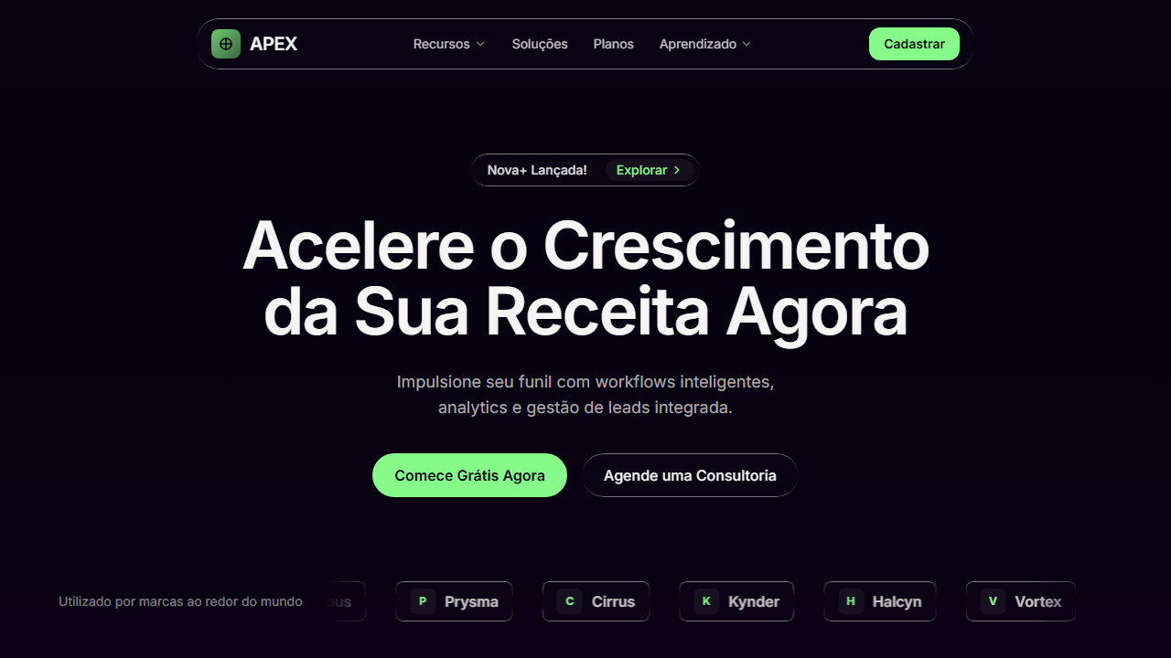
Liquid glass com backdrop-filter blur(4px) e pseudo-element gradient border via mask-composite, video background full-screen (Terra rotacionando do espaço) com autoPlay loop muted playsInline object-cover absolute inset-0, marquee horizontal infinito translateX(0%) a translateX(-50%) em 20s linear infinite, hover suave em botões e links (200ms transition)
Light/Dark
✗ None / ✓ Full
CSS
font-family: 'Geist Sans', sans-serif; background: hsl(260,87%,3%); color: hsl(40,6%,95%); .liquid-glass { background: rgba(255,255,255,0.01); background-blend-mode: luminosity; backdrop-filter: blur(4px); border: none; box-shadow: inset 0 1px 1px rgba(255,255,255,0.1); overflow: hidden; position: relative; } .liquid-glass::before { content:''; position:absolute; inset:0; padding:1.4px; background: linear-gradient(180deg, rgba(255,255,255,0.45) 0%, rgba(255,255,255,0.15) 20%, rgba(255,255,255,0) 40%, rgba(255,255,255,0) 60%, rgba(255,255,255,0.15) 80%, rgba(255,255,255,0.45) 100%); border-radius:inherit; -webkit-mask: linear-gradient(#fff 0 0) content-box, linear-gradient(#fff 0 0); -webkit-mask-composite: xor; mask-composite: exclude; pointer-events:none; } @keyframes marquee { 0%{transform:translateX(0%)} 100%{transform:translateX(-50%)} } .marquee-track { animation: marquee 20s linear infinite; }
Variáveis
--background: hsl(260,87%,3%); --foreground: hsl(40,6%,95%); --primary: hsl(121,95%,76%); --primary-foreground: hsl(0,0%,5%); --hero-heading: hsl(40,10%,96%); --hero-sub: hsl(40,6%,82%); --secondary: hsl(240,4%,16%); --muted: hsl(240,4%,16%); --border: hsl(240,4%,20%); --font-primary: 'Geist Sans', sans-serif; --border-radius-full: 9999px; --border-radius-3xl: 1.5rem; --border-radius-xl: 0.75rem; --border-radius-lg: 0.5rem
Checklist
☐ Fundo escuro hsl(260,87%,3%) com leve tom roxo, ☐ Vídeo background full-screen da Terra do espaço, ☐ Classe .liquid-glass reutilizável com backdrop-filter e pseudo-element gradient border, ☐ Navbar pill centralizada liquid-glass com logo + nav items + CTA verde, ☐ Badge de anúncio liquid-glass rounded-full, ☐ Heading text-7xl semibold tracking-tight, ☐ Dois botões CTA (verde primary + liquid-glass secondary), ☐ Marquee social proof com 6 marcas em loop infinito 20s, ☐ Fonte Geist Sans 400-700, ☐ Cor primária verde #87FB89
DESIGN.md
Design System: Dark SaaS Hero with Liquid Glass
1. Visual Theme & Atmosphere
Hero SaaS dark com liquid glass, vídeo de fundo espacial, navbar pill, marquee social proof e CTA verde vibrante. Prompt pronto para IA generativa. Evolução do glassmorphism para liquid glass em 2025-2026, combinando backdrop-filter com pseudo-elements de borda gradiente via mask-composite. O padrão dark SaaS hero com vídeo de fundo e social proof marquee tornou-se a assinatura visual de startups tech modernas, popularizado por ferramentas como Linear, Vercel e Stripe.
- Density: 5/10 — Balanced
- Variance: 4/10 — Moderate
- Motion: 8/10 — Cinematic
2. Color Palette & Roles
- Primary (#87FB89) — Primary accent, CTAs and interactive elements
3. Typography Rules
- Display / Hero: Geist Sans — Weight 700, tight tracking, used for headline impact
- Body: Geist Sans — Weight 400, 16px/1.6 line-height, max 72ch per line
- UI Labels / Captions: Geist Sans — 0.875rem, weight 500, slight letter-spacing
- Monospace: JetBrains Mono — Used for code, metadata, and technical values
Scale:
- Hero: clamp(2.5rem, 5vw, 4rem)
- H1: 2.25rem
- H2: 1.5rem
- Body: 1rem / 1.6
- Small: 0.875rem
4. Component Stylings
- Primary Button: Pill-shaped (9999px) shape. Accent color fill. Hover: 8% darken + subtle lift shadow. Active: -1px translate tactile press. Font weight 600. No outer glows.
- Secondary / Ghost Button: Outline variant. 1.5px border in muted color. Text in primary color. Hover: subtle background fill.
- Cards: Pill-shaped (9999px) corners. Surface background. Subtle shadow (0 2px 12px rgba(0,0,0,0.06)). 1px border stroke.
- Inputs: Label above input. 1px border stroke. Focus ring: 2px accent color offset 2px. Error text below in semantic red. No floating labels.
- Navigation: Primary surface background. Active item: accent color indicator. Font weight 500 when active.
- Skeletons: Shimmer animation matching component dimensions. No circular spinners.
- Empty States: Icon-based composition with descriptive text and action button.
5. Layout Principles
- Grid: CSS Grid primary. Max-width containment: 1280px centered with 1.5rem side padding.
- Spacing rhythm: Balanced. Base unit: 0.5rem (8px).
- Section vertical gaps: clamp(4rem, 8vw, 8rem).
- Hero layout: Split-screen (text left, visual right).
- Feature sections: Zig-zag alternating text+image rows. No 3-equal-columns.
- Mobile collapse: All multi-column layouts collapse below 768px. No horizontal overflow.
- z-index contract: base (0) / sticky-nav (100) / overlay (200) / modal (300) / toast (500).
6. Motion & Interaction
- Physics: Spring — stiffness 120, damping 20. Confident, weighted transitions.
- Entry animations: Fade + translate-Y (16px → 0) over 540ms ease-out. Staggered cascades for lists: 120ms between items.
- Hover states: Scale(1.03) + shadow lift over 200ms.
- Page transitions: Fade + slide (300ms).
- Performance: Only transform and opacity animated. No layout-triggering properties.
7. Anti-Patterns (Banned)
- No emojis in UI — use icon system only (Lucide, Heroicons)
- No pure white (#FFFFFF) backgrounds — use off-white or dark surfaces
- No oversaturated accent colors (saturation cap: 80%)
- No 3-column equal-width feature layouts — use zig-zag or asymmetric grid
- No
h-screen— usemin-h-[100dvh] - No AI copywriting clichés: "Elevate", "Seamless", "Unleash", "Next-Gen"
- No broken external image links — use picsum.photos or inline SVG
- No generic lorem ipsum in demos
Prompt para AI
Create a dark SaaS landing page hero section. Font: Geist Sans (400-700). Background: near-black with slight purple hsl(260,87%,3%). Foreground: warm off-white hsl(40,6%,95%). Primary accent: bright green #87FB89 hsl(121,95%,76%). Full-screen background VIDEO of rotating Earth from space (autoPlay, loop, muted, playsInline, object-cover, absolute inset-0) covering entire hero. Liquid Glass effect as reusable .liquid-glass class: background rgba(255,255,255,0.01), background-blend-mode luminosity, backdrop-filter blur(4px), no border, box-shadow inset 0 1px 1px rgba(255,255,255,0.1), overflow hidden, plus ::before pseudo-element with vertical gradient border using mask-composite (padding 1.4px, gradient from white 0.45 to transparent to white 0.45, webkit-mask-composite xor, mask-composite exclude). Layout top-to-bottom centered over video: (1) Navbar liquid-glass pill rounded-3xl max-w-850px with logo gradient square + crosshair SVG + APEX text, nav items Features/Solutions/Plans/Learning, Sign Up green CTA. (2) Announcement badge liquid-glass rounded-full pill 'Nova+ Launched!' with Explore chip + ChevronRight. (3) Heading text-7xl font-semibold tracking-tight 'Accelerate Your Revenue Growth Now'. (4) Subheading text-lg opacity-80. (5) Two CTA buttons: 'Start Free Right Now' green primary rounded-full, 'Schedule a Consult' liquid-glass rounded-full. (6) Social proof marquee at bottom with brand names Vortex/Nimbus/Prysma/Cirrus/Kynder/Halcyn scrolling horizontally, duplicated for seamless loop, 20s linear infinite animation.
Relacionados
Última sincronização: 01/04/2026