Vertical Whiteboard Timeline
Estilo Vertical Whiteboard Timeline: landing page tutorial com visual de quadro branco, timeline vertical, steps numerados, setas desenhadas a mao e icones doodle.
Uso: Tutoriais passo a passo, Onboarding de produto, Guias educativos, How-to pages, Documentacao visual, Landing pages long-form
Contexto Histórico
Variacao vertical do estilo Whiteboard Flowchart, inspirada em infograficos de tutorial desenhados a mao em quadros brancos fisicos. O layout timeline vertical com steps numerados a esquerda e conteudo a direita e um padrao classico de UX educativo, combinado aqui com a estetica handmade de marcadores, post-its e setas organicas. Ideal para conteudos sequenciais que precisam guiar o usuario de cima para baixo com clareza visual.
Especificações Técnicas
Cores
Primárias
Secundárias
Efeitos
MOLDURA METALICA: Borda cinza gradient multi-stop simulando frame de aluminio de whiteboard fisico com box-shadow duplo. Na base, marcadores Expo e apagador como elementos decorativos (divs estilizados). | TIMELINE VERTICAL: Linha tracejada ou solida preta irregular descendo do lado esquerdo (30-40% largura), conectando circulos numerados de cada step. | CIRCULOS NUMERADOS: Circulos com borda preta grossa 2.5-3px, fill pastel (azul, verde, rosa alternando), numero grande em Permanent Marker. | SETAS CONECTORAS: SVG paths com stroke-linecap round, stroke-width 3-4px variavel, curvatura organica. Setas horizontais do circulo para a caixa de conteudo a direita. Setas verticais descendentes entre steps. | CAIXAS DE CONTEUDO: Retangulos com bordas pretas irregulares 2-3px, fundo branco ou amarelo pastel, hard shadow 4-6px offset sem blur. Screenshots internos com bordas grossas e cantos levemente amassados. | ICONES DOODLE: SVG stroke-only (laptop, pasta, engrenagem, play, megafone, cursor), contorno preto 2-3px, fill pastel opcional, tamanho 40-80px. | SOMBRAS HARD: box-shadow com blur ZERO, offset 4-6px, cor #333 opacity 0.3-0.5. | TEXTURA WHITEBOARD: Background noise sutil 5-8% opacity sobre fundo branco-gelo.
Light/Dark
✓ Full / ✗ None
CSS
font-family: 'Permanent Marker'/'Kalam'/'Patrick Hand'/'Caveat', box-shadow: 4px 4px 0px rgba(51,51,51,0.4) NO BLUR, border: 2.5px solid #1A1A1A, stroke-width: 3-4px variable, stroke-linecap: round, stroke-linejoin: round, stroke-dasharray for dashed timeline, background: linear-gradient(135deg, #C8CACD, #D8DADD, #C0C2C5, #B0B2B5) for frame, grid-template-columns: 35% 65% collapsing to 1fr at 768px, gap: 4-6rem between steps, transform: rotate(-2deg) on titles, clip-path or rough.js for irregular borders, Intersection Observer for scroll reveal
Variáveis
--wb-bg: #F9FAFB, --wb-bg-page: #E8E9EB, --wb-frame: #B8BBBE, --wb-ink: #1A1A1A, --wb-ink-soft: rgba(26,26,26,0.7), --wb-ink-faint: rgba(26,26,26,0.35), --wb-blue: #A5D8FF, --wb-yellow: #FFF9E6, --wb-green: #C3E8BD, --wb-pink: #FADADD, --wb-lavender: #E8DCF5, --wb-orange: #FFE0C2, --wb-shadow: 4px 4px 0px rgba(51,51,51,0.4), --wb-shadow-strong: 6px 6px 0px rgba(51,51,51,0.5), --font-title: 'Permanent Marker' cursive, --font-body: 'Kalam' cursive, --font-accent: 'Patrick Hand' cursive, --font-handwrite: 'Caveat' cursive, --wb-border: 2.5px solid #1A1A1A, --wb-border-thick: 3px solid #1A1A1A, --timeline-width: 35%, --content-width: 65%, --step-gap: 5rem
Checklist
☐ Moldura metalica com gradient cinza e marcadores Expo decorativos na base, ☐ Timeline vertical esquerda com linha tracejada preta, ☐ Circulos numerados com fill pastel alternado e borda preta grossa, ☐ Setas SVG curvas horizontais (circulo → caixa) e verticais (step → step), ☐ Caixas de conteudo com bordas irregulares e hard shadow sem blur, ☐ 4 fontes Google: Permanent Marker + Kalam + Patrick Hand + Caveat, ☐ Icones doodle SVG stroke-only com fill pastel opcional, ☐ Sombras hard 4-6px offset sem blur em todos os elementos, ☐ Textura whiteboard sutil no fundo, ☐ Layout 35/65 colapsando para stack em mobile, ☐ Fade-in sequencial dos steps ao scroll, ☐ CTA final com destaque de cor mais forte
DESIGN.md
Design System: Vertical Whiteboard Timeline
1. Visual Theme & Atmosphere
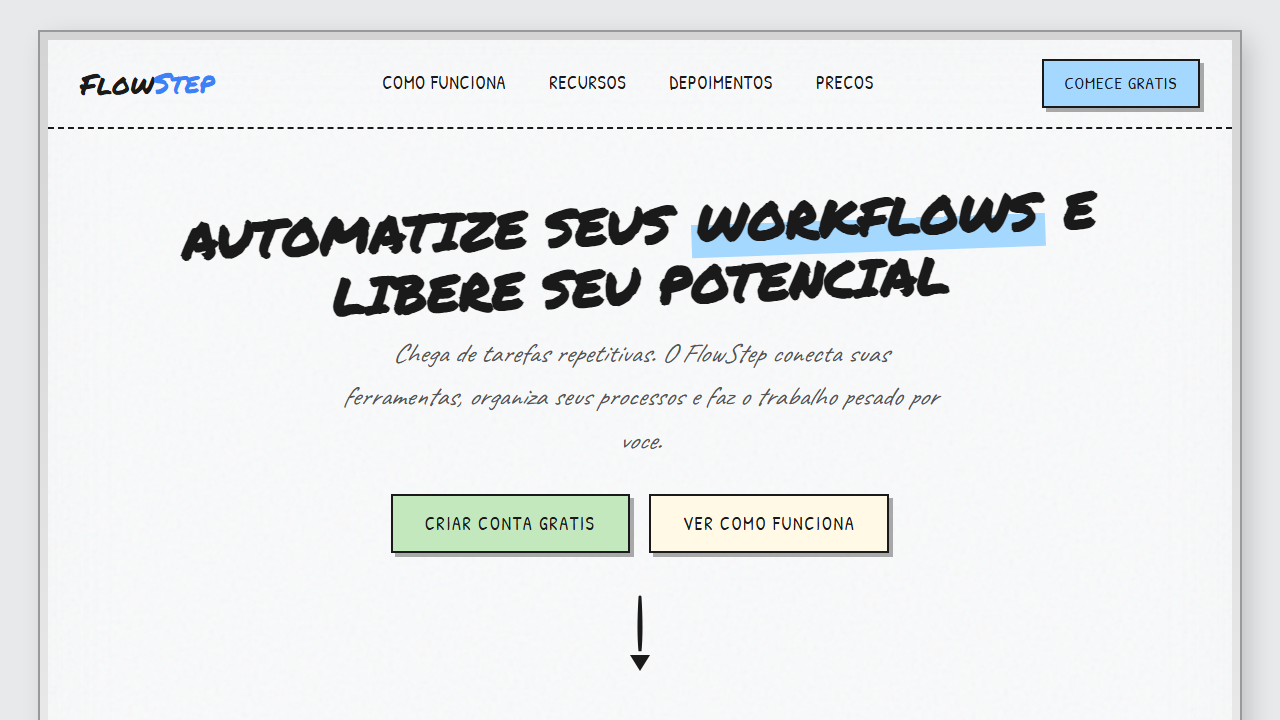
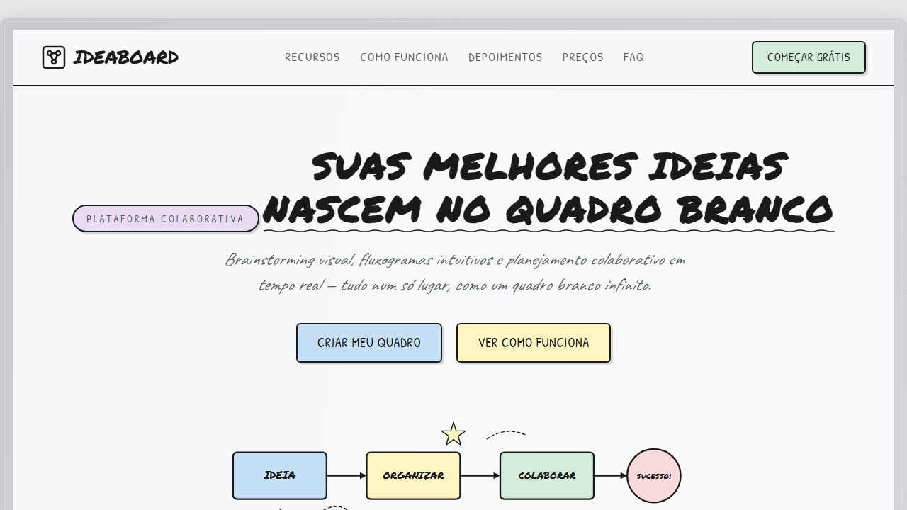
Estilo Vertical Whiteboard Timeline: landing page tutorial com visual de quadro branco, timeline vertical, steps numerados, setas desenhadas a mao e icones doodle. Variacao vertical do estilo Whiteboard Flowchart, inspirada em infograficos de tutorial desenhados a mao em quadros brancos fisicos. O layout timeline vertical com steps numerados a esquerda e conteudo a direita e um padrao classico de UX educativo, combinado aqui com a estetica handmade de marcadores, post-its e setas organicas. Ideal para conteudos sequenciais que precisam guiar o usuario de cima para baixo com clareza visual.
- Density: 5/10 — Balanced
- Variance: 8/10 — Expressive
- Motion: 4/10 — Subtle
2. Color Palette & Roles
- Branco-Gelo (#F9FAFB) — Light surface, card backgrounds
- Tinta Preta Marcador (#1A1A1A) — Secondary surface or text color
- Moldura Cinza (#B8BBBE) — Secondary text, borders, muted elements
- Fundo Pagina (#E8E9EB) — Primary background surface
- Azul Pastel (#A5D8FF) — Secondary accent
- Amarelo Pastel (#FFF9E6) — Warning states, attention indicators
- Verde Claro (#C3E8BD) — Success states, positive indicators
- Rosa Suave (#FADADD) — Decorative accent, highlight elements
- Laranja Suave (#FFE0C2) — Warm accent, call-to-action secondary
- Lavanda (#E8DCF5) — Extended palette, decorative use
3. Typography Rules
- Display / Hero: Permanent Marker — Weight 700, tight tracking, used for headline impact
- Accent: Kalam — Used for decorative or emphasis text
- Body: Permanent Marker — Weight 400, 16px/1.6 line-height, max 72ch per line
- UI Labels / Captions: Permanent Marker — 0.875rem, weight 500, slight letter-spacing
- Monospace: JetBrains Mono — Used for code, metadata, and technical values
Scale:
- Hero: clamp(2.5rem, 5vw, 4rem)
- H1: 2.25rem
- H2: 1.5rem
- Body: 1rem / 1.6
- Small: 0.875rem
4. Component Stylings
- Primary Button: Moderately rounded (0.75rem) shape. Accent color fill. Hover: 8% darken + subtle lift shadow. Active: -1px translate tactile press. Font weight 600. No outer glows.
- Secondary / Ghost Button: Outline variant. 1.5px border in muted color. Text in primary color. Hover: subtle background fill.
- Cards: Moderately rounded (0.75rem) corners. Surface background. Subtle shadow (0 2px 12px rgba(0,0,0,0.06)). 1px border stroke.
- Inputs: Label above input. 1px border stroke. Focus ring: 2px accent color offset 2px. Error text below in semantic red. No floating labels.
- Navigation: Primary surface background. Active item: accent color indicator. Font weight 500 when active.
- Skeletons: Shimmer animation matching component dimensions. No circular spinners.
- Empty States: Icon-based composition with descriptive text and action button.
5. Layout Principles
- Grid: CSS Grid primary. Max-width containment: 1280px centered with 1.5rem side padding.
- Spacing rhythm: Balanced. Base unit: 0.5rem (8px).
- Section vertical gaps: clamp(4rem, 8vw, 8rem).
- Hero layout: Asymmetric composition.
- Feature sections: Asymmetric grid with varied card sizes. No 3-equal-columns.
- Mobile collapse: All multi-column layouts collapse below 768px. No horizontal overflow.
- z-index contract: base (0) / sticky-nav (100) / overlay (200) / modal (300) / toast (500).
6. Motion & Interaction
- Physics: Ease-out curves, 200-300ms duration. Smooth and predictable.
- Entry animations: Fade + translate-Y (16px → 0) over 420ms ease-out. Staggered cascades for lists: 80ms between items.
- Hover states: Subtle color shift + shadow adjustment over 200ms.
- Page transitions: Fade only (200ms).
- Performance: Only transform and opacity animated. No layout-triggering properties.
7. Anti-Patterns (Banned)
- No emojis in UI — use icon system only (Lucide, Heroicons)
- No pure black (#000000) — use off-black or charcoal variants
- No oversaturated accent colors (saturation cap: 80%)
- No 3-column equal-width feature layouts — use zig-zag or asymmetric grid
- No
h-screen— usemin-h-[100dvh] - No AI copywriting clichés: "Elevate", "Seamless", "Unleash", "Next-Gen"
- No broken external image links — use picsum.photos or inline SVG
- No generic lorem ipsum in demos
Prompt para AI
Design a vertical whiteboard tutorial landing page with metallic aluminum frame border (gray gradient, dual box-shadow) and decorative Expo markers at the bottom. Layout: left column (30-40%) has vertical dashed timeline with numbered step circles (pastel fills, thick black borders, Permanent Marker font numbers), right column (60-70%) has content boxes with explanations and doodle icons. Curved SVG arrows connect circles to content boxes horizontally, and vertical arrows connect steps top-to-bottom. 4 Google Fonts: Permanent Marker for titles/step numbers (uppercase, slight rotation), Caveat for handwritten annotations (italic), Kalam for body text, Patrick Hand for labels. All elements use hard shadows (4-6px offset, ZERO blur, #333 at 0.3-0.5 opacity). Solid black borders 2-3px on everything. Content boxes have white or pale yellow #FFF9E6 background. Doodle SVG icons: laptop with download arrow, cursor clicking, folder with checkmark, plus button, gear, play button, megaphone, connector plugs — all stroke-only with round linecap/linejoin. Step circles alternate pastel colors: blue #A5D8FF, green #C3E8BD, pink #FADADD, orange #FFE0C2, lavender #E8DCF5. Final CTA box with stronger blue or pink background. Whiteboard texture: subtle noise overlay 5-8% opacity. Mobile: timeline centers, content stacks below each step circle. Intersection Observer fade-in animation on scroll.
Relacionados
Última sincronização: 01/04/2026