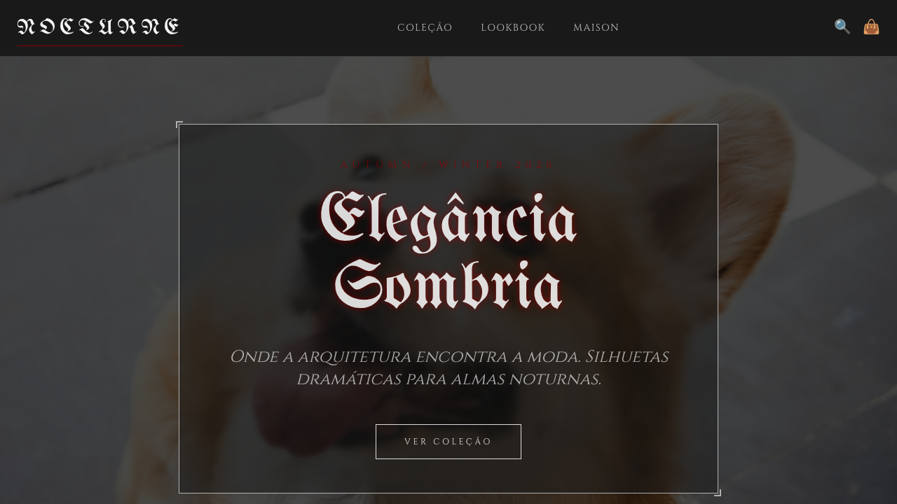
Steampunk Vitoriano
Steampunk Vitoriano — Design general com steampunk, victorian, ornate. Template e prompt pronto para IA.
Uso: Landing pages, SaaS
Contexto Histórico
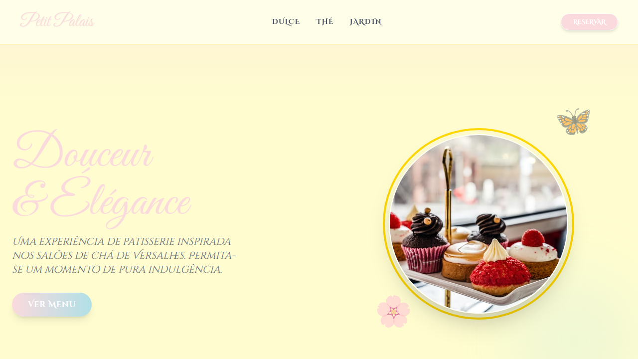
Estilo Steampunk Vitoriano representa uma tendência moderna em design UI/UX web com foco em general.
Especificações Técnicas
Cores
Primárias
Secundárias
Efeitos
Intricate gear animations, brass borders, leather textures, detailed illustrations, vintage typography, gas lamp glows, schematic overlays, interactive mechanical elements
Light/Dark
✓ Full / ✗ No
CSS
background-image: url('parchment-texture.jpg'), background-color: #F5DEB3, color: #5C0000, font-family: 'IM Fell English', serif, border: 3px solid #B5A642, box-shadow: 0 0 10px rgba(0,0,0,0.5), text-shadow: 1px 1px 0 #FFFFF0, animation: gear-rotate 20s linear infinite, transform-style: preserve-3d, perspective: 1000px
Variáveis
--brass-steampunk: #B5A642, --mahogany-steampunk: #5C0000, --sepia-steampunk: #704214, --parchment-steampunk: #F5DEB3, --gear-animation-duration: 20s, --font-steampunk: 'IM Fell English', serif
Checklist
☐ Intricate gear animations, ☐ Brass borders, ☐ Leather textures, ☐ Detailed illustrations, ☐ Vintage typography, ☐ Gas lamp glows
DESIGN.md
Design System: Steampunk Vitoriano
1. Visual Theme & Atmosphere
Steampunk Vitoriano — Design general com steampunk, victorian, ornate. Template e prompt pronto para IA. Estilo Steampunk Vitoriano representa uma tendência moderna em design UI/UX web com foco em general.
- Density: 5/10 — Balanced
- Variance: 8/10 — Expressive
- Motion: 6/10 — Expressive
2. Color Palette & Roles
- Brass (#B5A642) — Primary surface or dominant color
- Rich Mahogany (#5C0000) — Secondary surface or text color
- Sepia (#704214) — Supporting palette color
- Parchment (#F5DEB3) — Supporting palette color
- Copper (#B87333) — Metallic accent, decorative detail
- Deep Teal (#008080) — Secondary accent
- Clockwork Orange (#D46A00) — Warm accent, call-to-action secondary
- Ivory (#FFFFF0) — Secondary surface
3. Typography Rules
- Display / Hero: IM Fell English — Weight 700, tight tracking, used for headline impact
- Body: IM Fell English — Weight 400, 16px/1.6 line-height, max 72ch per line
- UI Labels / Captions: IM Fell English — 0.875rem, weight 500, slight letter-spacing
- Monospace: JetBrains Mono — Used for code, metadata, and technical values
Scale:
- Hero: clamp(2.5rem, 5vw, 4rem)
- H1: 2.25rem
- H2: 1.5rem
- Body: 1rem / 1.6
- Small: 0.875rem
4. Component Stylings
- Primary Button: Subtly rounded (0.5rem) shape. Accent color fill. Hover: 8% darken + subtle lift shadow. Active: -1px translate tactile press. Font weight 600. No outer glows.
- Secondary / Ghost Button: Outline variant. 1.5px border in muted color. Text in primary color. Hover: subtle background fill.
- Cards: Subtly rounded (0.5rem) corners. Surface background. Subtle shadow (0 2px 12px rgba(0,0,0,0.06)). 1px border stroke.
- Inputs: Label above input. 1px border stroke. Focus ring: 2px accent color offset 2px. Error text below in semantic red. No floating labels.
- Navigation: Primary surface background. Active item: accent color indicator. Font weight 500 when active.
- Skeletons: Shimmer animation matching component dimensions. No circular spinners.
- Empty States: Icon-based composition with descriptive text and action button.
5. Layout Principles
- Grid: CSS Grid primary. Max-width containment: 1280px centered with 1.5rem side padding.
- Spacing rhythm: Balanced. Base unit: 0.5rem (8px).
- Section vertical gaps: clamp(4rem, 8vw, 8rem).
- Hero layout: Asymmetric composition.
- Feature sections: Asymmetric grid with varied card sizes. No 3-equal-columns.
- Mobile collapse: All multi-column layouts collapse below 768px. No horizontal overflow.
- z-index contract: base (0) / sticky-nav (100) / overlay (200) / modal (300) / toast (500).
6. Motion & Interaction
- Physics: Spring — stiffness 120, damping 20. Confident, weighted transitions.
- Entry animations: Fade + translate-Y (16px → 0) over 480ms ease-out. Staggered cascades for lists: 100ms between items.
- Hover states: Scale(1.03) + shadow lift over 200ms.
- Page transitions: Fade + slide (300ms).
- Performance: Only transform and opacity animated. No layout-triggering properties.
7. Anti-Patterns (Banned)
- No emojis in UI — use icon system only (Lucide, Heroicons)
- No pure black (#000000) — use off-black or charcoal variants
- No oversaturated accent colors (saturation cap: 80%)
- No 3-column equal-width feature layouts — use zig-zag or asymmetric grid
- No
h-screen— usemin-h-[100dvh] - No AI copywriting clichés: "Elevate", "Seamless", "Unleash", "Next-Gen"
- No broken external image links — use picsum.photos or inline SVG
- No generic lorem ipsum in demos
Prompt para AI
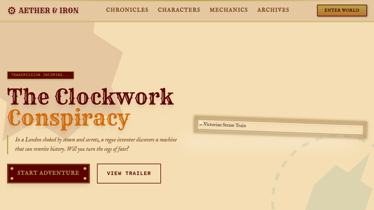
Design a Victorian steampunk landing page. Use: brass and rich mahogany, intricate gear animations, leather textures, detailed illustrations, vintage typography, gas lamp glows, schematic overlays, interactive mechanical elements.
Relacionados
Última sincronização: 01/04/2026