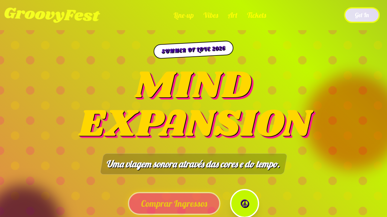
Psicodélico Anos 60
Psicodélico Anos 60 — Design general com psychedelic, 60s, trippy. Template e prompt pronto para IA.
Uso: Landing pages, SaaS
Contexto Histórico
Estilo Psicodélico Anos 60 representa uma tendência moderna em design UI/UX web com foco em general.
Especificações Técnicas
Cores
Primárias
Secundárias
Efeitos
Swirling patterns, liquid light show effects, distorted typography, vibrant color clashes, abstract illustrations, mind-bending animations, paisley patterns, free-form layouts
Light/Dark
✓ Full / ✗ No
CSS
background: linear-gradient(45deg, #FF5F00, #FF1D8E, #C2F700), color: #FFFFFF, animation: liquid-flow 10s infinite alternate, font-family: 'Lobster', cursive, text-shadow: 2px 2px 0 #000000, filter: contrast(1.5) saturate(1.5), transform: skew(3deg), border: none
Variáveis
--electric-orange-psych: #FF5F00, --hot-pink-psych: #FF1D8E, --lime-green-psych: #C2F700, --royal-blue-psych: #4700A5, --liquid-flow-duration: 10s, --font-psych: 'Lobster', cursive
Checklist
☐ Swirling patterns, ☐ Liquid light show effects, ☐ Distorted typography, ☐ Vibrant color clashes, ☐ Abstract illustrations, ☐ Mind-bending animations
DESIGN.md
Design System: Psicodélico Anos 60
1. Visual Theme & Atmosphere
Psicodélico Anos 60 — Design general com psychedelic, 60s, trippy. Template e prompt pronto para IA. Estilo Psicodélico Anos 60 representa uma tendência moderna em design UI/UX web com foco em general.
- Density: 5/10 — Balanced
- Variance: 4/10 — Moderate
- Motion: 6/10 — Expressive
2. Color Palette & Roles
- Electric Orange (#FF5F00) — Warm accent, call-to-action secondary
- Hot Pink (#FF1D8E) — Primary text color
- Lime Green (#C2F700) — Supporting palette color
- Royal Blue (#4700A5) — Accent highlight, links and focus states
- Sunshine Yellow (#FFD700) — Warning states, attention indicators
- Purple Haze (#A020F0) — Accent color, emphasis elements
- White (#FFFFFF) — Secondary surface
- Black (#000000) — Deep contrast surface
3. Typography Rules
- Display / Hero: Lobster — Weight 700, tight tracking, used for headline impact
- Body: Lobster — Weight 400, 16px/1.6 line-height, max 72ch per line
- UI Labels / Captions: Lobster — 0.875rem, weight 500, slight letter-spacing
- Monospace: JetBrains Mono — Used for code, metadata, and technical values
Scale:
- Hero: clamp(2.5rem, 5vw, 4rem)
- H1: 2.25rem
- H2: 1.5rem
- Body: 1rem / 1.6
- Small: 0.875rem
4. Component Stylings
- Primary Button: Subtly rounded (0.5rem) shape. Accent color fill. Hover: 8% darken + subtle lift shadow. Active: -1px translate tactile press. Font weight 600. No outer glows.
- Secondary / Ghost Button: Outline variant. 1.5px border in muted color. Text in primary color. Hover: subtle background fill.
- Cards: Subtly rounded (0.5rem) corners. Surface background. Subtle shadow (0 2px 12px rgba(0,0,0,0.06)). 1px border stroke.
- Inputs: Label above input. 1px border stroke. Focus ring: 2px accent color offset 2px. Error text below in semantic red. No floating labels.
- Navigation: Primary surface background. Active item: accent color indicator. Font weight 500 when active.
- Skeletons: Shimmer animation matching component dimensions. No circular spinners.
- Empty States: Icon-based composition with descriptive text and action button.
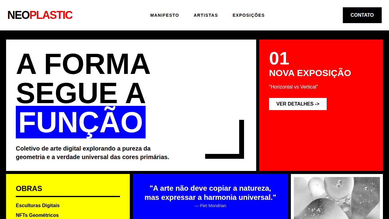
5. Layout Principles
- Grid: CSS Grid primary. Max-width containment: 1280px centered with 1.5rem side padding.
- Spacing rhythm: Balanced. Base unit: 0.5rem (8px).
- Section vertical gaps: clamp(4rem, 8vw, 8rem).
- Hero layout: Split-screen (text left, visual right).
- Feature sections: Zig-zag alternating text+image rows. No 3-equal-columns.
- Mobile collapse: All multi-column layouts collapse below 768px. No horizontal overflow.
- z-index contract: base (0) / sticky-nav (100) / overlay (200) / modal (300) / toast (500).
6. Motion & Interaction
- Physics: Spring — stiffness 120, damping 20. Confident, weighted transitions.
- Entry animations: Fade + translate-Y (16px → 0) over 480ms ease-out. Staggered cascades for lists: 100ms between items.
- Hover states: Scale(1.03) + shadow lift over 200ms.
- Page transitions: Fade + slide (300ms).
- Performance: Only transform and opacity animated. No layout-triggering properties.
7. Anti-Patterns (Banned)
- No emojis in UI — use icon system only (Lucide, Heroicons)
- No pure black (#000000) — use off-black or charcoal variants
- No oversaturated accent colors (saturation cap: 80%)
- No 3-column equal-width feature layouts — use zig-zag or asymmetric grid
- No
h-screen— usemin-h-[100dvh] - No AI copywriting clichés: "Elevate", "Seamless", "Unleash", "Next-Gen"
- No broken external image links — use picsum.photos or inline SVG
- No generic lorem ipsum in demos
Prompt para AI
Design a 60s psychedelic landing page. Use: electric orange and hot pink, swirling patterns, liquid light show effects, distorted typography, vibrant color clashes, abstract illustrations, mind-bending animations, paisley patterns.
Relacionados
Última sincronização: 01/04/2026