Paper & Ink
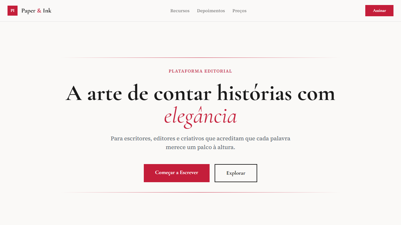
Design editorial literário com Cormorant Garamond, drop caps, pull quotes e fundo creme quente. Elegância de papel e tinta. Prompt para IA.
Uso: Editoras, Blogs literários, Revistas culturais, Portfolios de escritores
Contexto Histórico
Inspirado na tradição tipográfica de livros e revistas impressas. Usa Cormorant Garamond e Source Serif 4 para criar hierarquia literária, com drop caps e pull quotes que remetem à elegância da impressão clássica.
Especificações Técnicas
Cores
Primárias
Secundárias
Efeitos
Drop caps (first letter large and decorative), pull quotes with elegant styling, elegant horizontal rules (thin lines with ornaments), literary typography hierarchy, smooth page-like transitions 300ms
Light/Dark
✓ Full / ✗ No
CSS
font-family: 'Cormorant Garamond' for headings, 'Source Serif 4' for body, background: #faf9f7, color: #1a1a1a, .drop-cap::first-letter { font-size: 4em; float: left; line-height: 0.8; padding-right: 8px; font-family: 'Cormorant Garamond'; color: #c41e3a }, .pull-quote { font-family: 'Cormorant Garamond'; font-size: 1.5em; font-style: italic; border-left: 3px solid #c41e3a; padding-left: 20px }, hr.elegant { border: none; height: 1px; background: linear-gradient(to right, transparent, #1a1a1a, transparent) }
Variáveis
--bg-cream: #faf9f7, --text-charcoal: #1a1a1a, --accent-crimson: #c41e3a, --font-display: 'Cormorant Garamond', --font-body: 'Source Serif 4', --drop-cap-size: 4em, --pull-quote-border: 3px, --hr-color: #1a1a1a
Checklist
☐ Cormorant Garamond + Source Serif 4 carregados, ☐ Warm cream background #faf9f7, ☐ Drop caps decorativos, ☐ Pull quotes com estilo elegante, ☐ Horizontal rules elegantes, ☐ Crimson accent #c41e3a, ☐ Typography hierarchy literária, ☐ Responsivo mobile/tablet/desktop
DESIGN.md
Design System: Paper & Ink
1. Visual Theme & Atmosphere
Design editorial literário com Cormorant Garamond, drop caps, pull quotes e fundo creme quente. Elegância de papel e tinta. Prompt para IA. Inspirado na tradição tipográfica de livros e revistas impressas. Usa Cormorant Garamond e Source Serif 4 para criar hierarquia literária, com drop caps e pull quotes que remetem à elegância da impressão clássica.
- Density: 5/10 — Balanced
- Variance: 4/10 — Moderate
- Motion: 4/10 — Subtle
2. Color Palette & Roles
- Warm Cream (#faf9f7) — Light surface, card backgrounds
- Charcoal (#1a1a1a) — Dark surface, primary background
- Crimson Accent (#c41e3a) — Primary accent, CTAs and interactive elements
- Light Cream (#f5f3ef) — Secondary surface
- Medium Grey (#666666) — Secondary text, borders, muted elements
- Soft Brown (#8b7355) — Extended palette, decorative use
3. Typography Rules
- Display / Hero: Cormorant Garamond — Weight 700, tight tracking, used for headline impact
- Accent: Cormorant Garamond' for headings — Used for decorative or emphasis text
- Body: Cormorant Garamond — Weight 400, 16px/1.6 line-height, max 72ch per line
- UI Labels / Captions: Cormorant Garamond — 0.875rem, weight 500, slight letter-spacing
- Monospace: JetBrains Mono — Used for code, metadata, and technical values
Scale:
- Hero: clamp(2.5rem, 5vw, 4rem)
- H1: 2.25rem
- H2: 1.5rem
- Body: 1rem / 1.6
- Small: 0.875rem
4. Component Stylings
- Primary Button: Subtly rounded (0.5rem) shape. Accent color fill. Hover: 8% darken + subtle lift shadow. Active: -1px translate tactile press. Font weight 600. No outer glows.
- Secondary / Ghost Button: Outline variant. 1.5px border in muted color. Text in primary color. Hover: subtle background fill.
- Cards: Subtly rounded (0.5rem) corners. Surface background. Subtle shadow (0 2px 12px rgba(0,0,0,0.06)). 1px border stroke.
- Inputs: Label above input. 1px border stroke. Focus ring: 2px accent color offset 2px. Error text below in semantic red. No floating labels.
- Navigation: Primary surface background. Active item: accent color indicator. Font weight 500 when active.
- Skeletons: Shimmer animation matching component dimensions. No circular spinners.
- Empty States: Icon-based composition with descriptive text and action button.
5. Layout Principles
- Grid: CSS Grid primary. Max-width containment: 1280px centered with 1.5rem side padding.
- Spacing rhythm: Balanced. Base unit: 0.5rem (8px).
- Section vertical gaps: clamp(4rem, 8vw, 8rem).
- Hero layout: Split-screen (text left, visual right).
- Feature sections: Zig-zag alternating text+image rows. No 3-equal-columns.
- Mobile collapse: All multi-column layouts collapse below 768px. No horizontal overflow.
- z-index contract: base (0) / sticky-nav (100) / overlay (200) / modal (300) / toast (500).
6. Motion & Interaction
- Physics: Ease-out curves, 200-300ms duration. Smooth and predictable.
- Entry animations: Fade + translate-Y (16px → 0) over 420ms ease-out. Staggered cascades for lists: 80ms between items.
- Hover states: Subtle color shift + shadow adjustment over 200ms.
- Page transitions: Fade only (200ms).
- Performance: Only transform and opacity animated. No layout-triggering properties.
7. Anti-Patterns (Banned)
- No emojis in UI — use icon system only (Lucide, Heroicons)
- No pure black (#000000) — use off-black or charcoal variants
- No oversaturated accent colors (saturation cap: 80%)
- No 3-column equal-width feature layouts — use zig-zag or asymmetric grid
- No
h-screen— usemin-h-[100dvh] - No AI copywriting clichés: "Elevate", "Seamless", "Unleash", "Next-Gen"
- No broken external image links — use picsum.photos or inline SVG
- No generic lorem ipsum in demos
Prompt para AI
Design an editorial, literary, thoughtful landing page with paper and ink aesthetic. Warm cream background (#faf9f7) with charcoal text (#1a1a1a). Use Cormorant Garamond for elegant serif display and Source Serif 4 for body text. Add drop caps (large decorative first letters). Include pull quotes with elegant styling. Use elegant horizontal rules (thin lines). Crimson accent (#c41e3a) for highlights. Literary, thoughtful feel throughout.
Relacionados
Última sincronização: 01/04/2026