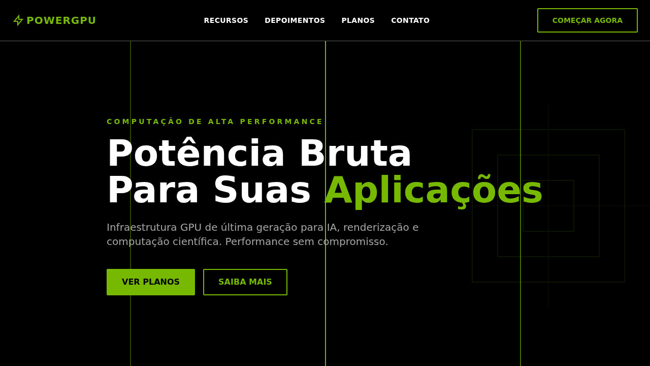
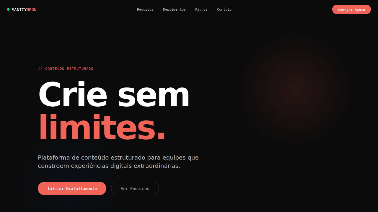
NVIDIA Power Green
Estilo NVIDIA Power Green com alto contraste, acento verde industrial e cantos afiados. Ideal para GPU computing, hardware e tecnologia de alto desempenho.
Uso: GPU computing, Hardware, Tecnologia de alto desempenho, Data centers, Gaming
Contexto Histórico
Inspirado no design da NVIDIA, onde o verde #76b900 funciona como impressão digital da marca em um universo preto-e-branco industrial.
Especificações Técnicas
Cores
Primárias
Secundárias
Efeitos
Verde NVIDIA (#76b900) como acento puro — bordas, underlines e highlights interativos, nunca como superfície. Fundo preto dominante com texto branco em seções escuras. Tipografia industrial pesada (weight 700 padrão para headlines). Border-radius mínimo (1-2px) — cantos afiados e engenheirados. Botões com borda verde 2px solid #76b900. Nav uppercase weight 700. Seções alternando preto/branco. Sombra mínima rgba(0,0,0,0.3) 0px 0px 5px.
Light/Dark
✓ Full / ✓ Full
CSS
background: #000000; color: #ffffff; accent: #76b900; border: 2px solid #76b900 for CTAs; border-radius: 2px; font-family: system-ui, Arial, sans-serif; font-weight: 700; text-transform: uppercase for nav; box-shadow: rgba(0,0,0,0.3) 0px 0px 5px
Variáveis
--bg-dark: #000000; --bg-light: #ffffff; --text-dark: #000000; --text-light: #ffffff; --accent-green: #76b900; --green-light: #bff230; --border: #5e5e5e; --near-black: #1a1a1a; --radius: 2px
Checklist
☐ Verde #76b900 apenas como acento, ☐ Fundo preto dominante, ☐ Headlines weight 700, ☐ Radius mínimo 1-2px, ☐ Botões borda verde 2px, ☐ Nav uppercase, ☐ Alternância preto/branco, ☐ Responsivo
DESIGN.md
Design System: NVIDIA Power Green
1. Visual Theme & Atmosphere
Estilo NVIDIA Power Green com alto contraste, acento verde industrial e cantos afiados. Ideal para GPU computing, hardware e tecnologia de alto desempenho. Inspirado no design da NVIDIA, onde o verde #76b900 funciona como impressão digital da marca em um universo preto-e-branco industrial.
- Density: 5/10 — Balanced
- Variance: 4/10 — Moderate
- Motion: 4/10 — Subtle
2. Color Palette & Roles
- Preto (#000000) — Dark surface, primary background
- Branco (#ffffff) — Light surface, card backgrounds
- Verde NVIDIA (#76b900) — Supporting palette color
- Quase Preto (#1a1a1a) — Dark surface, primary background
- Verde Claro (#bff230) — Success states, positive indicators
- Laranja (#df6500) — Warm accent, call-to-action secondary
- Cinza (#a7a7a7) — Secondary text, borders, muted elements
- Borda (#5e5e5e) — Extended palette, decorative use
3. Typography Rules
- Display / Hero: system-ui — Weight 700, tight tracking, used for headline impact
- Body: system-ui — Weight 400, 16px/1.6 line-height, max 72ch per line
- UI Labels / Captions: system-ui — 0.875rem, weight 500, slight letter-spacing
- Monospace: JetBrains Mono — Used for code, metadata, and technical values
Scale:
- Hero: clamp(2.5rem, 5vw, 4rem)
- H1: 2.25rem
- H2: 1.5rem
- Body: 1rem / 1.6
- Small: 0.875rem
4. Component Stylings
- Primary Button: Sharp edges (0px) shape. Accent color fill. Hover: 8% darken + subtle lift shadow. Active: -1px translate tactile press. Font weight 600. No outer glows.
- Secondary / Ghost Button: Outline variant. 1.5px border in muted color. Text in primary color. Hover: subtle background fill.
- Cards: Sharp edges (0px) corners. Surface background. Subtle shadow (0 2px 12px rgba(0,0,0,0.06)). 1px border stroke.
- Inputs: Label above input. 1px border stroke. Focus ring: 2px accent color offset 2px. Error text below in semantic red. No floating labels.
- Navigation: Primary surface background. Active item: accent color indicator. Font weight 500 when active.
- Skeletons: Shimmer animation matching component dimensions. No circular spinners.
- Empty States: Icon-based composition with descriptive text and action button.
5. Layout Principles
- Grid: CSS Grid primary. Max-width containment: 1280px centered with 1.5rem side padding.
- Spacing rhythm: Balanced. Base unit: 0.5rem (8px).
- Section vertical gaps: clamp(4rem, 8vw, 8rem).
- Hero layout: Split-screen (text left, visual right).
- Feature sections: Zig-zag alternating text+image rows. No 3-equal-columns.
- Mobile collapse: All multi-column layouts collapse below 768px. No horizontal overflow.
- z-index contract: base (0) / sticky-nav (100) / overlay (200) / modal (300) / toast (500).
6. Motion & Interaction
- Physics: Ease-out curves, 200-300ms duration. Smooth and predictable.
- Entry animations: Fade + translate-Y (16px → 0) over 420ms ease-out. Staggered cascades for lists: 80ms between items.
- Hover states: Subtle color shift + shadow adjustment over 200ms.
- Page transitions: Fade only (200ms).
- Performance: Only transform and opacity animated. No layout-triggering properties.
7. Anti-Patterns (Banned)
- No emojis in UI — use icon system only (Lucide, Heroicons)
- No pure white (#FFFFFF) backgrounds — use off-white or dark surfaces
- No oversaturated accent colors (saturation cap: 80%)
- No 3-column equal-width feature layouts — use zig-zag or asymmetric grid
- No
h-screen— usemin-h-[100dvh] - No AI copywriting clichés: "Elevate", "Seamless", "Unleash", "Next-Gen"
- No broken external image links — use picsum.photos or inline SVG
- No generic lorem ipsum in demos
Prompt para AI
Design an NVIDIA-inspired high-contrast landing page. NVIDIA Green (#76b900) as pure accent — borders, underlines, interactive highlights only, never as surface fill. Black (#000000) dominant background with white text. Industrial heavy typography (weight 700 for headlines at 36px). Minimal border-radius (1-2px) — sharp engineered corners. Green-bordered buttons (2px solid #76b900). Uppercase navigation at weight 700. Sections alternating black/white. Minimal shadow rgba(0,0,0,0.3) 0px 0px 5px.
Relacionados
Última sincronização: 01/04/2026