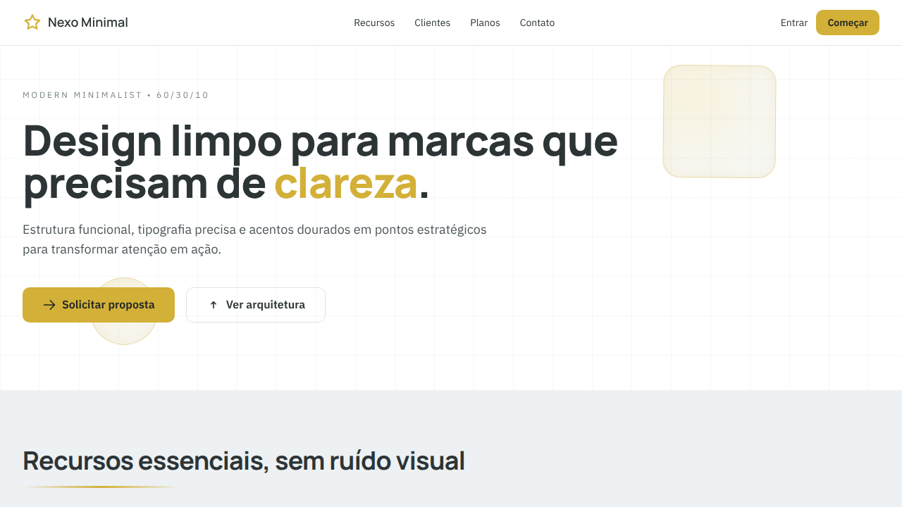
Modern Minimalist
Estilo Modern Minimalist com paleta 60/30/10: branco e cinza suave na base, carvão profundo para legibilidade e dourado de destaque para CTAs.
Uso: Design de logos minimalistas, Landing pages corporativas, Sites institucionais clean, Produtos SaaS premium
Contexto Histórico
Baseado na evolução do minimalismo editorial e do Swiss Style para interfaces digitais contemporâneas, prioriza clareza, hierarquia visual e uso estratégico de acentos cromáticos.
Especificações Técnicas
Cores
Primárias
Secundárias
Efeitos
10%: Accent Gold #D3B037 para CTAs, ícones-chave e microdetalhes; sombras sutis, bordas finas 1px, tipografia nítida e transições suaves (200-250ms)
Light/Dark
✓ Full / ◐ Partial
CSS
background: #FFFFFF; color: #2D3436; --surface-alt: #DFE6E9; --accent: #D3B037; border: 1px solid rgba(45,52,54,0.12); box-shadow: 0 2px 8px rgba(45,52,54,0.06); transition: all 0.25s ease; font-family: 'Inter', sans-serif;
Variáveis
--color-primary-60-a: #FFFFFF; --color-primary-60-b: #DFE6E9; --color-secondary-30: #2D3436; --color-accent-10: #D3B037; --radius-sm: 8px; --border-subtle: 1px solid rgba(45,52,54,0.12); --shadow-soft: 0 2px 8px rgba(45,52,54,0.06); --transition-fast: 250ms ease;
Checklist
☐ Proporção 60/30/10 respeitada, ☐ Fundo limpo com #FFFFFF/#DFE6E9, ☐ Tipografia em #2D3436 com contraste alto, ☐ Destaques pontuais em #D3B037, ☐ Espaço em branco generoso, ☐ Layout responsivo
DESIGN.md
Design System: Modern Minimalist
1. Visual Theme & Atmosphere
Estilo Modern Minimalist com paleta 60/30/10: branco e cinza suave na base, carvão profundo para legibilidade e dourado de destaque para CTAs. Baseado na evolução do minimalismo editorial e do Swiss Style para interfaces digitais contemporâneas, prioriza clareza, hierarquia visual e uso estratégico de acentos cromáticos.
- Density: 3/10 — Airy
- Variance: 2/10 — Structured
- Motion: 4/10 — Subtle
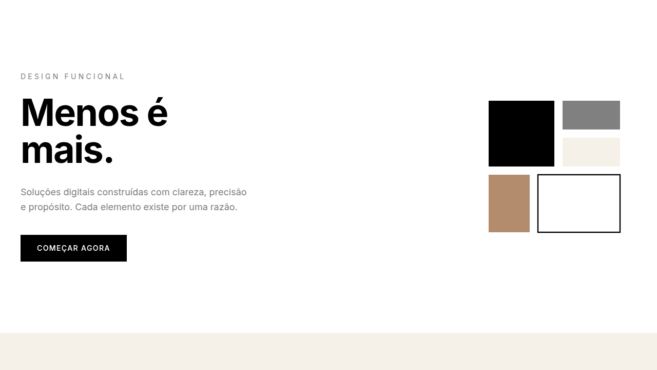
2. Color Palette & Roles
- Pure White (#FFFFFF) — Light surface, card backgrounds
- e Soft Grey (#DFE6E9) — Secondary text, borders, muted elements
- Deep Charcoal (#2D3436) — Deep contrast surface
3. Typography Rules
- Display / Hero: Inter — Weight 700, tight tracking, used for headline impact
- Body: Inter — Weight 400, 16px/1.6 line-height, max 72ch per line
- UI Labels / Captions: Inter — 0.875rem, weight 500, slight letter-spacing
- Monospace: JetBrains Mono — Used for code, metadata, and technical values
Scale:
- Hero: clamp(2.5rem, 5vw, 4rem)
- H1: 2.25rem
- H2: 1.5rem
- Body: 1rem / 1.6
- Small: 0.875rem
4. Component Stylings
- Primary Button: Moderately rounded (0.75rem) shape. Accent color fill. Hover: 8% darken + subtle lift shadow. Active: -1px translate tactile press. Font weight 600. No outer glows.
- Secondary / Ghost Button: Outline variant. 1.5px border in muted color. Text in primary color. Hover: subtle background fill.
- Cards: Moderately rounded (0.75rem) corners. Surface background. Subtle shadow (0 2px 12px rgba(0,0,0,0.06)). 1px border stroke.
- Inputs: Label above input. 1px border stroke. Focus ring: 2px accent color offset 2px. Error text below in semantic red. No floating labels.
- Navigation: Primary surface background. Active item: accent color indicator. Font weight 500 when active.
- Skeletons: Shimmer animation matching component dimensions. No circular spinners.
- Empty States: Icon-based composition with descriptive text and action button.
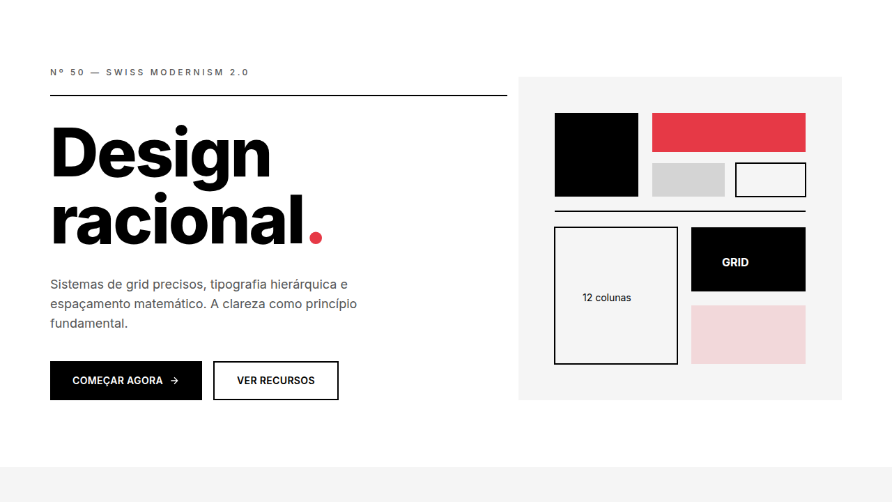
5. Layout Principles
- Grid: CSS Grid primary. Max-width containment: 1280px centered with 1.5rem side padding.
- Spacing rhythm: Balanced. Base unit: 0.5rem (8px).
- Section vertical gaps: clamp(4rem, 8vw, 8rem).
- Hero layout: Split-screen (text left, visual right).
- Feature sections: Zig-zag alternating text+image rows. No 3-equal-columns.
- Mobile collapse: All multi-column layouts collapse below 768px. No horizontal overflow.
- z-index contract: base (0) / sticky-nav (100) / overlay (200) / modal (300) / toast (500).
6. Motion & Interaction
- Physics: Ease-out curves, 200-300ms duration. Smooth and predictable.
- Entry animations: Fade + translate-Y (16px → 0) over 420ms ease-out. Staggered cascades for lists: 80ms between items.
- Hover states: Subtle color shift + shadow adjustment over 200ms.
- Page transitions: Fade only (200ms).
- Performance: Only transform and opacity animated. No layout-triggering properties.
7. Anti-Patterns (Banned)
- No emojis in UI — use icon system only (Lucide, Heroicons)
- No decorative gradients — flat color only
- No shadows heavier than 0 2px 8px rgba(0,0,0,0.08)
- No pure black (#000000) — use off-black or charcoal variants
- No oversaturated accent colors (saturation cap: 80%)
- No 3-column equal-width feature layouts — use zig-zag or asymmetric grid
- No
h-screen— usemin-h-[100dvh] - No AI copywriting clichés: "Elevate", "Seamless", "Unleash", "Next-Gen"
- No broken external image links — use picsum.photos or inline SVG
- No generic lorem ipsum in demos
Prompt para AI
Create a modern minimalist landing page with strict 60/30/10 color balance. Use 60% pure white (#FFFFFF) and soft grey (#DFE6E9) for clean backgrounds and generous whitespace, 30% deep charcoal (#2D3436) for typography and structure, and 10% accent gold (#D3B037) for CTAs and key focal points. Keep the layout geometric, highly legible, and elegant. Avoid visual noise and heavy decoration.
Relacionados
Última sincronização: 01/04/2026