Minimalismo Fotográfico Elegante
Minimalismo Fotográfico Elegante — Design minimalism com photography, portfolio, elegant. Template e prompt pronto para IA.
Uso: Landing pages, Websites modernas
Contexto Histórico
Estilo Minimalismo Fotográfico Elegante representa uma tendência moderna em design UI/UX web com foco em minimalism.
Especificações Técnicas
Cores
Primárias
Secundárias
Efeitos
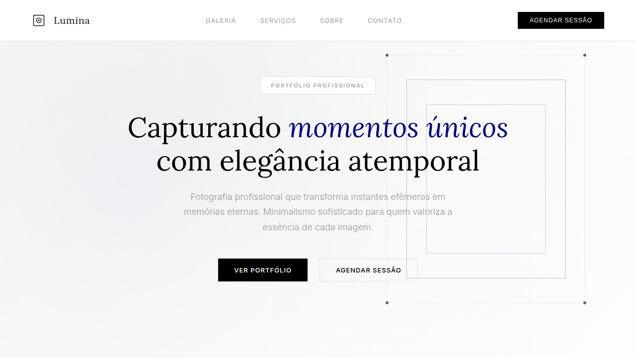
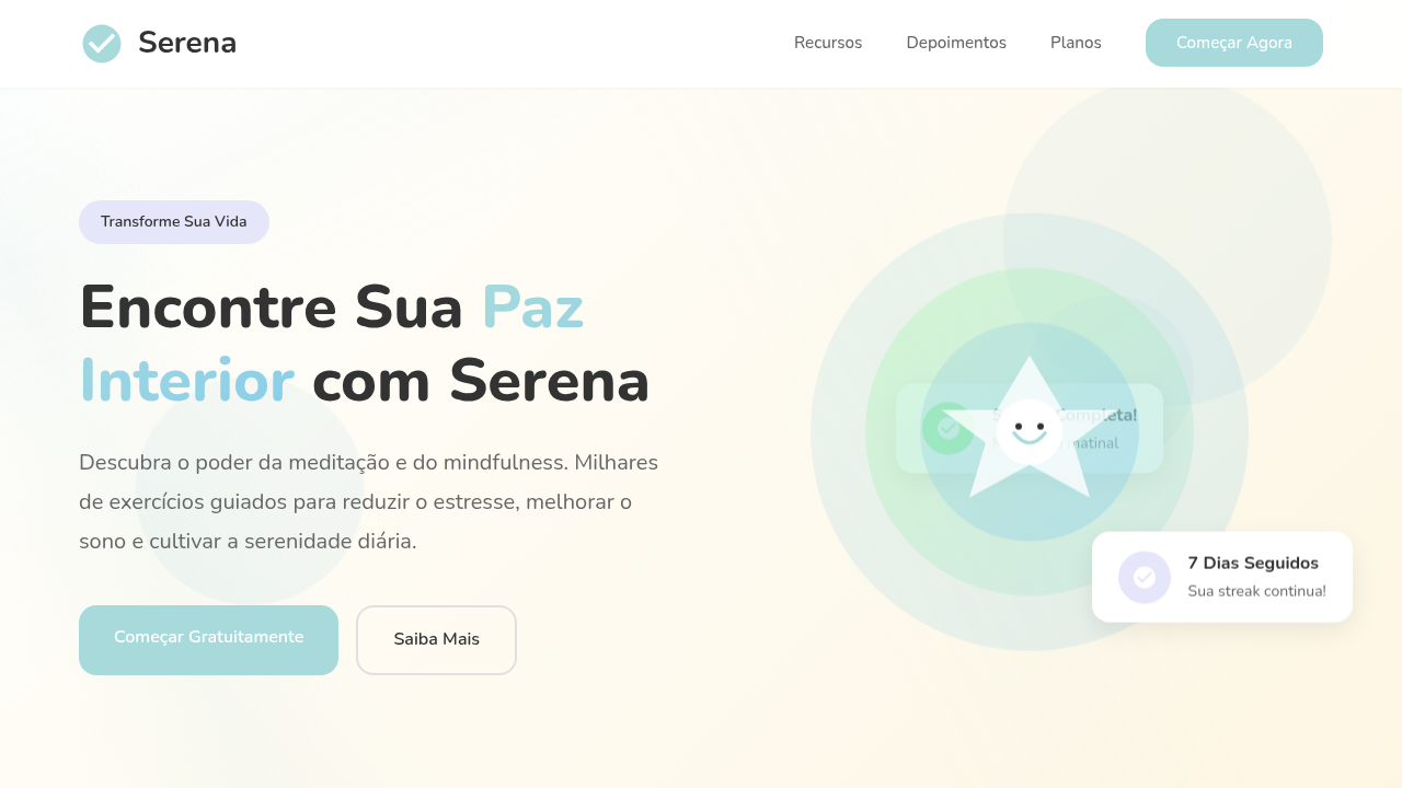
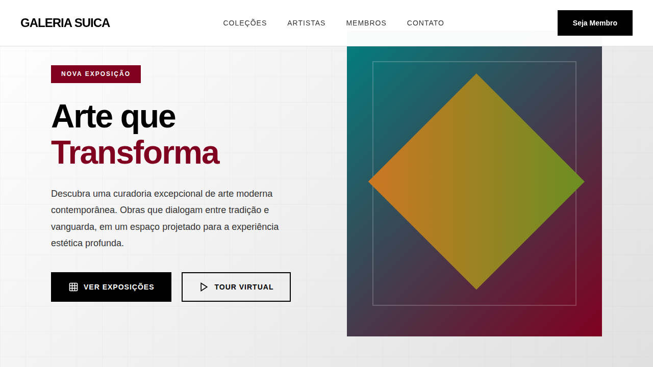
Foco total na imagem, tipografia serifada elegante para títulos e sans-serif para corpo, navegação discreta, espaço em branco generoso, transições suaves de galeria, micro-interações de zoom em imagens.
Light/Dark
✓ Full / ✗ No
CSS
background: #FFFFFF, color: #333333, border-bottom: 1px solid #E0E0E0, font-family: "Lora, serif", transition: all 0.4s ease-in-out, .gallery-grid, .image-overlay, .nav-discreet.
Variáveis
--white-bg: #FFFFFF, --black-text: #000000, --dark-grey-text: #333333, --light-grey-border: #E0E0E0, --font-serif: "Lora, serif", --font-sans: "Helvetica Neue, sans-serif", --image-focus-scale: 1.05.
Checklist
☐ Foco total na imagem, ☐ Tipografia serifada elegante, ☐ Navegação discreta, ☐ Espaço em branco generoso, ☐ Transições de galeria, ☐ Micro-interações de zoom.
DESIGN.md
Design System: Minimalismo Fotográfico Elegante
1. Visual Theme & Atmosphere
Minimalismo Fotográfico Elegante — Design minimalism com photography, portfolio, elegant. Template e prompt pronto para IA. Estilo Minimalismo Fotográfico Elegante representa uma tendência moderna em design UI/UX web com foco em minimalism.
- Density: 3/10 — Airy
- Variance: 8/10 — Expressive
- Motion: 4/10 — Subtle
2. Color Palette & Roles
- Branco (#FFFFFF) — Light surface, card backgrounds
- Preto (#000000) — Dark surface, primary background
- Cinza Escuro (#333333) — Dark surface, primary background
- Cinza Claro (#E0E0E0) — Secondary text, borders, muted elements
- Bege (#F5F5DC) — Extended palette, decorative use
- Azul Marinho (#000080) — Secondary accent
- Verde Escuro (#006400) — Deep contrast surface
- Marrom (#A52A2A) — Extended palette, decorative use
3. Typography Rules
- Display / Hero: Lora — Weight 700, tight tracking, used for headline impact
- Body: Lora — Weight 400, 16px/1.6 line-height, max 72ch per line
- UI Labels / Captions: Lora — 0.875rem, weight 500, slight letter-spacing
- Monospace: JetBrains Mono — Used for code, metadata, and technical values
Scale:
- Hero: clamp(2.5rem, 5vw, 4rem)
- H1: 2.25rem
- H2: 1.5rem
- Body: 1rem / 1.6
- Small: 0.875rem
4. Component Stylings
- Primary Button: Subtly rounded (0.5rem) shape. Accent color fill. Hover: 8% darken + subtle lift shadow. Active: -1px translate tactile press. Font weight 600. No outer glows.
- Secondary / Ghost Button: Outline variant. 1.5px border in muted color. Text in primary color. Hover: subtle background fill.
- Cards: Subtly rounded (0.5rem) corners. Surface background. Subtle shadow (0 2px 12px rgba(0,0,0,0.06)). 1px border stroke.
- Inputs: Label above input. 1px border stroke. Focus ring: 2px accent color offset 2px. Error text below in semantic red. No floating labels.
- Navigation: Primary surface background. Active item: accent color indicator. Font weight 500 when active.
- Skeletons: Shimmer animation matching component dimensions. No circular spinners.
- Empty States: Icon-based composition with descriptive text and action button.
5. Layout Principles
- Grid: CSS Grid primary. Max-width containment: 1280px centered with 1.5rem side padding.
- Spacing rhythm: Balanced. Base unit: 0.5rem (8px).
- Section vertical gaps: clamp(4rem, 8vw, 8rem).
- Hero layout: Asymmetric composition.
- Feature sections: Asymmetric grid with varied card sizes. No 3-equal-columns.
- Mobile collapse: All multi-column layouts collapse below 768px. No horizontal overflow.
- z-index contract: base (0) / sticky-nav (100) / overlay (200) / modal (300) / toast (500).
6. Motion & Interaction
- Physics: Ease-out curves, 200-300ms duration. Smooth and predictable.
- Entry animations: Fade + translate-Y (16px → 0) over 420ms ease-out. Staggered cascades for lists: 80ms between items.
- Hover states: Subtle color shift + shadow adjustment over 200ms.
- Page transitions: Fade only (200ms).
- Performance: Only transform and opacity animated. No layout-triggering properties.
7. Anti-Patterns (Banned)
- No emojis in UI — use icon system only (Lucide, Heroicons)
- No decorative gradients — flat color only
- No shadows heavier than 0 2px 8px rgba(0,0,0,0.08)
- No pure black (#000000) — use off-black or charcoal variants
- No oversaturated accent colors (saturation cap: 80%)
- No 3-column equal-width feature layouts — use zig-zag or asymmetric grid
- No
h-screen— usemin-h-[100dvh] - No AI copywriting clichés: "Elevate", "Seamless", "Unleash", "Next-Gen"
- No broken external image links — use picsum.photos or inline SVG
- No generic lorem ipsum in demos
Prompt para AI
Design an elegant and minimalist photography portfolio landing page. Use: full focus on high-quality images, elegant serif typography for titles, discreet navigation, generous white space, smooth gallery transitions, image zoom micro-interactions, clean and sophisticated feel.
Relacionados
Última sincronização: 01/04/2026