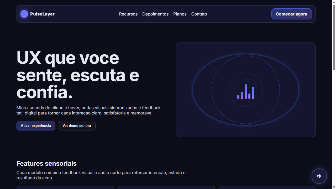
Micro-Sound UX
Micro-Sound UX: interface multissensorial com sons tateis, ondas visuais, ripple effects e feedback audio-visual sincronizado. Web Audio API integrada. Prompt para IA.
Uso: Apps de produtividade premium, Plataformas de musica, Interfaces de gaming, Dashboards interativos, Experiencias imersivas, Ferramentas criativas
Contexto Histórico
Impulsionado pelo costume tatil e sonoro gerado pelos smartphones, o som retornou com classe a web em 2025-2026. Sem reproducoes pesadas de fundo contra a vontade do usuario, o foco esta em micro-interacoes diminutas: cliques mecanicos satisfatorios, tons suaves no hover e bipes curtos indicando sucesso ou erro.
Especificações Técnicas
Cores
Primárias
Secundárias
Efeitos
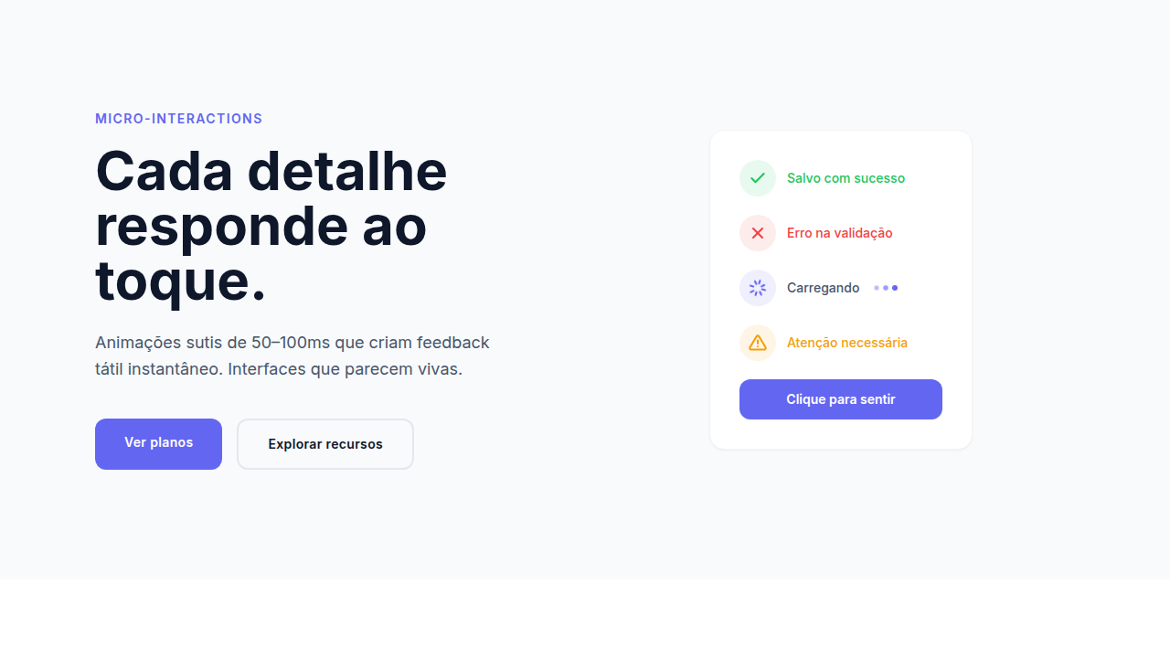
UX Multissensorial com micro-sons: clique mecanico satisfatorio ao apertar botoes (Web Audio API oscillator 80ms), tons suaves low-frequency ao hover em links (sine wave 200Hz 50ms fade), bipes curtos para sucesso/erro de formularios, indicador visual de som ativo (icone speaker pulsante), ondas sonoras visuais (CSS animation em circulos concentricos), ripple effect tatil nos cliques, feedback visual sincronizado com audio (flash de cor no momento do som), toggle mute respeitando preferencias do usuario
Light/Dark
✗ None / ✓ Full
CSS
background: #0D0D1A; color: #E8E8F0; font-family: 'Inter', sans-serif; @keyframes ripple { from { transform: scale(0); opacity: 0.6 } to { transform: scale(4); opacity: 0 } }; @keyframes pulse-glow { 0%,100% { box-shadow: 0 0 10px color } 50% { box-shadow: 0 0 25px color } }; @keyframes shake { 0%,100% { transform: translateX(0) } 25% { transform: translateX(-4px) } 75% { transform: translateX(4px) } }; transition: all 200ms ease; border-radius: 12px
Variáveis
--bg-deep: #0D0D1A; --bg-surface: #1A1A3E; --color-text: #E8E8F0; --color-interactive: #4A7CFF; --color-success: #00E676; --color-error: #FF5252; --color-warning: #FFD740; --color-hover: #9C6AFF; --ripple-duration: 600ms; --pulse-duration: 2s; --sound-click-freq: 200; --sound-hover-freq: 150; --sound-duration: 80; --border-radius: 12px; --font-primary: 'Inter', sans-serif
Checklist
☐ Fundo escuro profundo com elementos interativos brilhantes, ☐ Ripple wave animation em cliques de botao, ☐ Pulse glow no hover de elementos interativos, ☐ Ondas sonoras visuais (circulos concentricos animados), ☐ Shake animation para erros, ☐ Icone speaker pulsante flutuante, ☐ Web Audio API para micro-sons reais, ☐ Toggle mute com localStorage, ☐ Feedback visual sincronizado com audio, ☐ Color coding por tipo de interacao
DESIGN.md
Design System: Micro-Sound UX
1. Visual Theme & Atmosphere
Micro-Sound UX: interface multissensorial com sons tateis, ondas visuais, ripple effects e feedback audio-visual sincronizado. Web Audio API integrada. Prompt para IA. Impulsionado pelo costume tatil e sonoro gerado pelos smartphones, o som retornou com classe a web em 2025-2026. Sem reproducoes pesadas de fundo contra a vontade do usuario, o foco esta em micro-interacoes diminutas: cliques mecanicos satisfatorios, tons suaves no hover e bipes curtos indicando sucesso ou erro.
- Density: 5/10 — Balanced
- Variance: 4/10 — Moderate
- Motion: 6/10 — Expressive
2. Color Palette & Roles
- Escuro Profundo (#0D0D1A) — Primary background surface
- Azul Noturno (#1A1A3E) — Accent highlight, links and focus states
- Branco Suave (#E8E8F0) — Light surface, card backgrounds
- Azul Interacao (#4A7CFF) — Secondary accent
- Verde Sucesso (#00E676) — Success states, positive indicators
- Vermelho Erro (#FF5252) — Error states, destructive actions
- Amarelo Atencao (#FFD740) — Warning states, attention indicators
- Roxo Hover (#9C6AFF) — Accent color, emphasis elements
3. Typography Rules
- Display / Hero: Inter — Weight 700, tight tracking, used for headline impact
- Body: Inter — Weight 400, 16px/1.6 line-height, max 72ch per line
- UI Labels / Captions: Inter — 0.875rem, weight 500, slight letter-spacing
- Monospace: JetBrains Mono — Used for code, metadata, and technical values
Scale:
- Hero: clamp(2.5rem, 5vw, 4rem)
- H1: 2.25rem
- H2: 1.5rem
- Body: 1rem / 1.6
- Small: 0.875rem
4. Component Stylings
- Primary Button: Rounded (12px) shape. Accent color fill. Hover: 8% darken + subtle lift shadow. Active: -1px translate tactile press. Font weight 600. No outer glows.
- Secondary / Ghost Button: Outline variant. 1.5px border in muted color. Text in primary color. Hover: subtle background fill.
- Cards: Rounded (12px) corners. Surface background. Subtle shadow (0 2px 12px rgba(0,0,0,0.06)). 1px border stroke.
- Inputs: Label above input. 1px border stroke. Focus ring: 2px accent color offset 2px. Error text below in semantic red. No floating labels.
- Navigation: Primary surface background. Active item: accent color indicator. Font weight 500 when active.
- Skeletons: Shimmer animation matching component dimensions. No circular spinners.
- Empty States: Icon-based composition with descriptive text and action button.
5. Layout Principles
- Grid: CSS Grid primary. Max-width containment: 1280px centered with 1.5rem side padding.
- Spacing rhythm: Balanced. Base unit: 0.5rem (8px).
- Section vertical gaps: clamp(4rem, 8vw, 8rem).
- Hero layout: Split-screen (text left, visual right).
- Feature sections: Zig-zag alternating text+image rows. No 3-equal-columns.
- Mobile collapse: All multi-column layouts collapse below 768px. No horizontal overflow.
- z-index contract: base (0) / sticky-nav (100) / overlay (200) / modal (300) / toast (500).
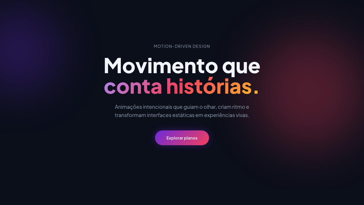
6. Motion & Interaction
- Physics: Spring — stiffness 120, damping 20. Confident, weighted transitions.
- Entry animations: Fade + translate-Y (16px → 0) over 480ms ease-out. Staggered cascades for lists: 100ms between items.
- Hover states: Scale(1.03) + shadow lift over 200ms.
- Page transitions: Fade + slide (300ms).
- Performance: Only transform and opacity animated. No layout-triggering properties.
7. Anti-Patterns (Banned)
- No emojis in UI — use icon system only (Lucide, Heroicons)
- No pure black (#000000) — use off-black or charcoal variants
- No oversaturated accent colors (saturation cap: 80%)
- No 3-column equal-width feature layouts — use zig-zag or asymmetric grid
- No
h-screen— usemin-h-[100dvh] - No AI copywriting clichés: "Elevate", "Seamless", "Unleash", "Next-Gen"
- No broken external image links — use picsum.photos or inline SVG
- No generic lorem ipsum in demos
Prompt para AI
Design a multisensory landing page with micro-sound UX integration. Dark deep background (#0D0D1A) with glowing interactive elements. Each interactive element has VISUAL FEEDBACK that suggests sound: buttons show ripple wave animation on click (concentric circles expanding outward), hover states pulse with a subtle glow animation (suggesting a soft tone), form success shows expanding green sound wave rings, form error shows red vibration shake animation. Include a floating speaker icon that pulses to indicate audio is available. Visual sound wave representations: animated concentric circles, oscillating sine wave SVG paths, equalizer bar animations. Use Web Audio API via minimal inline JS for actual micro-sounds: oscillator sine wave 200Hz for 80ms on button click, 150Hz for 50ms on hover, ascending tone for success, descending for error. Include a mute toggle that respects user preference (localStorage). Color coding: blue for interactive, green for success, red for error, purple for hover state. Typography clean and modern (Inter). All visual animations should FEEL tactile and satisfying.
Relacionados
Última sincronização: 01/04/2026