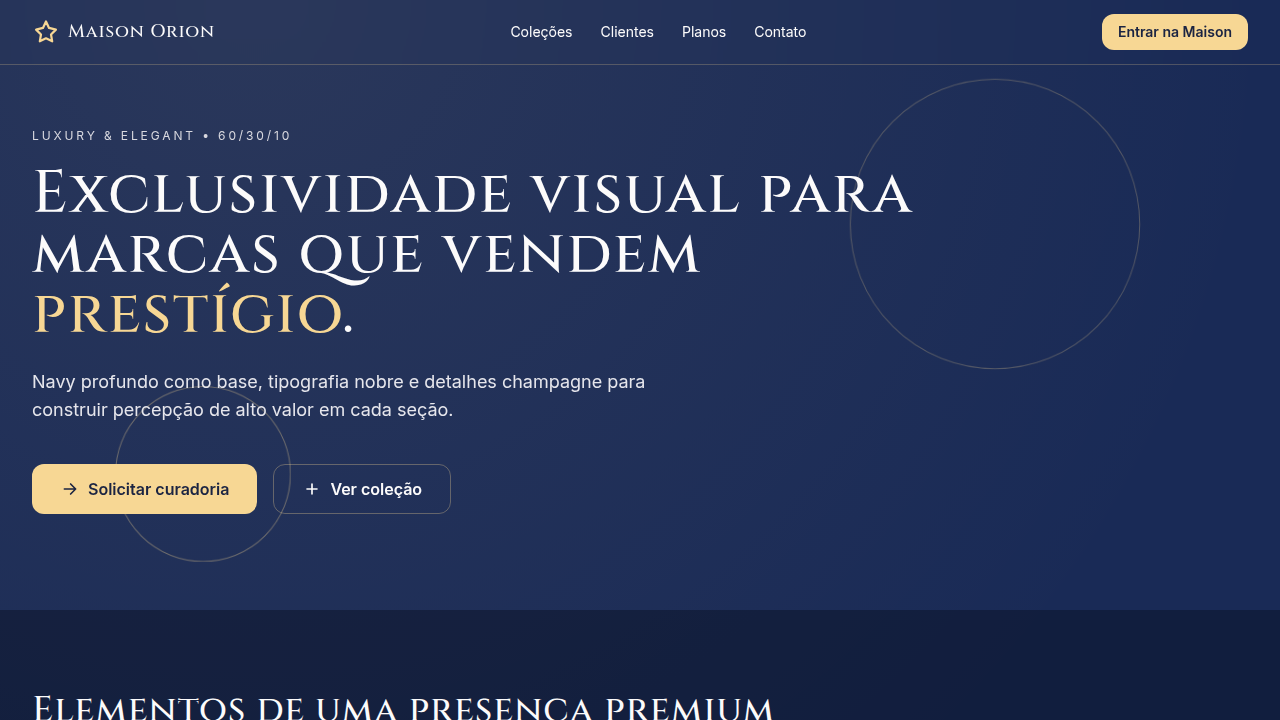
Luxury & Elegant
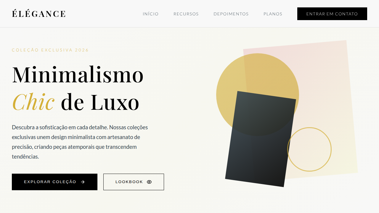
Estilo Luxury & Elegant com navy profundo, branco perolado, rosa empoeirado e acento champagne para branding clássico de alto padrão.
Uso: Branding de luxo, Hotéis e hospitalidade premium, Moda high-end, Joalheria, Serviços financeiros exclusivos
Contexto Histórico
Inspirado em identidades clássicas de maisons de luxo e design editorial sofisticado, combina base escura nobre com acentos claros e metálicos para comunicar exclusividade.
Especificações Técnicas
Cores
Primárias
Secundárias
Efeitos
10%: Champagne #F7D794 em filetes, logomarca e botões premium; tipografia serifada para títulos, contraste refinado, brilho discreto e transições suaves (240-320ms)
Light/Dark
✓ Full / ✓ Full
CSS
background: #192A56; color: #FCFBFB; --rose: #EDA6A3; --champagne: #F7D794; border: 1px solid rgba(247,215,148,0.26); box-shadow: 0 10px 30px rgba(25,42,86,0.45); letter-spacing: 0.01em; transition: all 0.28s ease;
Variáveis
--color-dominant-60: #192A56; --color-secondary-30-text: #FCFBFB; --color-secondary-30-surface: #EDA6A3; --color-accent-10: #F7D794; --font-display: 'Playfair Display', serif; --font-body: 'Inter', sans-serif; --radius-md: 10px; --shadow-lux: 0 10px 30px rgba(25,42,86,0.45);
Checklist
☐ Midnight Navy dominante (60%), ☐ Pearl White + Dusty Rose compondo 30%, ☐ Champagne aplicado com parcimônia (10%), ☐ Hierarquia tipográfica elegante, ☐ Sensação premium consistente, ☐ Responsivo
DESIGN.md
Design System: Luxury & Elegant
1. Visual Theme & Atmosphere
Estilo Luxury & Elegant com navy profundo, branco perolado, rosa empoeirado e acento champagne para branding clássico de alto padrão. Inspirado em identidades clássicas de maisons de luxo e design editorial sofisticado, combina base escura nobre com acentos claros e metálicos para comunicar exclusividade.
- Density: 5/10 — Balanced
- Variance: 4/10 — Moderate
- Motion: 4/10 — Subtle
2. Color Palette & Roles
- Midnight Navy (#192A56) — Dark surface, primary background
- Pearl White (#FCFBFB) — Secondary surface
- Dusty Rose (#EDA6A3) — Extended palette, decorative use
3. Typography Rules
- Display / Hero: Playfair Display — Weight 700, tight tracking, used for headline impact
- Accent: Inter — Used for decorative or emphasis text
- Body: Playfair Display — Weight 400, 16px/1.6 line-height, max 72ch per line
- UI Labels / Captions: Playfair Display — 0.875rem, weight 500, slight letter-spacing
- Monospace: JetBrains Mono — Used for code, metadata, and technical values
Scale:
- Hero: clamp(2.5rem, 5vw, 4rem)
- H1: 2.25rem
- H2: 1.5rem
- Body: 1rem / 1.6
- Small: 0.875rem
4. Component Stylings
- Primary Button: Subtly rounded (0.5rem) shape. Accent color fill. Hover: 8% darken + subtle lift shadow. Active: -1px translate tactile press. Font weight 600. No outer glows.
- Secondary / Ghost Button: Outline variant. 1.5px border in muted color. Text in primary color. Hover: subtle background fill.
- Cards: Subtly rounded (0.5rem) corners. Surface background. Subtle shadow (0 2px 12px rgba(0,0,0,0.06)). 1px border stroke.
- Inputs: Label above input. 1px border stroke. Focus ring: 2px accent color offset 2px. Error text below in semantic red. No floating labels.
- Navigation: Primary surface background. Active item: accent color indicator. Font weight 500 when active.
- Skeletons: Shimmer animation matching component dimensions. No circular spinners.
- Empty States: Icon-based composition with descriptive text and action button.
5. Layout Principles
- Grid: CSS Grid primary. Max-width containment: 1280px centered with 1.5rem side padding.
- Spacing rhythm: Balanced. Base unit: 0.5rem (8px).
- Section vertical gaps: clamp(4rem, 8vw, 8rem).
- Hero layout: Split-screen (text left, visual right).
- Feature sections: Zig-zag alternating text+image rows. No 3-equal-columns.
- Mobile collapse: All multi-column layouts collapse below 768px. No horizontal overflow.
- z-index contract: base (0) / sticky-nav (100) / overlay (200) / modal (300) / toast (500).
6. Motion & Interaction
- Physics: Ease-out curves, 200-300ms duration. Smooth and predictable.
- Entry animations: Fade + translate-Y (16px → 0) over 420ms ease-out. Staggered cascades for lists: 80ms between items.
- Hover states: Subtle color shift + shadow adjustment over 200ms.
- Page transitions: Fade only (200ms).
- Performance: Only transform and opacity animated. No layout-triggering properties.
7. Anti-Patterns (Banned)
- No emojis in UI — use icon system only (Lucide, Heroicons)
- No pure black (#000000) — use off-black or charcoal variants
- No oversaturated accent colors (saturation cap: 80%)
- No 3-column equal-width feature layouts — use zig-zag or asymmetric grid
- No
h-screen— usemin-h-[100dvh] - No AI copywriting clichés: "Elevate", "Seamless", "Unleash", "Next-Gen"
- No broken external image links — use picsum.photos or inline SVG
- No generic lorem ipsum in demos
Prompt para AI
Craft a luxury and elegant interface with strict 60/30/10 color hierarchy. Use 60% midnight navy (#192A56) to establish exclusivity, 30% pearl white (#FCFBFB) and dusty rose (#EDA6A3) for refined typography and supporting surfaces, and 10% champagne (#F7D794) for premium accents such as logo details, dividers, and key CTA highlights. Prioritize timeless composition and restrained ornamentation.
Relacionados
Última sincronização: 01/04/2026