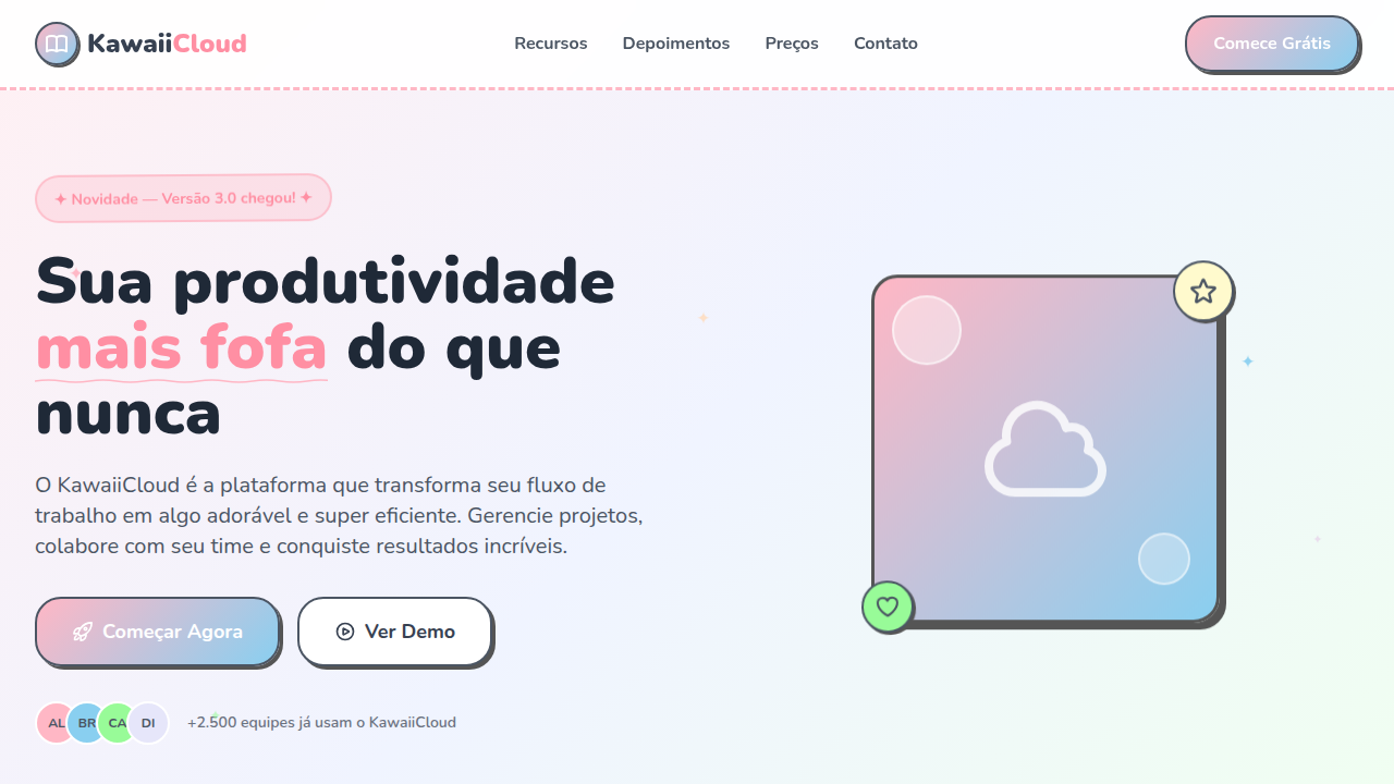
Kawaii Doodle Art
Estilo kawaii com doodles fofos, cores pastel, bordas desenhadas à mão e animações bouncy. Perfeito para projetos criativos, infantis e pop japonês.
Uso: Projetos infantis, Lojas de presentes, Apps de bem-estar, Fan sites, Blogs criativos
Contexto Histórico
Kawaii (可愛い) significa 'fofo' em japonês e é pilar da cultura pop japonesa desde os anos 1970. Hello Kitty, Sanrio e a cultura de stickers definiram essa estética globalmente.
Especificações Técnicas
Cores
Primárias
Secundárias
Efeitos
Doodle-style hand-drawn borders (wavy/irregular), sparkle/star decorations via CSS pseudo-elements, bouncy hover animations (scale + rotate), rounded everything (20-30px radius), subtle wobble animation on elements, pastel gradient backgrounds
Light/Dark
✓ Full / ✗ No
CSS
border-radius: 24px, border: 3px solid with wavy SVG filter, font-family: 'Nunito' or 'Quicksand' rounded, animation: bounce 0.5s ease for hover, background: linear-gradient(135deg, pastel1, pastel2), box-shadow: 3px 3px 0 #333 for sticker outline, transform: scale(1.05) rotate(2deg) on hover
Variáveis
--border-radius: 24px, --doodle-border: 3px wavy, --font-kawaii: 'Nunito', --bounce-scale: 1.05, --sparkle-size: 12px, --pastel-pink: #FFB7C5, --pastel-blue: #89CFF0, --sticker-shadow: 3px 3px 0 #333
Checklist
☐ Pastel color palette consistent, ☐ Doodle-style wavy borders, ☐ Sparkle/star decorations, ☐ Super rounded corners 20-30px, ☐ Bouncy hover animations, ☐ Playful bubbly typography
DESIGN.md
Design System: Kawaii Doodle Art
1. Visual Theme & Atmosphere
Estilo kawaii com doodles fofos, cores pastel, bordas desenhadas à mão e animações bouncy. Perfeito para projetos criativos, infantis e pop japonês. Kawaii (可愛い) significa 'fofo' em japonês e é pilar da cultura pop japonesa desde os anos 1970. Hello Kitty, Sanrio e a cultura de stickers definiram essa estética globalmente.
- Density: 5/10 — Balanced
- Variance: 8/10 — Expressive
- Motion: 6/10 — Expressive
2. Color Palette & Roles
- Sakura Pink (#FFB7C5) — Primary text color
- Baby Blue (#89CFF0) — Accent highlight, links and focus states
- Mint Green (#98FB98) — Supporting palette color
- Lavender (#E6E6FA) — Extended palette, decorative use
- Peach (#FFDAB9) — Extended palette, decorative use
- Lemon Yellow (#FFFACD) — Warning states, attention indicators
- Coral (#FF7F7F) — Extended palette, decorative use
- Lilac (#DDA0DD) — Extended palette, decorative use
3. Typography Rules
- Display / Hero: Nunito — Weight 700, tight tracking, used for headline impact
- Accent: Quicksand — Used for decorative or emphasis text
- Body: Nunito — Weight 400, 16px/1.6 line-height, max 72ch per line
- UI Labels / Captions: Nunito — 0.875rem, weight 500, slight letter-spacing
- Monospace: JetBrains Mono — Used for code, metadata, and technical values
Scale:
- Hero: clamp(2.5rem, 5vw, 4rem)
- H1: 2.25rem
- H2: 1.5rem
- Body: 1rem / 1.6
- Small: 0.875rem
4. Component Stylings
- Primary Button: Generously rounded (1.5rem) shape. Accent color fill. Hover: 8% darken + subtle lift shadow. Active: -1px translate tactile press. Font weight 600. No outer glows.
- Secondary / Ghost Button: Outline variant. 1.5px border in muted color. Text in primary color. Hover: subtle background fill.
- Cards: Generously rounded (1.5rem) corners. Surface background. Subtle shadow (0 2px 12px rgba(0,0,0,0.06)). 1px border stroke.
- Inputs: Label above input. 1px border stroke. Focus ring: 2px accent color offset 2px. Error text below in semantic red. No floating labels.
- Navigation: Primary surface background. Active item: accent color indicator. Font weight 500 when active.
- Skeletons: Shimmer animation matching component dimensions. No circular spinners.
- Empty States: Icon-based composition with descriptive text and action button.
5. Layout Principles
- Grid: CSS Grid primary. Max-width containment: 1280px centered with 1.5rem side padding.
- Spacing rhythm: Balanced. Base unit: 0.5rem (8px).
- Section vertical gaps: clamp(4rem, 8vw, 8rem).
- Hero layout: Asymmetric composition.
- Feature sections: Asymmetric grid with varied card sizes. No 3-equal-columns.
- Mobile collapse: All multi-column layouts collapse below 768px. No horizontal overflow.
- z-index contract: base (0) / sticky-nav (100) / overlay (200) / modal (300) / toast (500).
6. Motion & Interaction
- Physics: Spring — stiffness 120, damping 20. Confident, weighted transitions.
- Entry animations: Fade + translate-Y (16px → 0) over 480ms ease-out. Staggered cascades for lists: 100ms between items.
- Hover states: Scale(1.03) + shadow lift over 200ms.
- Page transitions: Fade + slide (300ms).
- Performance: Only transform and opacity animated. No layout-triggering properties.
7. Anti-Patterns (Banned)
- No emojis in UI — use icon system only (Lucide, Heroicons)
- No pure black (#000000) — use off-black or charcoal variants
- No oversaturated accent colors (saturation cap: 80%)
- No 3-column equal-width feature layouts — use zig-zag or asymmetric grid
- No
h-screen— usemin-h-[100dvh] - No AI copywriting clichés: "Elevate", "Seamless", "Unleash", "Next-Gen"
- No broken external image links — use picsum.photos or inline SVG
- No generic lorem ipsum in demos
Prompt para AI
Design a kawaii doodle art style landing page. Use cute pastel colors (pink, baby blue, mint, lavender), hand-drawn doodle borders, sparkle and star decorations, super rounded corners (20-30px). Typography should be playful and bubbly. Include chibi-style SVG illustrations, sticker-like elements with white outlines, and bouncy hover animations. Everything should feel cute, friendly, and hand-crafted.
Relacionados
Última sincronização: 01/04/2026