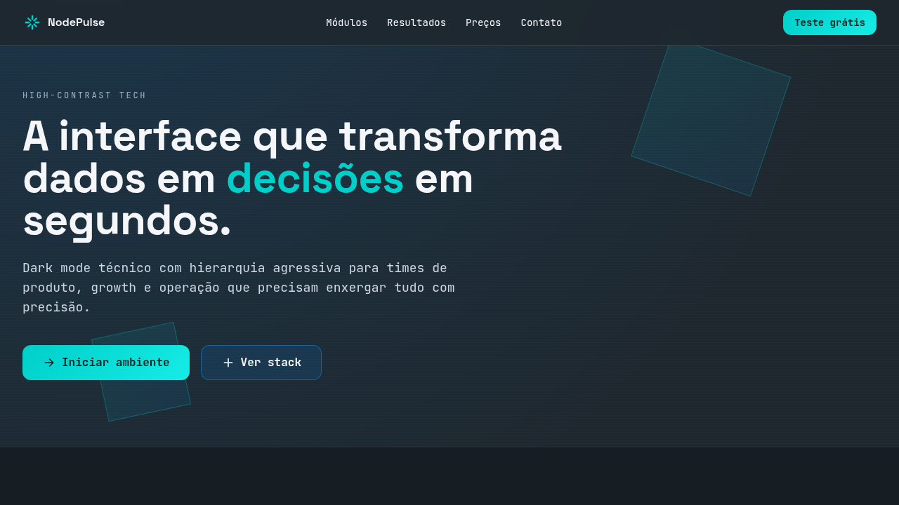
High-Contrast Tech
Estilo High-Contrast Tech com base dark, leitura extrema e acentos neon para interfaces tecnológicas, dashboards e experiências UX/UI de alto desempenho.
Uso: UX/UI de produto digital, Dashboards analytics, Plataformas SaaS, Conteúdo tecnológico, Apps B2B
Contexto Histórico
Derivado da consolidação do dark mode em produtos digitais e da estética cyber-tech, equilibra legibilidade funcional com acentos vibrantes orientados a interação.
Especificações Técnicas
Cores
Primárias
Secundárias
Efeitos
10%: Cyan Neon #00CEC9 para botões primários, notificações e elementos interativos; brilho controlado, bordas técnicas e transições rápidas (180-220ms)
Light/Dark
✓ Full / ✓ Full
CSS
background: #1E272E; color: #F5F6FA; --blue-struct: #0984E3; --accent-neon: #00CEC9; border: 1px solid rgba(245,246,250,0.12); box-shadow: 0 0 0 1px rgba(0,206,201,0.15), 0 8px 24px rgba(0,0,0,0.35); transition: all 0.2s ease;
Variáveis
--color-dominant-60: #1E272E; --color-secondary-30-text: #F5F6FA; --color-secondary-30-struct: #0984E3; --color-accent-10: #00CEC9; --radius-md: 10px; --focus-ring: 0 0 0 3px rgba(0,206,201,0.35); --shadow-tech: 0 8px 24px rgba(0,0,0,0.35);
Checklist
☐ Base dark #1E272E predominante (60%), ☐ Leitura forte com #F5F6FA, ☐ Estrutura secundária em #0984E3, ☐ Destaque neon #00CEC9 limitado a 10%, ☐ Contraste AA/AAA validado, ☐ Responsivo
DESIGN.md
Design System: High-Contrast Tech
1. Visual Theme & Atmosphere
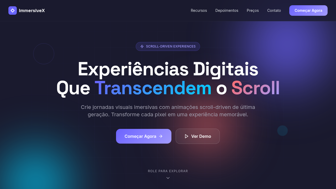
Estilo High-Contrast Tech com base dark, leitura extrema e acentos neon para interfaces tecnológicas, dashboards e experiências UX/UI de alto desempenho. Derivado da consolidação do dark mode em produtos digitais e da estética cyber-tech, equilibra legibilidade funcional com acentos vibrantes orientados a interação.
- Density: 8/10 — Dense
- Variance: 4/10 — Moderate
- Motion: 4/10 — Subtle
2. Color Palette & Roles
- Night Black (#1E272E) — Dark surface, primary background
- Cloud White (#F5F6FA) — Secondary surface
- Electric Blue (#0984E3) — Secondary accent
3. Typography Rules
- Display / Hero: System UI stack (-apple-system, sans-serif) — Weight 700, tight tracking, used for headline impact
- Body: System UI stack (-apple-system, sans-serif) — Weight 400, 16px/1.6 line-height, max 72ch per line
- UI Labels / Captions: System UI stack (-apple-system, sans-serif) — 0.875rem, weight 500, slight letter-spacing
- Monospace: JetBrains Mono — Used for code, metadata, and technical values
Scale:
- Hero: clamp(2.5rem, 5vw, 4rem)
- H1: 2.25rem
- H2: 1.5rem
- Body: 1rem / 1.6
- Small: 0.875rem
4. Component Stylings
- Primary Button: Generously rounded (1.5rem) shape. Accent color fill. Hover: 8% darken + subtle lift shadow. Active: -1px translate tactile press. Font weight 600. No outer glows.
- Secondary / Ghost Button: Outline variant. 1.5px border in muted color. Text in primary color. Hover: subtle background fill.
- Cards: Generously rounded (1.5rem) corners. Surface background. Subtle shadow (0 2px 12px rgba(0,0,0,0.06)). 1px border stroke.
- Inputs: Label above input. 1px border stroke. Focus ring: 2px accent color offset 2px. Error text below in semantic red. No floating labels.
- Navigation: Primary surface background. Active item: accent color indicator. Font weight 500 when active.
- Skeletons: Shimmer animation matching component dimensions. No circular spinners.
- Empty States: Icon-based composition with descriptive text and action button.
5. Layout Principles
- Grid: CSS Grid primary. Max-width containment: 1280px centered with 1.5rem side padding.
- Spacing rhythm: Balanced. Base unit: 0.5rem (8px).
- Section vertical gaps: clamp(4rem, 8vw, 8rem).
- Hero layout: Split-screen (text left, visual right).
- Feature sections: Zig-zag alternating text+image rows. No 3-equal-columns.
- Mobile collapse: All multi-column layouts collapse below 768px. No horizontal overflow.
- z-index contract: base (0) / sticky-nav (100) / overlay (200) / modal (300) / toast (500).
6. Motion & Interaction
- Physics: Ease-out curves, 200-300ms duration. Smooth and predictable.
- Entry animations: Fade + translate-Y (16px → 0) over 420ms ease-out. Staggered cascades for lists: 80ms between items.
- Hover states: Subtle color shift + shadow adjustment over 200ms.
- Page transitions: Fade only (200ms).
- Performance: Only transform and opacity animated. No layout-triggering properties.
7. Anti-Patterns (Banned)
- No emojis in UI — use icon system only (Lucide, Heroicons)
- No pure white (#FFFFFF) backgrounds — use off-white or dark surfaces
- No oversaturated accent colors (saturation cap: 80%)
- No 3-column equal-width feature layouts — use zig-zag or asymmetric grid
- No
h-screen— usemin-h-[100dvh] - No AI copywriting clichés: "Elevate", "Seamless", "Unleash", "Next-Gen"
- No broken external image links — use picsum.photos or inline SVG
- No generic lorem ipsum in demos
Prompt para AI
Create a high-contrast tech interface with strict 60/30/10 color distribution. Use 60% night black (#1E272E) as the dark-mode foundation, 30% cloud white (#F5F6FA) plus electric blue (#0984E3) for readability and structural hierarchy, and 10% cyan neon (#00CEC9) for primary actions and interaction cues. Emphasize clarity, data-driven hierarchy, and crisp UI components.
Relacionados
Última sincronização: 01/04/2026