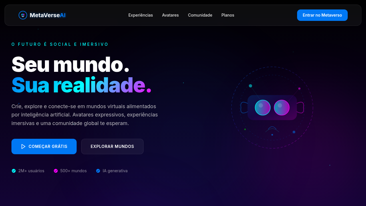
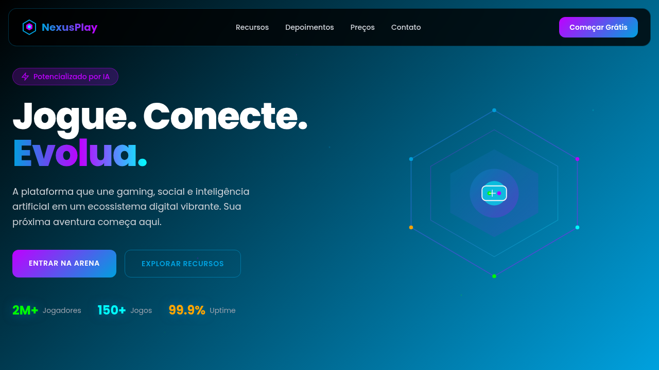
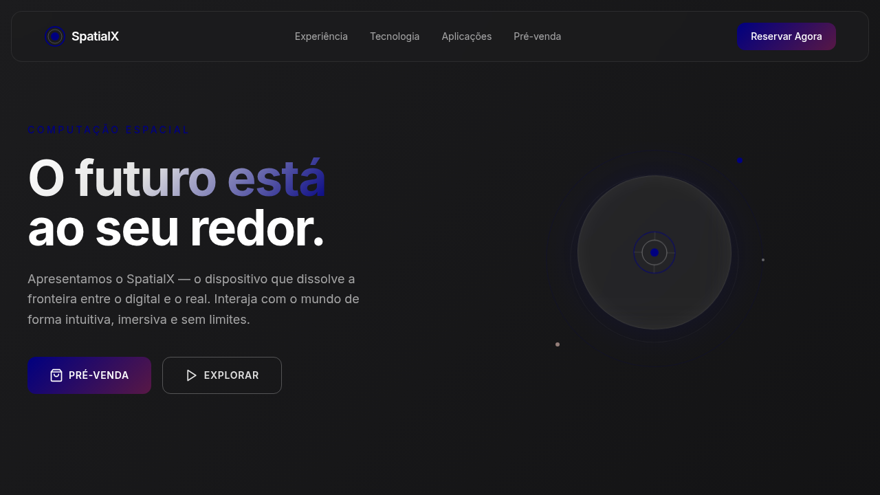
Estilo de Realidade Virtual Social
Estilo de Realidade Virtual Social — Design tech-inspired com metaverse, virtual reality, augmented reality. Template e prompt pronto para IA.
Uso: Landing pages, Websites modernas
Contexto Histórico
Estilo Estilo de Realidade Virtual Social representa uma tendência moderna em design UI/UX web com foco em tech-inspired.
Especificações Técnicas
Cores
Primárias
Secundárias
Efeitos
Gradientes etéreos, elementos flutuantes, transições de realidade virtual, visualizações de avatares 3D, micro-interações sociais, tipografia futurista, efeitos de partículas, portais dimensionais.
Light/Dark
✗ No / ✓ Full (com elementos de luz e sombra)
CSS
background: linear-gradient(180deg, #000000, #3A0CA3), color: #FFFFFF, text-shadow: 0 0 10px rgba(0,120,244,0.5), box-shadow: inset 0 0 20px rgba(0,0,0,0.7), backdrop-filter: blur(15px) saturate(1.8), font-family: "Inter, sans-serif", animation: metaverse-pulse 8s infinite alternate, perspective: 1000px, transform-style: preserve-3d.
Variáveis
--social-blue: #0078F4, --dark-purple: #3A0CA3, --white: #FFFFFF, --light-grey: #E0E0E0, --gradient-start: #000000, --gradient-end: #3A0CA3, --font-futuristic: "Inter, sans-serif", --shadow-immersive: inset 0 0 20px rgba(0,0,0,0.7).
Checklist
☐ Gradientes etéreos, ☐ Elementos flutuantes, ☐ Transições VR, ☐ Avatares 3D, ☐ Micro-interações sociais, ☐ Tipografia futurista.
DESIGN.md
Design System: Estilo de Realidade Virtual Social
1. Visual Theme & Atmosphere
Estilo de Realidade Virtual Social — Design tech-inspired com metaverse, virtual reality, augmented reality. Template e prompt pronto para IA. Estilo Estilo de Realidade Virtual Social representa uma tendência moderna em design UI/UX web com foco em tech-inspired.
- Density: 5/10 — Balanced
- Variance: 4/10 — Moderate
- Motion: 8/10 — Cinematic
2. Color Palette & Roles
- Azul Social (#0078F4) — Accent highlight, links and focus states
- Roxo Escuro (#3A0CA3) — Dark surface, primary background
- Branco (#FFFFFF) — Light surface, card backgrounds
- Cinza Claro (#E0E0E0) — Secondary text, borders, muted elements
- Ciano (#00FFFF) — Extended palette, decorative use
- Magenta (#FF00FF) — Decorative accent, highlight elements
- Verde Elétrico (#00FF00) — Success states, positive indicators
- Preto (#000000) — Deep contrast surface
3. Typography Rules
- Display / Hero: Inter — Weight 700, tight tracking, used for headline impact
- Body: Inter — Weight 400, 16px/1.6 line-height, max 72ch per line
- UI Labels / Captions: Inter — 0.875rem, weight 500, slight letter-spacing
- Monospace: JetBrains Mono — Used for code, metadata, and technical values
Scale:
- Hero: clamp(2.5rem, 5vw, 4rem)
- H1: 2.25rem
- H2: 1.5rem
- Body: 1rem / 1.6
- Small: 0.875rem
4. Component Stylings
- Primary Button: Subtly rounded (0.5rem) shape. Accent color fill. Hover: 8% darken + subtle lift shadow. Active: -1px translate tactile press. Font weight 600. No outer glows.
- Secondary / Ghost Button: Outline variant. 1.5px border in muted color. Text in primary color. Hover: subtle background fill.
- Cards: Subtly rounded (0.5rem) corners. Surface background. Subtle shadow (0 2px 12px rgba(0,0,0,0.06)). 1px border stroke.
- Inputs: Label above input. 1px border stroke. Focus ring: 2px accent color offset 2px. Error text below in semantic red. No floating labels.
- Navigation: Primary surface background. Active item: accent color indicator. Font weight 500 when active.
- Skeletons: Shimmer animation matching component dimensions. No circular spinners.
- Empty States: Icon-based composition with descriptive text and action button.
5. Layout Principles
- Grid: CSS Grid primary. Max-width containment: 1280px centered with 1.5rem side padding.
- Spacing rhythm: Balanced. Base unit: 0.5rem (8px).
- Section vertical gaps: clamp(4rem, 8vw, 8rem).
- Hero layout: Split-screen (text left, visual right).
- Feature sections: Zig-zag alternating text+image rows. No 3-equal-columns.
- Mobile collapse: All multi-column layouts collapse below 768px. No horizontal overflow.
- z-index contract: base (0) / sticky-nav (100) / overlay (200) / modal (300) / toast (500).
6. Motion & Interaction
- Physics: Spring — stiffness 120, damping 20. Confident, weighted transitions.
- Entry animations: Fade + translate-Y (16px → 0) over 540ms ease-out. Staggered cascades for lists: 120ms between items.
- Hover states: Scale(1.03) + shadow lift over 200ms.
- Page transitions: Fade + slide (300ms).
- Performance: Only transform and opacity animated. No layout-triggering properties.
7. Anti-Patterns (Banned)
- No emojis in UI — use icon system only (Lucide, Heroicons)
- No pure black (#000000) — use off-black or charcoal variants
- No oversaturated accent colors (saturation cap: 80%)
- No 3-column equal-width feature layouts — use zig-zag or asymmetric grid
- No
h-screen— usemin-h-[100dvh] - No AI copywriting clichés: "Elevate", "Seamless", "Unleash", "Next-Gen"
- No broken external image links — use picsum.photos or inline SVG
- No generic lorem ipsum in demos
Prompt para AI
Design an immersive and futuristic landing page for a new metaverse space. Use: social blue and dark purple gradients, floating elements, VR transitions, 3D avatar visualizations, social micro-interactions, futuristic typography, particle effects, dimensional portals, AI-powered social features.
Relacionados
Última sincronização: 01/04/2026