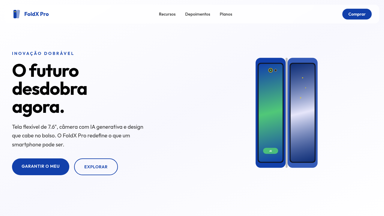
Estilo de Inovação em Dispositivos Móveis
Estilo de Inovação em Dispositivos Móveis — Design tech-inspired com smartphone, foldable, ai. Template e prompt pronto para IA.
Uso: Landing pages, Websites modernas
Contexto Histórico
Estilo Estilo de Inovação em Dispositivos Móveis representa uma tendência moderna em design UI/UX web com foco em tech-inspired.
Especificações Técnicas
Cores
Primárias
Secundárias
Efeitos
Animações de dobra de tela, visualizações de câmera com IA, brilhos sutis em elementos de design, tipografia limpa (sans-serif), micro-interações responsivas, elementos 3D do dispositivo, transições fluidas.
Light/Dark
✓ Full / ✗ No (com opções de tema)
CSS
background: #FFFFFF, color: #000000, box-shadow: 0 5px 15px rgba(0,0,0,0.1), border-radius: 15px, font-family: "Helvetica, Arial, sans-serif", transition: all 0.3s ease-in-out, background-image: linear-gradient(to bottom, #F8F8F8, #FFFFFF), .fold-animation, .ai-camera-effect.
Variáveis
--galaxy-blue: #1240AB, --black: #000000, --white: #FFFFFF, --silver: #C0C0C0, --border-radius-lg: 15px, --font-main: "Helvetica, Arial, sans-serif", --shadow-device: 0 5px 15px rgba(0,0,0,0.1).
Checklist
☐ Animações de dobra de tela, ☐ Visualizações de câmera com IA, ☐ Brilhos sutis, ☐ Tipografia limpa, ☐ Elementos 3D do dispositivo, ☐ Transições fluidas.
DESIGN.md
Design System: Estilo de Inovação em Dispositivos Móveis
1. Visual Theme & Atmosphere
Estilo de Inovação em Dispositivos Móveis — Design tech-inspired com smartphone, foldable, ai. Template e prompt pronto para IA. Estilo Estilo de Inovação em Dispositivos Móveis representa uma tendência moderna em design UI/UX web com foco em tech-inspired.
- Density: 5/10 — Balanced
- Variance: 4/10 — Moderate
- Motion: 8/10 — Cinematic
2. Color Palette & Roles
- Azul Galáctico (#1240AB) — Accent highlight, links and focus states
- Preto (#000000) — Dark surface, primary background
- Branco (#FFFFFF) — Light surface, card backgrounds
- Prata (#C0C0C0) — Supporting palette color
- Verde Esmeralda (#50C878) — Success states, positive indicators
- Lavanda (#E6E6FA) — Extended palette, decorative use
- Dourado (#FFD700) — Premium accent, decorative highlights
- Cinza Escuro (#333333) — Deep contrast surface
3. Typography Rules
- Display / Hero: Helvetica — Weight 700, tight tracking, used for headline impact
- Body: Helvetica — Weight 400, 16px/1.6 line-height, max 72ch per line
- UI Labels / Captions: Helvetica — 0.875rem, weight 500, slight letter-spacing
- Monospace: JetBrains Mono — Used for code, metadata, and technical values
Scale:
- Hero: clamp(2.5rem, 5vw, 4rem)
- H1: 2.25rem
- H2: 1.5rem
- Body: 1rem / 1.6
- Small: 0.875rem
4. Component Stylings
- Primary Button: Rounded (15px) shape. Accent color fill. Hover: 8% darken + subtle lift shadow. Active: -1px translate tactile press. Font weight 600. No outer glows.
- Secondary / Ghost Button: Outline variant. 1.5px border in muted color. Text in primary color. Hover: subtle background fill.
- Cards: Rounded (15px) corners. Surface background. Subtle shadow (0 2px 12px rgba(0,0,0,0.06)). 1px border stroke.
- Inputs: Label above input. 1px border stroke. Focus ring: 2px accent color offset 2px. Error text below in semantic red. No floating labels.
- Navigation: Primary surface background. Active item: accent color indicator. Font weight 500 when active.
- Skeletons: Shimmer animation matching component dimensions. No circular spinners.
- Empty States: Icon-based composition with descriptive text and action button.
5. Layout Principles
- Grid: CSS Grid primary. Max-width containment: 1280px centered with 1.5rem side padding.
- Spacing rhythm: Balanced. Base unit: 0.5rem (8px).
- Section vertical gaps: clamp(4rem, 8vw, 8rem).
- Hero layout: Split-screen (text left, visual right).
- Feature sections: Zig-zag alternating text+image rows. No 3-equal-columns.
- Mobile collapse: All multi-column layouts collapse below 768px. No horizontal overflow.
- z-index contract: base (0) / sticky-nav (100) / overlay (200) / modal (300) / toast (500).
6. Motion & Interaction
- Physics: Spring — stiffness 120, damping 20. Confident, weighted transitions.
- Entry animations: Fade + translate-Y (16px → 0) over 540ms ease-out. Staggered cascades for lists: 120ms between items.
- Hover states: Scale(1.03) + shadow lift over 200ms.
- Page transitions: Fade + slide (300ms).
- Performance: Only transform and opacity animated. No layout-triggering properties.
7. Anti-Patterns (Banned)
- No emojis in UI — use icon system only (Lucide, Heroicons)
- No pure black (#000000) — use off-black or charcoal variants
- No oversaturated accent colors (saturation cap: 80%)
- No 3-column equal-width feature layouts — use zig-zag or asymmetric grid
- No
h-screen— usemin-h-[100dvh] - No AI copywriting clichés: "Elevate", "Seamless", "Unleash", "Next-Gen"
- No broken external image links — use picsum.photos or inline SVG
- No generic lorem ipsum in demos
Prompt para AI
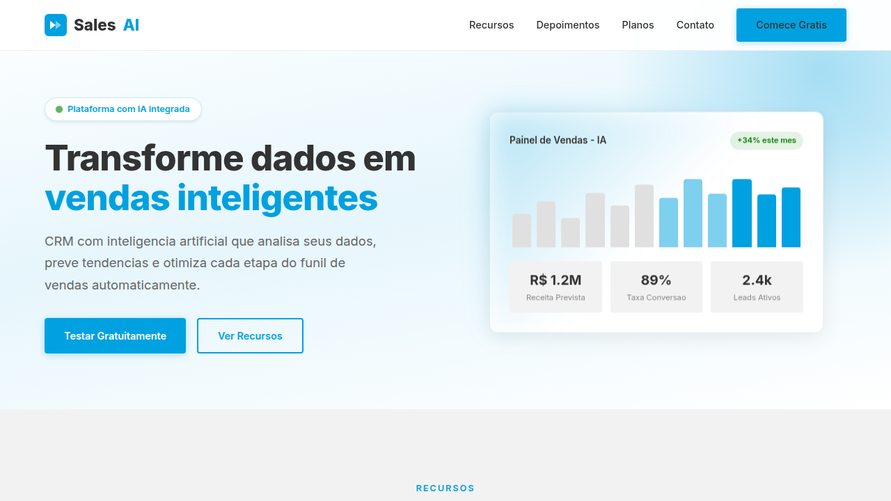
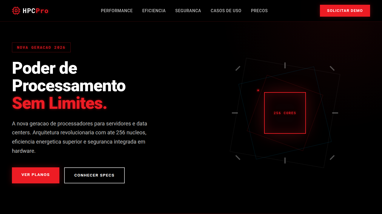
Design a sleek and modern landing page for a new foldable smartphone. Use: galactic blue accents, screen folding animations, AI camera visualizations, subtle design glows, clean typography, responsive micro-interactions, 3D device elements, fluid transitions, user-centric and innovative feel.
Relacionados
Última sincronização: 01/04/2026