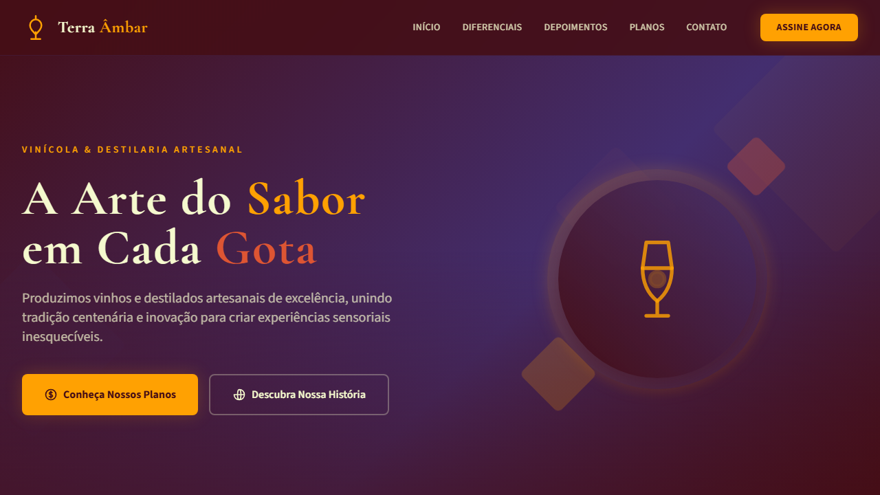
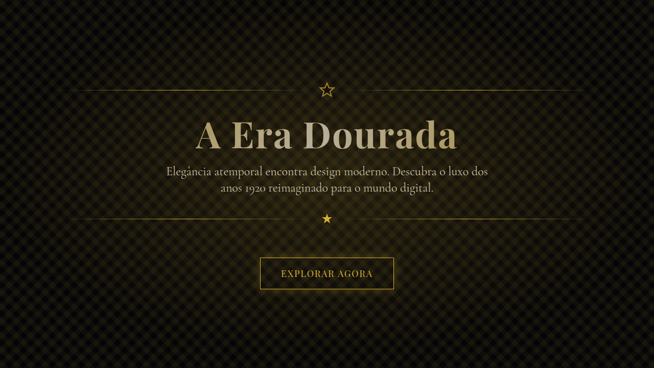
Ember & Amethyst Premium
Estilo Ember & Amethyst Premium com laranja vibrante, roxo régio e vermelho intenso. Gradientes diagonais ousados e tipografia expressiva. Ideal para marcas de moda, gastronomia e entretenimento.
Uso: Marcas de moda premium, Gastronomia autoral, Entretenimento e eventos, Vinícolas e destilarias, Agências criativas
Contexto Histórico
Inspirado na fusão entre a energia do fogo e a nobreza da ametista, este estilo combina tons quentes vibrantes com roxo profundo para criar interfaces dramáticas e memoráveis que transmitem paixão e sofisticação.
Especificações Técnicas
Cores
Primárias
Secundárias
Efeitos
Bold gradient overlays (orange-to-purple diagonals), dramatic shadow depth, warm ambient glow on CTAs, expressive serif headlines with generous tracking, geometric accent shapes via clip-path, vibrant hover state color shifts, smooth 400ms transitions with ease-out
Light/Dark
✓ Full
CSS
font-family: 'Cormorant Garamond', serif; --font-body: 'Source Sans 3', sans-serif; --color-action: #FFA102; --color-structure: #432E6F; background: linear-gradient(135deg, #450E16, #432E6F); color: #F5F9CE; border-radius: 8px; box-shadow: 0 8px 24px rgba(69,14,22,0.35); transition: all 0.4s ease-out;
Variáveis
--color-vivid-orange: #FFA102; --color-purple: #432E6F; --color-tomato: #DD5533; --color-yoghurt: #F5F9CE; --color-ginshu: #BC2D29; --color-rum: #450E16; --font-display: 'Cormorant Garamond', serif; --font-body: 'Source Sans 3', sans-serif; --radius-md: 8px; --shadow-warm: 0 8px 24px rgba(69,14,22,0.35); --glow-orange: 0 0 24px rgba(255,161,2,0.2);
Checklist
☐ Vivid Orange #FFA102 action color, ☐ Her Highness Purple #432E6F structure, ☐ Frozen Tomato #DD5533 emphasis, ☐ Bold diagonal gradients, ☐ Dramatic shadow depth, ☐ Warm glow on CTAs, ☐ Expressive serif headlines, ☐ Geometric clip-path accents, ☐ Responsive layout
DESIGN.md
Design System: Ember & Amethyst Premium
1. Visual Theme & Atmosphere
Estilo Ember & Amethyst Premium com laranja vibrante, roxo régio e vermelho intenso. Gradientes diagonais ousados e tipografia expressiva. Ideal para marcas de moda, gastronomia e entretenimento. Inspirado na fusão entre a energia do fogo e a nobreza da ametista, este estilo combina tons quentes vibrantes com roxo profundo para criar interfaces dramáticas e memoráveis que transmitem paixão e sofisticação.
- Density: 5/10 — Balanced
- Variance: 4/10 — Moderate
- Motion: 4/10 — Subtle
2. Color Palette & Roles
- Vivid Orange (#FFA102) — Warm accent, call-to-action secondary
- Her Highness Purple (#432E6F) — Accent color, emphasis elements
- Frozen Tomato Red (#DD5533) — Error states, destructive actions
- Yoghurt Cream (#F5F9CE) — Secondary surface
- Ginshu Crimson (#BC2D29) — Extended palette, decorative use
- Rum Chocolate (#450E16) — Extended palette, decorative use
3. Typography Rules
- Display / Hero: Cormorant Garamond — Weight 700, tight tracking, used for headline impact
- Body: Cormorant Garamond — Weight 400, 16px/1.6 line-height, max 72ch per line
- UI Labels / Captions: Cormorant Garamond — 0.875rem, weight 500, slight letter-spacing
- Monospace: JetBrains Mono — Used for code, metadata, and technical values
Scale:
- Hero: clamp(2.5rem, 5vw, 4rem)
- H1: 2.25rem
- H2: 1.5rem
- Body: 1rem / 1.6
- Small: 0.875rem
4. Component Stylings
- Primary Button: Generously rounded (1.5rem) shape. Accent color fill. Hover: 8% darken + subtle lift shadow. Active: -1px translate tactile press. Font weight 600. No outer glows.
- Secondary / Ghost Button: Outline variant. 1.5px border in muted color. Text in primary color. Hover: subtle background fill.
- Cards: Generously rounded (1.5rem) corners. Surface background. Subtle shadow (0 2px 12px rgba(0,0,0,0.06)). 1px border stroke.
- Inputs: Label above input. 1px border stroke. Focus ring: 2px accent color offset 2px. Error text below in semantic red. No floating labels.
- Navigation: Primary surface background. Active item: accent color indicator. Font weight 500 when active.
- Skeletons: Shimmer animation matching component dimensions. No circular spinners.
- Empty States: Icon-based composition with descriptive text and action button.
5. Layout Principles
- Grid: CSS Grid primary. Max-width containment: 1280px centered with 1.5rem side padding.
- Spacing rhythm: Balanced. Base unit: 0.5rem (8px).
- Section vertical gaps: clamp(4rem, 8vw, 8rem).
- Hero layout: Split-screen (text left, visual right).
- Feature sections: Zig-zag alternating text+image rows. No 3-equal-columns.
- Mobile collapse: All multi-column layouts collapse below 768px. No horizontal overflow.
- z-index contract: base (0) / sticky-nav (100) / overlay (200) / modal (300) / toast (500).
6. Motion & Interaction
- Physics: Ease-out curves, 200-300ms duration. Smooth and predictable.
- Entry animations: Fade + translate-Y (16px → 0) over 420ms ease-out. Staggered cascades for lists: 80ms between items.
- Hover states: Subtle color shift + shadow adjustment over 200ms.
- Page transitions: Fade only (200ms).
- Performance: Only transform and opacity animated. No layout-triggering properties.
7. Anti-Patterns (Banned)
- No emojis in UI — use icon system only (Lucide, Heroicons)
- No pure black (#000000) — use off-black or charcoal variants
- No oversaturated accent colors (saturation cap: 80%)
- No 3-column equal-width feature layouts — use zig-zag or asymmetric grid
- No
h-screen— usemin-h-[100dvh] - No AI copywriting clichés: "Elevate", "Seamless", "Unleash", "Next-Gen"
- No broken external image links — use picsum.photos or inline SVG
- No generic lorem ipsum in demos
Prompt para AI
Create a vibrant, bold, and luxurious UI that fuses fiery warmth with regal depth. Use vivid orange (#FFA102) as the primary action color, deep purple (#432E6F) for structural elements, and frozen tomato red (#DD5533) for emphasis. Background alternates between rum chocolate (#450E16) dark sections and yoghurt cream (#F5F9CE) light sections. Apply bold diagonal gradients, dramatic shadows, warm ambient glow on buttons, expressive serif headlines, and geometric clip-path accents. The feel should be passionate, energetic, and unmistakably premium.
Relacionados
Última sincronização: 01/04/2026