Electric Studio
Layout split panel profissional com branco e azul elétrico, tipografia Manrope bold e espaçamento confiante. Ideal para estúdios e agências. Prompt para IA.
Uso: Estúdios de design, Agências digitais, Portfolios profissionais, Consultorias
Contexto Histórico
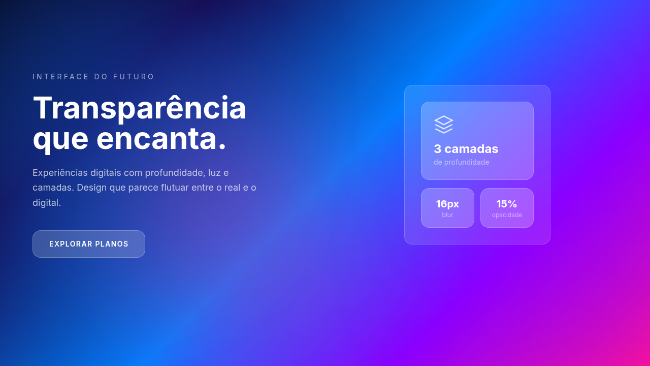
Inspirado em estúdios de design contemporâneos que usam layouts split-panel para criar contraste visual forte. A combinação de painéis claros e escuros cria hierarquia natural e impacto visual imediato.
Especificações Técnicas
Cores
Primárias
Secundárias
Efeitos
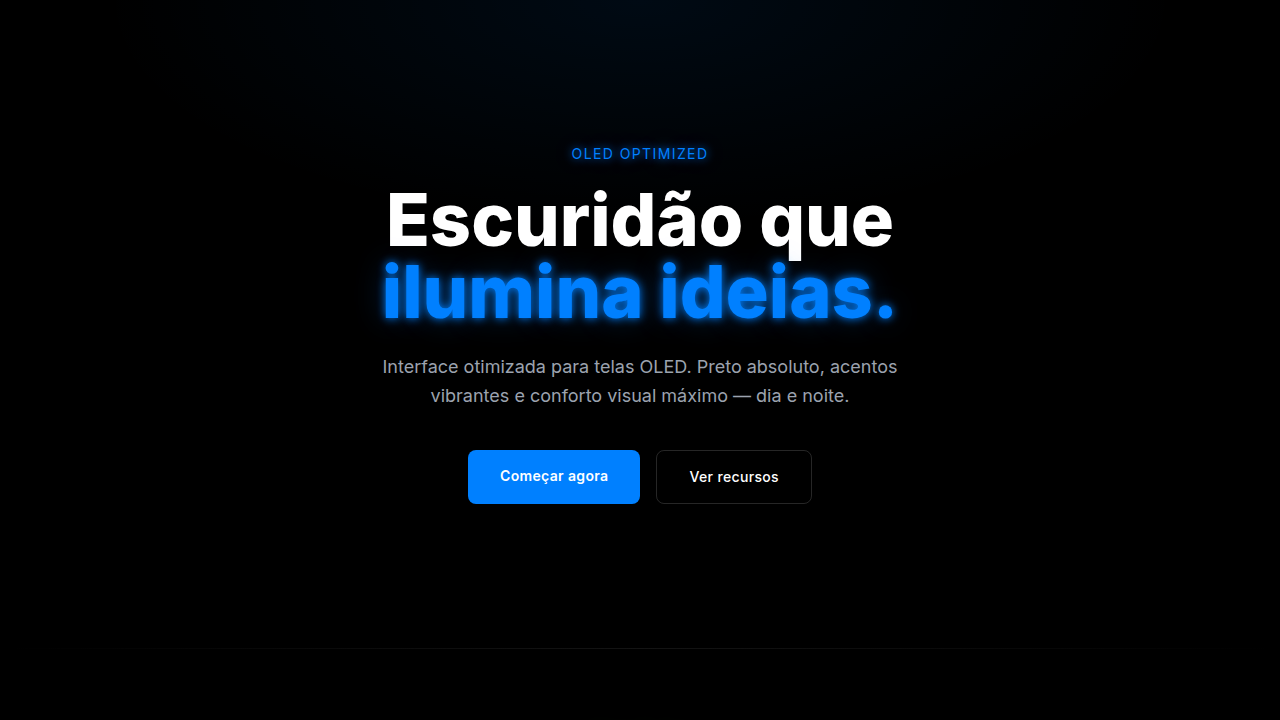
Two-panel vertical split, accent bar on panel edge, quote typography as hero element, minimal confident spacing, smooth transitions 300ms
Light/Dark
✓ Full / ✓ Full
CSS
font-family: 'Manrope', .split-top { background: #ffffff; color: #0a0a0a }, .split-bottom { background: #4361ee; color: #ffffff }, .accent-bar { width: 4px; background: #4361ee }, .quote-hero { font-size: clamp(2rem, 5vw, 4rem); font-weight: 800; line-height: 1.1 }
Variáveis
--bg-dark: #0a0a0a, --bg-white: #ffffff, --accent-blue: #4361ee, --text-dark: #0a0a0a, --text-light: #ffffff, --font-primary: 'Manrope', --font-weight-display: 800, --font-weight-body: 400
Checklist
☐ Manrope font carregada, ☐ Two-panel vertical split, ☐ Accent bar em bordas, ☐ Quote typography como hero, ☐ Brand marks nos cantos, ☐ Espaçamento confiante e mínimo, ☐ Responsivo mobile/tablet/desktop
DESIGN.md
Design System: Electric Studio
1. Visual Theme & Atmosphere
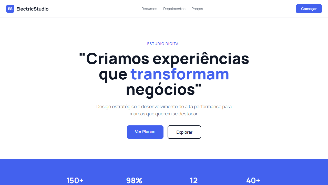
Layout split panel profissional com branco e azul elétrico, tipografia Manrope bold e espaçamento confiante. Ideal para estúdios e agências. Prompt para IA. Inspirado em estúdios de design contemporâneos que usam layouts split-panel para criar contraste visual forte. A combinação de painéis claros e escuros cria hierarquia natural e impacto visual imediato.
- Density: 3/10 — Airy
- Variance: 3/10 — Restrained
- Motion: 4/10 — Subtle
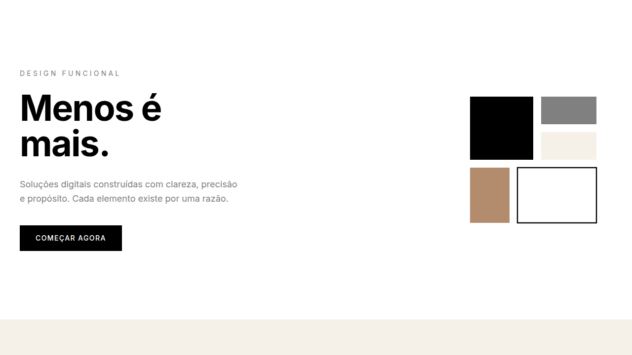
2. Color Palette & Roles
- Dark Black (#0a0a0a) — Dark surface, primary background
- Pure White (#ffffff) — Light surface, card backgrounds
- Accent Blue (#4361ee) — Primary accent, CTAs and interactive elements
- Light Grey (#f5f5f5) — Secondary text, borders, muted elements
- Medium Grey (#888888) — Secondary text, borders, muted elements
- Dark Blue (#2d3abe) — Deep contrast surface
3. Typography Rules
- Display / Hero: Manrope — Weight 700, tight tracking, used for headline impact
- Body: Manrope — Weight 400, 16px/1.6 line-height, max 72ch per line
- UI Labels / Captions: Manrope — 0.875rem, weight 500, slight letter-spacing
- Monospace: JetBrains Mono — Used for code, metadata, and technical values
Scale:
- Hero: clamp(2.5rem, 5vw, 4rem)
- H1: 2.25rem
- H2: 1.5rem
- Body: 1rem / 1.6
- Small: 0.875rem
4. Component Stylings
- Primary Button: Subtly rounded (0.5rem) shape. Accent color fill. Hover: 8% darken + subtle lift shadow. Active: -1px translate tactile press. Font weight 600. No outer glows.
- Secondary / Ghost Button: Outline variant. 1.5px border in muted color. Text in primary color. Hover: subtle background fill.
- Cards: Subtly rounded (0.5rem) corners. Surface background. Subtle shadow (0 2px 12px rgba(0,0,0,0.06)). 1px border stroke.
- Inputs: Label above input. 1px border stroke. Focus ring: 2px accent color offset 2px. Error text below in semantic red. No floating labels.
- Navigation: Primary surface background. Active item: accent color indicator. Font weight 500 when active.
- Skeletons: Shimmer animation matching component dimensions. No circular spinners.
- Empty States: Icon-based composition with descriptive text and action button.
5. Layout Principles
- Grid: CSS Grid primary. Max-width containment: 1280px centered with 1.5rem side padding.
- Spacing rhythm: Balanced. Base unit: 0.5rem (8px).
- Section vertical gaps: clamp(4rem, 8vw, 8rem).
- Hero layout: Split-screen (text left, visual right).
- Feature sections: Zig-zag alternating text+image rows. No 3-equal-columns.
- Mobile collapse: All multi-column layouts collapse below 768px. No horizontal overflow.
- z-index contract: base (0) / sticky-nav (100) / overlay (200) / modal (300) / toast (500).
6. Motion & Interaction
- Physics: Ease-out curves, 200-300ms duration. Smooth and predictable.
- Entry animations: Fade + translate-Y (16px → 0) over 420ms ease-out. Staggered cascades for lists: 80ms between items.
- Hover states: Subtle color shift + shadow adjustment over 200ms.
- Page transitions: Fade only (200ms).
- Performance: Only transform and opacity animated. No layout-triggering properties.
7. Anti-Patterns (Banned)
- No emojis in UI — use icon system only (Lucide, Heroicons)
- No pure black (#000000) — use off-black or charcoal variants
- No oversaturated accent colors (saturation cap: 80%)
- No 3-column equal-width feature layouts — use zig-zag or asymmetric grid
- No
h-screen— usemin-h-[100dvh] - No AI copywriting clichés: "Elevate", "Seamless", "Unleash", "Next-Gen"
- No broken external image links — use picsum.photos or inline SVG
- No generic lorem ipsum in demos
Prompt para AI
Design a bold, clean professional landing page with a two-panel vertical split layout. White panel on top, blue/dark panel on bottom. Use Manrope font throughout (800 for display, 400/500 for body). Add accent bar on panel edges. Use quote typography as hero element. Brand marks in corners. Minimal, confident spacing.
Relacionados
Última sincronização: 01/04/2026