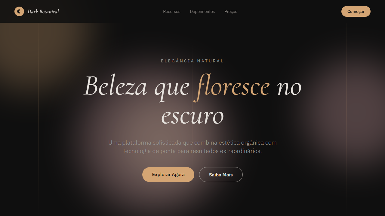
Dark Botanical
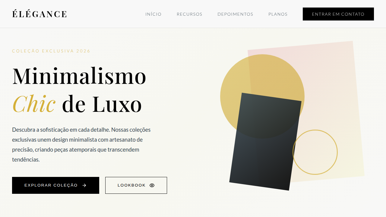
Design elegante dark com tipografia Cormorant serif, círculos abstratos e acentos quentes em rosa, ouro e terracota. Premium e sofisticado. Prompt para IA.
Uso: Marcas de luxo, Joalherias, Spas premium, Galerias de arte, Vinícolas
Contexto Histórico
Inspirado na estética botânica dark que combina elegância clássica com modernidade. Usa tipografia serif refinada e formas abstratas suaves para criar atmosfera premium e artística, sem recorrer a ilustrações.
Especificações Técnicas
Cores
Primárias
Secundárias
Efeitos
Abstract soft gradient circles (blurred, overlapping), warm color accents (pink, gold, terracotta), thin vertical accent lines, italic signature typography, no illustrations only abstract CSS shapes, smooth transitions 350ms
Light/Dark
✗ No / ✓ Full
CSS
font-family: 'Cormorant' for headings, 'IBM Plex Sans' for body, background: #0f0f0f, color: #e8e4df, .abstract-circle { position: absolute; border-radius: 50%; filter: blur(60px); opacity: 0.3 }, .accent-line { width: 1px; height: 80px; background: #d4a574 }, .signature-text { font-family: 'Cormorant'; font-style: italic; font-weight: 400 }
Variáveis
--bg-primary: #0f0f0f, --text-primary: #e8e4df, --text-secondary: #9a9590, --accent-warm: #d4a574, --accent-pink: #e8b4b8, --accent-gold: #c9b896, --font-display: 'Cormorant', --font-body: 'IBM Plex Sans', --blur-amount: 60px, --circle-opacity: 0.3
Checklist
☐ Cormorant + IBM Plex Sans carregados, ☐ Fundo deep black #0f0f0f, ☐ Abstract gradient circles CSS, ☐ Warm accents (pink, gold, terracotta), ☐ Thin vertical accent lines, ☐ Italic signature typography, ☐ Sem ilustrações, apenas shapes CSS, ☐ Responsivo mobile/tablet/desktop
DESIGN.md
Design System: Dark Botanical
1. Visual Theme & Atmosphere
Design elegante dark com tipografia Cormorant serif, círculos abstratos e acentos quentes em rosa, ouro e terracota. Premium e sofisticado. Prompt para IA. Inspirado na estética botânica dark que combina elegância clássica com modernidade. Usa tipografia serif refinada e formas abstratas suaves para criar atmosfera premium e artística, sem recorrer a ilustrações.
- Density: 5/10 — Balanced
- Variance: 8/10 — Expressive
- Motion: 4/10 — Subtle
2. Color Palette & Roles
- Deep Black (#0f0f0f) — Dark surface, primary background
- Warm Text (#e8e4df) — Primary text color
- Muted Text (#9a9590) — Primary text color
- Warm Accent (#d4a574) — Primary accent, CTAs and interactive elements
- Soft Pink (#e8b4b8) — Primary text color
- Gold (#c9b896) — Premium accent, decorative highlights
- Terracotta (#c4856a) — Extended palette, decorative use
3. Typography Rules
- Display / Hero: Cormorant — Weight 700, tight tracking, used for headline impact
- Accent: IBM Plex Sans — Used for decorative or emphasis text
- Body: Cormorant — Weight 400, 16px/1.6 line-height, max 72ch per line
- UI Labels / Captions: Cormorant — 0.875rem, weight 500, slight letter-spacing
- Monospace: JetBrains Mono — Used for code, metadata, and technical values
Scale:
- Hero: clamp(2.5rem, 5vw, 4rem)
- H1: 2.25rem
- H2: 1.5rem
- Body: 1rem / 1.6
- Small: 0.875rem
4. Component Stylings
- Primary Button: Rounded (50%) shape. Accent color fill. Hover: 8% darken + subtle lift shadow. Active: -1px translate tactile press. Font weight 600. No outer glows.
- Secondary / Ghost Button: Outline variant. 1.5px border in muted color. Text in primary color. Hover: subtle background fill.
- Cards: Rounded (50%) corners. Surface background. Subtle shadow (0 2px 12px rgba(0,0,0,0.06)). 1px border stroke.
- Inputs: Label above input. 1px border stroke. Focus ring: 2px accent color offset 2px. Error text below in semantic red. No floating labels.
- Navigation: Primary surface background. Active item: accent color indicator. Font weight 500 when active.
- Skeletons: Shimmer animation matching component dimensions. No circular spinners.
- Empty States: Icon-based composition with descriptive text and action button.
5. Layout Principles
- Grid: CSS Grid primary. Max-width containment: 1280px centered with 1.5rem side padding.
- Spacing rhythm: Balanced. Base unit: 0.5rem (8px).
- Section vertical gaps: clamp(4rem, 8vw, 8rem).
- Hero layout: Asymmetric composition.
- Feature sections: Asymmetric grid with varied card sizes. No 3-equal-columns.
- Mobile collapse: All multi-column layouts collapse below 768px. No horizontal overflow.
- z-index contract: base (0) / sticky-nav (100) / overlay (200) / modal (300) / toast (500).
6. Motion & Interaction
- Physics: Ease-out curves, 200-300ms duration. Smooth and predictable.
- Entry animations: Fade + translate-Y (16px → 0) over 420ms ease-out. Staggered cascades for lists: 80ms between items.
- Hover states: Subtle color shift + shadow adjustment over 200ms.
- Page transitions: Fade only (200ms).
- Performance: Only transform and opacity animated. No layout-triggering properties.
7. Anti-Patterns (Banned)
- No emojis in UI — use icon system only (Lucide, Heroicons)
- No pure white (#FFFFFF) backgrounds — use off-white or dark surfaces
- No oversaturated accent colors (saturation cap: 80%)
- No 3-column equal-width feature layouts — use zig-zag or asymmetric grid
- No
h-screen— usemin-h-[100dvh] - No AI copywriting clichés: "Elevate", "Seamless", "Unleash", "Next-Gen"
- No broken external image links — use picsum.photos or inline SVG
- No generic lorem ipsum in demos
Prompt para AI
Design an elegant, sophisticated dark landing page with artistic premium feel. Use Cormorant serif (400/600) for display and IBM Plex Sans (300/400) for body. Background deep black (#0f0f0f) with warm text (#e8e4df). Add abstract soft gradient circles using CSS (blurred, overlapping, warm colors). Include thin vertical accent lines. Use italic signature typography. Warm accents: pink (#e8b4b8), gold (#c9b896), terracotta. No illustrations, only abstract CSS shapes.
Relacionados
Última sincronização: 01/04/2026