Coinbase Trust Blue
Estilo Coinbase Trust Blue com acento azul institucional, pill buttons 56px e estética fintech limpa. Ideal para exchanges crypto, fintechs e plataformas financeiras.
Uso: Exchanges crypto, Fintechs, Plataformas financeiras, Wallets digitais
Contexto Histórico
Inspirado no design da Coinbase, que comunica confiança financeira através de azul institucional e design limpo binário light/dark.
Especificações Técnicas
Cores
Primárias
Secundárias
Efeitos
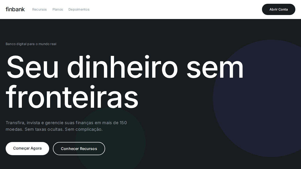
Coinbase Blue (#0052ff) como acento singular de confiança institucional. Sistema de quatro fontes proprietárias: Display para hero (80px weight 400 line-height 1.00), Sans para UI, Text para body, Icons para ícones. Botões pill com radius 56px assinatura. Seções alternando branco e dark (#0a0b0d). Hover transiciona para azul claro (#578bfa). Cool gray surface (#eef0f3) com blue tint. text-transform: lowercase em alguns labels — escolha incomum.
Light/Dark
✓ Full / ✓ Full
CSS
background:#ffffff dark:#0a0b0d;color:#0a0b0d;accent:#0052ff;hover:#578bfa;border-radius:56px pills,12px cards;font-family:system-ui;font-weight:400 display,600 UI;line-height:1.00 display;border:1px solid rgba(91,97,110,0.2)
Variáveis
--bg-light:#ffffff;--bg-dark:#0a0b0d;--text:#0a0b0d;--blue:#0052ff;--hover:#578bfa;--surface:#eef0f3;--dark-card:#282b31;--border:rgba(91,97,110,0.2);--radius-pill:56px;--radius-card:12px
Checklist
☐ Coinbase Blue #0052ff singular, ☐ Display 80px line-height 1.00, ☐ Pill buttons 56px radius, ☐ Alternância branco/dark, ☐ Hover azul claro, ☐ Cool gray surface, ☐ Focus 2px solid black, ☐ Responsivo
DESIGN.md
Design System: Coinbase Trust Blue
1. Visual Theme & Atmosphere
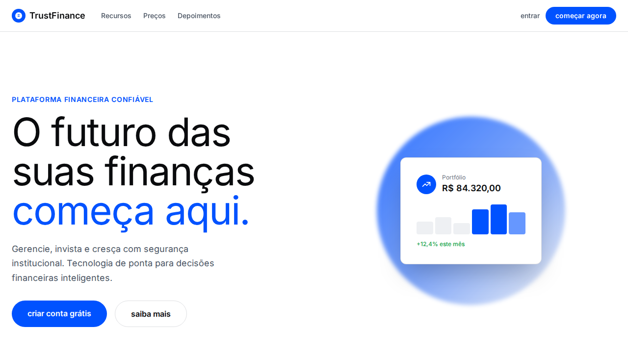
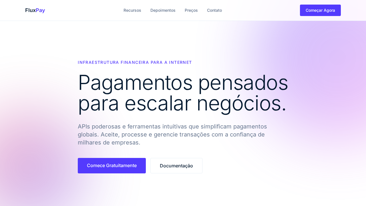
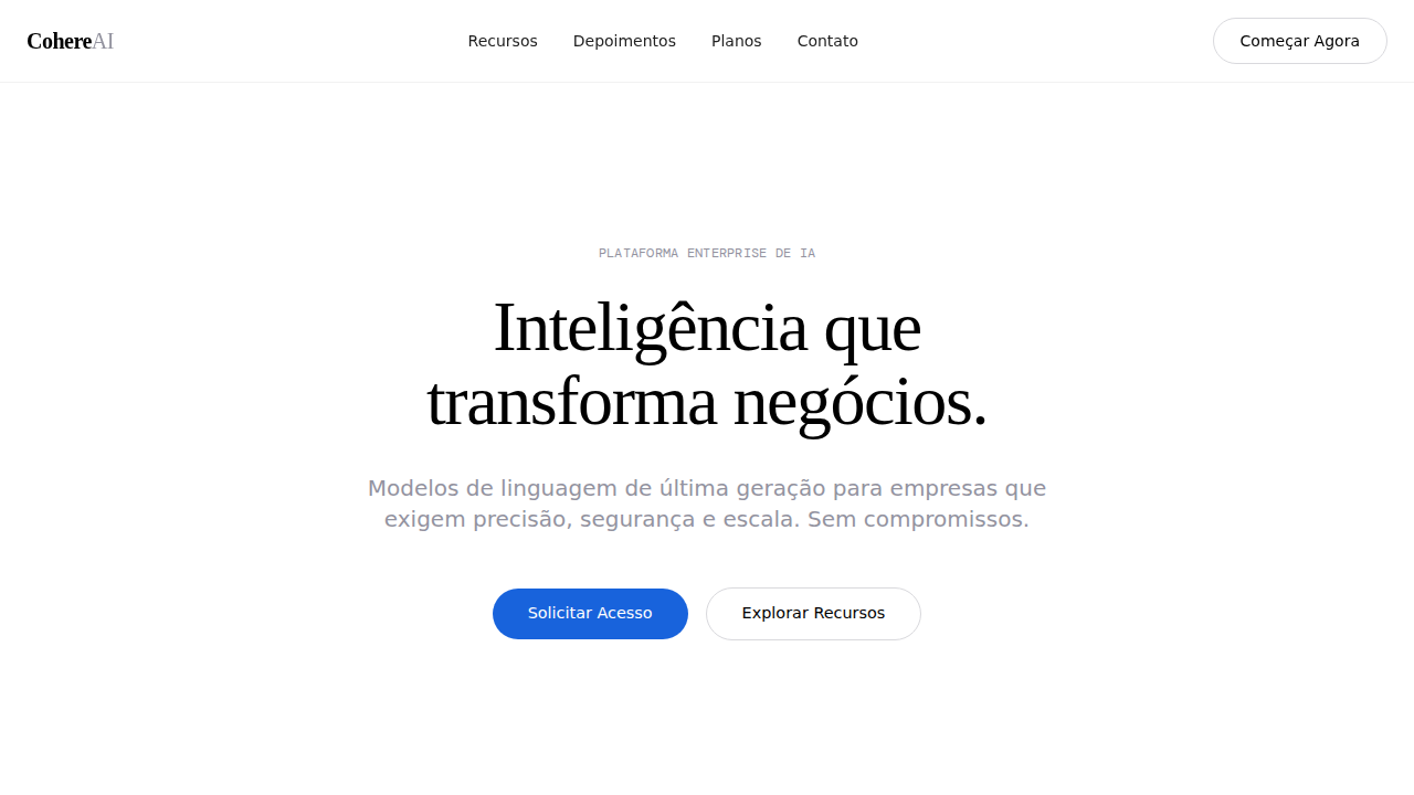
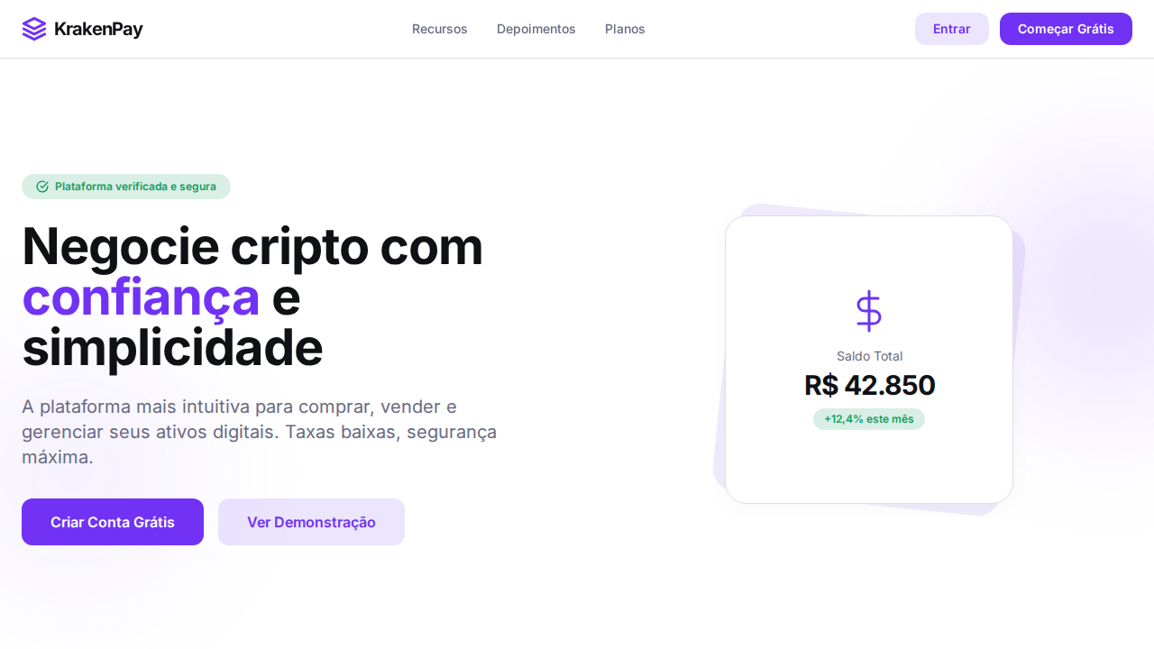
Estilo Coinbase Trust Blue com acento azul institucional, pill buttons 56px e estética fintech limpa. Ideal para exchanges crypto, fintechs e plataformas financeiras. Inspirado no design da Coinbase, que comunica confiança financeira através de azul institucional e design limpo binário light/dark.
- Density: 3/10 — Airy
- Variance: 3/10 — Restrained
- Motion: 4/10 — Subtle
2. Color Palette & Roles
- Coinbase Blue (#0052ff) — Primary background surface
- Branco (#ffffff) — Light surface, card backgrounds
- Near Black (#0a0b0d) — Dark surface, primary background
- Cool Gray (#eef0f3) — Secondary text, borders, muted elements
- Hover Blue (#578bfa) — Secondary accent
- Link Blue (#0667d0) — Primary text color
- Dark Card (#282b31) — Deep contrast surface
- Borda (rgba(91,97,110,0.2)) — Extended palette, decorative use
3. Typography Rules
- Display / Hero: system-ui — Weight 700, tight tracking, used for headline impact
- Body: system-ui — Weight 400, 16px/1.6 line-height, max 72ch per line
- UI Labels / Captions: system-ui — 0.875rem, weight 500, slight letter-spacing
- Monospace: JetBrains Mono — Used for code, metadata, and technical values
Scale:
- Hero: clamp(2.5rem, 5vw, 4rem)
- H1: 2.25rem
- H2: 1.5rem
- Body: 1rem / 1.6
- Small: 0.875rem
4. Component Stylings
- Primary Button: Pill-shaped (9999px) shape. Accent color fill. Hover: 8% darken + subtle lift shadow. Active: -1px translate tactile press. Font weight 600. No outer glows.
- Secondary / Ghost Button: Outline variant. 1.5px border in muted color. Text in primary color. Hover: subtle background fill.
- Cards: Pill-shaped (9999px) corners. Surface background. Subtle shadow (0 2px 12px rgba(0,0,0,0.06)). 1px border stroke.
- Inputs: Label above input. 1px border stroke. Focus ring: 2px accent color offset 2px. Error text below in semantic red. No floating labels.
- Navigation: Primary surface background. Active item: accent color indicator. Font weight 500 when active.
- Skeletons: Shimmer animation matching component dimensions. No circular spinners.
- Empty States: Icon-based composition with descriptive text and action button.
5. Layout Principles
- Grid: CSS Grid primary. Max-width containment: 1280px centered with 1.5rem side padding.
- Spacing rhythm: Balanced. Base unit: 0.5rem (8px).
- Section vertical gaps: clamp(4rem, 8vw, 8rem).
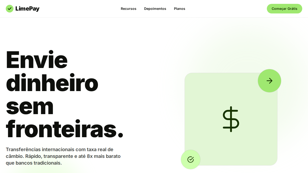
- Hero layout: Split-screen (text left, visual right).
- Feature sections: Zig-zag alternating text+image rows. No 3-equal-columns.
- Mobile collapse: All multi-column layouts collapse below 768px. No horizontal overflow.
- z-index contract: base (0) / sticky-nav (100) / overlay (200) / modal (300) / toast (500).
6. Motion & Interaction
- Physics: Ease-out curves, 200-300ms duration. Smooth and predictable.
- Entry animations: Fade + translate-Y (16px → 0) over 420ms ease-out. Staggered cascades for lists: 80ms between items.
- Hover states: Subtle color shift + shadow adjustment over 200ms.
- Page transitions: Fade only (200ms).
- Performance: Only transform and opacity animated. No layout-triggering properties.
7. Anti-Patterns (Banned)
- No emojis in UI — use icon system only (Lucide, Heroicons)
- No pure white (#FFFFFF) backgrounds — use off-white or dark surfaces
- No oversaturated accent colors (saturation cap: 80%)
- No 3-column equal-width feature layouts — use zig-zag or asymmetric grid
- No
h-screen— usemin-h-[100dvh] - No AI copywriting clichés: "Elevate", "Seamless", "Unleash", "Next-Gen"
- No broken external image links — use picsum.photos or inline SVG
- No generic lorem ipsum in demos
Prompt para AI
Design a Coinbase-inspired clean fintech landing page. Coinbase Blue (#0052ff) as singular trust accent. Display font at 80px weight 400, line-height 1.00 for hero. Sans-serif for UI at weight 600. Body font at 18px weight 400, line-height 1.56. Signature 56px radius pill buttons. Cool gray surface (#eef0f3) with blue tint. Sections alternating white and dark (#0a0b0d). Hover transitions to lighter blue (#578bfa). Focus: 2px solid black outline.
Relacionados
Última sincronização: 01/04/2026