Baroque
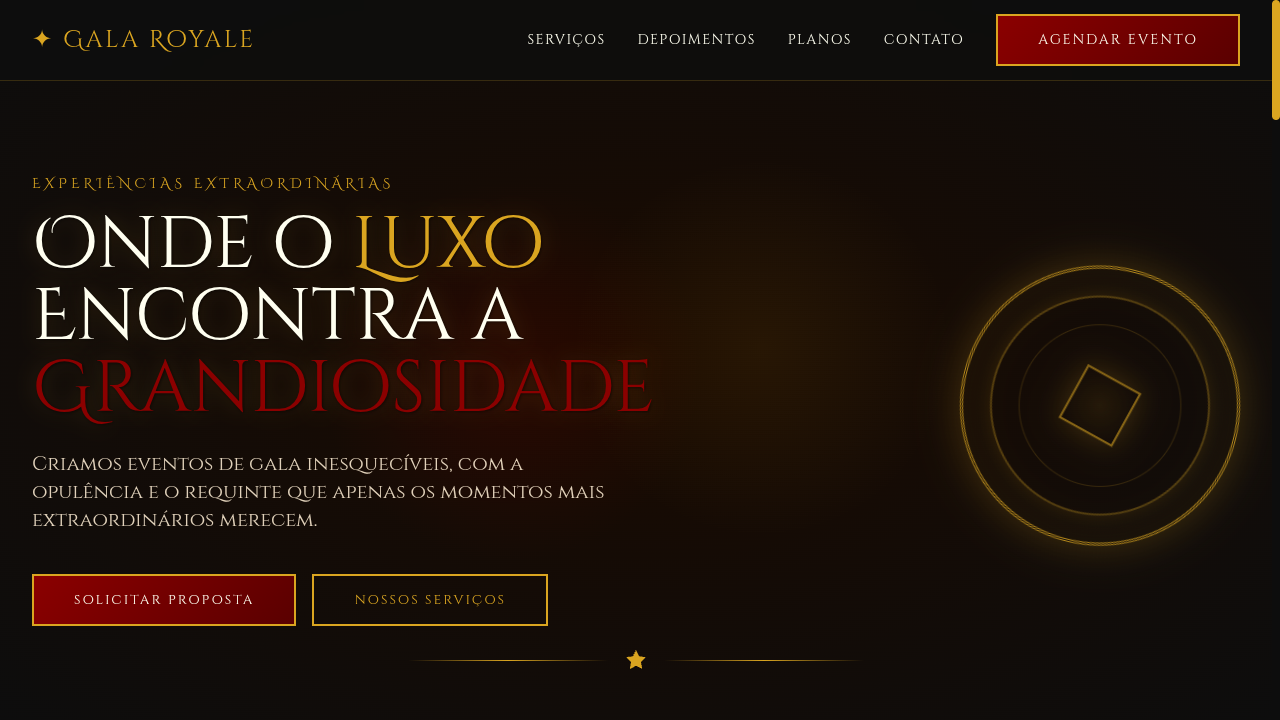
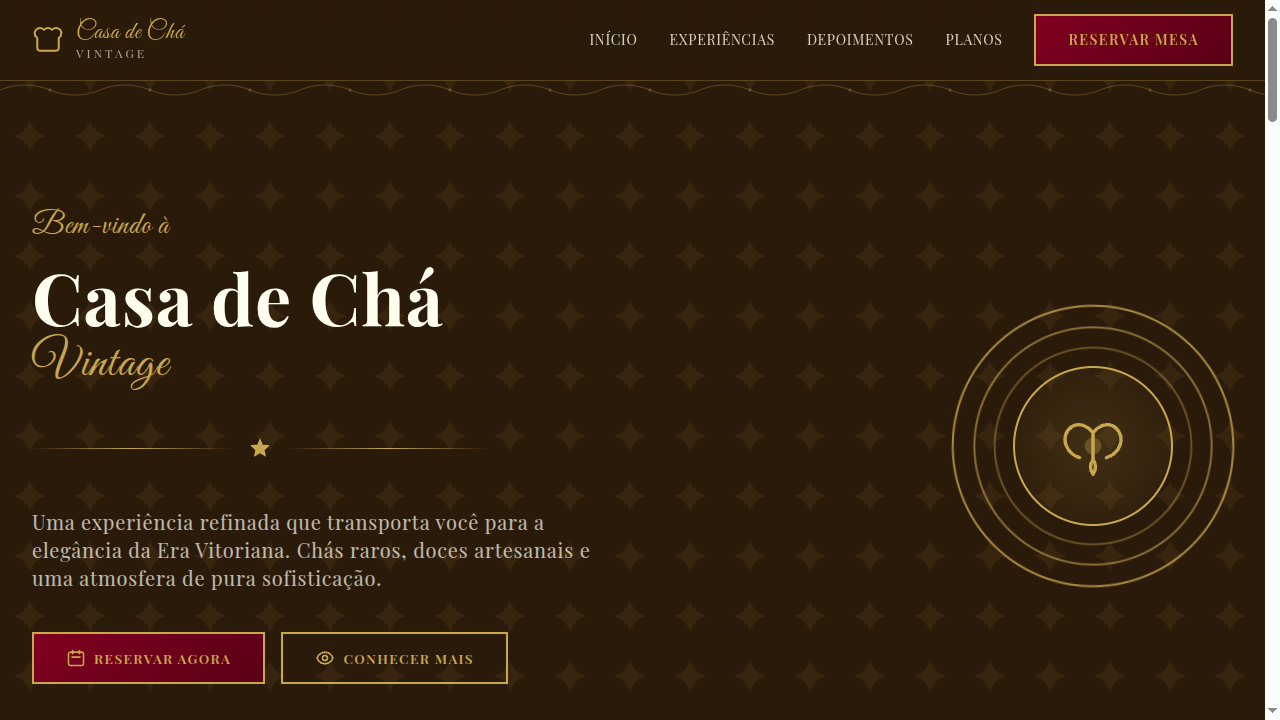
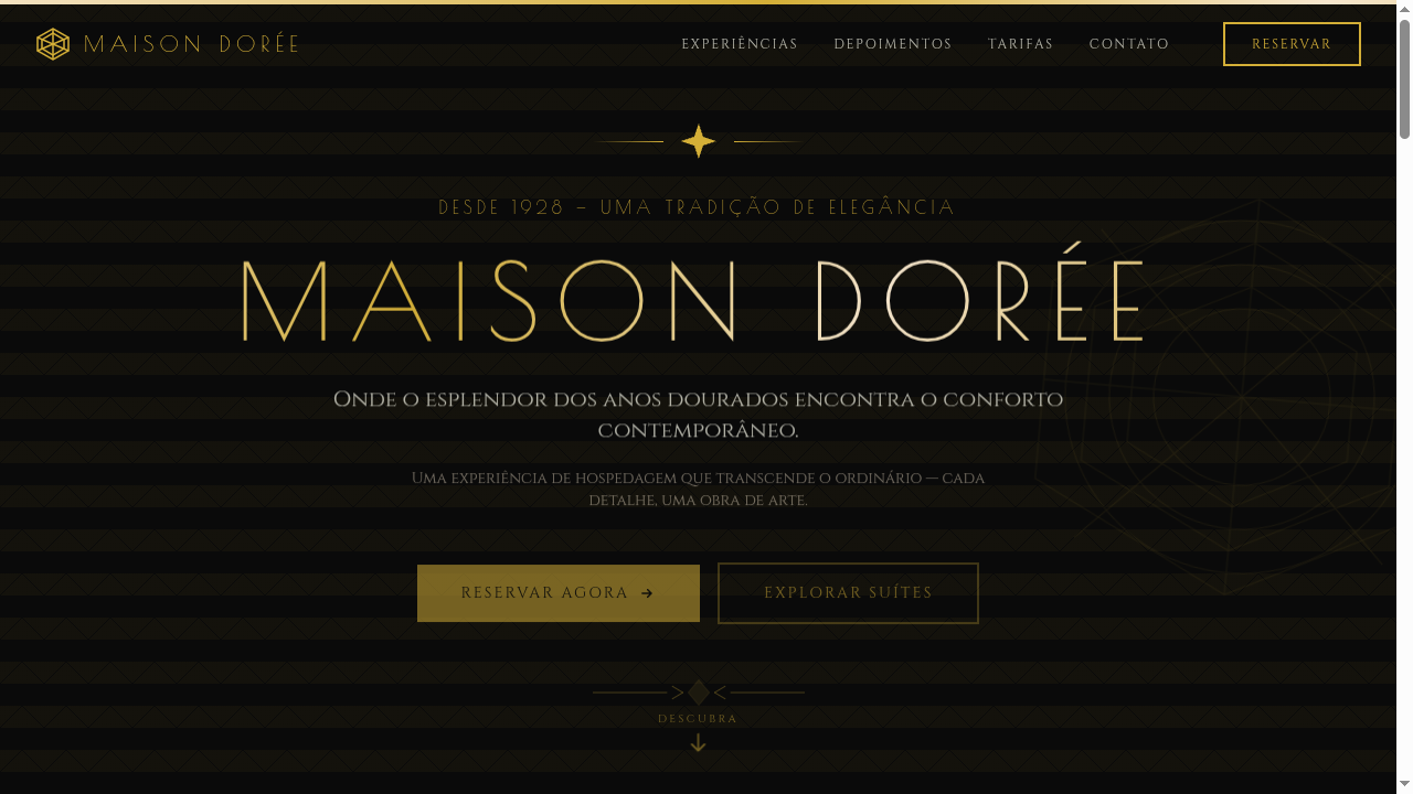
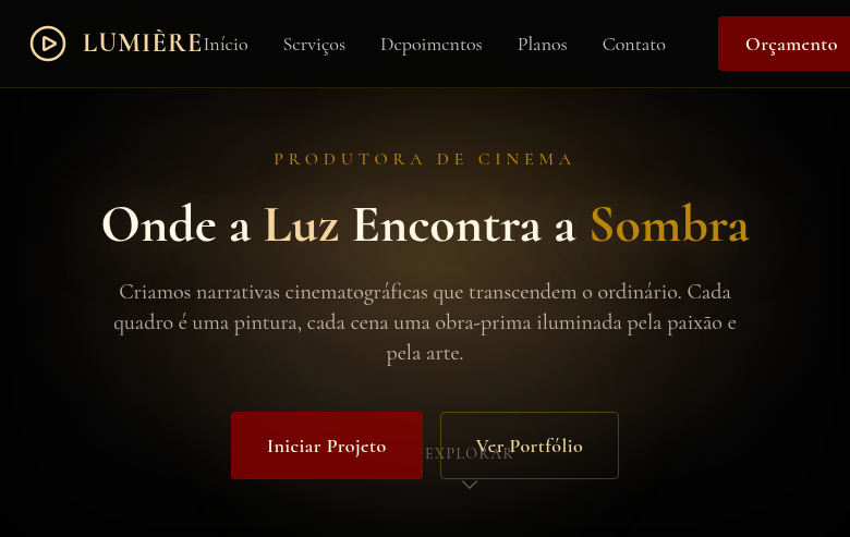
Estilo Barroco com cores ricas, ornamentação dramática e acentos dourados teatrais. Perfeito para branding de luxo, eventos e layouts editoriais elegantes.
Uso: Branding de eventos de luxo, Layouts editoriais, Embalagens elegantes, Convites premium
Contexto Histórico
O Barroco (séc. XVII) é marcado por drama, riqueza e ornamentação excessiva. Nasceu na Itália e se espalhou pela Europa, influenciando arte, arquitetura e música com contrastes intensos.
Especificações Técnicas
Cores
Primárias
Secundárias
Efeitos
Heavy ornamental borders, dramatic shadow gradients, gold leaf textures, rich layered backgrounds, theatrical lighting effects (radial gradients), smooth hover transitions (300ms)
Light/Dark
✓ Full / ✓ Full
CSS
font-family: 'Cinzel Decorative', serif, background: radial-gradient(ellipse, #1a0a00, #0D0D0D), border: 3px double #DAA520, color: #FFFFF0, box-shadow: 0 0 40px rgba(218,165,32,0.3), text-shadow: 1px 1px 3px rgba(0,0,0,0.5)
Variáveis
--color-crimson: #8B0000, --color-gold: #DAA520, --color-black: #0D0D0D, --font-display: 'Cinzel Decorative', --border-ornate: 3px double #DAA520, --shadow-dramatic: 0 0 40px rgba(218,165,32,0.3), --spacing: 2rem
Checklist
☐ Rich deep color palette, ☐ Ornate gold borders and accents, ☐ Dramatic lighting via gradients, ☐ Serif typography with flourishes, ☐ Theatrical contrast between light and dark, ☐ Responsive ornamental layout
DESIGN.md
Design System: Baroque
1. Visual Theme & Atmosphere
Estilo Barroco com cores ricas, ornamentação dramática e acentos dourados teatrais. Perfeito para branding de luxo, eventos e layouts editoriais elegantes. O Barroco (séc. XVII) é marcado por drama, riqueza e ornamentação excessiva. Nasceu na Itália e se espalhou pela Europa, influenciando arte, arquitetura e música com contrastes intensos.
- Density: 5/10 — Balanced
- Variance: 4/10 — Moderate
- Motion: 4/10 — Subtle
2. Color Palette & Roles
- Deep Crimson (#8B0000) — Primary surface or dominant color
- Royal Gold (#DAA520) — Premium accent, decorative highlights
- Midnight Black (#0D0D0D) — Dark surface, primary background
- Ivory (#FFFFF0) — Light surface, card backgrounds
- Royal Purple (#4B0082) — Accent color, emphasis elements
- Emerald (#046307) — Extended palette, decorative use
- Burnt Sienna (#E97451) — Extended palette, decorative use
- Champagne (#F7E7CE) — Extended palette, decorative use
3. Typography Rules
- Display / Hero: Cinzel Decorative — Weight 700, tight tracking, used for headline impact
- Body: Cinzel Decorative — Weight 400, 16px/1.6 line-height, max 72ch per line
- UI Labels / Captions: Cinzel Decorative — 0.875rem, weight 500, slight letter-spacing
- Monospace: JetBrains Mono — Used for code, metadata, and technical values
Scale:
- Hero: clamp(2.5rem, 5vw, 4rem)
- H1: 2.25rem
- H2: 1.5rem
- Body: 1rem / 1.6
- Small: 0.875rem
4. Component Stylings
- Primary Button: Subtly rounded (0.5rem) shape. Accent color fill. Hover: 8% darken + subtle lift shadow. Active: -1px translate tactile press. Font weight 600. No outer glows.
- Secondary / Ghost Button: Outline variant. 1.5px border in muted color. Text in primary color. Hover: subtle background fill.
- Cards: Subtly rounded (0.5rem) corners. Surface background. Subtle shadow (0 2px 12px rgba(0,0,0,0.06)). 1px border stroke.
- Inputs: Label above input. 1px border stroke. Focus ring: 2px accent color offset 2px. Error text below in semantic red. No floating labels.
- Navigation: Primary surface background. Active item: accent color indicator. Font weight 500 when active.
- Skeletons: Shimmer animation matching component dimensions. No circular spinners.
- Empty States: Icon-based composition with descriptive text and action button.
5. Layout Principles
- Grid: CSS Grid primary. Max-width containment: 1280px centered with 1.5rem side padding.
- Spacing rhythm: Balanced. Base unit: 0.5rem (8px).
- Section vertical gaps: clamp(4rem, 8vw, 8rem).
- Hero layout: Split-screen (text left, visual right).
- Feature sections: Zig-zag alternating text+image rows. No 3-equal-columns.
- Mobile collapse: All multi-column layouts collapse below 768px. No horizontal overflow.
- z-index contract: base (0) / sticky-nav (100) / overlay (200) / modal (300) / toast (500).
6. Motion & Interaction
- Physics: Ease-out curves, 200-300ms duration. Smooth and predictable.
- Entry animations: Fade + translate-Y (16px → 0) over 420ms ease-out. Staggered cascades for lists: 80ms between items.
- Hover states: Subtle color shift + shadow adjustment over 200ms.
- Page transitions: Fade only (200ms).
- Performance: Only transform and opacity animated. No layout-triggering properties.
7. Anti-Patterns (Banned)
- No emojis in UI — use icon system only (Lucide, Heroicons)
- No pure black (#000000) — use off-black or charcoal variants
- No oversaturated accent colors (saturation cap: 80%)
- No 3-column equal-width feature layouts — use zig-zag or asymmetric grid
- No
h-screen— usemin-h-[100dvh] - No AI copywriting clichés: "Elevate", "Seamless", "Unleash", "Next-Gen"
- No broken external image links — use picsum.photos or inline SVG
- No generic lorem ipsum in demos
Prompt para AI
Design a baroque-inspired landing page with dramatic contrasts, rich deep colors (crimson, gold, black), ornate decorative borders, gold leaf accents, theatrical lighting via radial gradients. Use serif fonts with flourishes, heavy ornamentation, and layered depth. Evoke luxury, opulence and grandeur.
Relacionados
Última sincronização: 01/04/2026