90s Retro Video Game
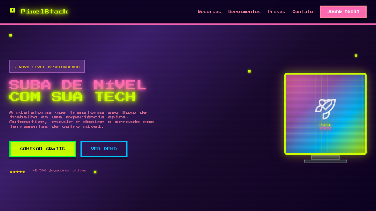
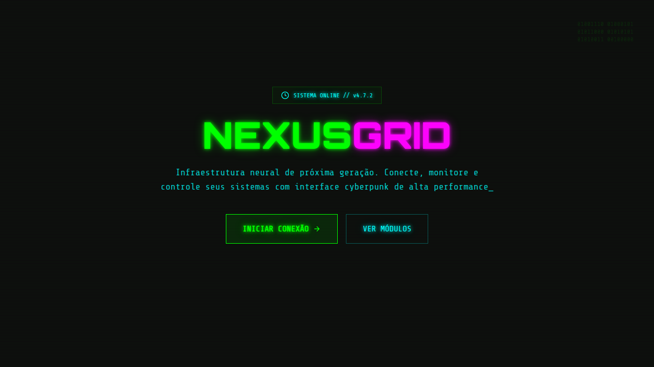
Estilo retrô anos 90 com pixel art, cores neon bubblegum, tipografia chunky e efeitos CRT arcade. Ideal para games, nostalgia e projetos Y2K.
Uso: Games indie, Projetos nostálgicos, Marketing Y2K, Streaming, Comunidades gamer
Contexto Histórico
A era dos 90s e Y2K trouxe cores vibrantes, pixel art e a estética arcade para o mainstream. Jogos como Sonic, Mario e a cultura dos fliperamas definiram uma geração visual.
Especificações Técnicas
Cores
Primárias
Secundárias
Efeitos
Pixel-art style borders (image-rendering: pixelated), neon glow text-shadow, chunky rounded typography (800+ weight), scanline overlay effect, CRT screen curvature, retro gradient backgrounds, blink/flash animations for arcade feel
Light/Dark
✓ Full / ✓ Full
CSS
image-rendering: pixelated, font-family: 'Press Start 2P' or monospace, font-weight: 800, text-shadow: 0 0 10px neon-color, 0 0 20px neon-color for glow, border: 4px solid with pixel-step pattern, background: linear-gradient(180deg, #FF69B4, #9B59B6), animation: scanline 8s linear infinite, box-shadow: inset 0 0 100px rgba(0,0,0,0.3) for CRT curve
Variáveis
--pixel-border: 4px solid, --neon-glow: 0 0 10px, --font-retro: 'Press Start 2P', --scanline-opacity: 0.05, --crt-curve: inset shadow, --color-neon-1: #FF69B4, --color-neon-2: #CCFF00
Checklist
☐ Pixel art style elements, ☐ Neon/bubblegum color palette, ☐ Chunky bold typography, ☐ Scanline or CRT overlay effect, ☐ Retro gradient backgrounds, ☐ Arcade-style interactive elements
DESIGN.md
Design System: 90s Retro Video Game
1. Visual Theme & Atmosphere
Estilo retrô anos 90 com pixel art, cores neon bubblegum, tipografia chunky e efeitos CRT arcade. Ideal para games, nostalgia e projetos Y2K. A era dos 90s e Y2K trouxe cores vibrantes, pixel art e a estética arcade para o mainstream. Jogos como Sonic, Mario e a cultura dos fliperamas definiram uma geração visual.
- Density: 5/10 — Balanced
- Variance: 7/10 — Dynamic
- Motion: 8/10 — Cinematic
2. Color Palette & Roles
- Hot Pink (#FF69B4) — Primary text color
- Electric Lime (#CCFF00) — Secondary surface or text color
- Cyber Purple (#9B59B6) — Accent color, emphasis elements
- Arcade Blue (#00BFFF) — Accent highlight, links and focus states
- Bubblegum (#FF85A2) — Extended palette, decorative use
- Neon Orange (#FF6B35) — Warm accent, call-to-action secondary
- Pixel Green (#00FF41) — Success states, positive indicators
- Chrome Yellow (#FFD700) — Warning states, attention indicators
3. Typography Rules
- Display / Hero: Press Start 2P' or monospace — Weight 700, tight tracking, used for headline impact
- Body: Press Start 2P' or monospace — Weight 400, 16px/1.6 line-height, max 72ch per line
- UI Labels / Captions: Press Start 2P' or monospace — 0.875rem, weight 500, slight letter-spacing
- Monospace: Press Start 2P' or monospace — Used for code, metadata, and technical values
Scale:
- Hero: clamp(2.5rem, 5vw, 4rem)
- H1: 2.25rem
- H2: 1.5rem
- Body: 1rem / 1.6
- Small: 0.875rem
4. Component Stylings
- Primary Button: Subtly rounded (0.5rem) shape. Accent color fill. Hover: 8% darken + subtle lift shadow. Active: -1px translate tactile press. Font weight 600. No outer glows.
- Secondary / Ghost Button: Outline variant. 1.5px border in muted color. Text in primary color. Hover: subtle background fill.
- Cards: Subtly rounded (0.5rem) corners. Surface background. Subtle shadow (0 2px 12px rgba(0,0,0,0.06)). 1px border stroke.
- Inputs: Label above input. 1px border stroke. Focus ring: 2px accent color offset 2px. Error text below in semantic red. No floating labels.
- Navigation: Primary surface background. Active item: accent color indicator. Font weight 500 when active.
- Skeletons: Shimmer animation matching component dimensions. No circular spinners.
- Empty States: Icon-based composition with descriptive text and action button.
5. Layout Principles
- Grid: CSS Grid primary. Max-width containment: 1280px centered with 1.5rem side padding.
- Spacing rhythm: Balanced. Base unit: 0.5rem (8px).
- Section vertical gaps: clamp(4rem, 8vw, 8rem).
- Hero layout: Asymmetric composition.
- Feature sections: Asymmetric grid with varied card sizes. No 3-equal-columns.
- Mobile collapse: All multi-column layouts collapse below 768px. No horizontal overflow.
- z-index contract: base (0) / sticky-nav (100) / overlay (200) / modal (300) / toast (500).
6. Motion & Interaction
- Physics: Spring — stiffness 120, damping 20. Confident, weighted transitions.
- Entry animations: Fade + translate-Y (16px → 0) over 540ms ease-out. Staggered cascades for lists: 120ms between items.
- Hover states: Scale(1.03) + shadow lift over 200ms.
- Page transitions: Fade + slide (300ms).
- Performance: Only transform and opacity animated. No layout-triggering properties.
7. Anti-Patterns (Banned)
- No emojis in UI — use icon system only (Lucide, Heroicons)
- No pure white (#FFFFFF) backgrounds — use off-white or dark surfaces
- No oversaturated accent colors (saturation cap: 80%)
- No 3-column equal-width feature layouts — use zig-zag or asymmetric grid
- No
h-screen— usemin-h-[100dvh] - No AI copywriting clichés: "Elevate", "Seamless", "Unleash", "Next-Gen"
- No broken external image links — use picsum.photos or inline SVG
- No generic lorem ipsum in demos
Prompt para AI
Design a 90s/Y2K retro video game style landing page. Use pixel art icons, bright neon and bubblegum colors (hot pink, lime green, electric blue), chunky rounded bold typography. Add scanline overlay effect, CRT screen curvature on cards, retro gradient backgrounds. Include arcade-style buttons with pixel borders, 8-bit inspired decorative elements, and nostalgic gaming references in the layout.
Relacionados
Última sincronização: 01/04/2026